50 Kitchen Wall Tile Ideas

This post may contain affiliate links: full affiliate disclosure.
Kitchen wall tile can quietly connect cabinets and counters, or become the room's strongest feature. Start by deciding which surface should lead visually.
These ideas compare layouts, colors, shapes, materials, and placements, with practical notes for samples, grout, cleaning, heat, edges, and installation planning.
Save the looks that fit your kitchen, then view real samples upright beside the countertop in daytime and evening light before ordering.
As an Amazon Associate I earn from qualifying purchases.
Layouts That Change the Look
A familiar tile can look completely different when its direction, offset, or rhythm changes. Compare layouts before paying more for an unusual material.
1. Run Classic Subway Tile in a Calm Brick Bond
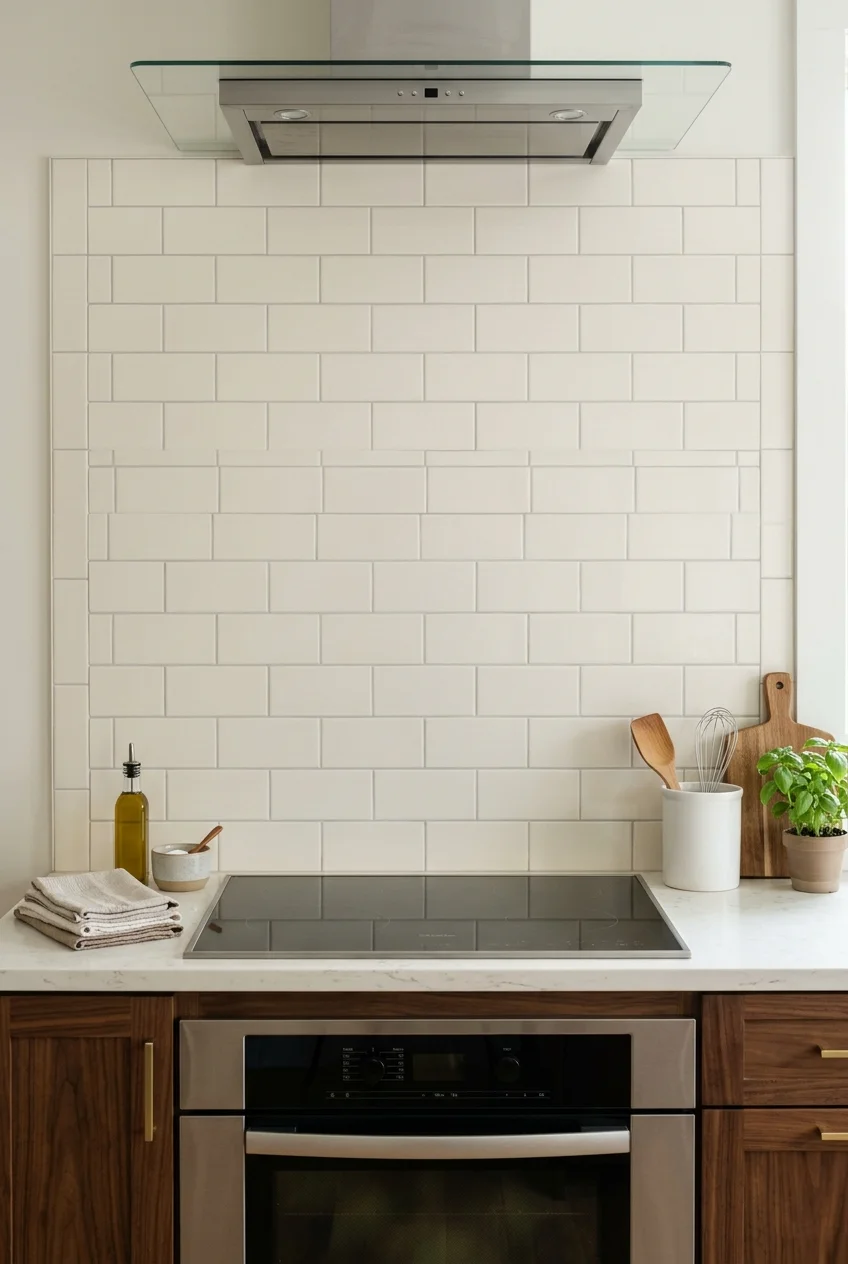
A running bond gives rectangular tile an easy horizontal rhythm, making it a dependable backdrop for detailed cabinetry, veined countertops, or open shelving.
Choose a softer grout contrast when the counter already has movement. Strong grout lines make every offset visible and create a busier graphic surface.
Dry-lay a centered row across the longest wall first. Shift the starting point if either end would finish with a distracting narrow sliver.
2. Stack Slim Tiles Vertically to Emphasize Height
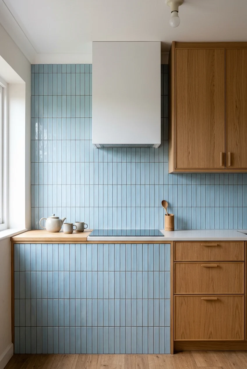
Vertical rows pull attention toward upper cabinets and ceilings, especially when narrow tiles continue behind a hood without a horizontal pattern break.
Keep the first guide line truly plumb because small errors repeat upward. A matching grout color lets the tall silhouette remain the main detail.
3. Use a Horizontal Stack for Clean Architectural Lines
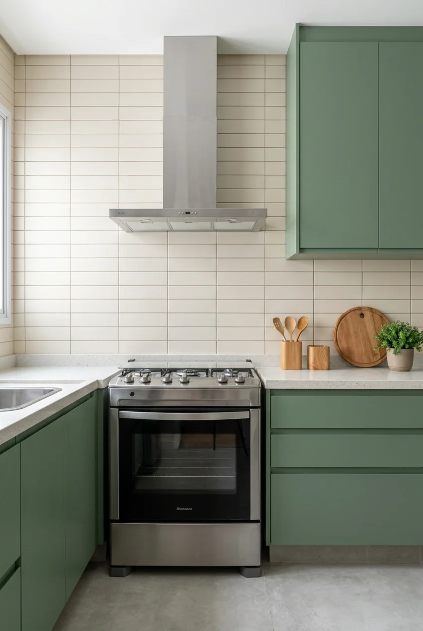
Straight horizontal stacks feel more orderly than an offset bond, giving traditional rectangular tile a crisp look suited to flat-front or simple Shaker cabinets.
Align a grout line with a major cabinet edge or shelf when possible. Random near-alignments can look accidental across a long, highly visible wall.
4. Make Herringbone the Movement, Not the Color
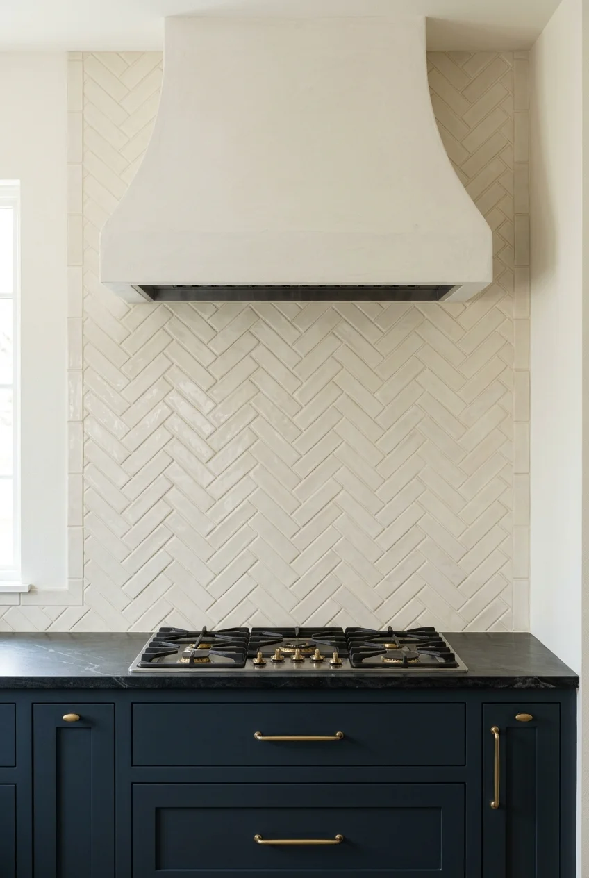
Herringbone adds diagonal movement with ordinary rectangles, so a restrained cream, gray, or muted blue palette can still create a memorable backsplash.
Center the pattern on the range or sink rather than the entire room when that focal area controls the kitchen's main sightline.
Expect more perimeter cuts than with stacked tile. Confirm the installer's layout plan and material allowance before treating the pattern as a simple swap.
Setup note Lay several connected sheets on the counter first, checking that sheet boundaries disappear and the herringbone points remain consistent across the field.
5. Choose Chevron for a Sharper Continuous Zigzag
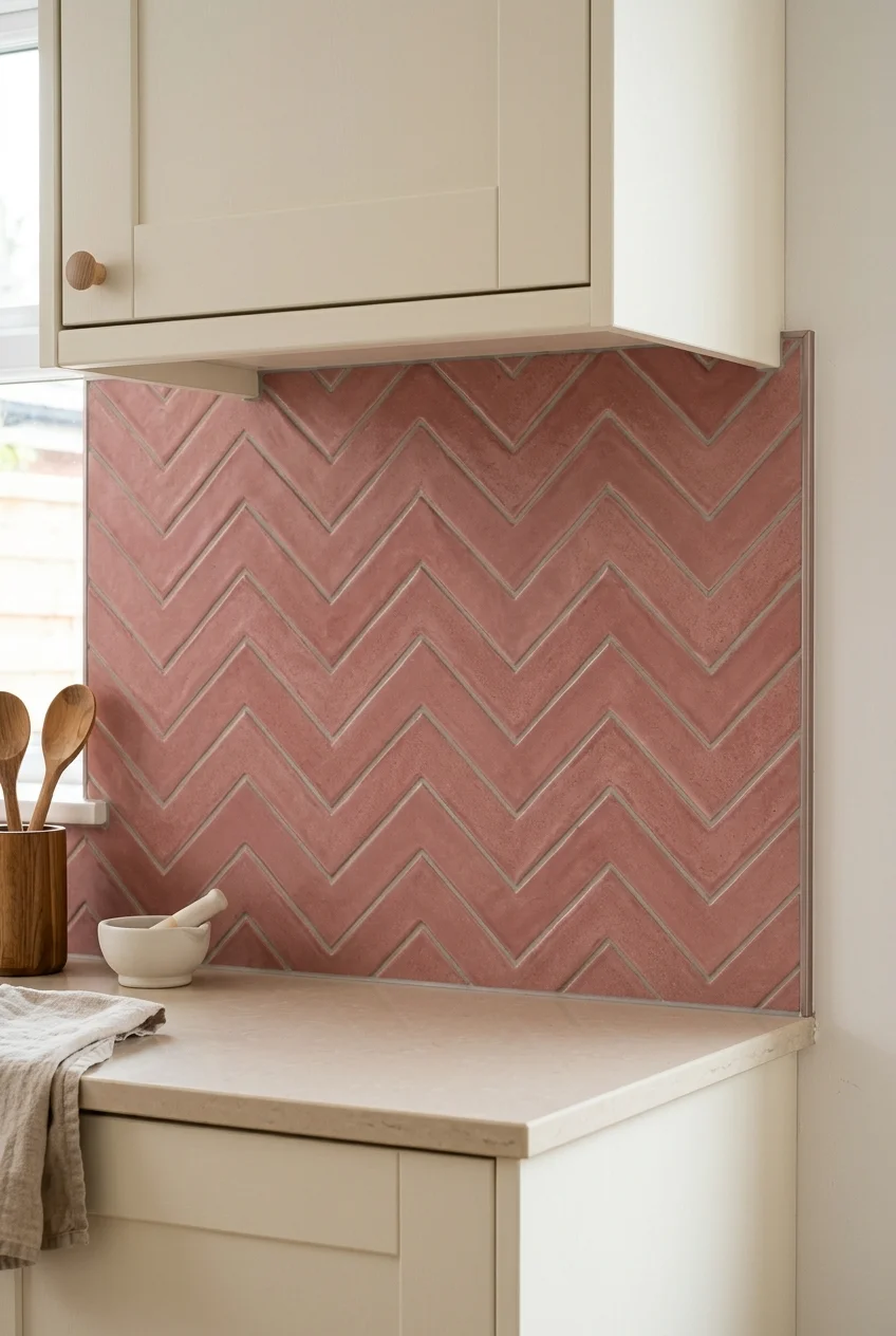
Chevron pieces meet in clean points, creating a more continuous zigzag than herringbone. It suits a centered panel where the geometry can read clearly.
Use a quiet counter and limited accessories nearby. The repeated points already provide enough energy, particularly with contrasting grout or saturated color.
6. Bring Woven Rhythm with a Basketweave Mosaic
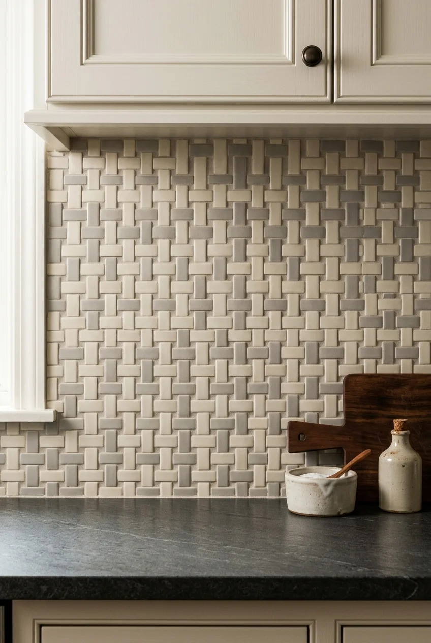
Basketweave mosaics introduce small-scale pattern without relying on bright color, making them useful when the room needs detail rather than another strong hue.
Inspect several sheets together before installation. Uneven spacing between mesh sheets becomes obvious once grout outlines the entire woven repeat across the wall.
7. Revisit Square Tile in a Precise Grid
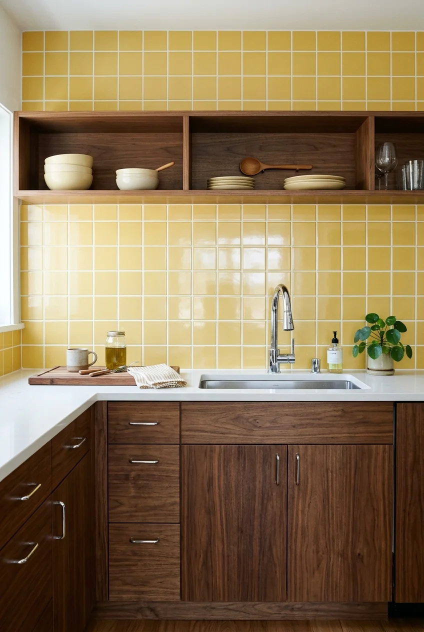
Square tile feels purposeful when joints align cleanly and the color relates to the cabinetry, rather than appearing like a leftover builder-grade surface.
Try medium squares for a calm field or smaller squares for a denser pattern. Tape their outlines on the wall to judge scale.
8. Turn Square Tiles on the Diagonal
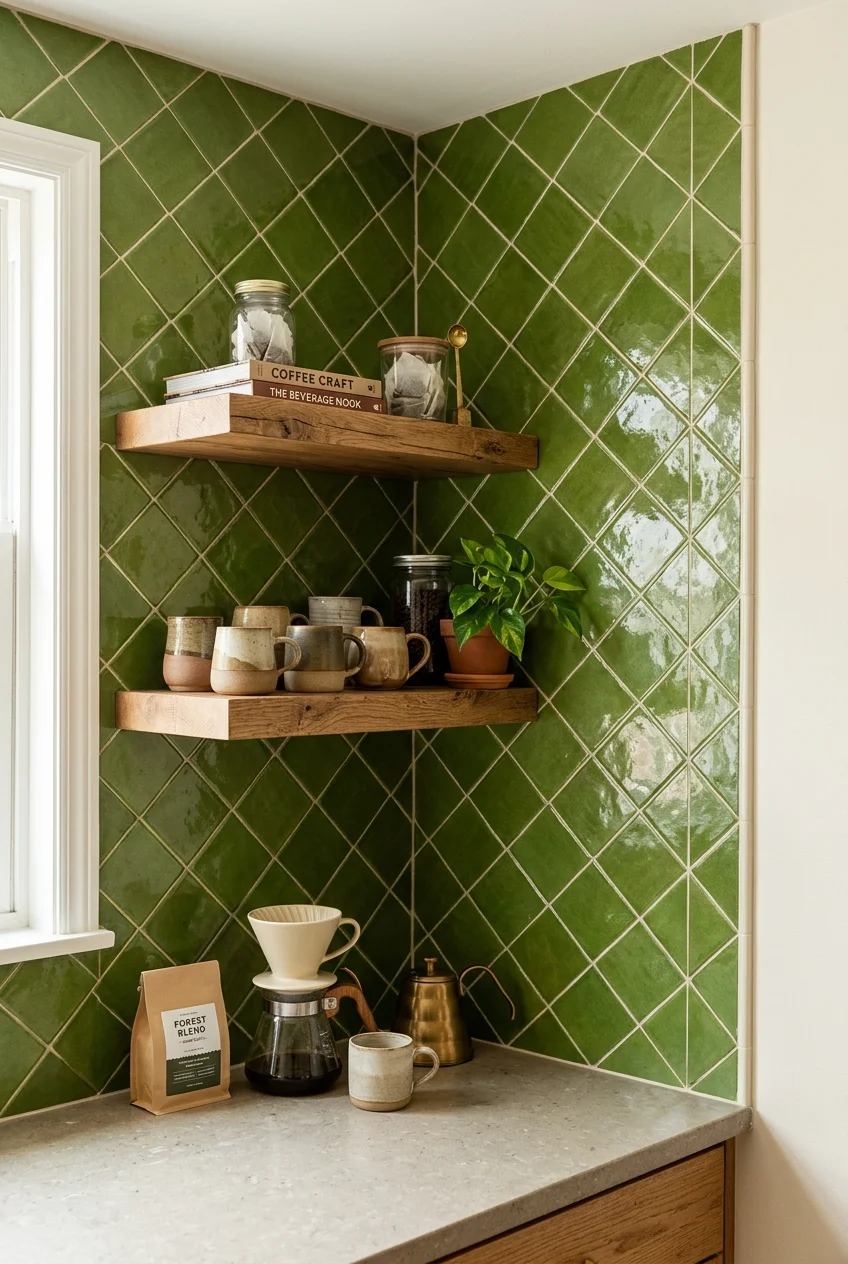
A diagonal square layout creates diamonds and makes a plain tile feel decorative, especially within a contained range panel or breakfast nook backsplash.
Frame the field with simple trim so cut triangles finish deliberately. Without an edge plan, the angled pattern can look abruptly interrupted.
9. Create Fine Stripes with Vertical Kit-Kat Tile
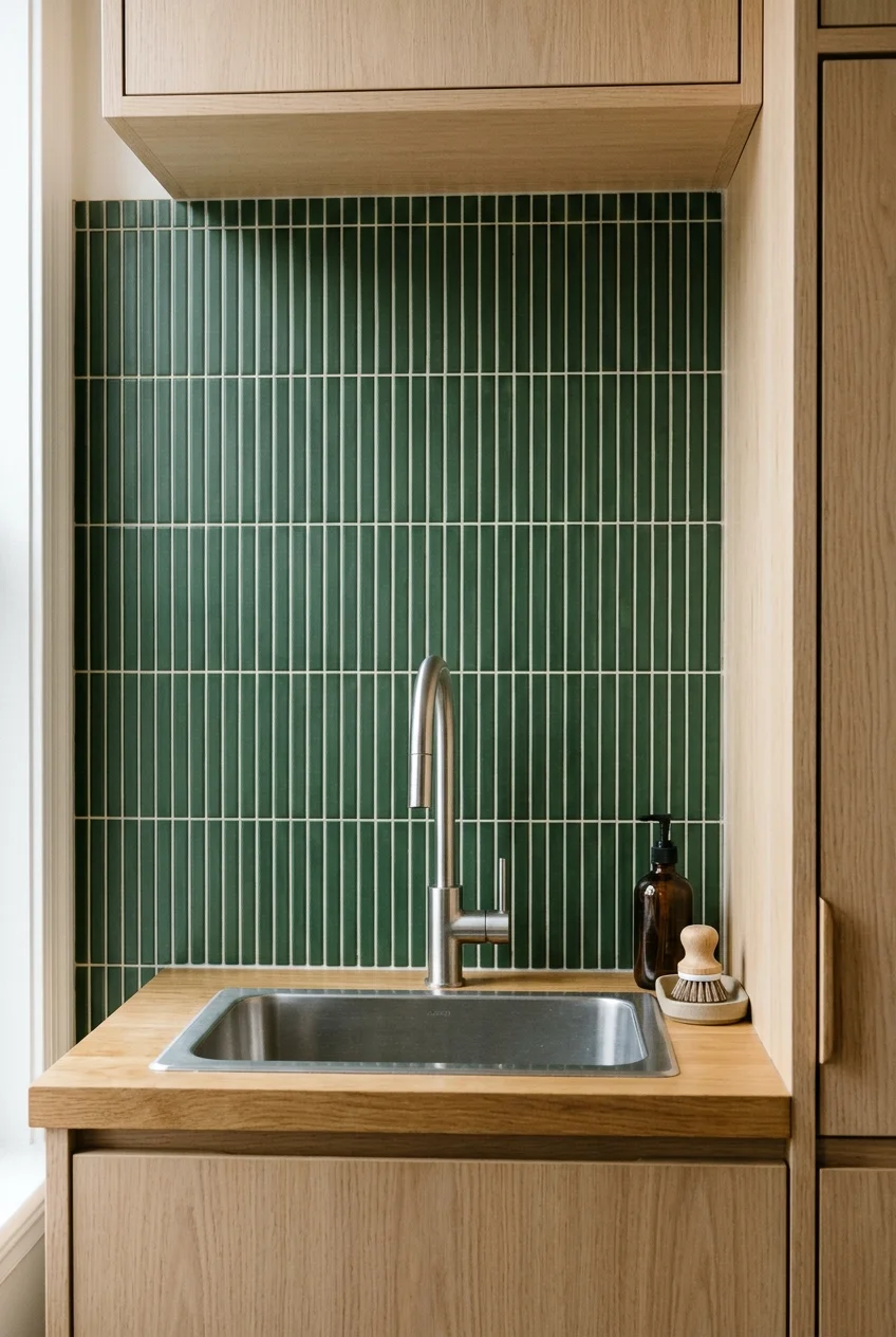
Narrow finger tiles create a finely striped wall that reads as texture from across the room and as individual pieces from the counter.
Use them on one connected wall rather than every surface when cabinets, counters, and floors already contribute strong lines or contrasting materials.
More joints mean more grout to maintain. Choose a grout color and cleaning routine before committing to a wide, frequently splashed installation.
10. Mix Two Tile Sizes in a Controlled Modular Pattern
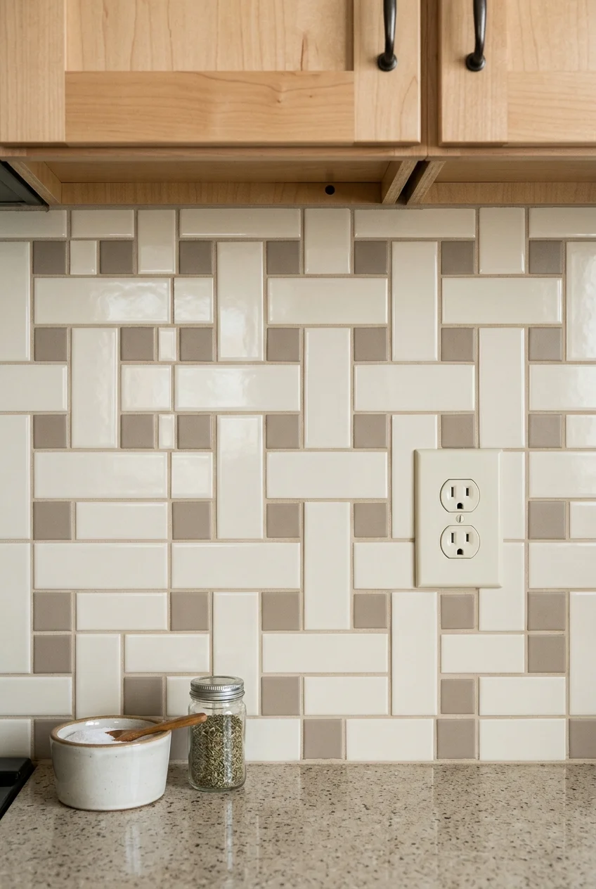
Combining one rectangle with one square can create a measured architectural repeat, giving a neutral backsplash interest without introducing another color or finish.
- Confirm both sizes share compatible thickness and edge profiles.
- Draw the full repeat around outlets before ordering.
- Keep the grout width consistent between every module.
Order the pieces as one planned system when possible. Mixing unrelated lines can create uneven faces that catch dirt and complicate edge finishing.
Color Palettes with a Point of View
Color works best when it answers something already in the room: a cabinet undertone, countertop fleck, metal finish, or desired amount of contrast.
11. Layer Warm White Tile with White Cabinets
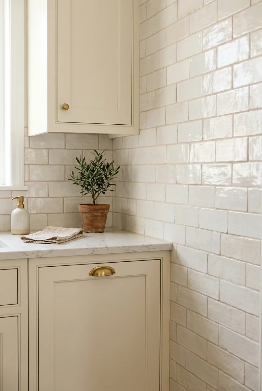
Warm white tile prevents white cabinetry from feeling flat when the glaze, grout, and cabinet paint differ slightly but share compatible creamy undertones.
If white cabinetry is your starting point, compare these backsplash ideas for white cabinets before choosing the tile's undertone and contrast.
Bring the cabinet door and tile sample together under task lighting. Two whites that agree in daylight can separate sharply beneath warm bulbs.
12. Build a Soft Cream and Taupe Tonal Wall
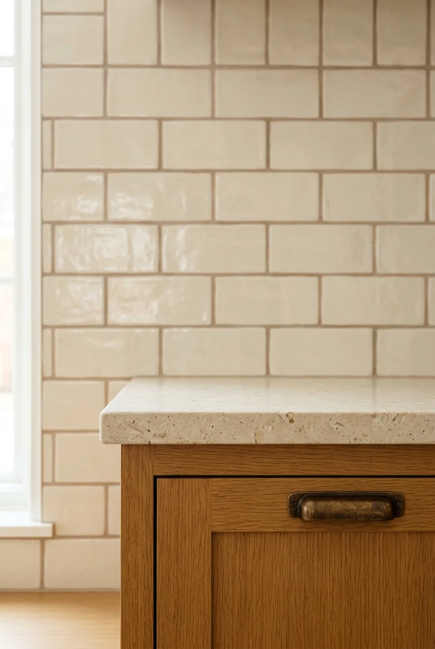
Cream tile with taupe grout creates gentle definition without a stark outline, particularly beside warm stone counters, bronze hardware, or honeyed wood cabinets.
Choose the grout after seeing the installed tile sample wet and dry. A near match can shift noticeably once grout cures around every edge.
13. Use Sage Green as a Quiet Neutral
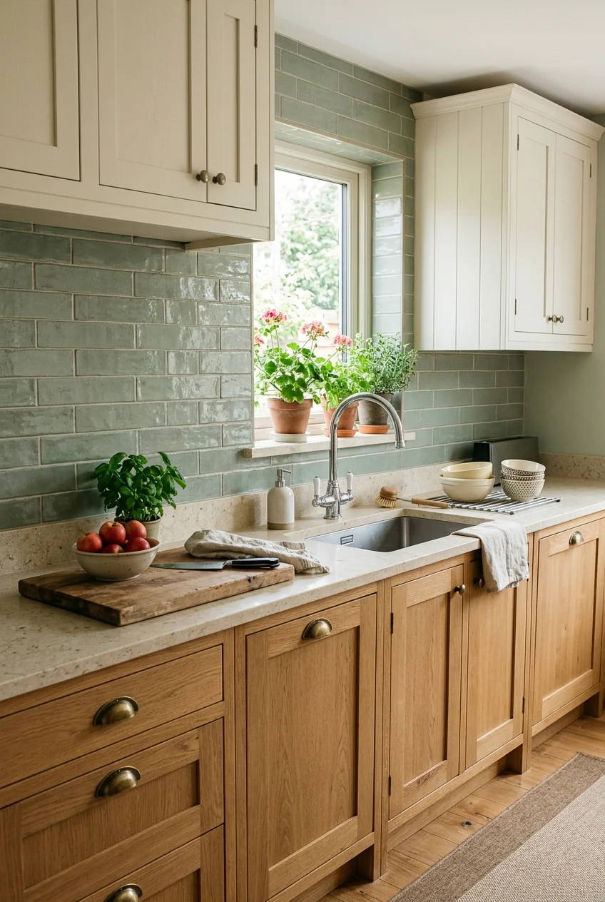
Muted sage supplies color while remaining calm beside oak, cream, black, or walnut, making it easier to update smaller accessories later.
Compare several greens against the countertop undertone. A blue sage can fight a golden stone, while an olive-leaning sample may connect them naturally.
14. Choose Olive Tile for Richer Earthy Depth
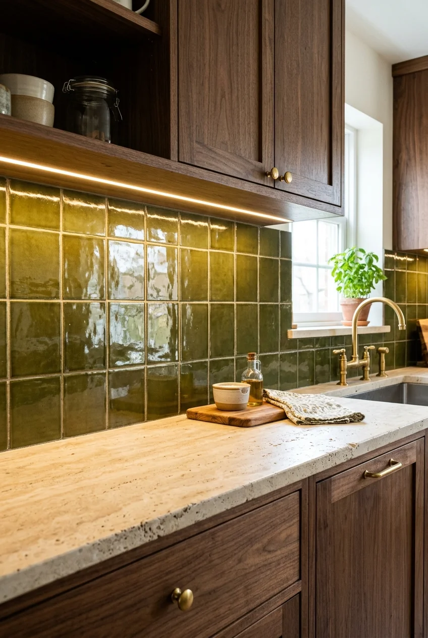
Olive tile has more weight than sage, creating a grounded backdrop for pale counters and wood while avoiding the severity of black.
A glossy surface reflects task lighting and reveals color variation. Matte olive feels quieter but may need deliberate lighting to avoid looking muddy.
15. Let Cobalt Blue Define One Working Wall
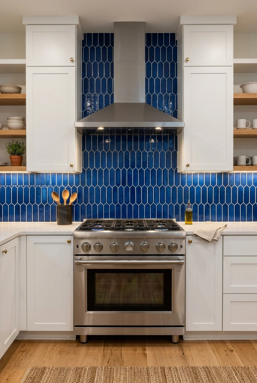
Cobalt tile can anchor a range or sink wall while surrounding white or wood surfaces keep the stronger color contained and useful.
Repeat the blue once in a small nearby detail rather than matching every accessory. The wall stays intentional without becoming a rigid theme.
Practical tip View a full sample board after dark because saturated blue can appear much deeper under under-cabinet lighting than it does near a showroom window.
16. Warm the Kitchen with Muted Terracotta
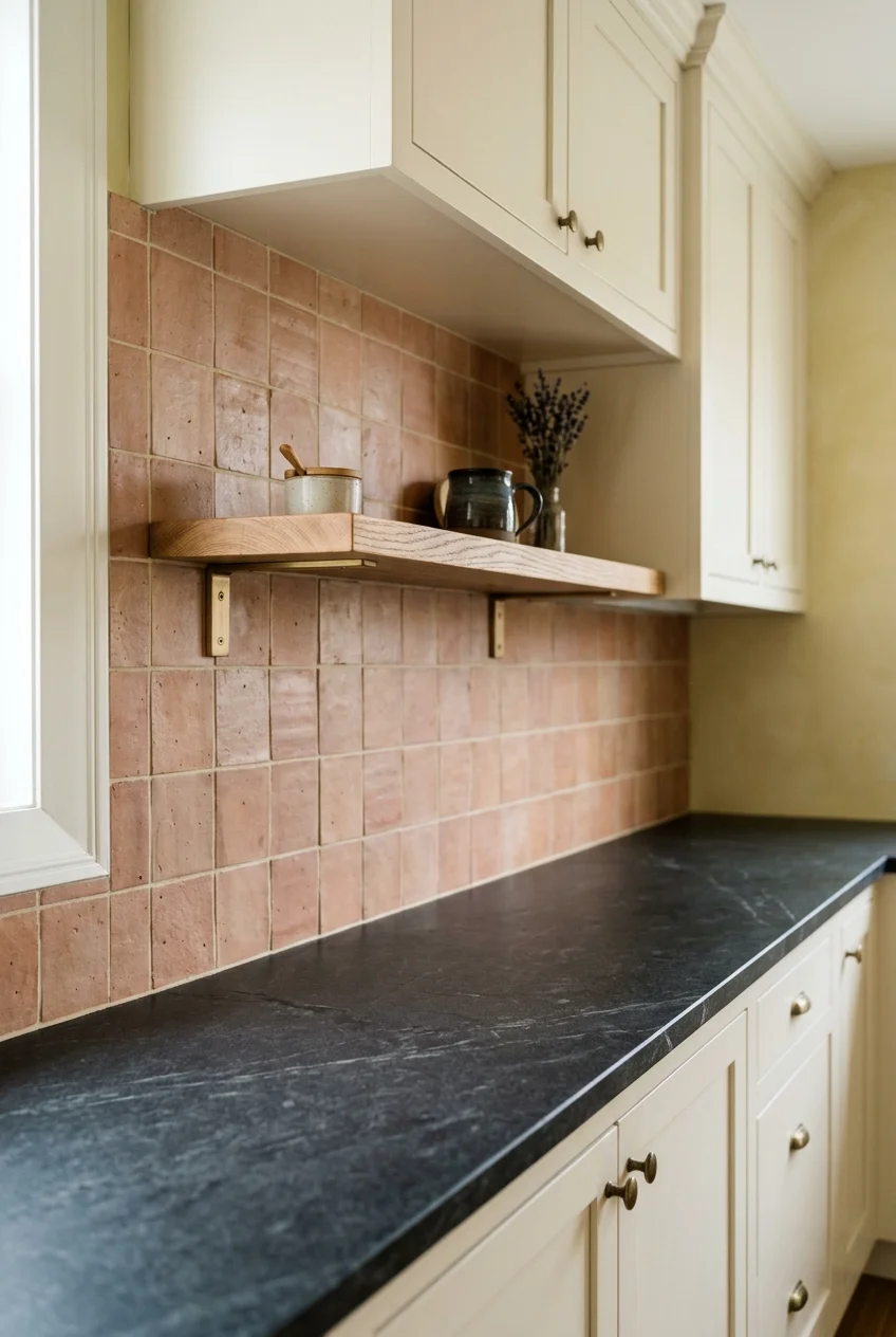
Muted clay tile brings warmth beside cream paint, oak, and soapstone-like counters without requiring a rustic room or heavily distressed finishes.
Decide whether you want true porous terracotta or a ceramic look-alike. Their sealing, staining, installation, and ongoing care requirements differ substantially.
Keep adjacent reds and oranges restrained so the clay remains a clear material choice rather than one element within an overly matched palette.
17. Try Burgundy Tile for a Deep Warm Accent
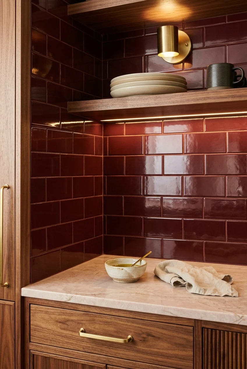
Burgundy glazed tile gives a kitchen depth and warmth, especially beside walnut, pale pink-beige stone, or softly aged brass rather than bright white.
Use the color on a measured backsplash area and keep grout close in value. High-contrast joints can make a dark wall feel fragmented.
18. Ground Pale Cabinets with Matte Charcoal
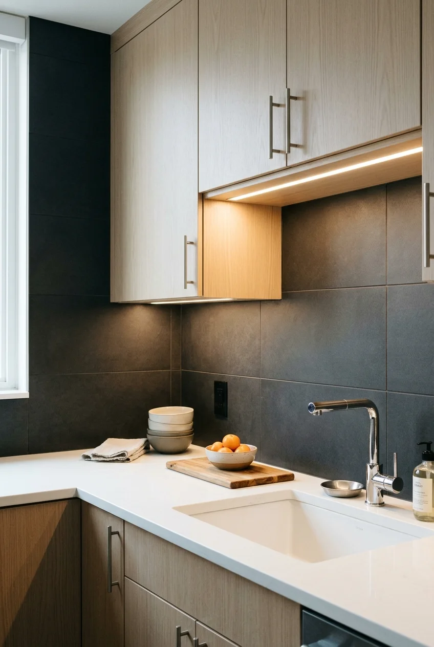
Matte charcoal tile can give pale cabinets a strong baseline without the mirror-like reflections of black glass or highly polished ceramic.
Check cleaning guidance for the exact finish. A textured matte surface may hold cooking residue differently from a smooth glazed tile.
Even task lighting matters on dark walls because it reveals the work surface and prevents the backsplash from becoming a featureless shadow.
19. Use Glossy Black Tile as a Reflective Backdrop
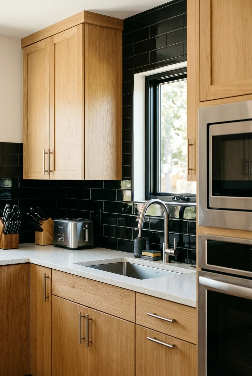
Glossy black tile reflects windows, fixtures, and shelves, creating more visual activity than matte black even when the tile shape stays simple.
Test the reflections from normal standing positions. Strong glare, visible outlets, or cluttered counters may become more prominent across a dark polished surface.
20. Blend Related Shades into a Gentle Ombré
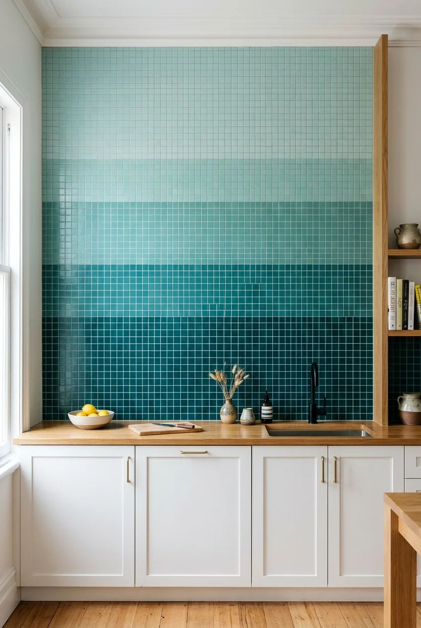
An ombré wall can move from deep to pale within one color family, giving a simple square or rectangle an intentionally layered appearance.
Plan the shade quantities on paper and open every box before installation. Random placement rarely produces a controlled gradient across interrupted cabinetry.
A short, open wall shows the transition best. Numerous windows, outlets, and upper cabinets can break the progression into unrelated patches.
Shapes, Materials, and Surface Texture
Shape and material affect cleaning, grout quantity, edge treatment, and installation as much as appearance. Let the working zone determine how tactile to go.
21. Let Handmade-Look Tile Show Subtle Variation
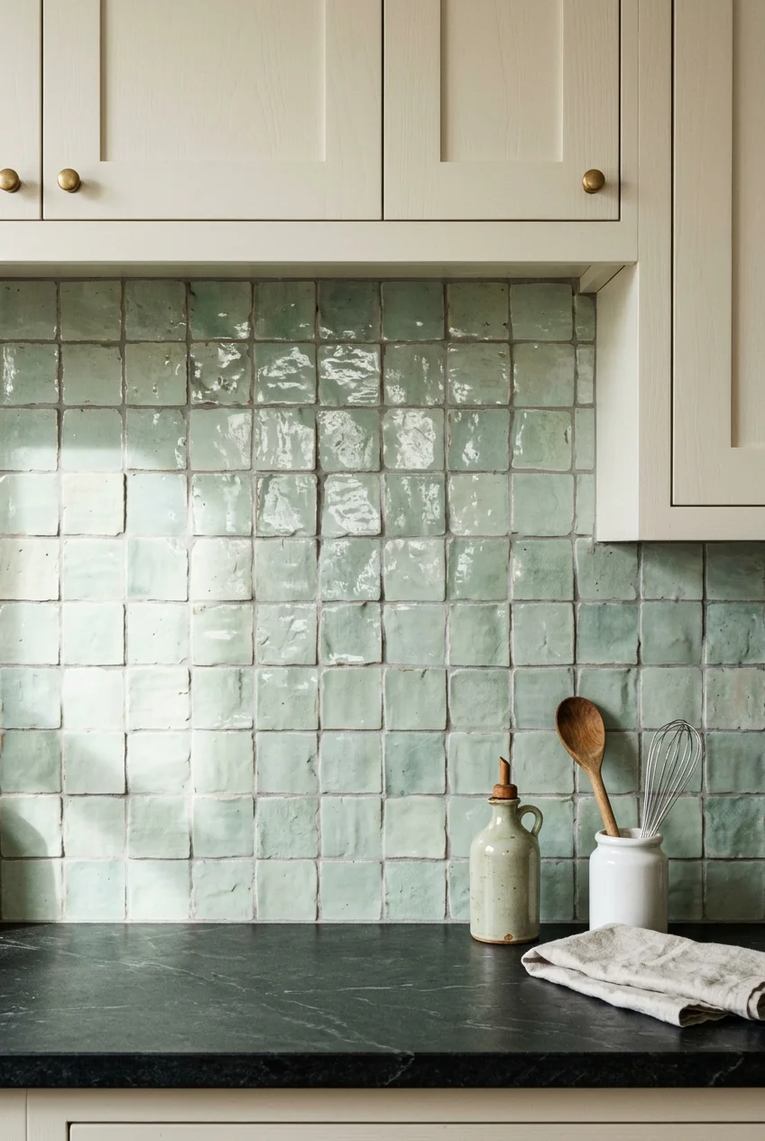
Handmade and handmade-look tiles gain depth from uneven glaze, softly irregular edges, and slight color shifts rather than from a complicated layout.
Open several boxes and blend pieces across the wall so darker or glossier tiles do not collect in an accidental block.
Ask how edge irregularity affects grout width and outlet covers. A mockup helps reveal whether the finished details will look deliberate.
22. Use Penny Rounds for Fine-Grained Curves
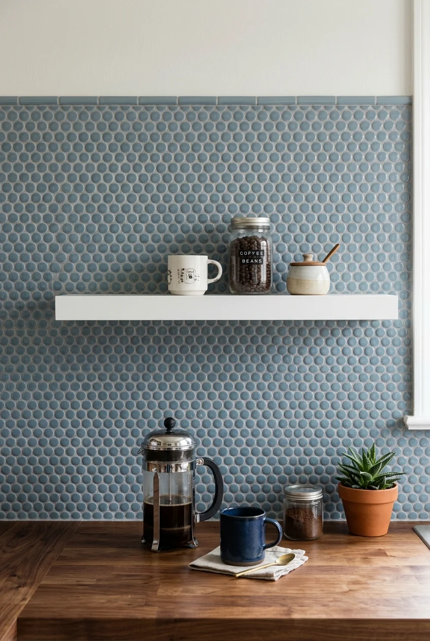
Penny rounds soften straight cabinet lines and create a finely dotted surface, making them especially effective in a small nook or short backsplash.
Because grout occupies more of the visible field, color choice changes the result dramatically. Matching grout softens the dots; contrast emphasizes every circle.
Watch for Check sheet spacing from several feet away before grout. Slightly wider seams between mesh sheets can create a visible grid through the round pattern.
23. Choose Hexagons for an Orderly Geometric Field
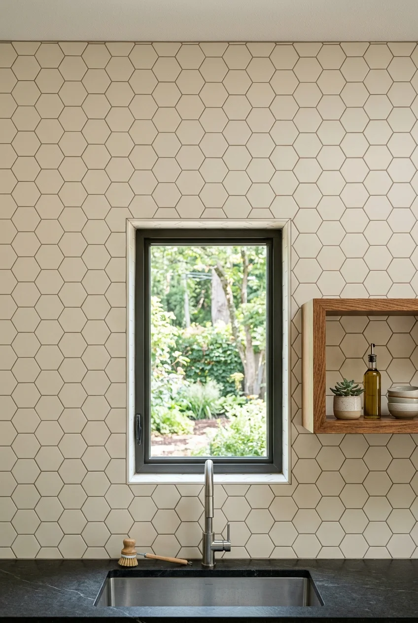
Hexagonal tile adds geometry without choosing a directional pattern, so it works across interrupted walls with windows, outlets, and open shelves.
Small hexagons read as texture; larger ones show individual shapes. Compare both at normal viewing distance instead of judging a single sample.
24. Soften Straight Cabinetry with Scallop Tile
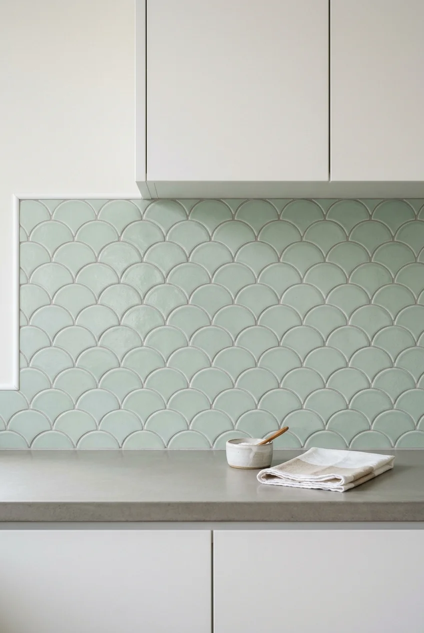
Scallop or fish-scale tile introduces rounded movement into kitchens dominated by rectangular doors, appliances, counters, shelves, and rigid architectural lines.
Choose whether the curves point upward or downward before ordering. The orientation changes where cut edges appear and how the pattern seems to move.
25. Use Picket Tile for Tall Faceted Geometry
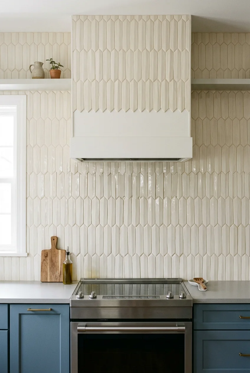
Picket tiles combine a vertical proportion with angled ends, delivering more structure than a rectangle and less visual density than a small mosaic.
- Check how points finish beneath upper cabinets.
- Plan symmetrical cuts around the main focal area.
- Select trim that matches the tile's full thickness.
A tone-matched grout keeps attention on the silhouette. Strong contrast turns the entire wall into a denser, more assertive honeycomb-like network.
26. Add Speckled Color with Terrazzo-Look Tile
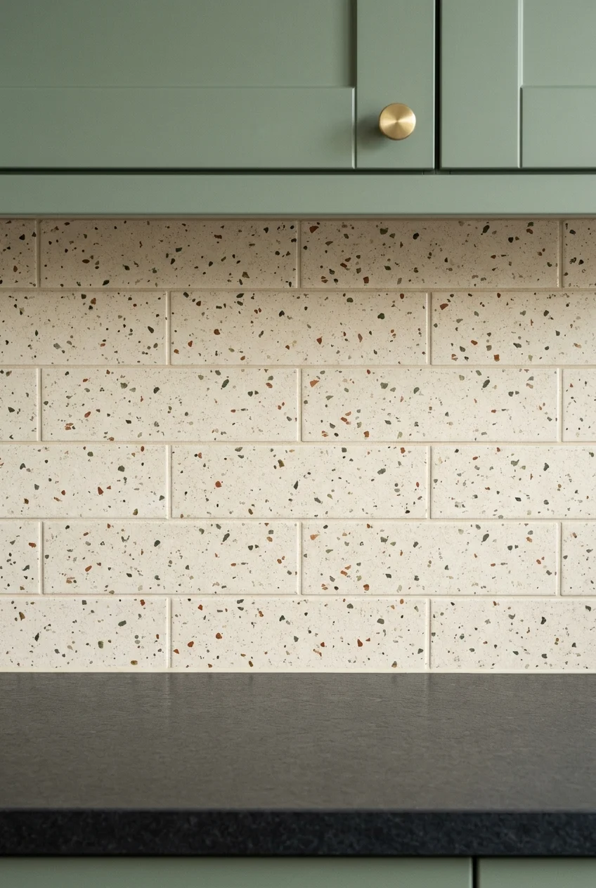
Terrazzo-look tile can connect several room colors through scattered chips, making it useful when cabinets, counters, and flooring need a shared bridge.
Choose chip scale carefully. Large, high-contrast fragments become a statement, while fine low-contrast flecks read as a forgiving textured neutral.
Place the sample beside the countertop, not above it in isolation. Two unrelated aggregate patterns can compete at their shared edge.
27. Use Glass Tile Where Light Can Work for It
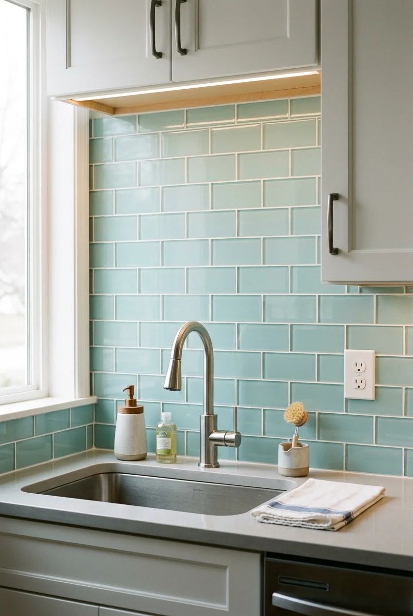
Glass tile reflects and transmits light differently from opaque ceramic, adding depth where a window or concealed task light can reach the wall.
Confirm the recommended setting material and cutting method for the exact product. Backing color, chips, and visible adhesive can alter a translucent installation.
Use a sample near outlets and edges because transparent or reflective surfaces can expose details that an opaque tile would quietly conceal.
28. Keep Marble Mosaic to a Focused Area
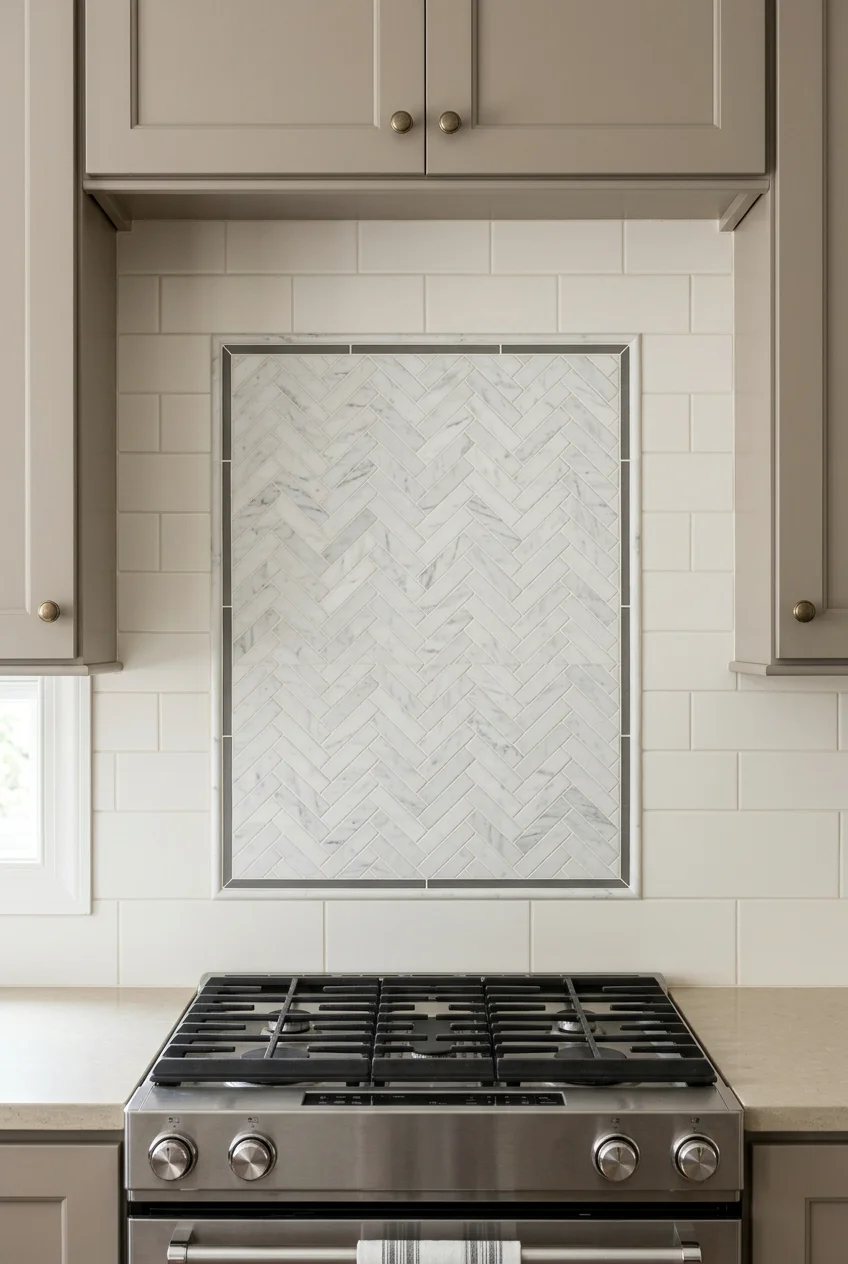
A marble mosaic brings natural veining and many joints, so a framed range panel often gives it more clarity than a crowded full-room application.
Select the slab or countertop first when it has strong movement. The mosaic should support that surface instead of introducing a second unrelated vein direction.
Natural stone can react to spills and cleaners. Follow the stone and setting-system manufacturers' guidance for sealing, grout, adhesive, and maintenance.
Practical tip Test sealer on an extra piece because some products can deepen color or change surface appearance, especially on porous or textured stone.
29. Choose Limestone-Look Porcelain for Quiet Texture
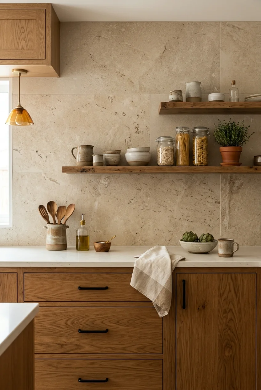
Limestone-look porcelain offers muted movement and warm mineral color without making genuine natural stone care part of every cooking spill.
Inspect several pieces for print repetition. A convincing installation distributes repeated faces and rotates allowable tiles instead of clustering identical markings.
30. Reserve Ribbed Tile for Lower-Splatter Zones
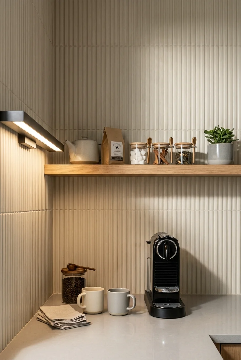
Ribbed ceramic casts fine shadows that enliven a single color, but deep grooves are less forgiving where sauce and grease regularly land.
- Use flatter tile directly behind active burners.
- Place deeper relief near a beverage or display zone.
- Check the manufacturer's cleaning instructions before buying.
A side-lit wall reveals the relief best. Under-cabinet lighting that grazes downward can emphasize both intentional texture and accumulated residue.
31. Reduce Grout Lines with Large-Format Porcelain
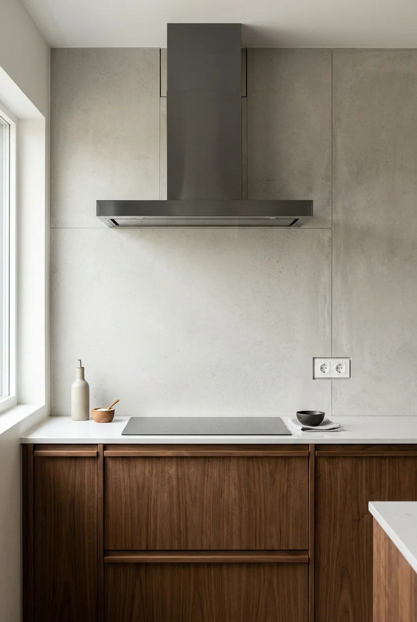
Large-format porcelain can create a broad, quiet surface with fewer joints, especially when the pattern resembles restrained plaster, concrete, or stone.
Large pieces demand a flat substrate, suitable setting materials, planned support, and careful handling. Treat installation complexity separately from the simple finished appearance.
Map sheet or tile seams around cabinets, corners, and outlets before cutting. One awkward narrow strip can undermine the intended continuous look.
Confirm the selected product is approved for the wall application and follow its manufacturer instructions rather than generalizing from another porcelain line.
32. Use Three-Dimensional Relief Away from Heavy Grease
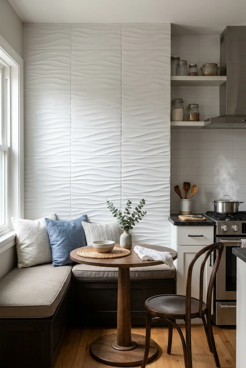
Three-dimensional tile can make a blank wall architectural through shadow alone, especially beside a dining nook or on a lightly used serving wall.
Avoid placing deep relief where frequent frying splatter makes every ridge a cleaning task. A flatter companion tile can protect the active cooking zone.
33. Get Pattern with Encaustic-Look Porcelain
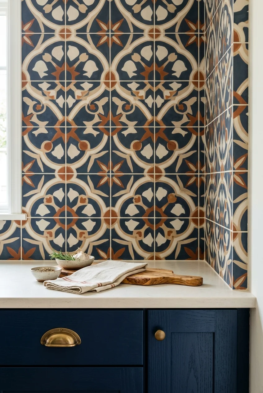
Encaustic-look porcelain delivers repeating color and pattern with product-specific porcelain care, making it practical to compare against genuine cement tile requirements.
Limit the palette to colors already present in cabinets, counters, or flooring. The pattern then connects finishes instead of adding unrelated decoration.
Check how the repeat meets corners and upper cabinets. A full printed module should remain legible across the most visible portion of the wall.
34. Scatter Hand-Painted Accents Through Plain Field Tile
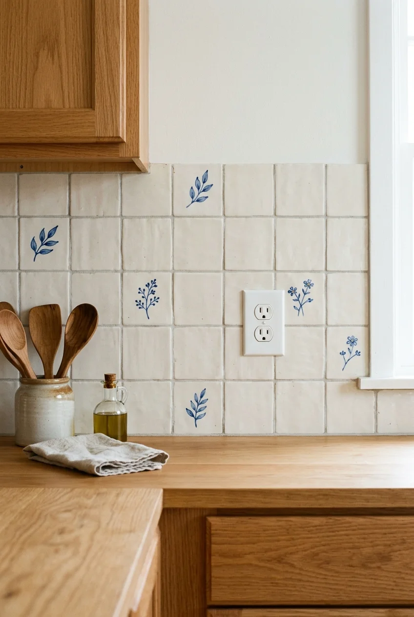
A few decorative tiles can punctuate a plain field without covering the wall in pattern, letting individual motifs read like small collected objects.
Arrange the accents on the floor first and photograph the plan. Random spacing should still avoid awkward clusters around outlets and corners.
35. Add a Narrow Band of Metallic Glaze
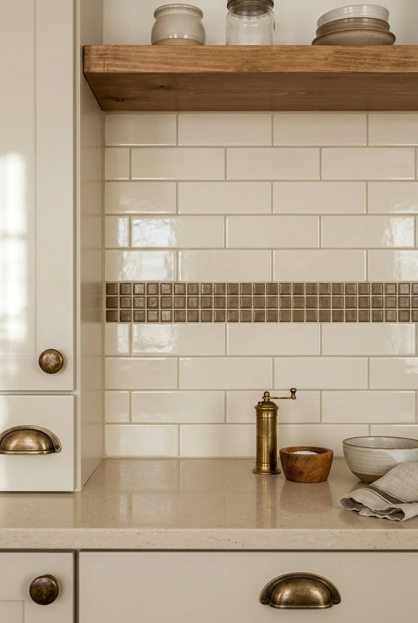
A narrow metallic-glaze band can repeat brass, copper, or stainless details without turning the entire backsplash into a reflective statement.
Keep the band clear of outlet plates when possible and verify cleaning guidance. Some decorative finishes need gentler care than surrounding field tile.
Placement, Scale, and Focal Walls
Where tile starts and stops can matter more than the tile itself. Plan boundaries around architecture, working zones, and the room's main approach.
36. Carry Tile to the Ceiling on an Open Wall
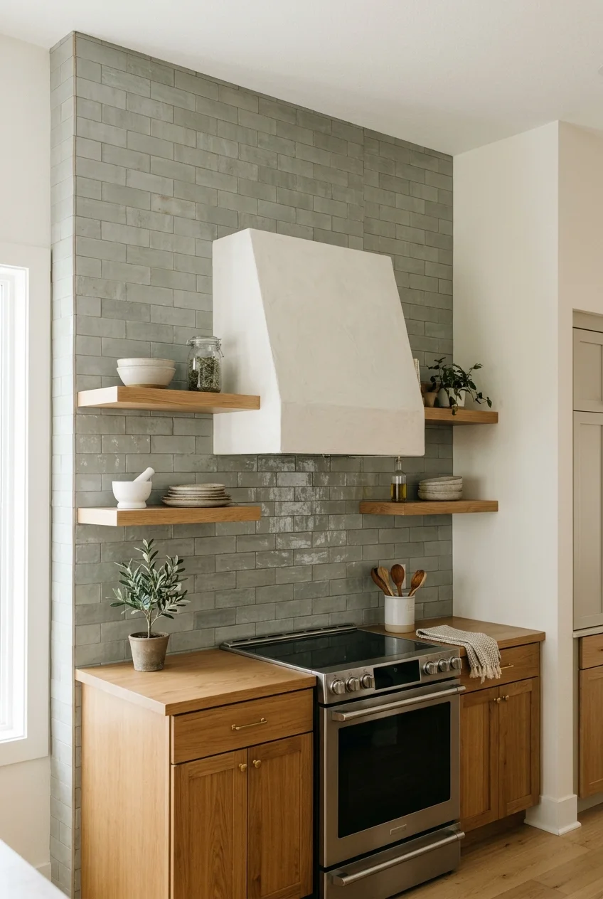
Full-height tile turns an open wall into a continuous architectural surface, especially where a hood, window, or shelves interrupt otherwise blank drywall.
- Choose the ceiling termination before setting the first row.
- Plan shelf brackets and hood fasteners before tiling.
- Map outlets, sconces, and trim on the elevation.
The added square footage raises material and labor requirements, while upper cuts become highly visible. Price the complete elevation rather than only the backsplash strip.
A simple field tile often handles this scale better than a dense pattern, leaving room for the hood and shelving to remain legible.
37. Wrap the Range Hood in the Same Tile Field
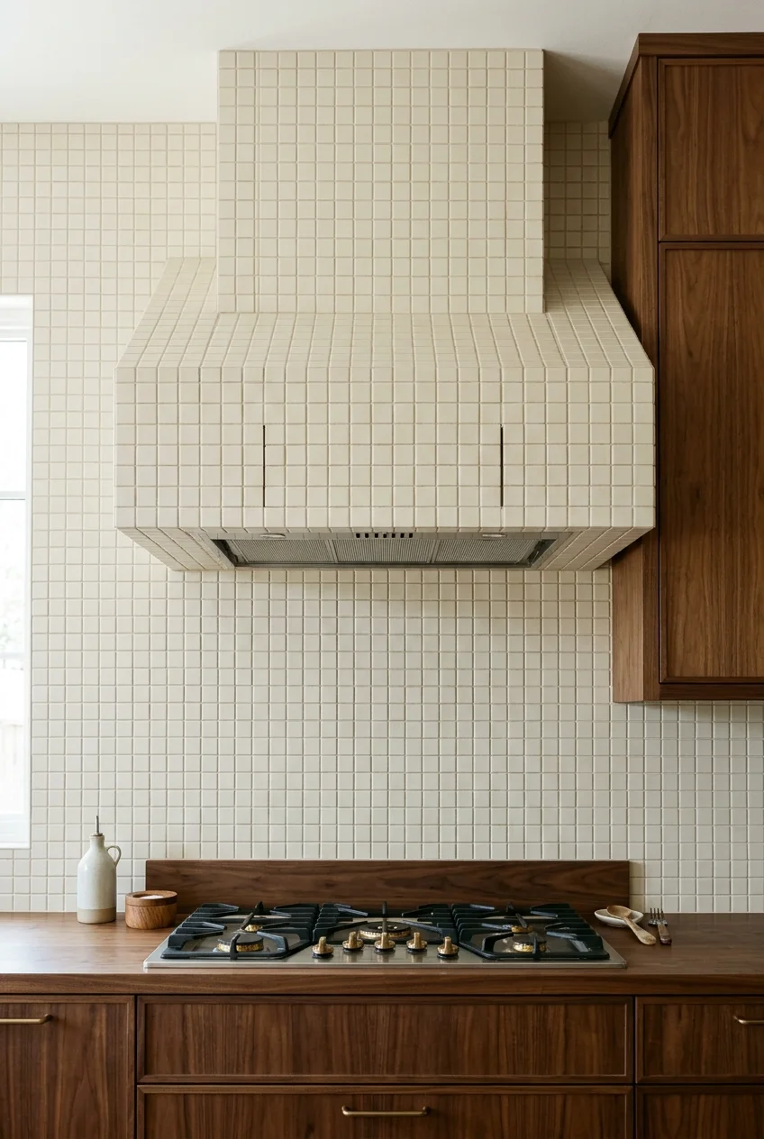
Tiling around a simple hood can make the cooking wall feel integrated, provided the hood remains serviceable and the selected assembly supports that finish.
Coordinate tile edges with the hood fabricator or installer. Corners, access panels, ventilation openings, and heat requirements need resolution before surface finishing begins.
Use one restrained tile and grout combination so the form reads clearly. Strong patterns can distort the hood's edges and proportions.
38. Frame a Decorative Panel Behind the Range
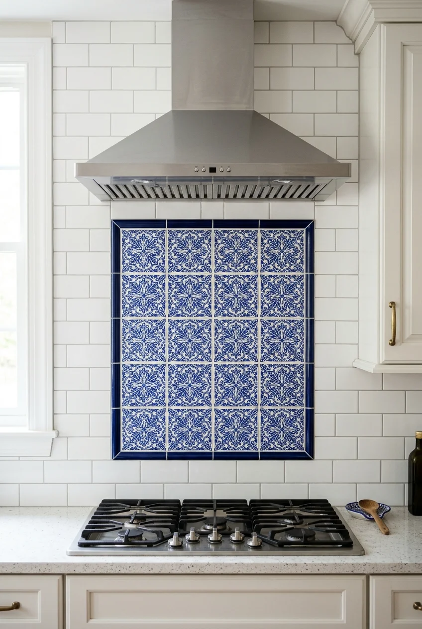
A bordered range panel concentrates expensive or patterned tile where it can be seen, while a quieter field tile handles the surrounding wall.
Size the panel to the range and hood rather than a generic rectangle. Center lines and border thickness should relate to both appliances.
Setup note Draw the complete panel at full scale on paper, including grout joints, before ordering decorative pieces or cutting the surrounding field tile.
39. Tile the Window Returns for a Finished Sink Wall
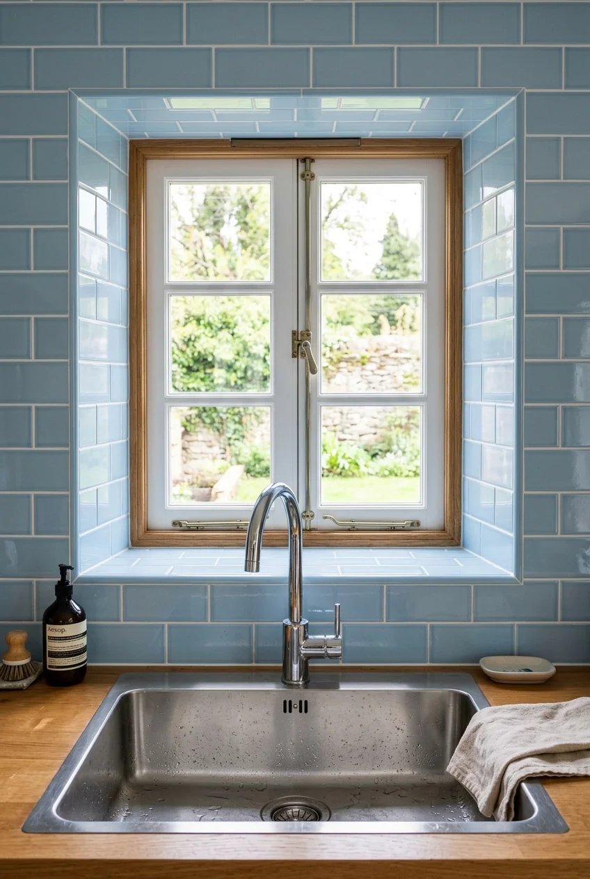
Continuing tile into window returns can make a sink wall feel complete and protect more of the reveal from frequent splashes.
The detail needs careful planning around frame depth, sill slope, trim, and operable hardware. Do not let added thickness interfere with window movement.
Use finished edges or compatible trim where tile stops. Exposed cut bodies beside a bright window are difficult to disguise after installation.
Watch for Confirm the window assembly and surrounding wall are sound before covering them; tile should not conceal leaks, damaged substrate, or unresolved condensation problems.
40. Use Tile as the Backdrop for Open Shelves
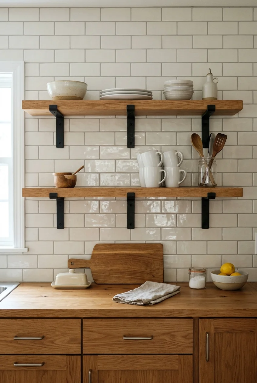
A tiled wall behind open shelves gives the display a durable visual ground, but shelf contents should remain edited enough to reveal the surface.
Plan bracket locations and secure supports to appropriate structure before tile work. Drilling finished tile later adds risk and limits adjustment.
If shelves are part of a wider cabinet update, review these kitchen cabinet makeover ideas before removing sound upper storage.
41. Keep a Short Backsplash Intentionally Low
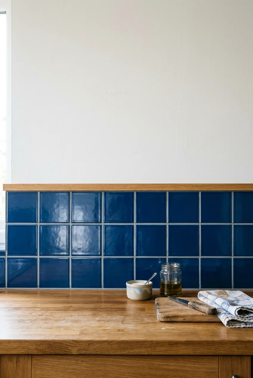
A short tiled upstand can protect the counter edge while leaving painted wall above, creating a lighter choice for lightly splashed serving areas.
Align the top edge consistently and finish it with suitable trim. An arbitrary height or exposed cut edge makes the treatment look unfinished.
42. Wrap Tile Around an Inside Corner
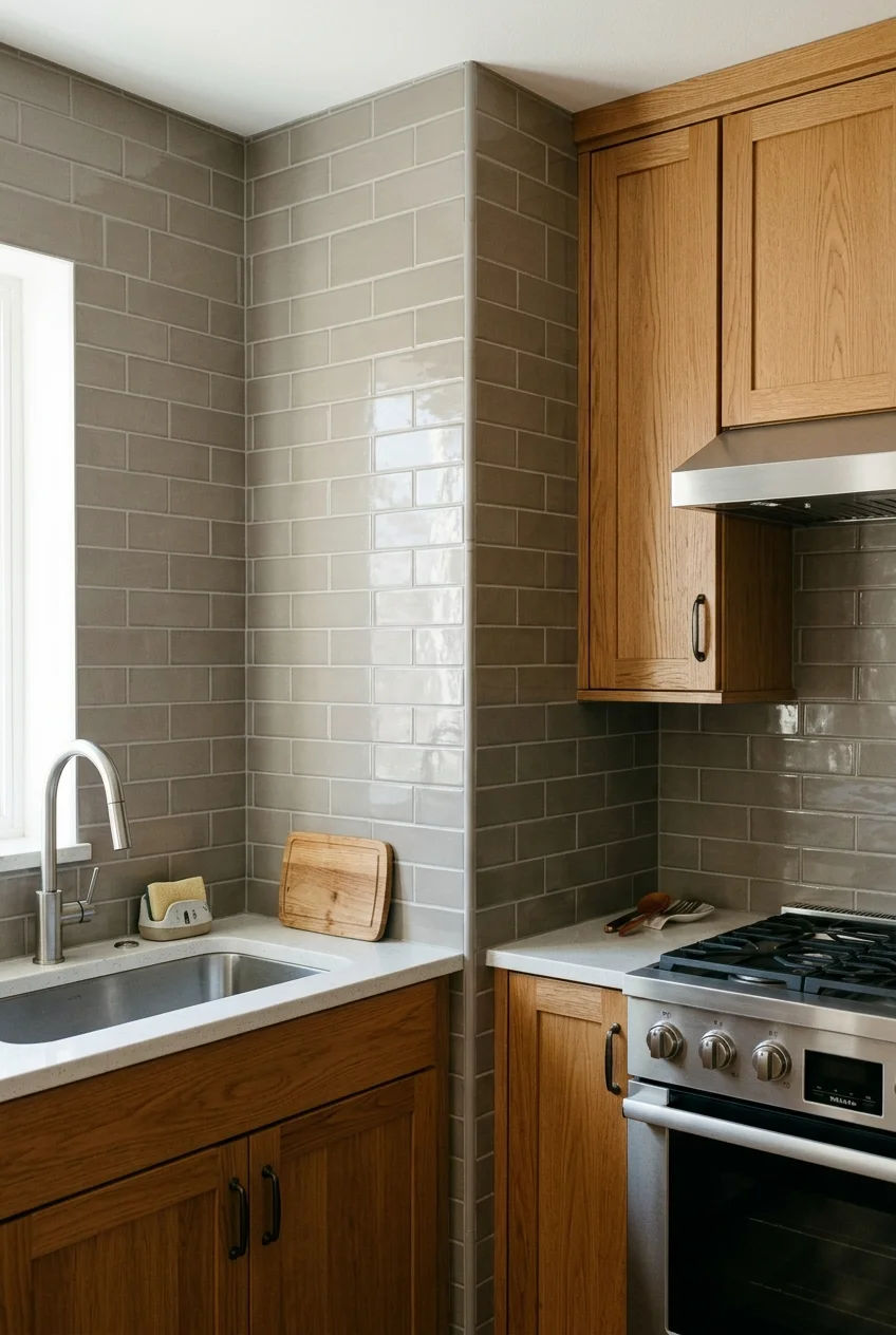
Continuing tile around an inside corner can connect sink and range runs, making an L-shaped kitchen read as one working zone.
Do not force rigid grout into the change of plane. Follow the selected installation system's movement-joint guidance for corners and counter transitions.
Coordinate pattern continuation before cuts begin. Some layouts turn the corner smoothly, while others look better restarting from a clear center line.
43. Use Larger, Quieter Tile in a Narrow Kitchen
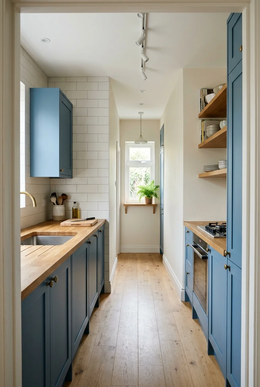
A narrow kitchen often benefits from fewer pattern breaks, making medium or larger quiet tiles useful along a long uninterrupted counter run.
For the rest of a slim layout, these narrow kitchen with island ideas help evaluate circulation before adding another central feature.
Keep the tile sample upright at the far end of the room. Its pattern scale should remain calm from the main entrance.
44. Give a Beverage Nook Its Own Tile Identity
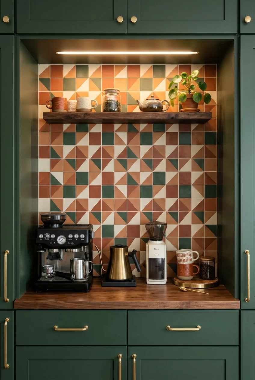
A beverage nook can carry stronger color or pattern than the main cooking wall because its smaller footprint creates a clear contained feature.
Repeat one finish from the main kitchen, such as cabinet paint or hardware, so the nook feels connected rather than assembled from leftovers.
45. Tile a Dining-Nook Wall for Durable Color
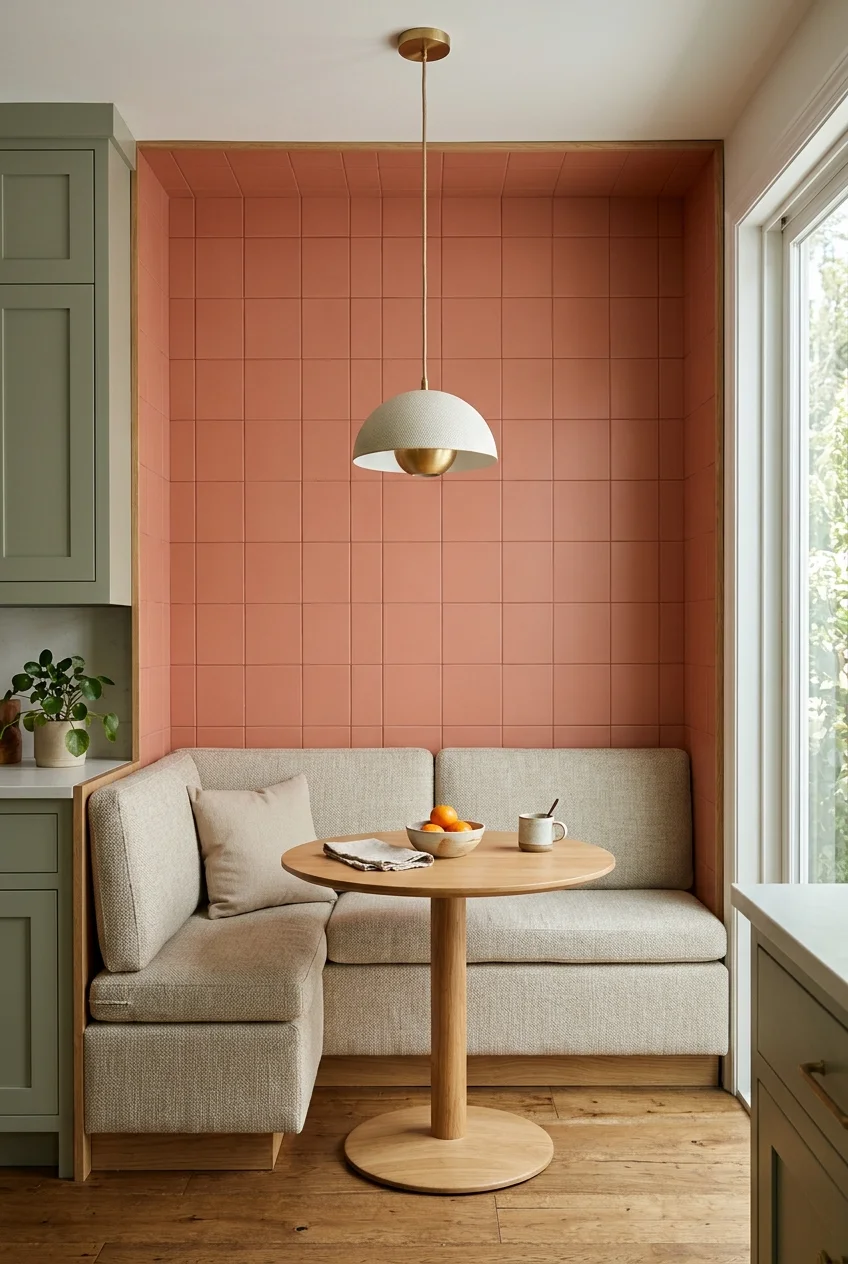
Wall tile behind a kitchen banquette can provide color and a wipeable surface where chair backs, bags, and family meals mark painted walls.
Choose a flatter finish at shoulder height and soften the hard surface with upholstered seating, curtains, or a wood table nearby.
Stop the tile at an architectural boundary, such as the nook recess or ceiling line, instead of ending it randomly beside the bench.
Decisions That Make the Finish Work
The final ideas focus on coordination, reversible options, grout, and edges—the choices that determine whether an appealing sample becomes a convincing finished wall.
46. Let a Sample Board Choose the Final Combination
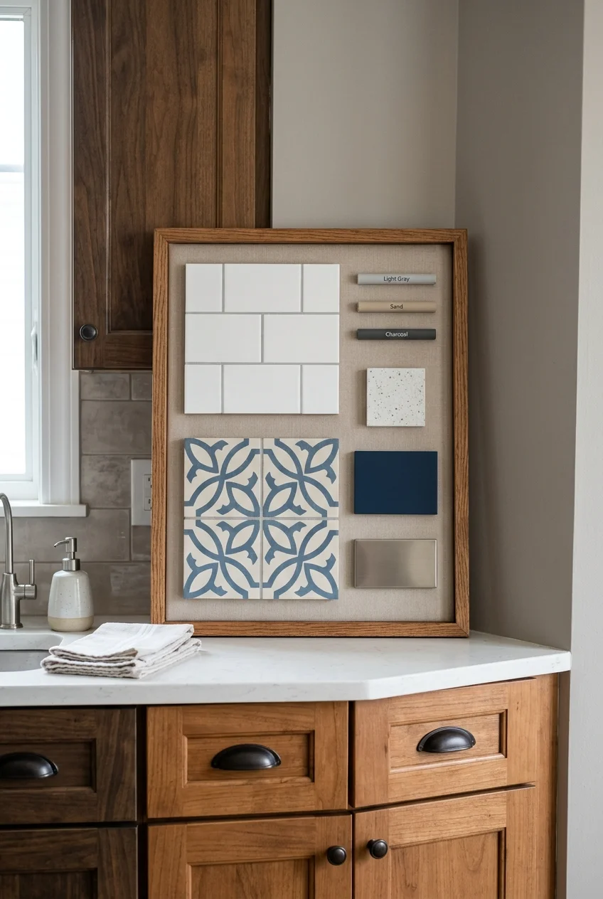
Build a portable sample board with tile, grout sticks, cabinet paint, counter material, and hardware rather than approving each finish separately.
- View the board upright beside the actual counter.
- Check it in morning, afternoon, and task lighting.
- Remove one competing element if everything demands attention.
Photograph the board from the doorway and close range. The two views reveal whether the tile works as a room surface and a material.
47. Pair a Busy Countertop with Quiet Field Tile
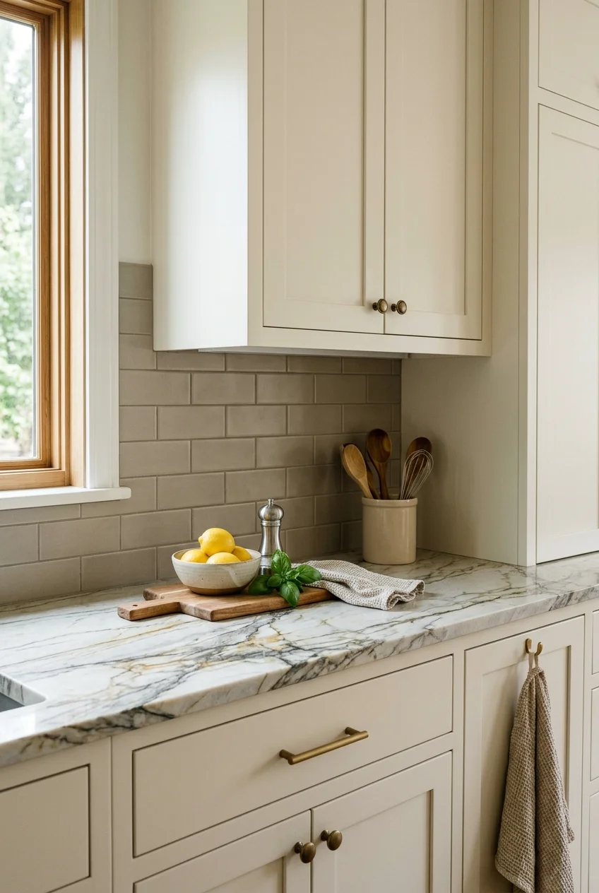
When a countertop has strong veining, movement, or many colors, simple wall tile gives that surface room to remain the visual anchor.
Pull one quiet undertone from the counter instead of matching its most dramatic vein. The relationship feels connected without becoming a duplicate.
Use texture sparingly if color stays neutral. A softly varied glaze can add depth while preserving the counter's clear leading role.
48. Test Peel-and-Stick Tile for a Reversible Refresh
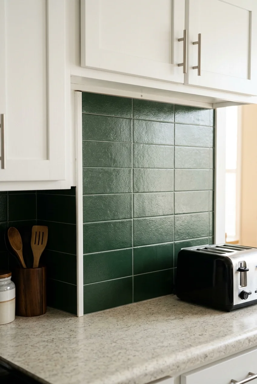
Peel-and-stick wall tile can change a rental or temporary kitchen without mortar, but adhesion depends on a smooth, even, clean, dry surface.
- Check the lease and test removal in a hidden area.
- Follow the product's wall-preparation and curing instructions.
- Respect its heat, flame, steam, and appliance clearances.
- Avoid covering damage, loose paint, or textured surfaces.
For a current color example, these green peel-and-stick tile sheets (paid link) show how saturated tile might read; verify measurements, wall suitability, and clearances before ordering.
Order enough from one verified batch for the planned wall, then dry-position the sheets so overlaps and printed repeats remain inconspicuous.
Setup note A removable product can still pull weak paint or leave residue, so rental-friendly marketing never replaces permission, surface testing, and careful removal.
49. Treat Grout Color as Part of the Pattern
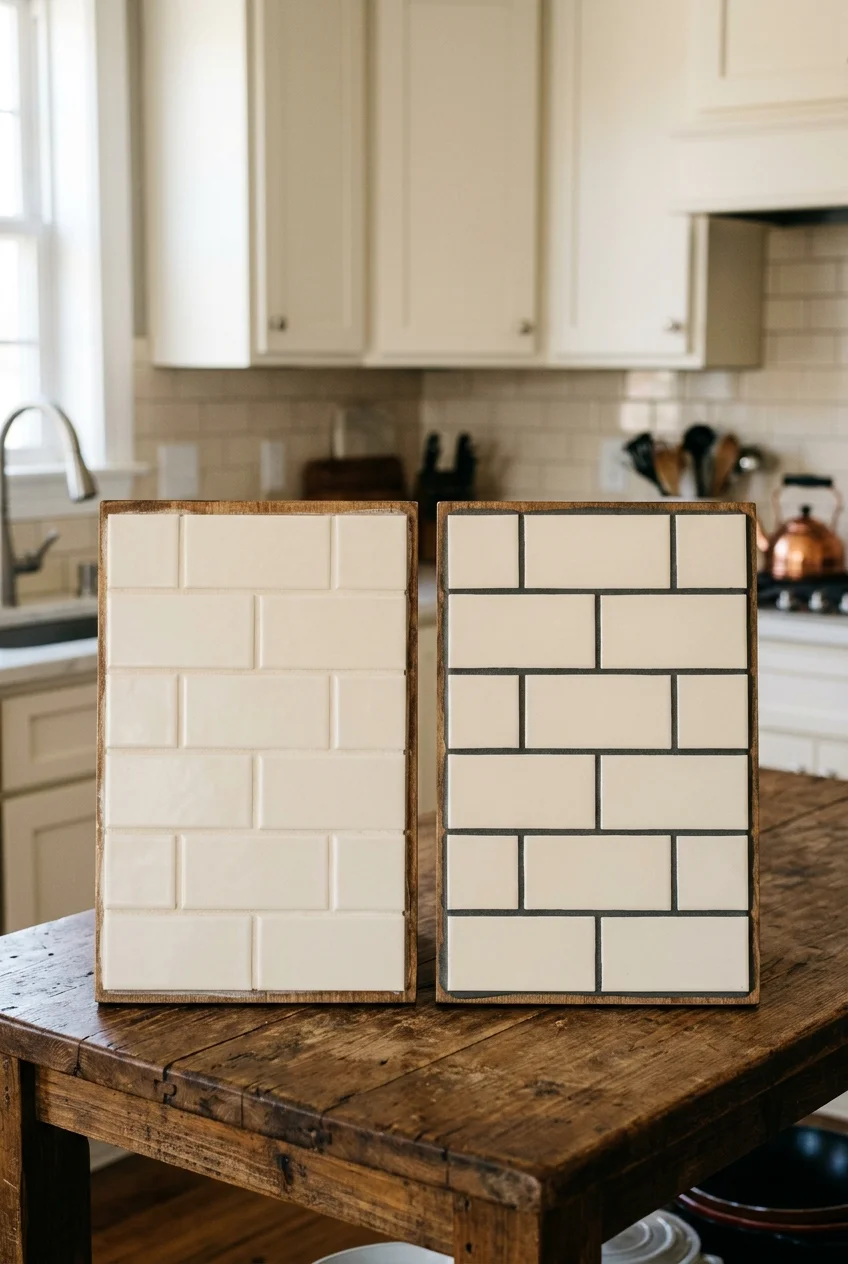
Grout can merge tile into a continuous field or outline every piece, changing the apparent scale and energy without changing the tile.
Make a real sample board using the planned joint width. Printed grout charts cannot reproduce texture, curing, surrounding color, or kitchen lighting.
Use flexible sealant where the chosen installation system requires movement accommodation, including relevant changes of plane and transitions to restraining surfaces.
Practical tip Keep the exact grout and sealant product information with the project records so later repairs do not depend on guessing a nearly matching color.
50. Make Edge Trim an Intentional Finish
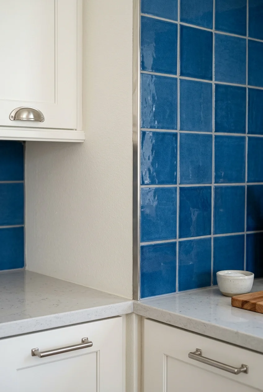
Every exposed tile edge needs a decision: a finished tile edge, matching trim piece, compatible profile, or another detail approved for the assembly.
Match trim depth to the installed tile and setting bed, not the loose tile alone. Incorrect depth creates proud edges or recessed channels.
Choose whether trim should disappear or repeat nearby metal. A deliberate relationship looks finished; a near match can look like a substitution.
Mark every outside corner, open end, window return, and top termination on the elevation before ordering, including extra length for cuts and waste.
Frequently Asked Questions
Should kitchen wall tile match the countertop exactly?
Usually, coordination works better than exact matching. Repeat an undertone, finish, or level of contrast while allowing one surface to carry stronger movement.
Is glossy or matte tile easier to use in a kitchen?
Smooth glazed tile is generally straightforward to wipe, while textured or deep-relief surfaces collect residue differently. Follow the exact product's care guidance.
Where should a kitchen backsplash start and stop?
Use architectural boundaries such as cabinet edges, corners, windows, or a complete wall. Avoid arbitrary endings that leave exposed cuts or narrow painted strips.
How much extra tile should I order?
The allowance depends on layout, cuts, breakage, shade variation, and future repairs. Have the installer calculate quantities from the final elevation and product guidance.