60 Kitchen Paint Colors With White Cabinets

This post may contain affiliate links: full affiliate disclosure.
White cabinets are a classic choice, but the wrong wall color can make them look dingy or cold.
Choosing a paint with the right undertone creates a seamless look that feels intentional and cozy. These warm neutrals provide enough contrast to highlight the cabinetry without overwhelming the space.
WARM NEUTRAL KITCHEN PAINT COLORS
1. Warm White
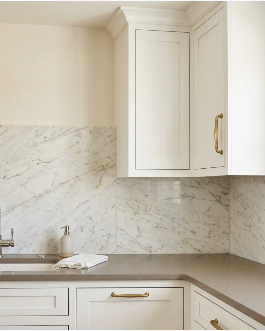
Use a warm white with cream undertones to layer colors rather than matching them exactly. This approach prevents the room from feeling like a sterile hospital wing.
Paint the walls one shade darker than the cabinets to create a sophisticated, monochromatic depth. A slight variation in sheen between the walls and cabinets adds even more visual interest.
- $30-$60 per gallon of premium paint
- Apply two coats to the wall area above the backsplash and around window trim
- Works best in kitchens with plenty of southern-facing natural light
Quick win: Test your paint swatch next to the cabinet door at different times of day to check for yellowing.
2. Soft Ivory
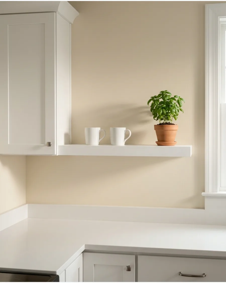
Soft ivory walls provide a gentle glow that makes a kitchen feel lived-in and welcoming. It serves as a perfect bridge between bright white doors and traditional wood elements.
Stick to a matte or eggshell finish on the walls to keep the focus on the semi-gloss cabinets. This shade hides minor wall imperfections much better than a pure, flat white.
- Project takes one weekend for a standard kitchen
- Remove all outlet covers and tape off cabinet edges before starting
- Ideal for cottage or farmhouse styles with lots of texture
Best shortcut: Use a high-quality painter's tape with edge-lock technology to get crisp lines against white trim.
3. Creamy Linen
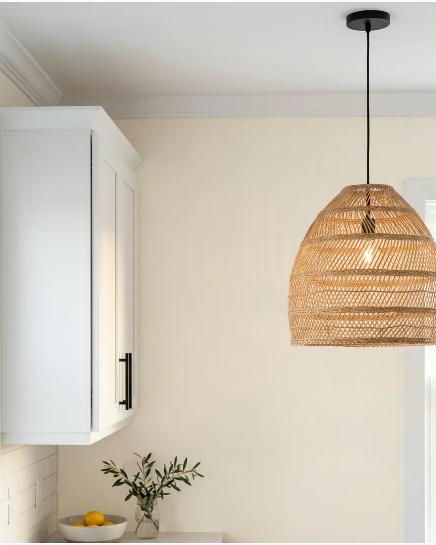
Creamy linen offers a hint of texture and warmth that keeps a bright kitchen from feeling too sharp. It pairs beautifully with natural textures like wicker or light oak furniture.
Incorporate woven light fixtures to pull the earthy tones from the wall color into the rest of the room. A linen-inspired paint color makes stainless steel appliances look less industrial and more high-end.
- Budget roughly $100 for paint and basic supplies
- Paint the window casing the same white as the cabinets for a custom look
- Complements light-colored wood floors and jute rugs
Most people skip this: Clean your walls with a damp cloth before painting to ensure the linen tone stays pure and even.
4. Pale Parchment
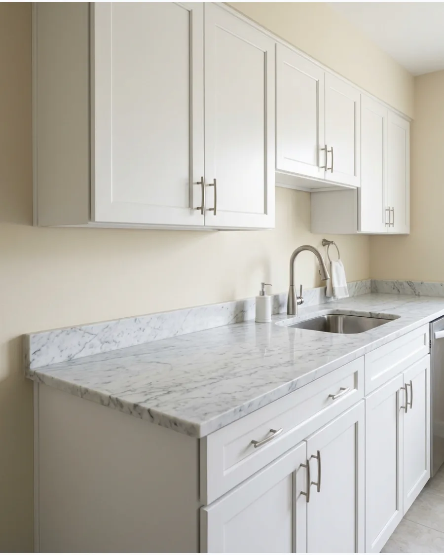
Pale parchment features a beige undertone that provides a soft contrast against crisp white cabinetry. It is an excellent choice for highlighting the natural veining in marble or quartz countertops.
Choose this color if your kitchen gets limited natural light, as it adds warmth without darkening the room. This shade acts as a neutral canvas that allows colorful decor or hardware to pop.
- Available at most major paint retailers
- Use a 3/8 inch nap roller for a smooth finish on drywall
- Pairs well with polished nickel or chrome hardware
Quick win: Paint a large sample board and move it around the room to see how the parchment reacts to shadows.
5. Oatmeal Beige
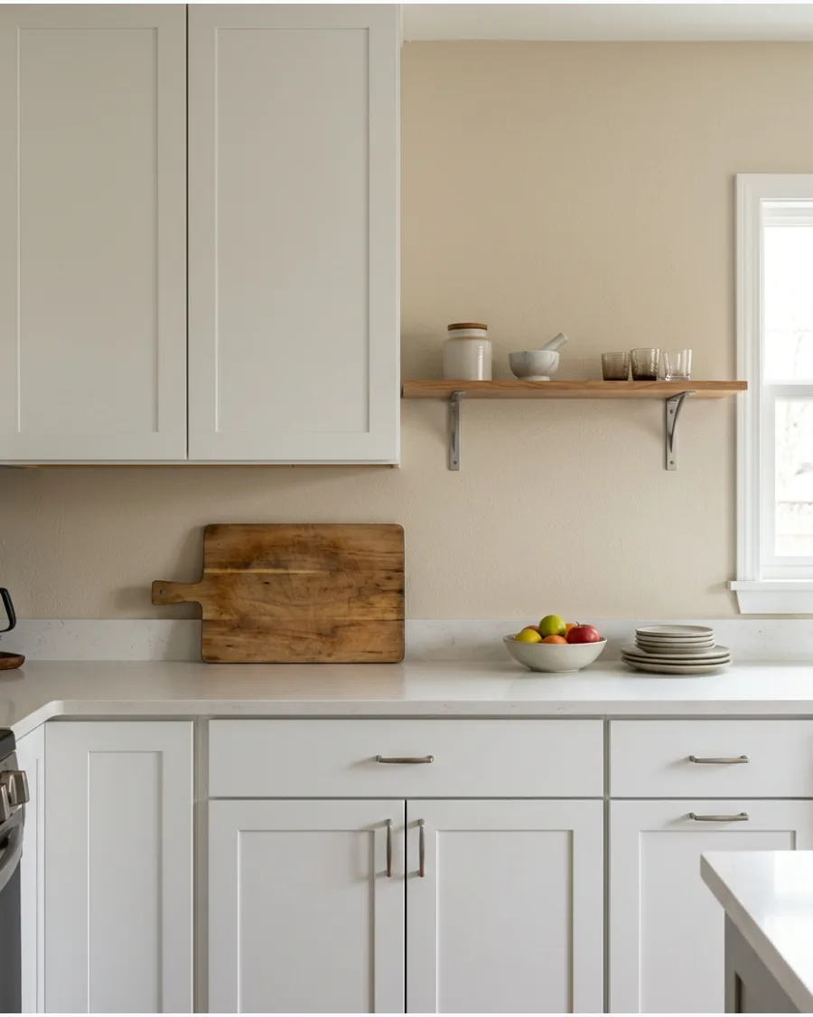
Oatmeal beige brings an organic, grounded feel to a kitchen dominated by white surfaces. The color mimics natural fibers and works well in spaces with open shelving.
Add raw wood accents like a cutting board or stool to emphasize the earthy quality of the paint. This color is forgiving with high traffic and does not show light scuffs as easily as white.
- Two gallons usually cover a medium-sized kitchen
- Tape off the ceiling line carefully to prevent beige bleeding onto white ceilings
- Great for high-traffic kitchens with kids or pets
Best shortcut: Use a small craft brush to get into the tight gaps between the cabinet molding and the wall.
6. Warm Greige
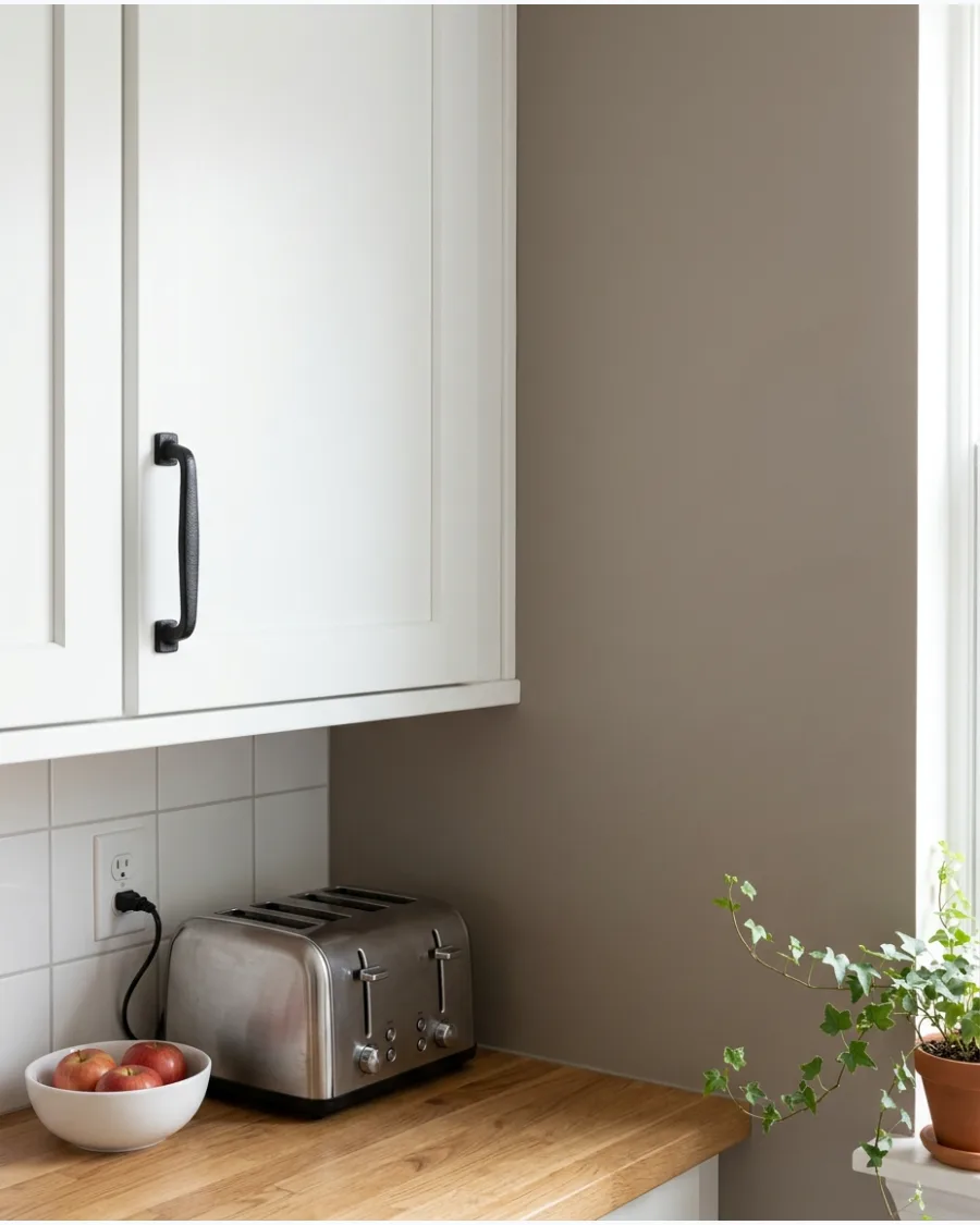
Warm greige is the ultimate balance between cozy beige and modern gray. It provides a sophisticated backdrop that makes white cabinets look crisp and clean.
Use black hardware or light fixtures to ground the space and add a modern edge. This color works in almost any lighting condition, making it a safe bet for open-concept layouts.
- High-end look for the cost of a few paint cans
- Apply paint in thin, even layers to avoid visible brush marks
- Complements both cool-toned stone and warm-toned wood
Most people skip this: Check the greige against your flooring to ensure the undertones do not clash.
7. Mushroom Beige
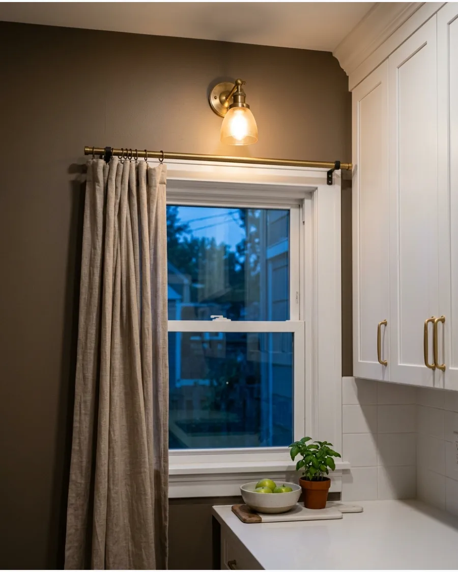
Mushroom beige is a trending neutral that adds a layer of quiet luxury to white kitchens. Its slightly muddy undertone provides a rich depth that bright whites lack.
Pair this color with aged brass or copper accents for a timeless, high-end kitchen aesthetic. It creates enough contrast to make white cabinetry truly stand out as a design feature.
- Expect to spend 4-6 hours on a standard backsplash wall
- Remove all hardware from cabinets to prevent accidental drips
- Works beautifully with off-white or cloud white cabinet finishes
Quick win: Use a light-colored primer if you are painting over a darker existing wall color.
8. Soft Putty
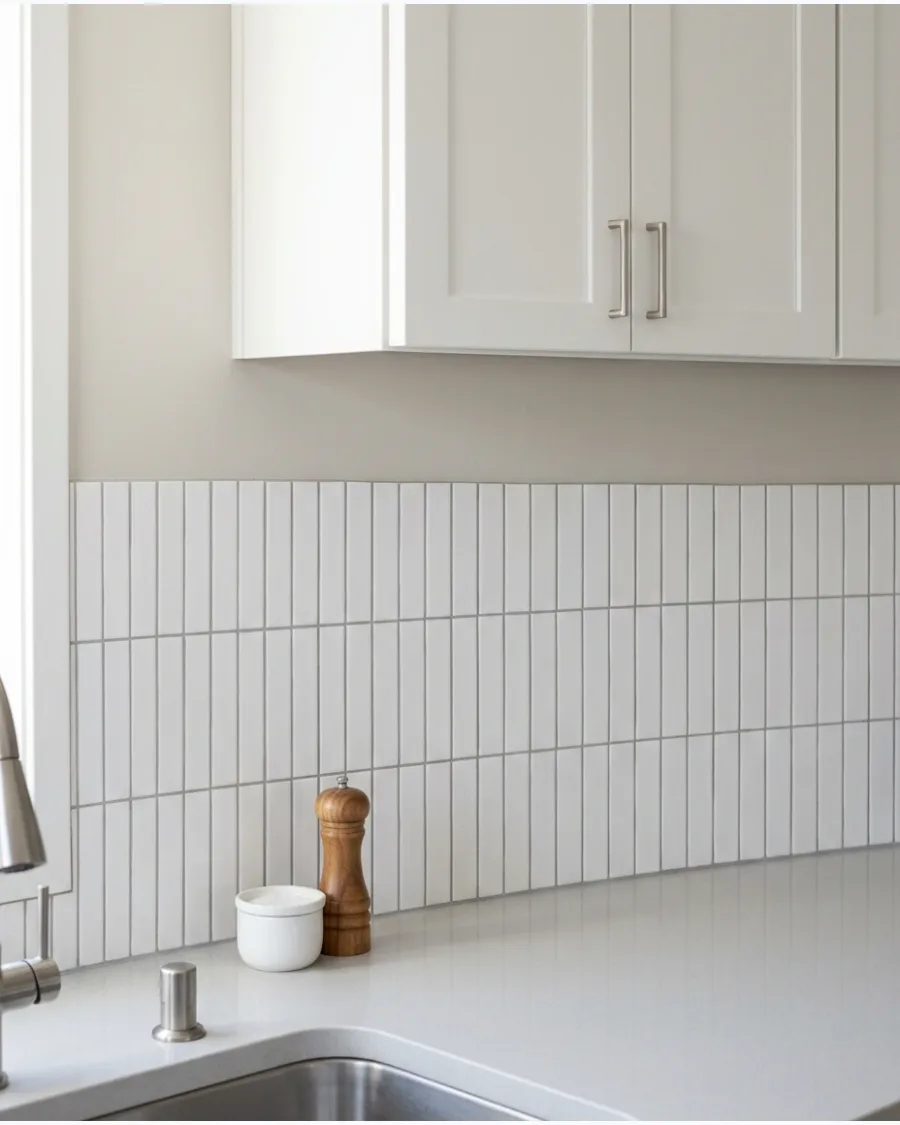
Soft putty is a muted, natural shade that feels both historic and fresh. It bridges the gap between traditional and modern styles with ease.
Install a simple white subway tile backsplash to let the putty wall color act as a soft frame. This shade is perfect for those who want color without the commitment of a bold hue.
- Low-VOC paint options are best for kitchen environments
- Keep a small jar of leftover paint for quick future touch-ups
- Pairs well with antique-style decor and vintage finds
Best shortcut: Use a paint edger tool to get a perfect line along the ceiling without using a ladder for hours.
9. Light Taupe
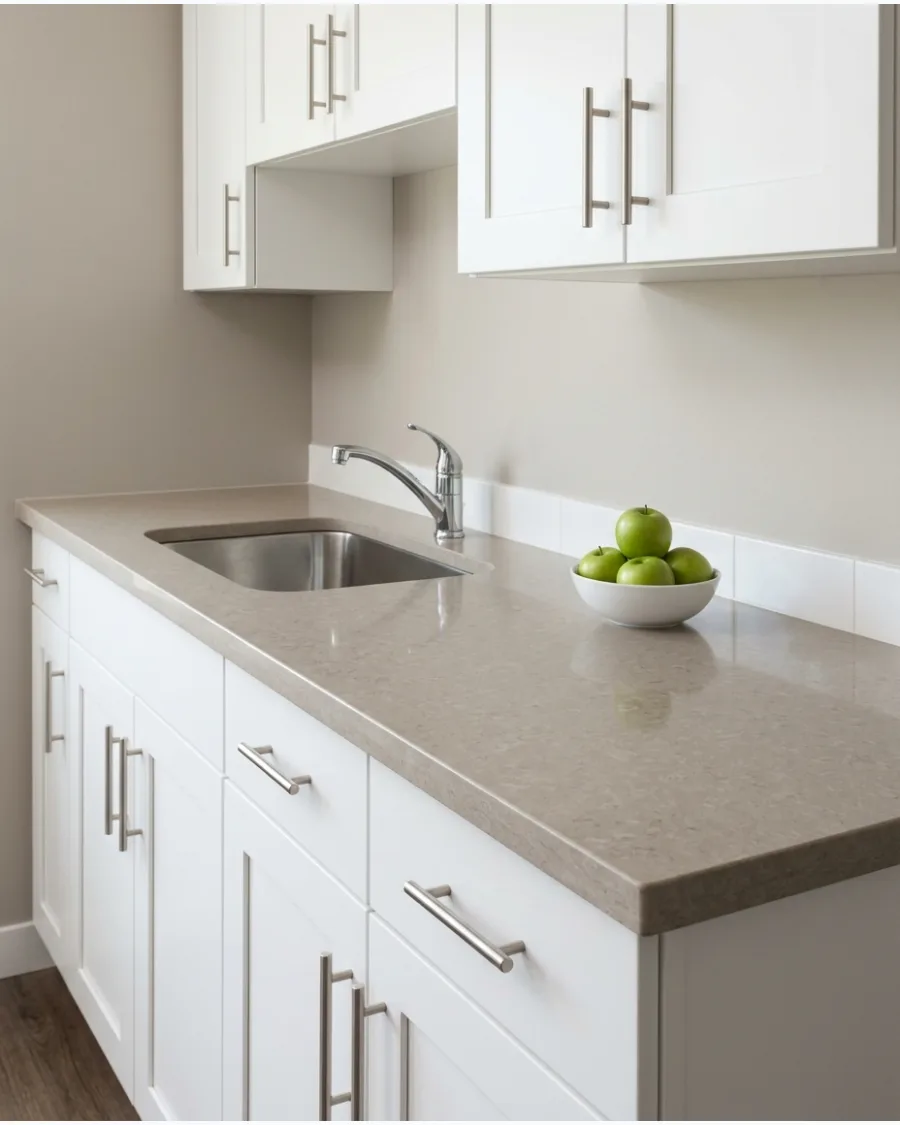
Light taupe offers a polished look that feels more intentional than a standard tan. It provides a subtle contrast that makes white shaker-style cabinets look sharp.
Use creamy stone or quartz countertops to pull the warm taupe tones throughout the entire kitchen. This color creates a calm atmosphere that is perfect for a busy morning routine.
- One gallon covers approximately 400 square feet
- Ensure the wall is sanded smooth before applying taupe paint
- Ideal for large kitchens with high ceilings
Most people skip this: Turn on your under-cabinet lighting while choosing the paint to see how the shadows fall.
10. Sandy Beige
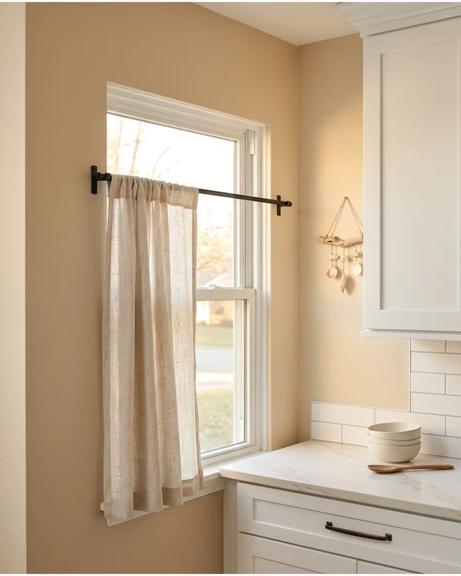
Sandy beige brings a relaxed, coastal vibe to a kitchen with white cabinetry. It mimics the look of sun-bleached wood and natural sand.
Incorporate linen window treatments or cafe curtains to enhance the soft, airy feel of the space. This color is excellent for making smaller kitchens feel larger and more open.
- Affordable way to update a kitchen without a full renovation
- Wipe down walls with a degreaser before painting near the stove
- Pairs perfectly with light oak or bleached wood floors
Quick win: Choose a semi-gloss finish for the trim and a satin finish for the walls for a professional look.
11. Almond Beige
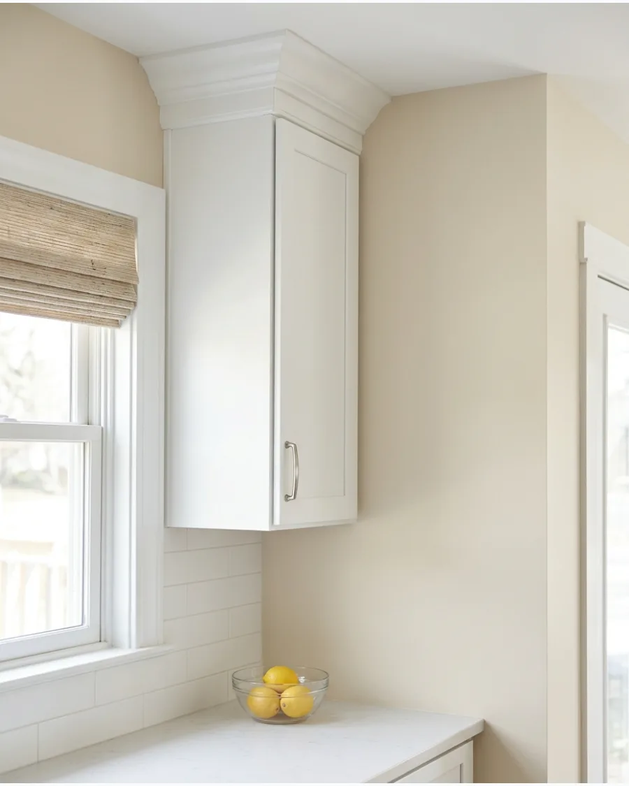
Almond beige adds a creamy warmth that keeps white cabinets from looking sterile. It works perfectly in kitchens with north-facing windows where light can feel a bit blue or cold.
Paint the window trim in the same color as the walls to make the room feel larger and more cohesive. This shade is the best choice for anyone who wants a color that feels intentional without being overwhelming.
- Budget-friendly gallon costs around $45-$70.
- Test a large swatch on the wall next to the cabinets for 48 hours.
- Works well with polished nickel or chrome hardware for a crisp look.
Quick win: Use a satin finish on the walls to help reflect light and make cleaning splashes easier.
Kitchen Color Palettes
12. Warm Camel and White Contrast
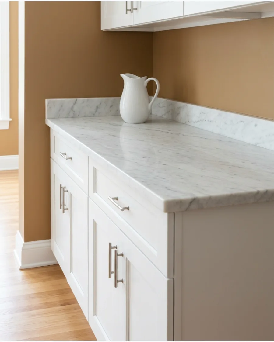
Soft camel paint bridges the gap between traditional beige and modern terracotta, providing a grounded backdrop for crisp white cabinetry. This earthy mid-tone prevents a white kitchen from feeling clinical while adding a layer of organic warmth that shifts with the light.
Apply a satin finish to the walls to allow the camel hue to reflect light without competing with the cabinet finish. Most people skip testing the color against the flooring; camel tones rely heavily on the undertones of the wood or tile below to look intentional rather than muddy.
- Purchase three variations of camel paint samples from a local hardware store to test yellow versus red undertones for under $30.
- Apply high-quality painter's tape along the cabinet edges to ensure the saturated camel pigment does not bleed onto the white wood.
- Swap standard chrome hardware for matte black or brushed brass to further complement the natural warmth of the wall color.
Most people skip this: Paint a large swatch on a piece of foam board and move it to different corners of the kitchen at noon and sunset to see how the camel hue reacts to changing shadows.
GREEN KITCHEN PAINT COLORS WITH WHITE CABINETS
13. Soft Sage Green
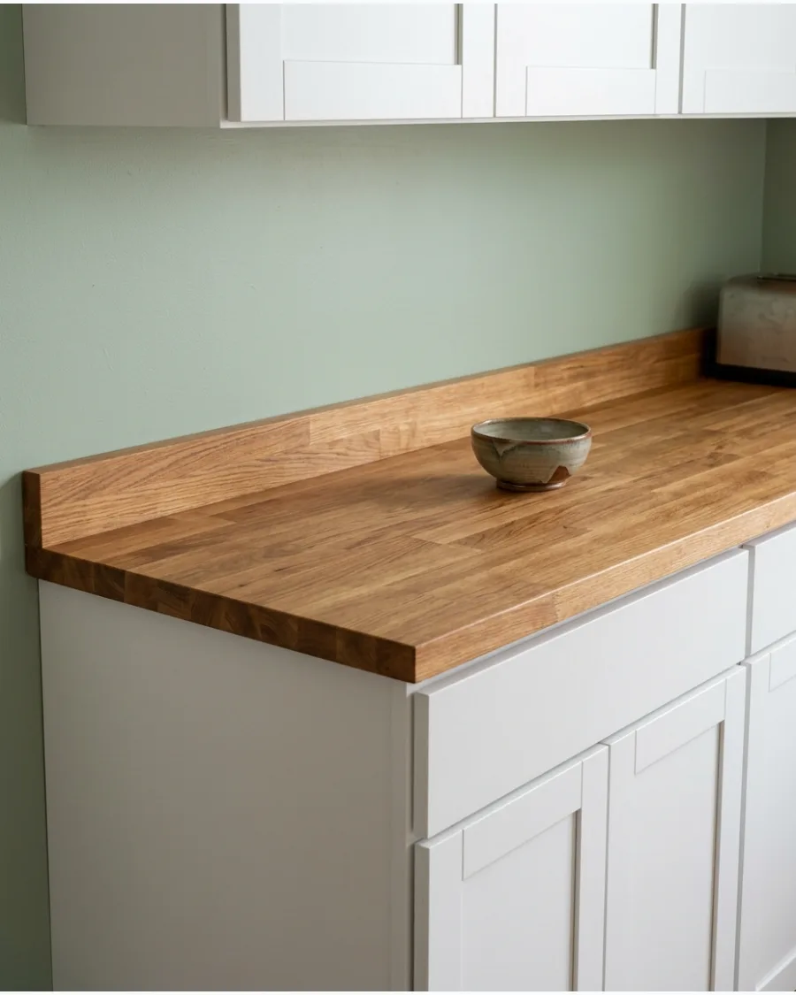
Soft sage green is the ultimate nature-inspired choice for a calming kitchen environment. It provides just enough contrast to make white shaker cabinets pop without making the room feel dark.
Incorporate a wood countertop or a large wooden bowl to ground the green and keep it from feeling too pastel. This color is a safe bet for resale value because it feels both fresh and traditional.
- Premium wash-and-wear paint is best for high-traffic zones.
- Apply two coats for even pigment distribution.
- Compliments white subway tile or marble backsplashes perfectly.
Most people skip this: Check the paint under your vent hood light, as different bulbs can turn sage into a dull gray.
14. Silver Sage
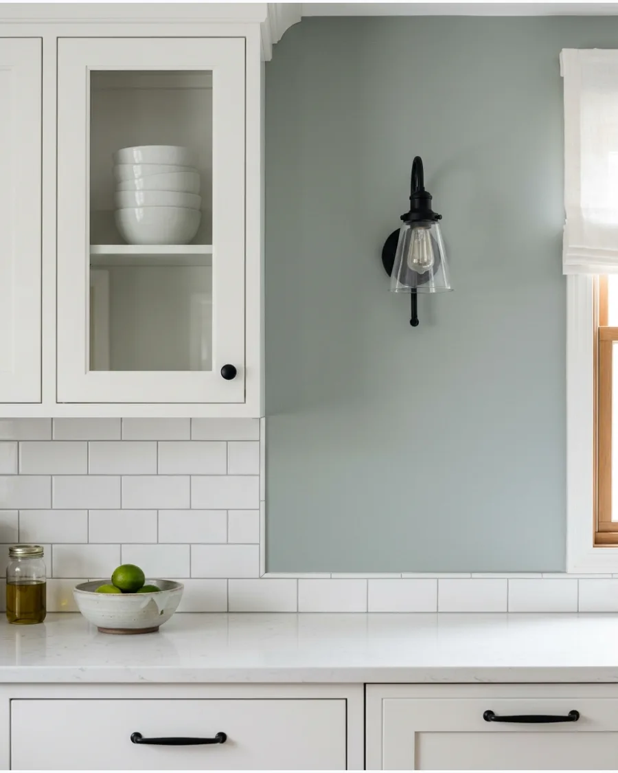
Silver sage is a sophisticated blend of green and gray that changes throughout the day. It looks more green in morning light and shifts to a cool gray by evening, keeping the kitchen dynamic.
Use black iron hardware to provide a sharp, modern edge against the soft wall color and white doors. This shade is the secret to making a standard builder-grade kitchen look custom and expensive.
- One gallon covers approximately 350-400 square feet.
- Use a microfiber roller for the smoothest finish on flat walls.
- Pairs well with stainless steel appliances for a sleek look.
Quick win: Paint a small piece of foam board and move it around the kitchen to see the color shifts.
15. Eucalyptus Green
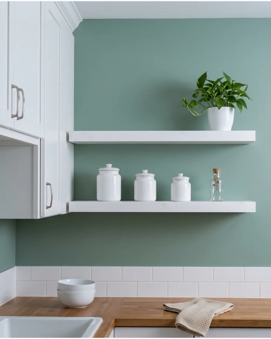
Eucalyptus green offers a fresh, organic backdrop that feels like a breath of fresh air. It is a mid-tone green that provides a clear distinction between the wall and white cabinetry.
Keep the decor simple with white ceramic jars and clear glass canisters to maintain the clean, airy vibe. It is a great choice for those who want a botanical look without going too dark or moody.
- High-pigment paint may require a tinted primer for the best depth.
- Dries to the touch in 1-2 hours; wait 4 hours between coats.
- Works beautifully in kitchens with plenty of indoor plants.
Best shortcut: If your kitchen is small, use this color on a single accent wall to prevent it from feeling boxed in.
16. Pale Celadon
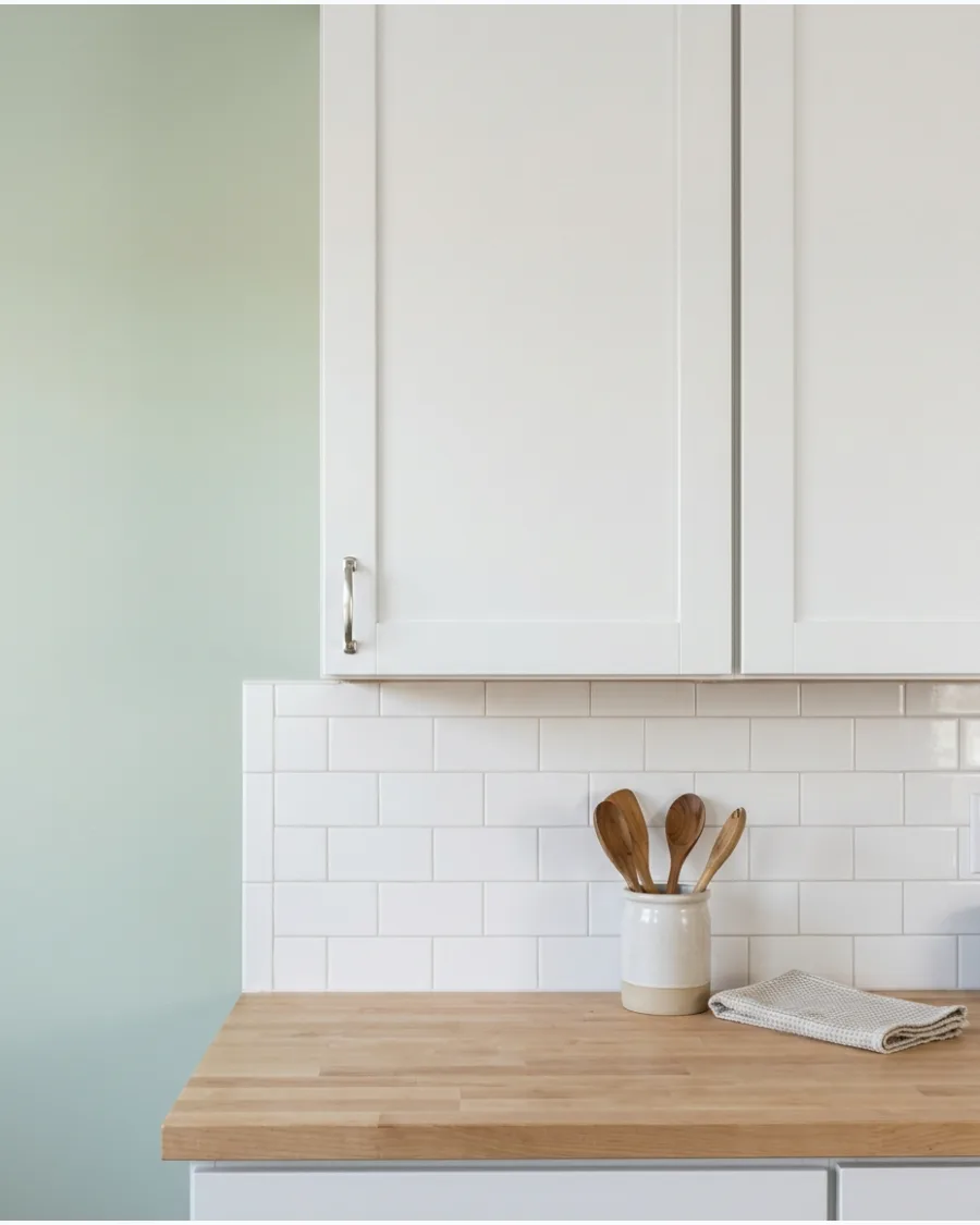
Pale celadon is a light, watery green that keeps a small kitchen feeling open and bright. The subtle blue undertones prevent it from looking like mint and give it a more refined, spa-like quality.
Install a white tile backsplash all the way to the ceiling to maximize the light-reflecting power of this soft color. It is the perfect solution for dark kitchens that need a boost of visual energy.
- Affordable DIY project that can be finished in a single weekend.
- Use a low-VOC paint to keep the kitchen usable during the process.
- Ideal for coastal or cottage-style kitchen designs.
Most people skip this: Match your outlet covers to the wall color or use white covers to keep the look seamless.
17. Dusty Olive
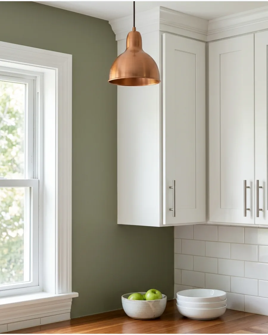
Dusty olive brings an earthy, grounded character that makes white cabinets feel more substantial. This color has a lived-in feel that hides minor wall scuffs and imperfections better than lighter shades.
Add vintage-inspired lighting like an aged copper pendant to highlight the warm undertones in the olive paint. It is a fantastic choice for anyone who wants a kitchen that feels cozy and historic.
- Eggshell finish is recommended for a soft look that still allows for light scrubbing.
- Use blue painter's tape for crisp lines along the white cabinet edges.
- Pairs excellently with terracotta floor tiles or accents.
Quick win: Paint the back of white open cabinets in this color for a hidden pop of personality.
18. Muted Moss Green
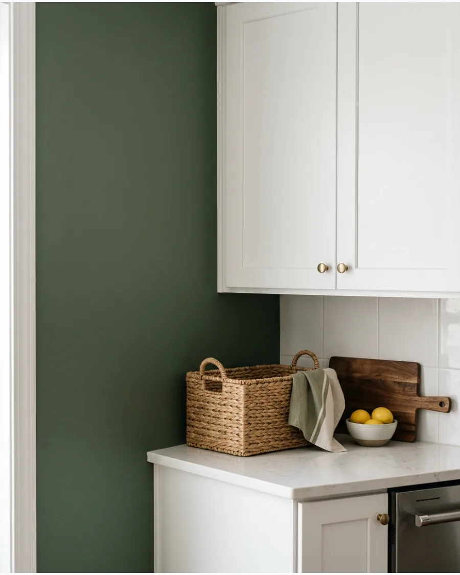
Muted moss green creates a comfortable, rustic atmosphere that feels incredibly welcoming. It is deep enough to provide a strong contrast with white cabinetry while still feeling like a neutral.
Layer in woven textures like seagrass placemats or wicker baskets to enhance the natural, grounded feel of the room. This color works best in kitchens with plenty of natural wood elements to balance the green.
- Darker greens like this often look better with a matte or flat finish.
- Plan for two full coats plus touch-ups for the richest color.
- Great for high-ceiling kitchens to bring the space down to a human scale.
Best shortcut: Use a high-quality angled brush for cutting in around cabinets to avoid messy edges.
19. Soft Gray-Green
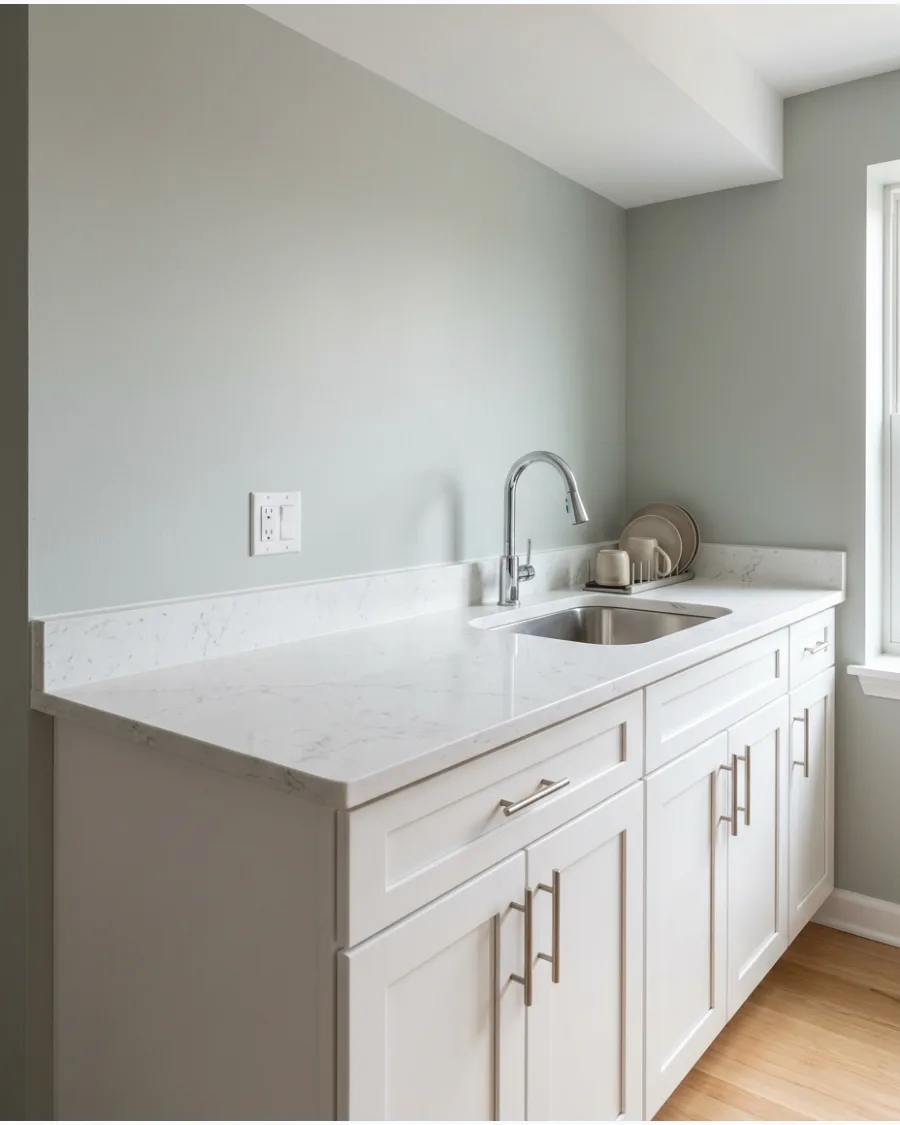
A soft gray-green is the ultimate chameleon color that works with almost any countertop material. It provides a touch of color for those who are afraid of going too bold but want more than just gray.
Pair this wall color with white quartz countertops that have light gray veining for a perfectly coordinated look. It is the most versatile green for modern homes because it never feels dated.
- Neutral enough to work with both gold and silver hardware finishes.
- One of the easiest colors to coordinate with adjacent room paints.
- Dries quickly, allowing for a fast kitchen refresh.
Most people skip this: Paint the baseboards the same white as the cabinets to frame the gray-green walls.
20. Khaki Green
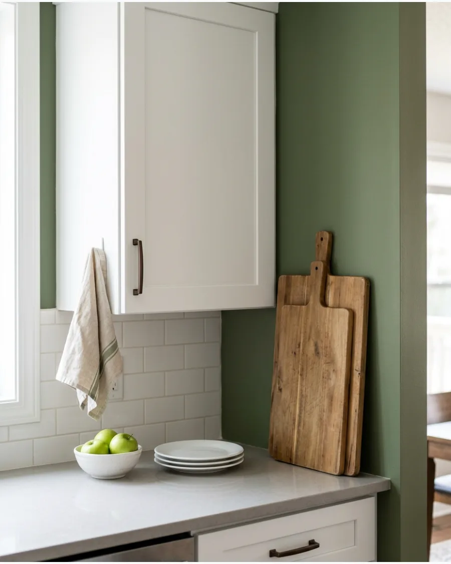
Khaki green adds a subtle warmth and a safari-chic depth to a kitchen with white cabinets. It has enough yellow and brown in it to feel organic and rich rather than cold.
Display large wood cutting boards against the wall to create a functional and beautiful contrast with the khaki paint. This color is an excellent choice for a kitchen that is the heart of a busy, active home.
- Mid-range price point for high-durability kitchen paint.
- Use a short-nap roller to avoid a heavy texture on the walls.
- Looks stunning with natural stone or slate flooring.
Quick win: Wipe down walls with a damp cloth before painting to ensure the khaki color adheres perfectly.
21. Smoky Jade
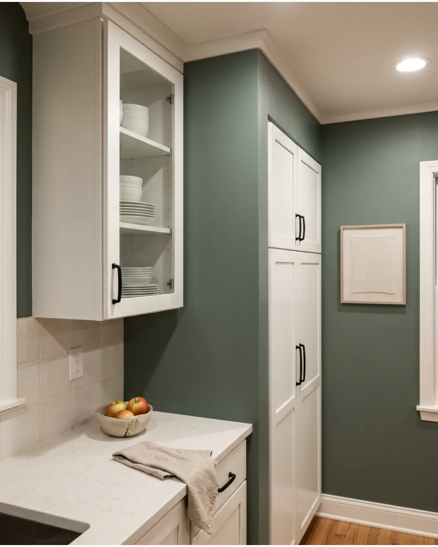
Smoky jade brings a richer blue-green tone into the kitchen without feeling overly bold. White cabinets prevent the deeper color from making the room feel heavy.
Paint a test swatch on a card and move it around the room to see how the green shifts in low light. Smoky jade needs a bit of light to reveal its blue undertones.
- Best for kitchens with medium to high natural light.
- Apply two coats of paint for full color saturation.
- Pair with matte black or gunmetal hardware for a modern look.
Quick win: Use this color on a pantry door if a full wall feels too dark.
22. Pale Seafoam Green
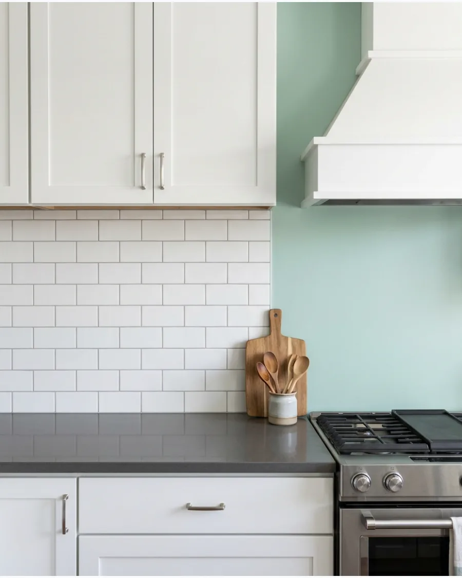
Pale seafoam green creates a fresh coastal effect with white cabinetry. Add light wood, white quartz, and brushed nickel details for a breezy finish.
Keep the ceiling and trim a crisp white to make the seafoam look intentional rather than faded. This color thrives in kitchens with southern exposure.
- Ideal for small kitchens that need to feel larger.
- Choose a satin finish for easy cleaning near cooking areas.
- Complements light-toned butcher block or white quartz countertops.
Best shortcut: Use peel-and-stick white subway tiles to quickly refresh the backsplash against this color.
23. Muted Mint Green
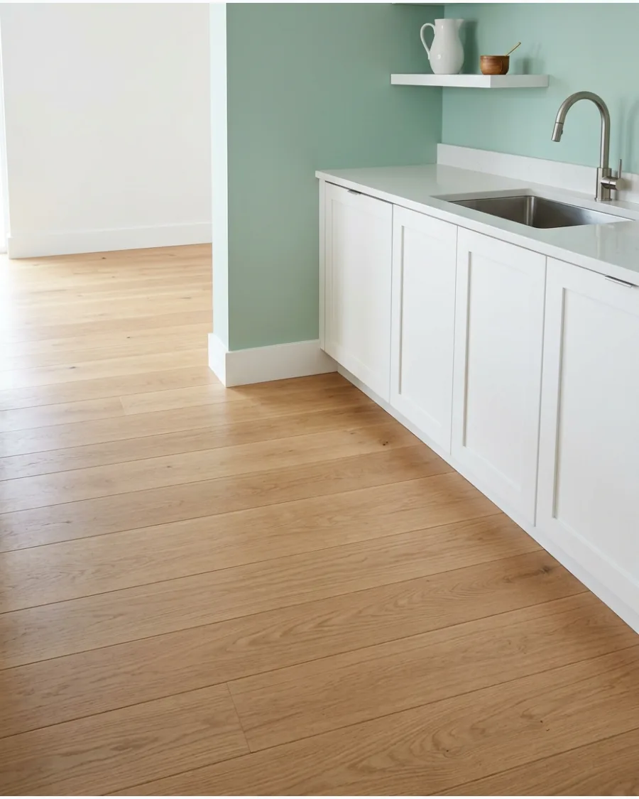
Muted mint offers a playful but sophisticated alternative to standard neutrals.
Choose a softened version rather than a bright pastel for a more modern appearance. Balance the cool mint tones with warm wood flooring or a bamboo window shade. It feels more mature than a bright nursery mint.
- Works well with modern farmhouse or cottage styles.
- Install warm-toned LED under-cabinet lighting to keep the color inviting.
- Dries in roughly two to four hours for a fast weekend update.
Most people skip this: Check the paint's undertone under your specific lightbulbs to avoid a neon effect.
24. Deep Forest Green
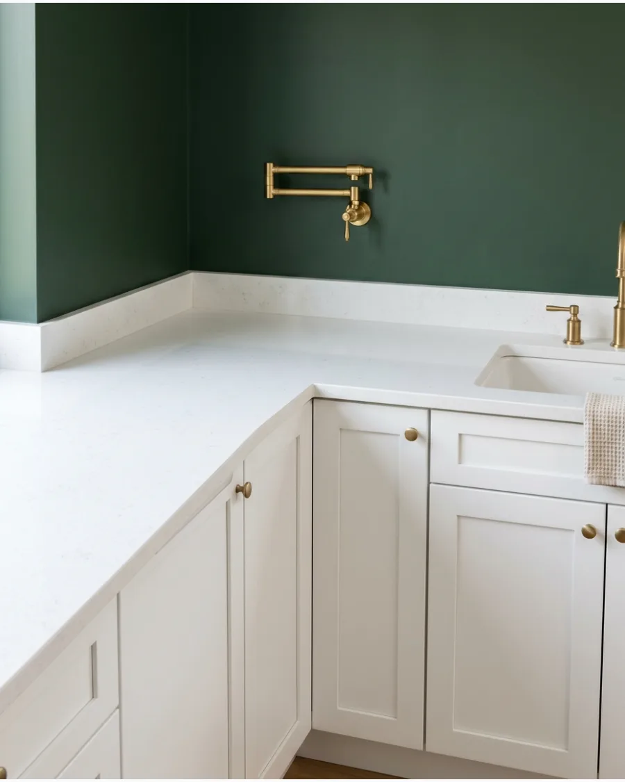
Deep forest green creates dramatic contrast against crisp white cabinets. Use it on one wall, a breakfast nook, or a smaller kitchen section to avoid overwhelming the space.
Limit the deep color to the wall space between the upper cabinets and the ceiling to create height. It adds immediate luxury to basic white shaker cabinets.
- Requires a high-quality primer for even coverage on dark tones.
- Use a microfiber roller to achieve a smooth, professional finish.
- Pair with gold or brass accents to lean into the luxurious feel.
Quick win: Use a gold pot filler to add a high-end focal point against the dark green wall.
BLUE KITCHEN PAINT COLORS WITH WHITE CABINETS
25. Powder Blue
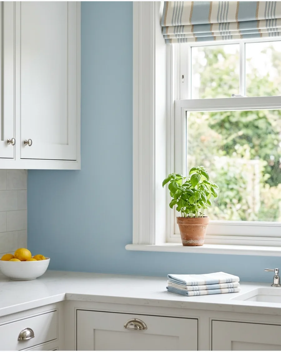
Powder blue walls make white cabinets feel clean, bright, and welcoming. The combination is ideal for cottage, coastal, and traditional kitchens.
Stick to a powder blue with a slight gray base to keep it from looking like a baby's room. It makes a small kitchen feel much larger.
- Great choice for kitchens with limited natural light.
- A wipeable eggshell finish is best for everyday kitchen walls.
- Complements traditional white beadboard or wainscoting.
Best shortcut: Add a self-watering herb planter to the windowsill for a pop of functional greenery.
26. Dusty Blue
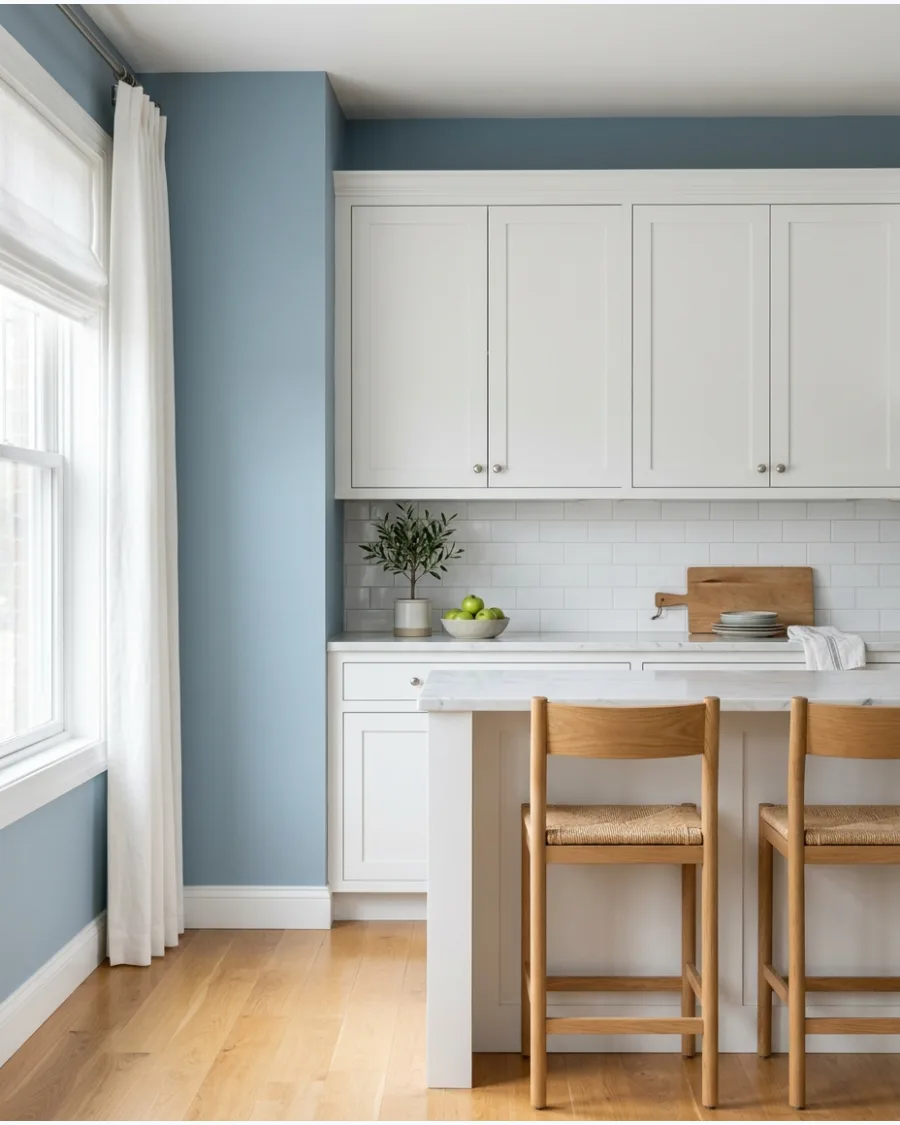
Dusty blue provides understated color with a softly aged appearance. Pair it with warm wood and brass accents to prevent the room from feeling too cool.
Choose a dusty blue with a high Light Reflectance Value if the kitchen lacks large windows. The gray tones make it act like a neutral.
- Sample at least three shades to find the right gray-to-blue ratio.
- Use angled brushes for crisp lines near the ceiling and trim.
- Works perfectly with warm-toned pendant lighting over an island.
Most people skip this: Match the stool material to your flooring to create a cohesive look with the blue walls.
27. Pale Blue-Gray
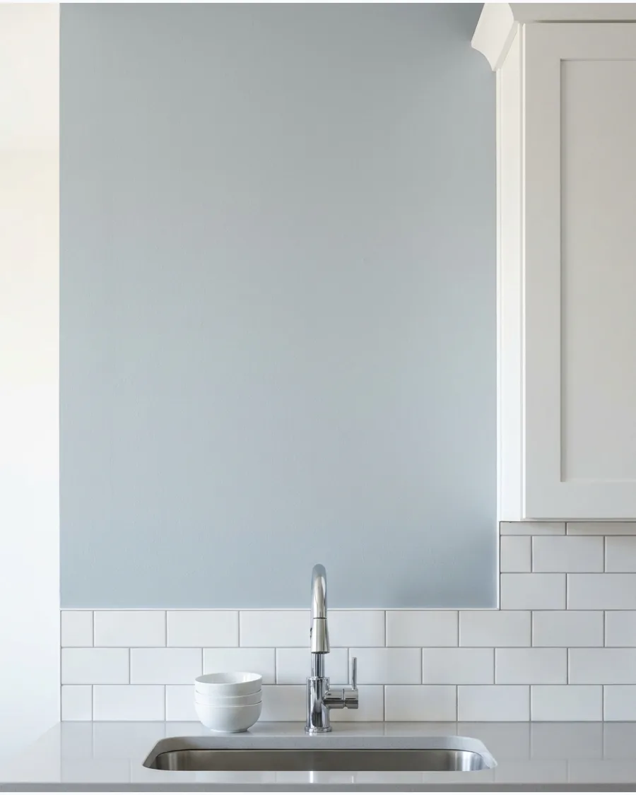
Pale blue-gray creates a peaceful backdrop for white kitchen cabinets. Select a shade with enough blue pigment to avoid creating an outdated all-gray palette.
Check the paint swatch at night to ensure the blue doesn't turn into a cold, flat gray. This is the safest choice for resale value.
- Low-VOC paint is recommended for indoor kitchen projects.
- One gallon typically covers about 400 square feet of wall space.
- Pairs seamlessly with any countertop material, from granite to laminate.
Quick win: Upgrade to a high-arc chrome faucet to complement the cool tones of the wall.
Home Decor
28. Soft Misty Blue Kitchen Walls
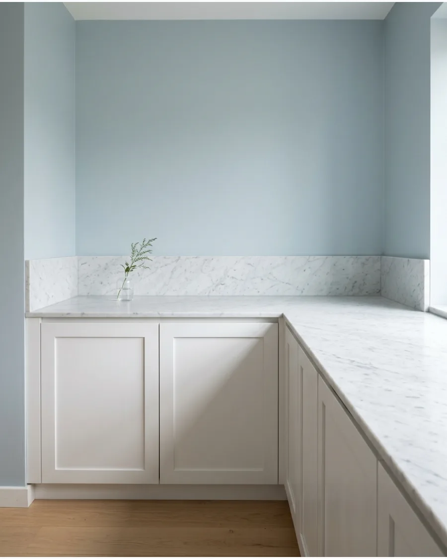
A muted coastal blue provides a sophisticated backdrop that prevents white cabinetry from looking stark or sterile. This specific hue bridges the gap between traditional and modern aesthetics by introducing color without overwhelming the light-filled space.
Apply a satin finish to the walls to ensure they are easy to wipe down while maintaining a soft, light-reflective glow. While many gravitate toward deep navy, a lighter dusty blue feels more expansive and airy in smaller kitchens.
- Samples of three different blue tones cost under $20 and should be observed at different times of day.
- Remove all hardware and tape off cabinet edges with high-quality painter's tape before applying the first coat.
- Pair this color with brass or gold cabinet pulls to add warmth to the cool-toned coastal palette.
Most people skip this: Testing the blue swatch directly against the white cabinet door in both morning and evening light prevents the color from unexpectedly looking too gray or purple.
BLUE KITCHEN PAINT COLORS WITH WHITE CABINETS
29. Sea Glass Blue
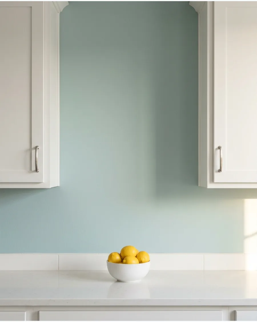
Sea glass blue combines soft blue and green undertones for a refreshing kitchen palette. It works particularly well in rooms with plenty of natural light.
Place a white ceramic vase or bowl near the wall to emphasize the delicate color shift. It changes beautifully as the sun moves throughout the day.
- Best for kitchens with large windows or glass doors.
- Use a small roller for tight spaces between upper and lower cabinets.
- A quality gallon of paint for this project costs approximately $50.
Quick win: A white ceramic fruit bowl makes the sea glass color look more vibrant by comparison.
30. Muted Cornflower Blue
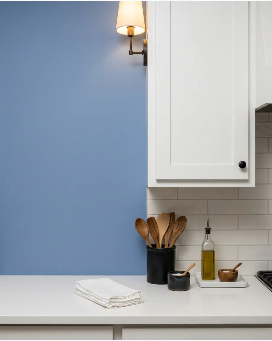
Muted cornflower blue brings cheerful color without becoming overly bright. White cabinets keep the overall design polished and balanced.
Use matte black hardware on the white cabinets to provide a sharp anchor for the soft blue walls. It adds personality without the risk of trend fatigue.
- Dries quickly, making it a great choice for a 48-hour room makeover.
- Tape off all cabinet edges carefully to prevent blue paint bleeds.
- Pairs well with light gray, white, or light wood countertops.
Most people skip this: Swapping old knobs for matte black ones takes less than an hour and completely changes the kitchen's feel.
31. Denim Blue
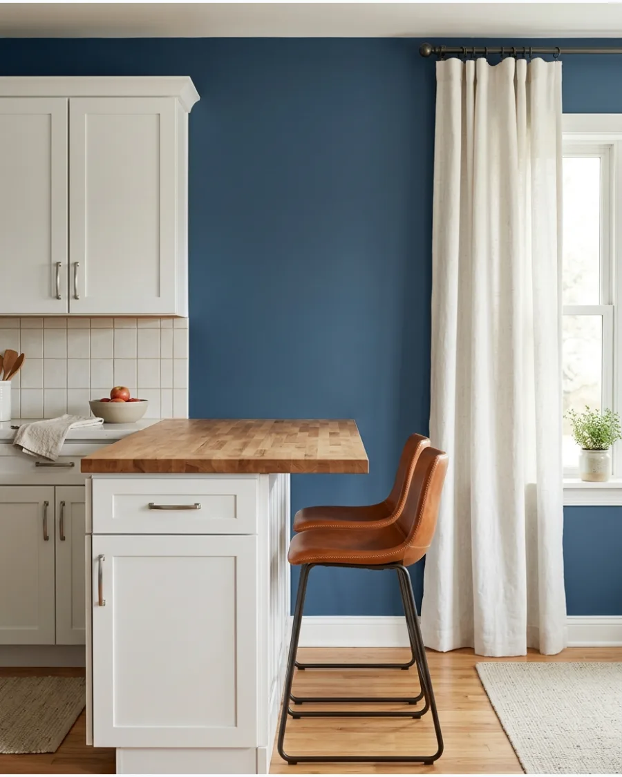
Denim blue is a medium-toned shade that feels casual and timeless. It bridges the gap between light and dark without overwhelming a smaller room.
Paint the walls denim blue and add leather bar stools to soften the cool tones of the white cabinets. A medium blue like this hides small scuffs better than lighter shades.
- Expect to pay $40 to $70 per gallon for high-quality interior paint.
- Tape off cabinet edges with high-quality painter's tape to ensure sharp lines.
- Swap chrome hardware for brass or gold to warm up the cool blue tones.
Quick win: Test this color near the floor to see how it looks against your baseboards.
32. Slate Blue
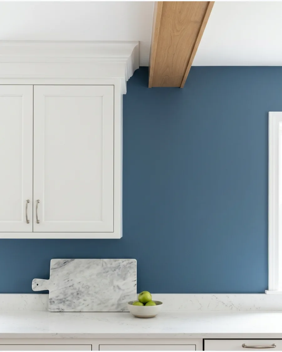
Slate blue brings a sophisticated, stony quality to the kitchen. It looks expensive when paired with white cabinetry and marble surfaces.
Install slate blue on the main kitchen walls to make white crown molding pop. This color acts like a neutral because of its heavy gray undertones.
- Plan for 1 to 2 days of work for a standard-sized kitchen.
- Use a 2.5-inch angled brush for cutting in around upper cabinets.
- This shade works well with both silver and gold faucet finishes.
Most people skip this: Check the paint at night, as slate blue can turn very gray in low light.
33. Muted Teal
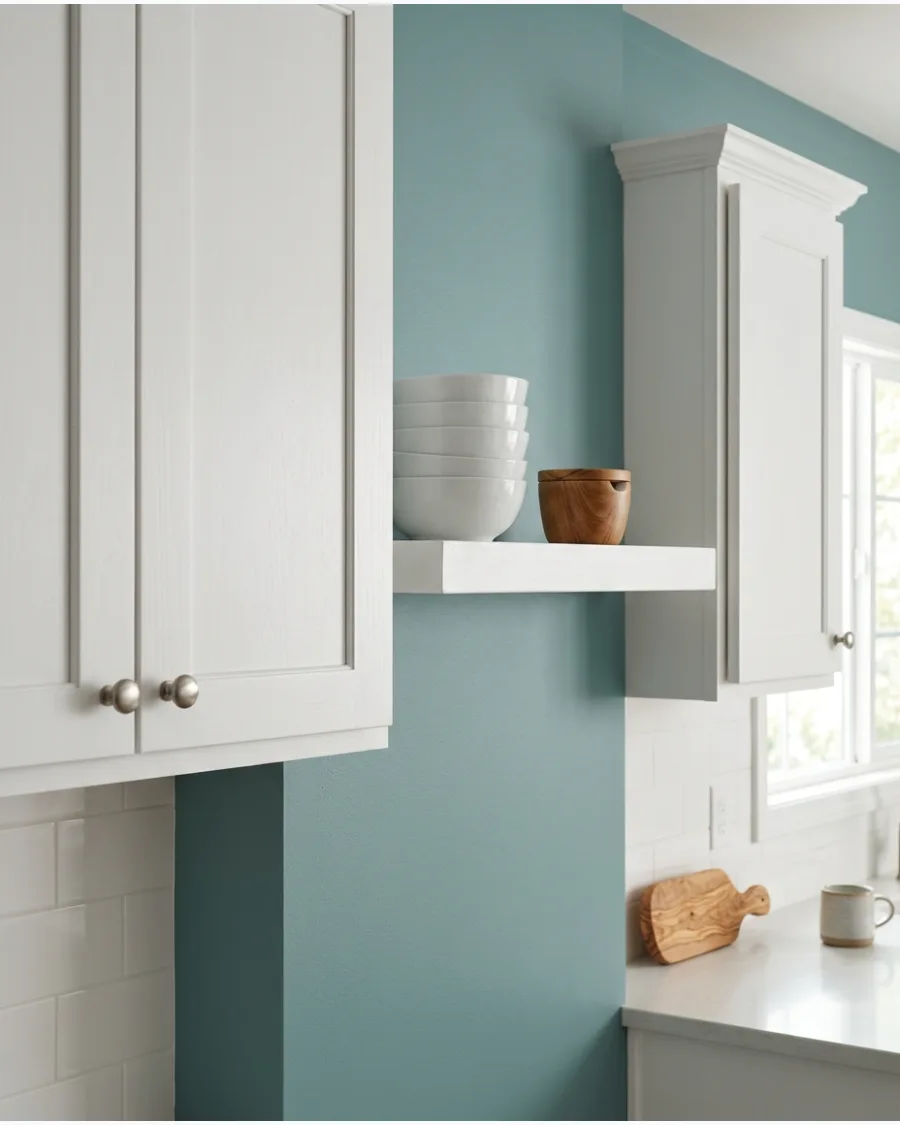
Muted teal gives a white kitchen personality without feeling like a tropical vacation. It has enough green to feel organic and enough blue to stay calm.
Choose a smoky teal for the walls to create a sophisticated backdrop for white dishware. It is a great choice if you want color but fear anything too bright.
- Budget about $50 for premium interior paint with a scrubbable finish.
- Remove all switch plates and outlet covers before painting for a clean look.
- Add a wooden bowl of green apples to the counter to highlight the teal tones.
Best shortcut: Use a satin finish to make the teal easier to wipe down near the stove.
34. Deep Navy Blue
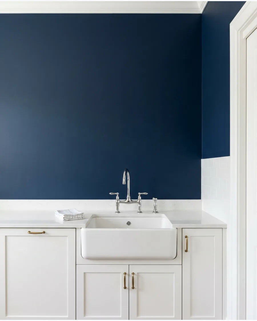
Deep navy walls create a classic, high-contrast look that makes white cabinets look crisp. This combination is a foolproof way to add drama to a bright room.
Apply deep navy to a single accent wall if you are worried about the room feeling too dark. It provides a sturdy anchor for a room filled with light-colored surfaces.
- Plan on applying 2 coats for full coverage with this dark pigment.
- Use a high-hide primer to save time when covering lighter existing colors.
- Pair with white subway tile and dark grout for a classic nautical feel.
Quick win: Paint the inside of a pantry door the same navy to tie the room together.
35. Inky Blue
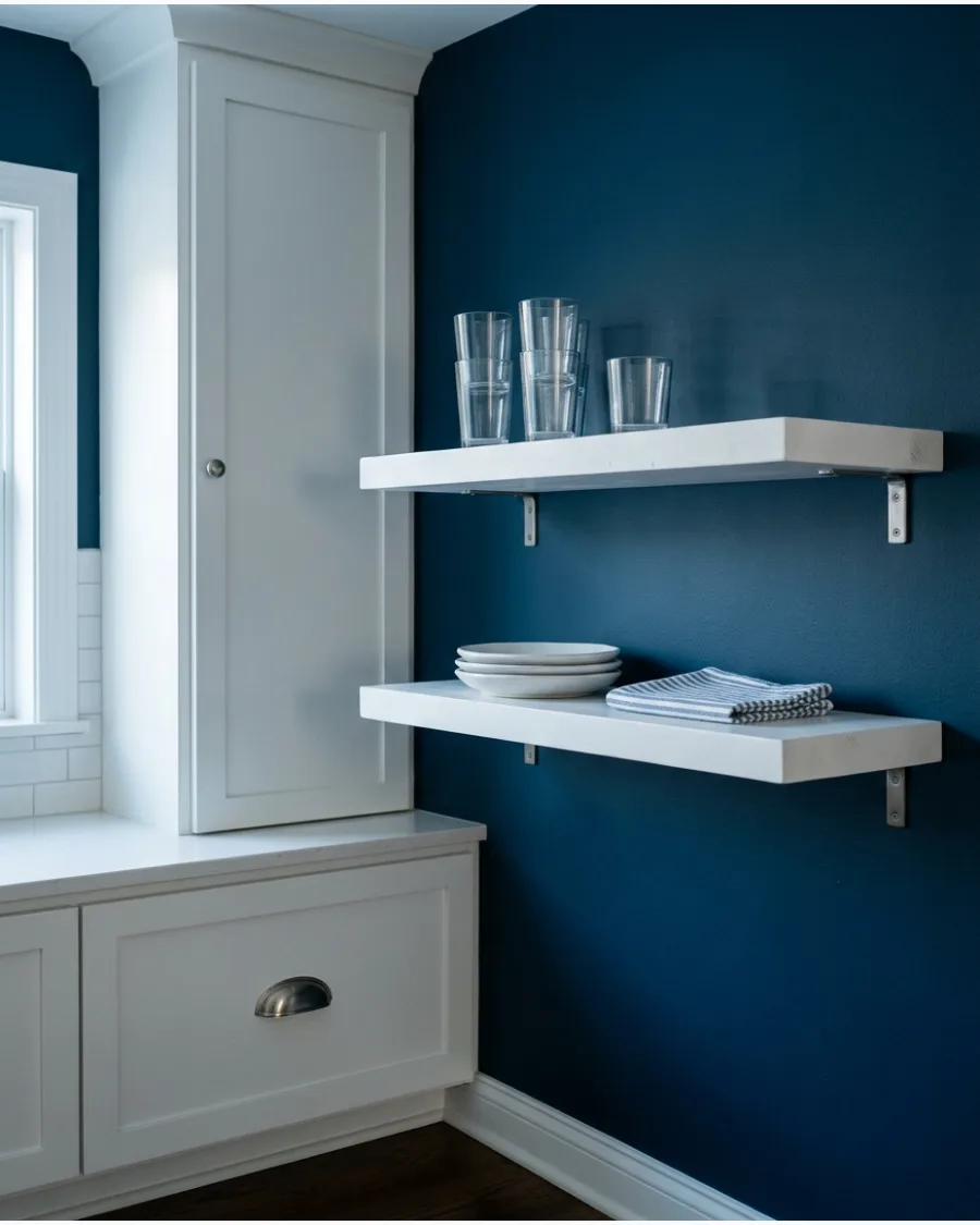
Inky blue is even darker than navy and feels very modern. It works beautifully behind open shelving where the white of the shelves can really stand out.
Use inky blue on the wall behind white open shelves to make your glassware sparkle. Darker blues like this make a large kitchen feel more intimate and cozy.
- Spend about $60 per gallon for high-pigment paint that resists fading.
- Use a microfiber roller for the smoothest finish on large wall sections.
- This color works best in kitchens with large windows and plenty of natural light.
Most people skip this: Use a dark-tinted primer so you do not have to do three or four coats.
36. Aqua Mist
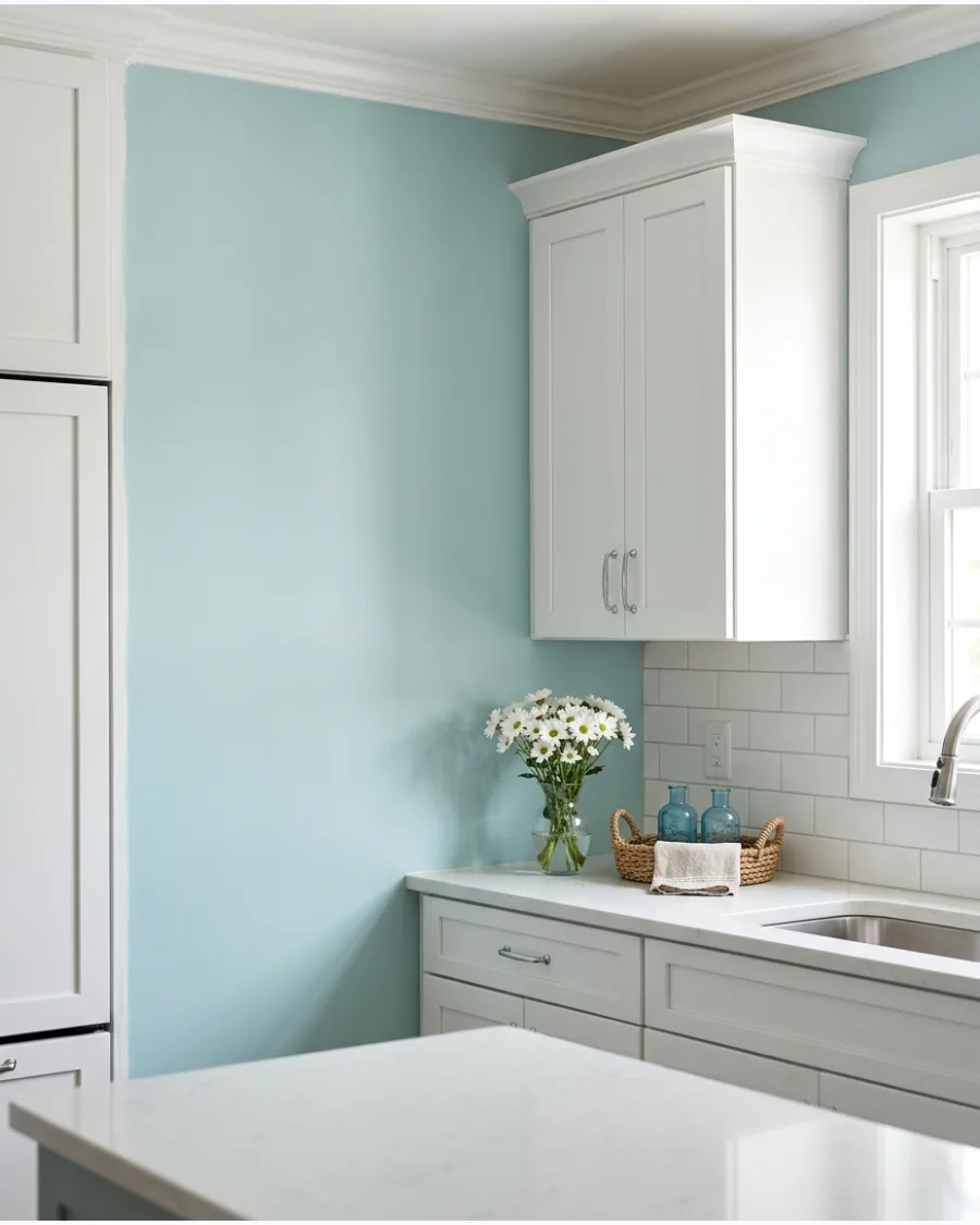
Aqua mist is a light, airy color that prevents a white kitchen from looking sterile. It reflects a lot of light, making it perfect for small or windowless spaces.
Paint the walls aqua mist to give your white cabinets a fresh, coastal energy. This shade is light enough to function as a near-white with just a hint of color.
- Allow 4 to 6 hours for a single coat to dry completely before recoating.
- Apply paint in large W motions for even distribution across the wall.
- Keep the trim and baseboards bright white to keep the look seamless.
Best shortcut: Buy a sample pot and paint a large poster board to move around the room at different times of day.
Kitchen Paint
37. Soft Peach and White Contrast
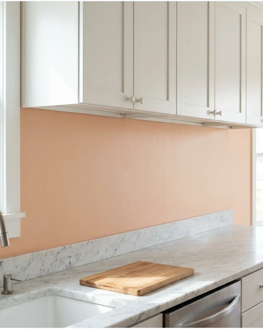
Muted peach creates a sophisticated warmth that prevents white cabinets from looking sterile or cold. This specific undertone bridges the gap between traditional beige and modern pink, offering a glow that shifts beautifully with natural light.
Test a large swatch behind the stove to see how the color interacts with both cabinetry and backsplash tile. Selecting a matte or eggshell finish ensures the pigment looks rich rather than reflective.
- Budget for two gallons of premium interior paint and high-quality rollers for a standard kitchen layout.
- Remove all cabinet hardware and mask off the edges of the white frames before applying the first coat.
- Pair this wall color with brushed gold or brass hardware to enhance the warm undertones of the peach.
Most people skip this: check the paint sample at night under artificial lighting, as peach can lean too orange depending on the bulb's color temperature.
EARTHY AND CLAY-INSPIRED PAINT COLORS
38. Soft Apricot
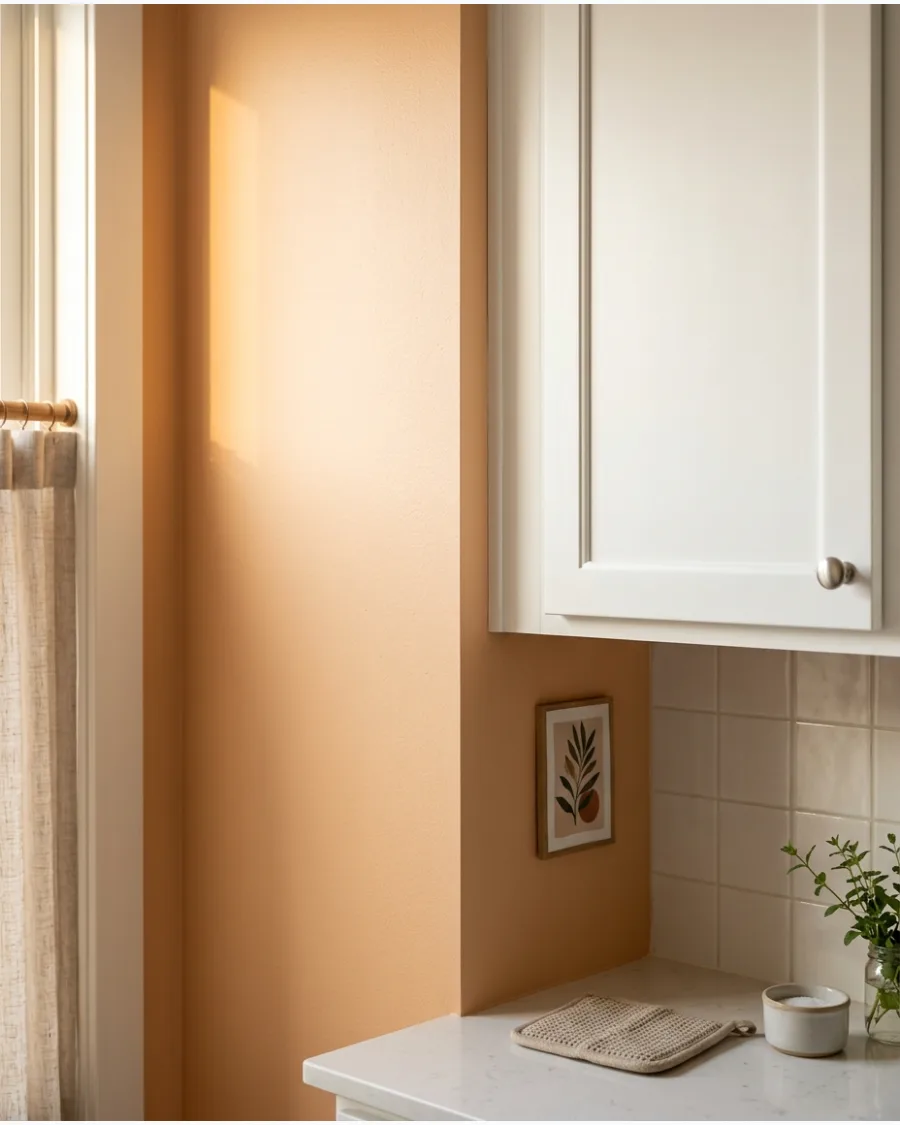
Soft apricot creates a cheerful atmosphere that feels like a permanent sunrise. It is warmer than peach and brings a lot of life to flat white cabinet doors.
Use soft apricot on walls that receive direct afternoon sun to maximize the warm glow. It is an excellent choice for making a cold-feeling kitchen feel more inviting.
- One gallon typically covers about 400 square feet of wall space.
- Keep a small jar of leftover paint for future touch-ups on high-traffic corners.
- Coordinate with cream-colored dish towels and linens to soften the contrast.
Most people skip this: Light bulbs with a warm white rating will make this color look its best.
39. Dusty Blush
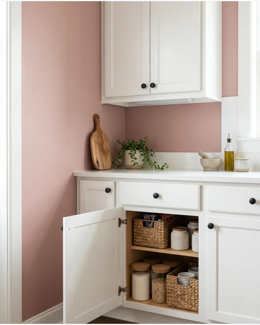
Dusty blush is a sophisticated pink that feels grown-up and calm. It provides a soft contrast that makes white cabinets look creamy rather than stark.
Incorporate dusty blush on the walls and use matte black hardware to ground the feminine color. It works like a warm neutral but with much more character.
- Spend about $15 for basic painting supplies like trays and liners.
- Paint the ceiling a bright ceiling white to keep the room feeling tall.
- This color works exceptionally well with gray stone or quartz countertops.
Best shortcut: Use a high-quality sash brush to get into the tight corners near the ceiling.
40. Rose Beige
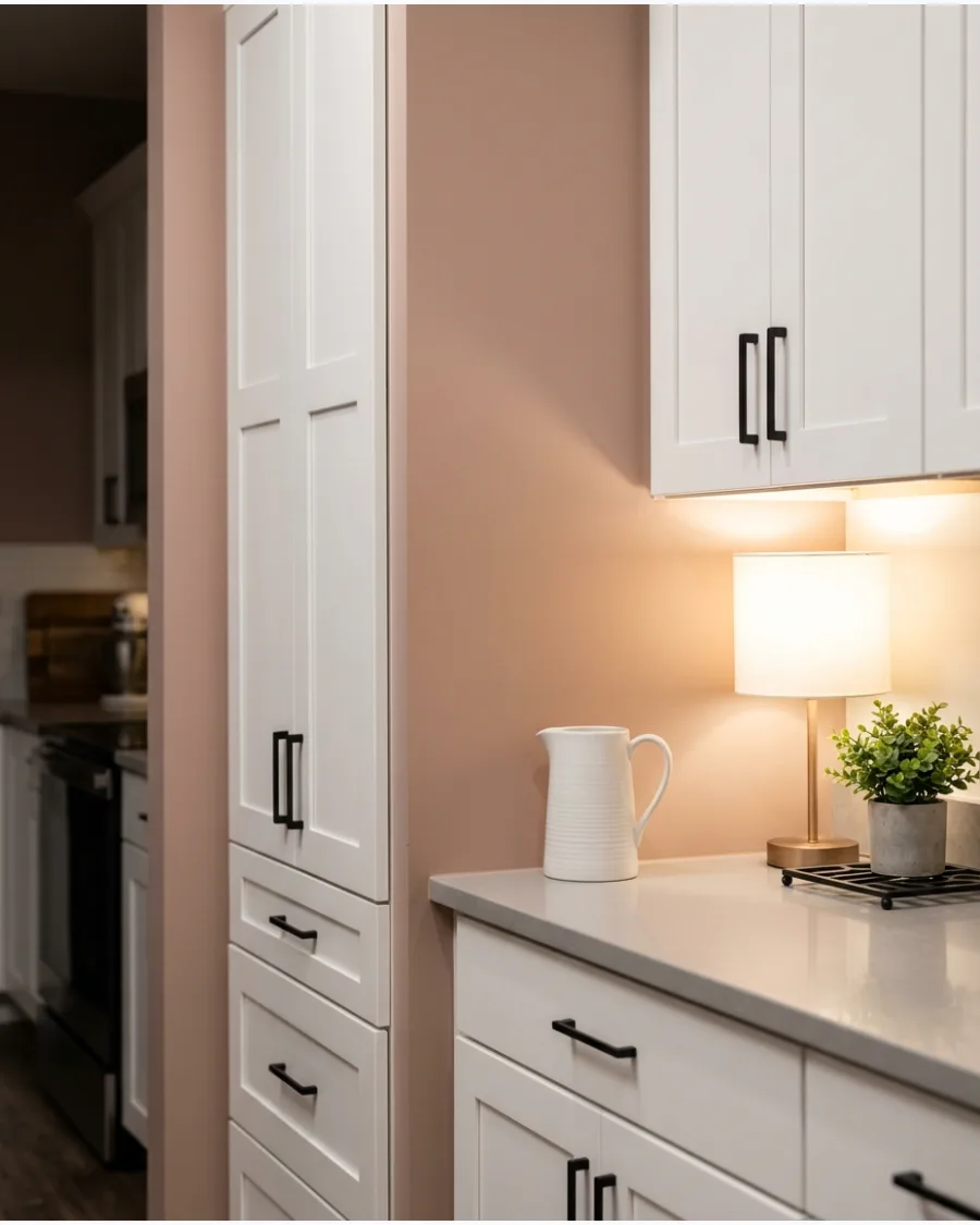
Rose beige is a clever mix of pink and tan that creates an elegant, muted background. It is warmer than gray but more modern than traditional beige.
Apply rose beige to the walls to give your white kitchen a subtle, upscale feel. It is the perfect choice for a homeowner who wants a barely there color.
- Plan for 2 to 3 hours of prep time for taping off trim and cabinets.
- Use an eggshell finish for a soft glow that is still easy to clean.
- Pair with unlacquered brass accents for a classic, high-end look.
Quick win: Compare this color against your backsplash tile to ensure the pink tones do not clash with the grout.
41. Clay Pink
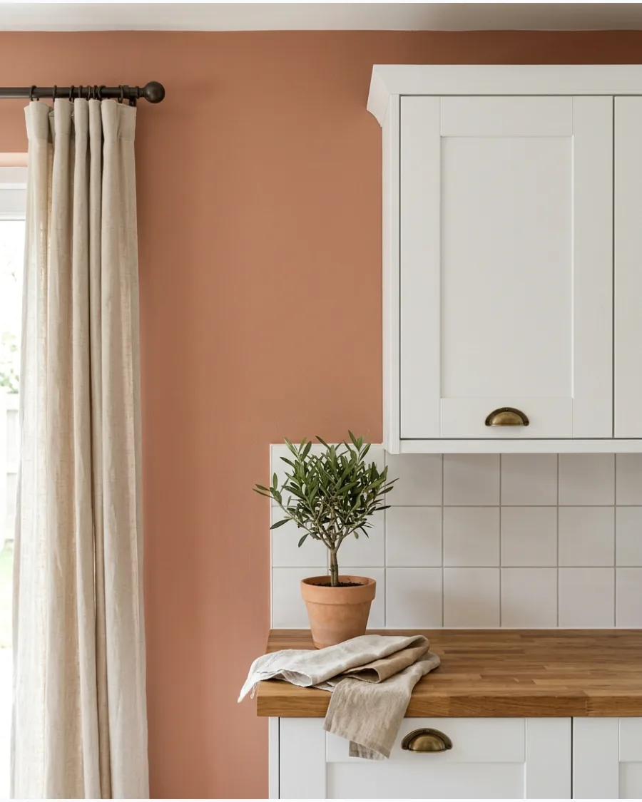
Clay pink has earthy brown undertones that make it feel mature and grounded. It works perfectly in Mediterranean or modern organic kitchens where you want color without it being too bright.
Paint a single wall in this shade to see how the natural light shifts the color from pink to tan throughout the day. This color acts as a neutral while still adding a layer of warmth that white cabinets often need.
- Expect to spend about fifty dollars for a gallon of premium interior paint.
- Remove all cabinet hardware and cover the white cabinet edges with painter tape before starting.
- Add a second coat to ensure the brown undertones look consistent and rich.
Quick win: Test this color near a window because it can look like a different shade depending on how much sun it gets.
42. Soft Terracotta
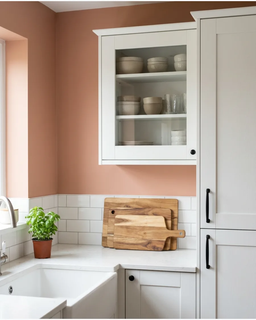
Soft terracotta brings natural warmth and depth to white kitchen cabinets. It creates a sun-drenched look that pairs beautifully with wood accents and creamy stone.
Layer in a few terracotta plant pots or a wooden bowl to pull the wall color into the rest of the room. This shade is the easiest way to make a cold white kitchen feel lived-in and inviting.
- Budget about twenty dollars for a high-quality angled brush for cutting in around cabinets.
- Wipe down walls with a damp cloth to remove kitchen grease so the paint sticks properly.
- Use a matte finish to hide minor wall bumps or texture issues common in older kitchens.
Best shortcut: Pair this with warm white light bulbs to keep the terracotta from looking too orange at night.
43. Cinnamon Brown
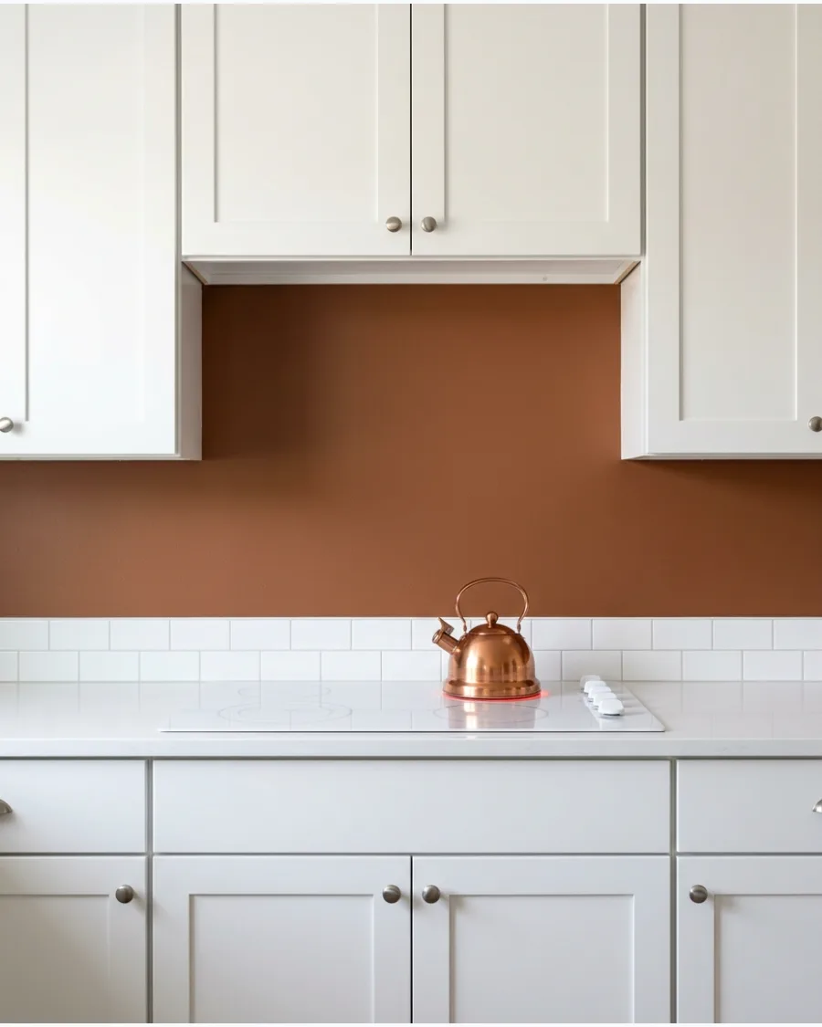
Cinnamon brown creates a warm, spice-inspired background that feels especially cozy during fall and winter. The dark wall makes white cabinets pop and look much brighter than they do against gray.
Swap out chrome hardware for oil-rubbed bronze to lean into the rich, cozy aesthetic of this color. It provides a high-contrast look that feels much softer than black or navy.
- Plan for a full weekend to allow for two coats and proper drying time.
- Keep a small container of white touch-up paint ready in case you slip while painting the edges.
- Apply this color to the pantry door for a small, low-risk pop of spice-inspired color.
Most people skip this: Use a primer tinted with a little brown to get full coverage in fewer coats.
44. Burnt Sienna
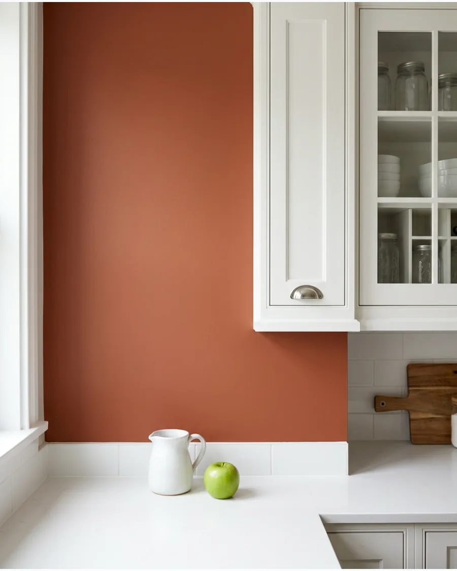
Burnt sienna offers a rich reddish-brown tone for kitchens that need more character. It works best as a bold accent color in a breakfast nook or on a feature wall.
Balance the intensity of the red tones by using white cabinets with simple, clean lines. This color makes a kitchen feel sophisticated and custom without a massive renovation budget.
- Buy a small sample pot first to ensure the red tones aren't too aggressive for your lighting.
- Protect your white countertops with heavy-duty drop cloths during the application.
- Tone down the look in small kitchens by only painting the wall space between the counter and cabinets.
Quick win: Use this color to highlight a built-in coffee station or a set of open shelves.
45. Muted Rust
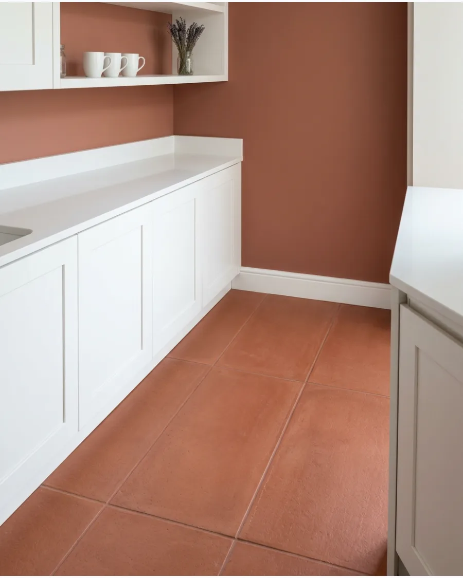
Muted rust creates an earthy, collected appearance when paired with white cabinets. It has a vintage feel that looks great with aged brass and warm wood floors.
Choose a flat or eggshell finish for this color to prevent it from looking too bright or shiny under kitchen lights. It is the perfect choice for someone who wants a bold color that still feels connected to nature.
- Look for paint brands that offer 'washable matte' finishes for easy kitchen cleanup.
- Store leftover paint in a cool, dry place for future touch-ups near high-traffic zones.
- Mix in woven baskets on top of white cabinets to complement the earthy rust tones.
Best shortcut: If you have a white tile backsplash, paint only the upper part of the wall to save time.
46. Deep Burgundy
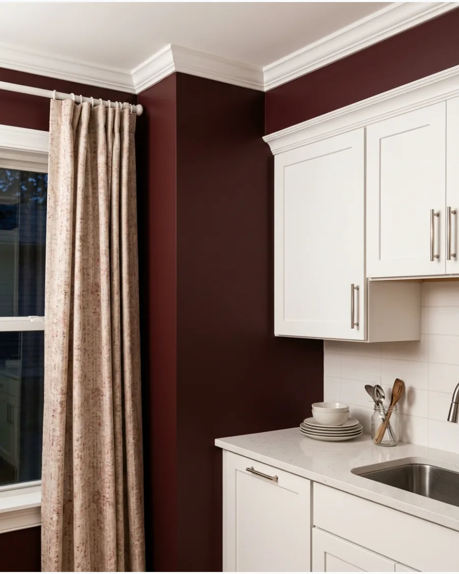
Deep burgundy adds sophisticated drama to a white kitchen. This moody shade creates a luxurious backdrop that makes even basic white cabinets look expensive.
Use this color in a kitchen with plenty of natural light to keep the space from feeling too small or dark. It is a bold choice that pays off by creating a truly memorable heart of the home.
- Invest in a high-quality roller cover to prevent streaks in this dark, saturated shade.
- Sand any rough spots on the wall before painting, as dark colors show every imperfection.
- Pair with polished nickel or chrome hardware to give the room a cool, modern edge.
Most people skip this: Paint the baseboards the same burgundy color to make the white cabinets stand out even more.
47. Muted Mulberry
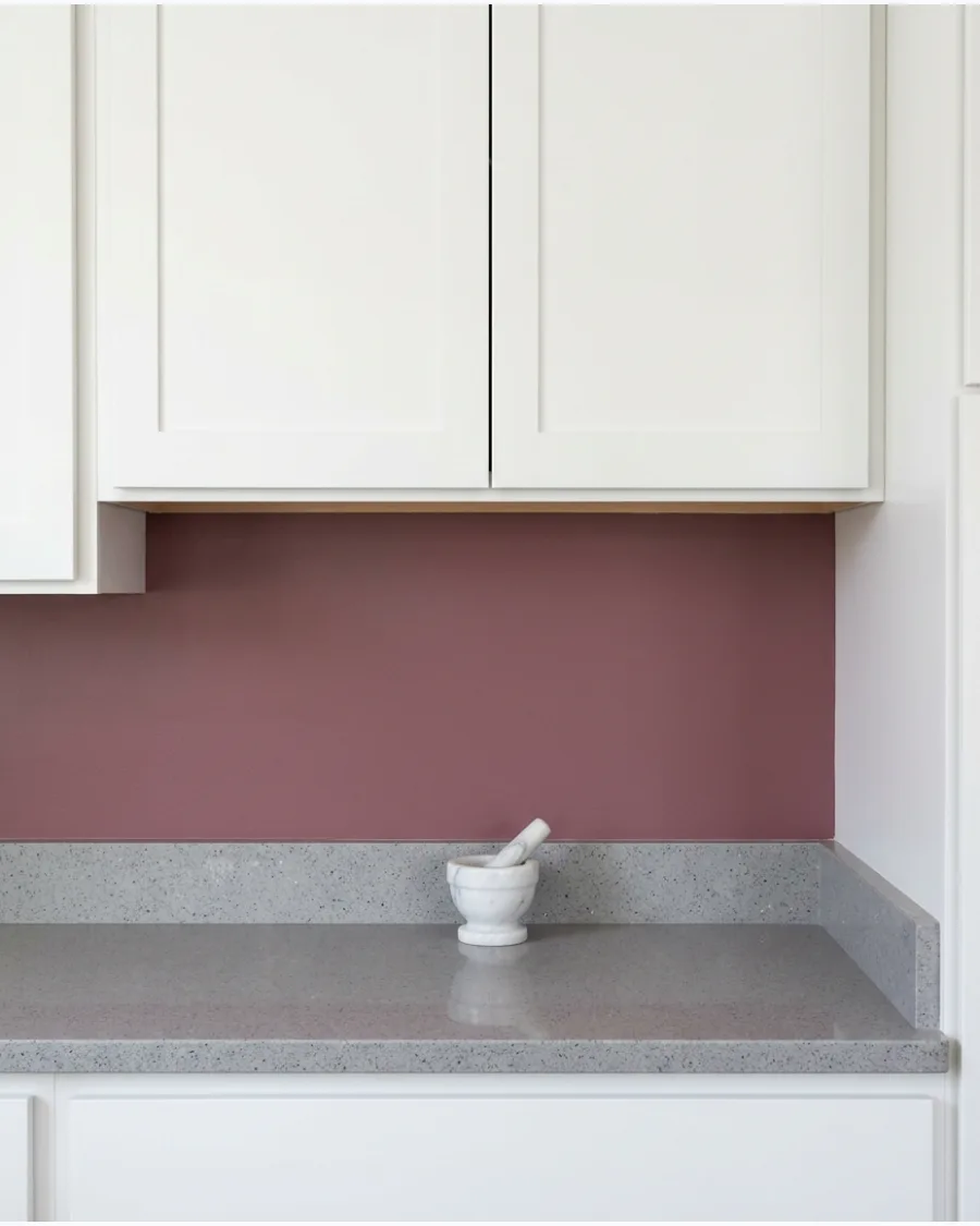
Muted mulberry combines plum, red, and brown undertones for a unique, complex look. White cabinetry keeps the palette fresh and prevents the purple tones from becoming overwhelming.
Pair this color with a white subway tile backsplash to create a clean break between the dark walls and the cabinets. This shade is a great alternative to navy if you want something a bit warmer.
- Plan for extra drying time between coats because dark pigments take longer to set.
- Use a small craft brush to get into the tight corners where the wall meets the cabinet crown molding.
- Swap out colorful kitchen towels for neutral cream or gray ones to let the walls be the star.
Quick win: This color looks incredible when styled with white marble or quartz countertops.
48. Earthy Plum
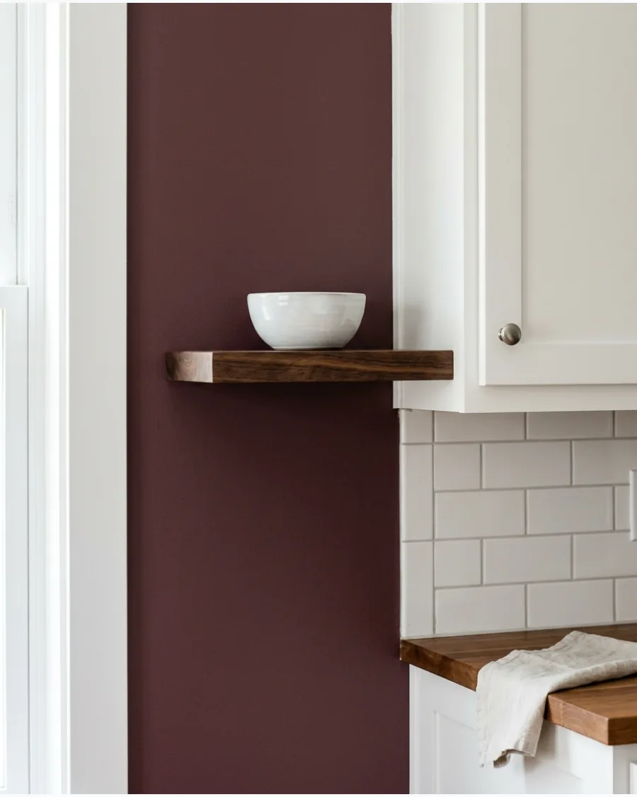
Earthy plum is a warm, softened purple that works surprisingly well with white cabinets. It creates a layered, designer look that feels very current.
Add a runner rug with hints of plum and cream to tie the wall color to the floor. This color looks best when paired with natural materials like stone and dark wood.
- Budget around fifteen dollars for a roll of high-quality painter tape with edge-lock technology.
- Move the refrigerator and stove slightly to paint the wall behind them for a professional finish.
- Use this color in a kitchen with dark wood floors to create a grounded, cozy environment.
Best shortcut: If the full room feels too dark, paint only the wall behind your open shelving.
YELLOW AND GOLDEN KITCHEN PAINT COLORS
49. Butter Yellow
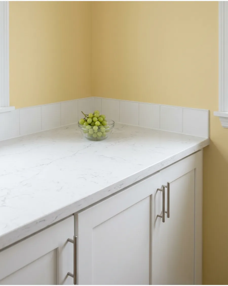
Butter yellow brings cheerful warmth to white cabinets without feeling too bright or overwhelming. It is a classic choice for cottage-style kitchens that need to feel sunny even on cloudy days.
Keep the ceiling a crisp white to prevent the yellow from making the room feel enclosed. This shade makes white cabinets look clean and bright rather than stark.
- Use a satin finish in the kitchen so you can easily wipe away food splatters.
- Test a large swatch on different walls to ensure the yellow doesn't look too neon at noon.
- Add a small bowl of green fruit to the counter to create a fresh, natural color contrast.
Most people skip this: Check your white cabinet undertones; this yellow works best with 'true' white or slightly warm white.
50. Pale Straw Yellow
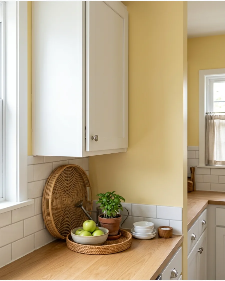
Pale straw yellow offers a sun-faded appearance that keeps the kitchen feeling light and airy. It pairs perfectly with white cabinetry and natural woven textures like rattan or seagrass.
Use this color in a kitchen with lots of windows to maximize the bright, outdoor-inspired feel. It is the ultimate choice for a kitchen that needs to feel calm and breezy.
- Buy a high-volume low-pressure (HVLP) sprayer if you want a perfectly smooth wall finish.
- Clean your rollers thoroughly before use to avoid getting fuzz in the light yellow paint.
- Incorporate a light wood island or bar stools to enhance the sun-bleached aesthetic.
Quick win: Replace old switch plates with clean white ones to blend in with the cabinets and straw-colored walls.
51. Warm Ochre
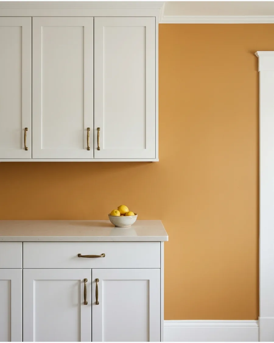
Warm ochre adds earthy golden depth and creates a welcoming atmosphere in a busy kitchen. White cabinets balance its richness and maintain a clean, crisp appearance throughout the day.
Apply this color to a single accent wall to prevent the gold tones from overwhelming the natural light in the room. Expert opinion: Rich ochre prevents white cabinets from looking too clinical by adding a layer of organic warmth.
- Budget for one gallon of premium interior paint for a standard accent wall.
- Tape off the cabinet edges with high-quality painter's tape before starting.
- Swap for a lighter straw yellow if the kitchen lacks large windows.
Quick win: Test a large swatch near the floor to see how the color reacts to shadows.
52. Muted Mustard
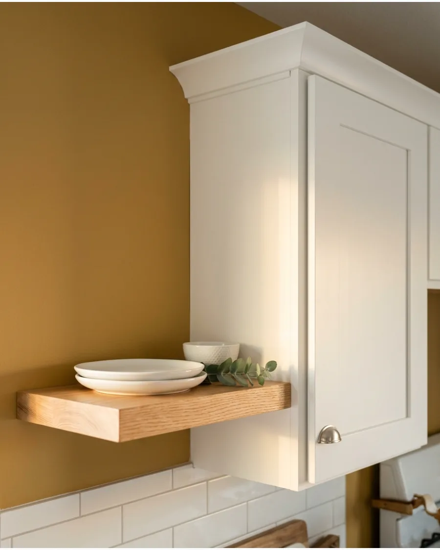
Muted mustard introduces personality while remaining grounded and sophisticated enough for a modern home. Use it as a focused accent color to highlight warm white cabinets and medium-toned wood elements.
Pair this shade with a light oak floating shelf to bridge the gap between the bold wall and the white cabinetry. Expert opinion: A matte finish works best for mustard tones to keep the color looking modern rather than dated.
- Plan for a full weekend to complete the prep and two coats of paint.
- Remove all outlet covers and switch plates for a professional finish.
- Use a more vibrant gold if the kitchen has industrial black accents.
Most people skip this: Sand the walls lightly before painting to ensure the deep yellow pigment settles evenly.
53. Golden Beige
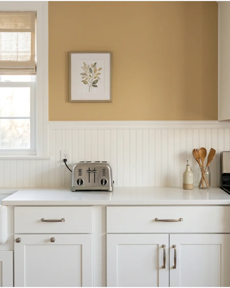
Golden beige combines the versatility of a neutral with a warm yellow undertone that brightens the space. It is ideal for kitchens that feel cold or receive little sunlight throughout the afternoon.
Paint the entire room in this shade to create a cohesive glow that softens the sharp lines of white doors. Expert opinion: This color acts as a bridge between traditional and modern styles, making it very easy to live with.
- Budget-friendly update that costs under fifty dollars for basic supplies.
- Paint the window trim the same white as the cabinets for a seamless look.
- Opt for a cooler greige if the kitchen has blue or green accents.
Best shortcut: Use a high-density foam roller to get a smooth surface on the narrow wall spaces between cabinets.
54. Soft Honey
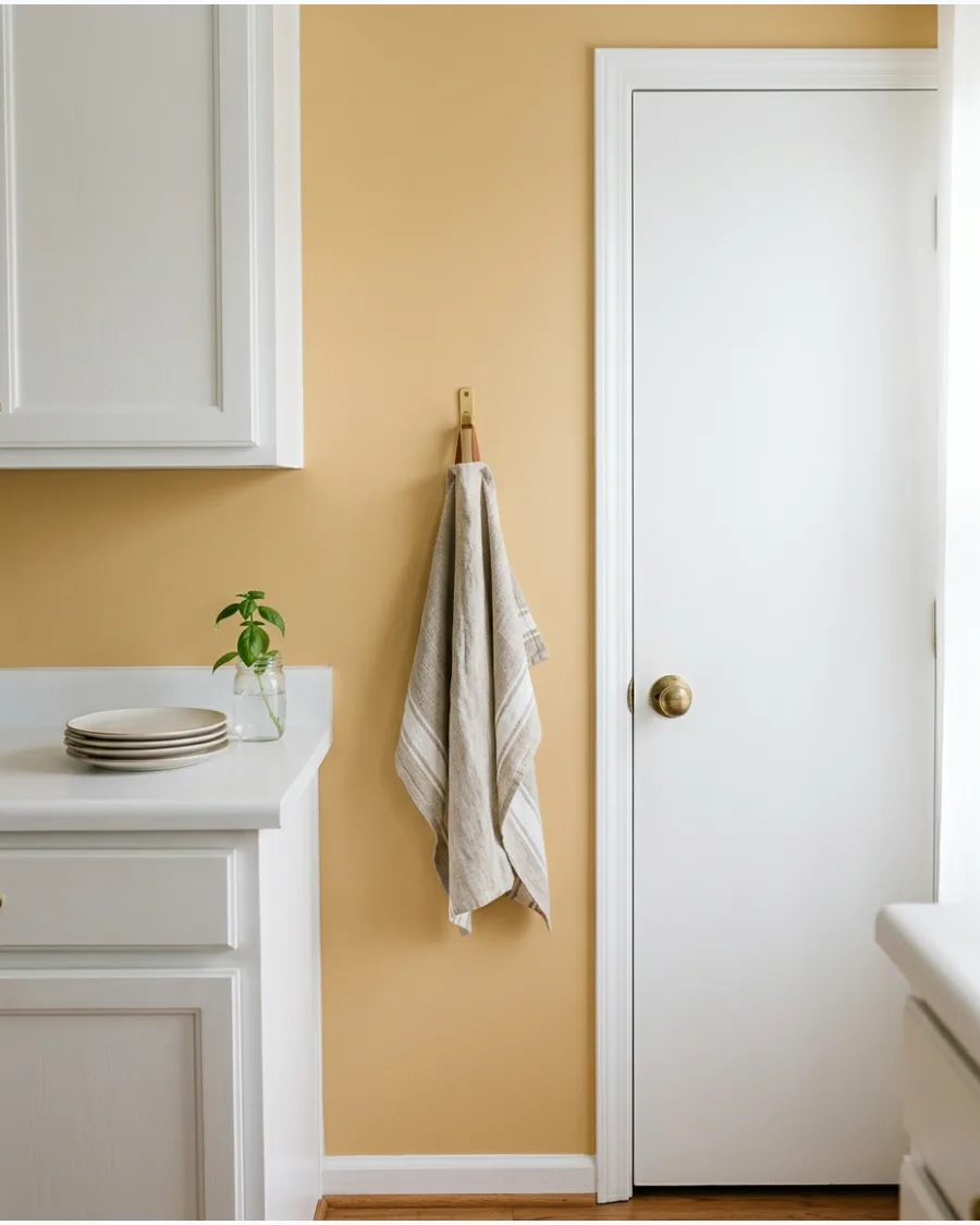
Soft honey walls create a glowing effect around white kitchen cabinets that feels cozy and bright. Pair the shade with oak furniture, brass fixtures, and cream-colored textiles for a layered look.
Use a satin finish on honey-toned walls to help reflect light and enhance the sunny feel of the space. Expert opinion: Honey tones make a kitchen feel lived-in and comfortable without the heaviness of true brown.
- Requires one afternoon of work for a simple feature wall.
- Clear the countertops completely to prevent paint splatter on small appliances.
- Add a darker amber rug to ground the bright honey walls.
Quick win: Check the color at night under artificial lights to ensure the honey tone doesn't turn too orange.
DARK AND DRAMATIC KITCHEN PAINT COLORS
55. Soft Charcoal
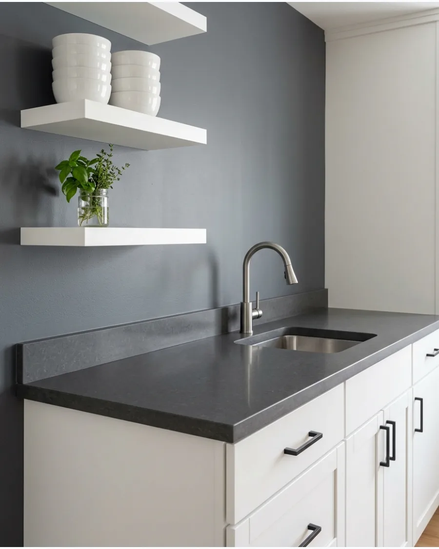
Soft charcoal creates modern contrast without the harshness of pure black or deep navy. It works well with bright white cabinets and light countertops to create a professional, chef-style kitchen.
Paint the wall area behind open shelving in charcoal to make white dishware pop visually. Expert opinion: Charcoal provides a high-end look that hides minor wall imperfections better than lighter colors.
- Intermediate level DIY project requiring careful cutting-in around trim.
- Use a gray-tinted primer to ensure the dark charcoal covers the wall in fewer coats.
- Try a lighter smoke gray if the kitchen is very small or narrow.
Most people skip this: Paint the baseboards the same charcoal color to make the walls feel taller and more continuous.
56. Warm Graphite
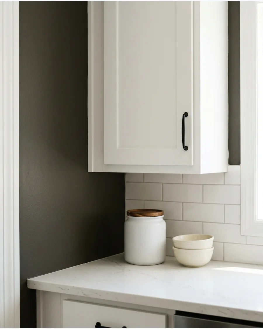
Warm graphite contains subtle brown undertones that make it feel more inviting than cool, blue-based grays. Use it in contemporary kitchens with white cabinetry and wood details to add sophisticated depth.
Carry the graphite color onto the soffit above the cabinets to create a built-in, custom look. Expert opinion: The brown undertone in graphite prevents the kitchen from feeling cold or metallic.
- Plan for three to five hours of work for a standard kitchen wall.
- Protect the top of the cabinets with drop cloths before painting the soffit.
- Pair with walnut accents to highlight the brown undertones in the paint.
Best shortcut: Use an angled sash brush to cut in perfectly around the cabinet crown molding.
57. Soft Black
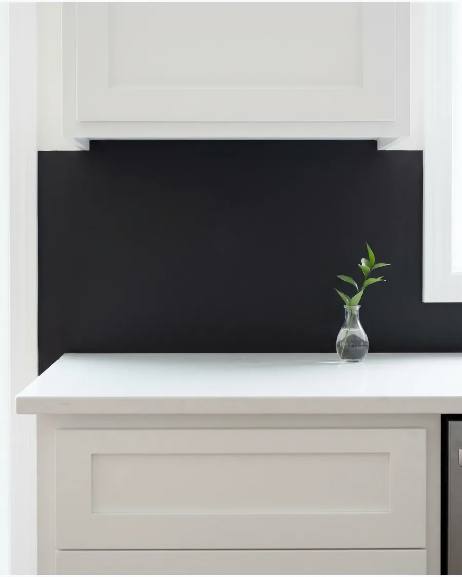
Soft black walls create a bold, high-contrast kitchen with a sophisticated and timeless finish. Keep the countertops, backsplash, and flooring lighter to maintain balance and prevent the room from feeling dark.
Limit the soft black to the wall space above the cabinets to ground the room without making it feel cave-like. Expert opinion: Soft black acts as a neutral that makes every other color in the room look more vibrant.
- Requires at least two coats for full, deep color saturation.
- Wipe down walls with a damp cloth to remove dust before applying dark pigment.
- Use a chalkboard paint version for a functional family message center.
Quick win: Use matte black hardware on the white cabinets to tie the whole color scheme together.
58. Chocolate Brown
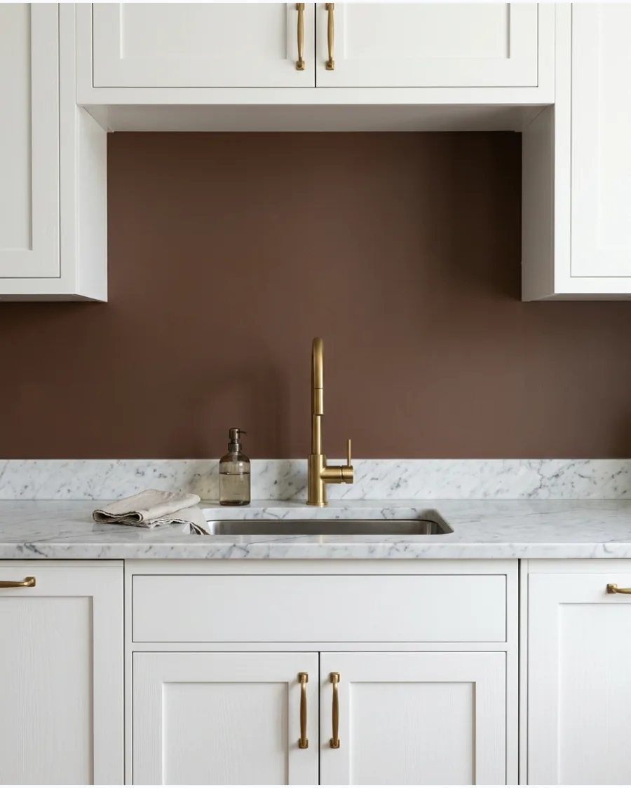
Chocolate brown brings warmth and depth to white kitchen cabinets for a classic look. The combination feels especially luxurious when paired with marble surfaces and brass lighting fixtures.
Paint the backsplash wall in this deep brown to create a striking backdrop for white lower cabinets. Expert opinion: This shade provides the drama of a dark color while feeling much warmer than gray or black.
- One gallon typically covers a small to medium kitchen accent area.
- Use a high-quality synthetic brush for smooth edges along the countertop.
- Add white picture frame molding over the brown wall for a traditional touch.
Most people skip this: Light the kitchen with warm-toned bulbs to bring out the richness of the chocolate pigment.
59. Espresso Brown
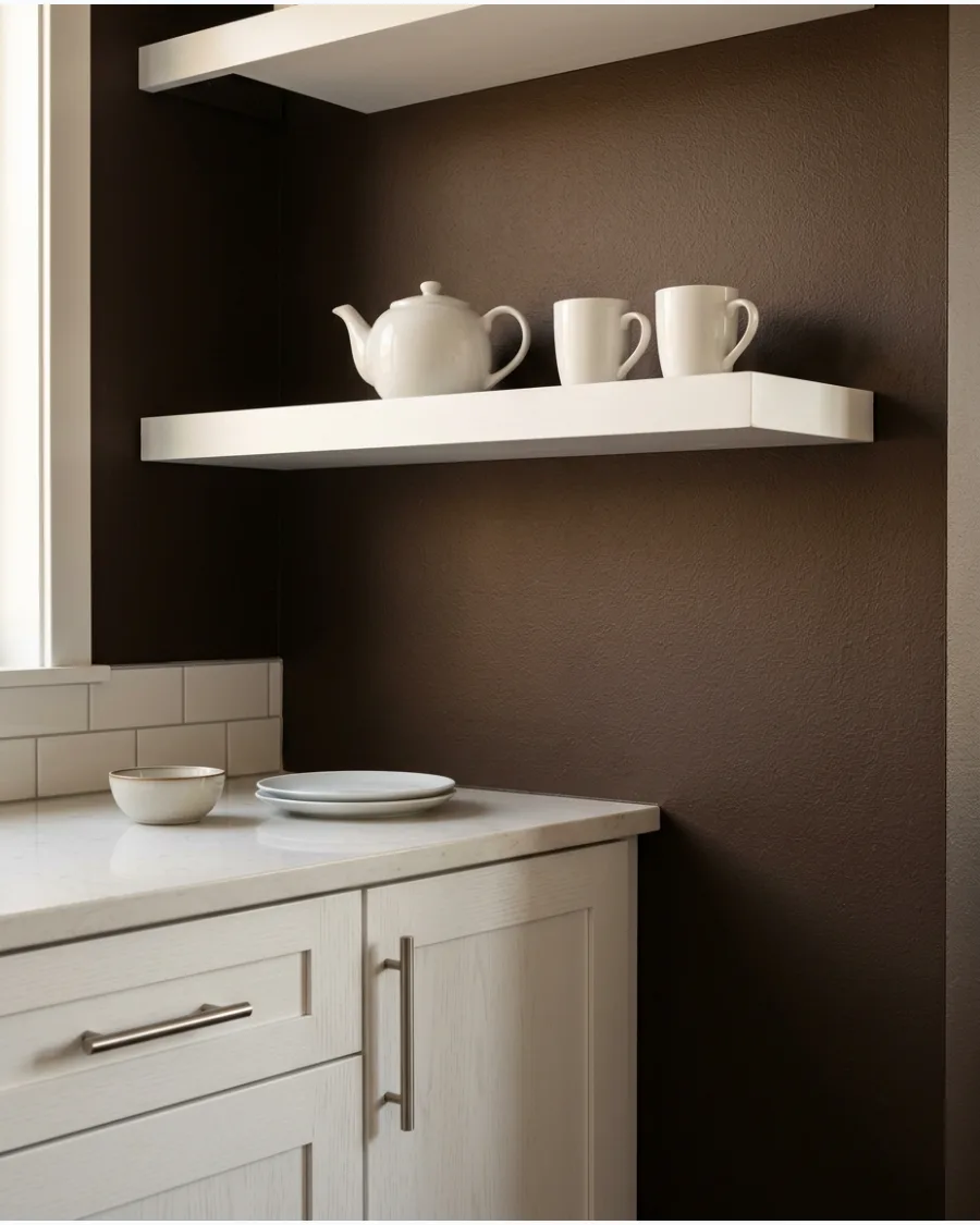
Espresso brown creates a dramatic yet natural backdrop for crisp white cabinetry in modern homes. It is best suited to larger kitchens or rooms with abundant natural light to prevent a cramped feeling.
Install white floating shelves against an espresso wall to maximize the contrast and display colorful kitchenware. Expert opinion: Espresso is the perfect choice for those who want a dark look that still feels organic and earthy.
- Best for large, well-lit kitchen spaces with high ceilings.
- Stir the paint thoroughly to ensure the dark pigments are fully mixed.
- Switch to a lighter mocha shade if the espresso feels too heavy for the room size.
Best shortcut: Use a small artist brush to touch up the tiny gaps where the cabinet meets the wall.
60. Earthy Brick Red
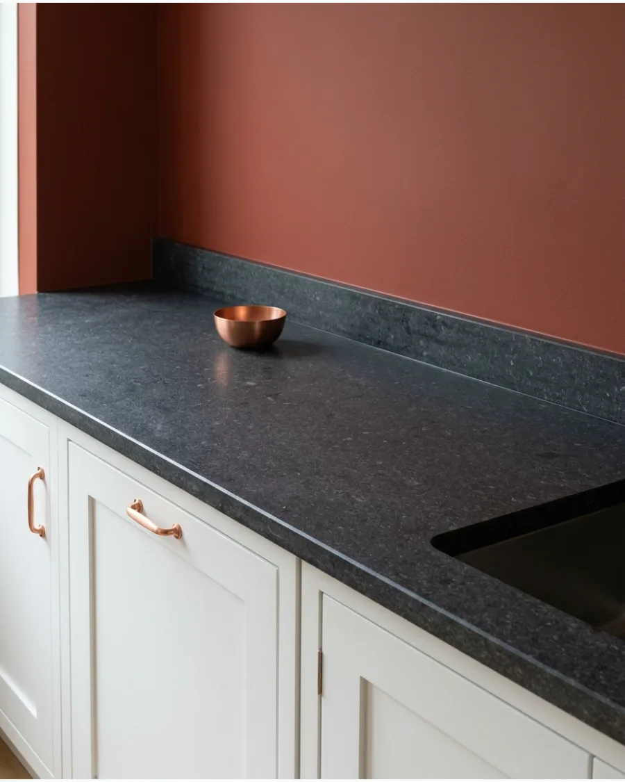
Earthy brick red adds warm, historic character to a white kitchen without feeling too bright. Choose a muted brown-red tone and pair it with wood, stone, and aged metal finishes for a rustic feel.
Paint a small breakfast nook or pantry area in brick red to define the space as a cozy separate zone. Expert opinion: A muted red provides energy and appetite appeal without the intensity of a bright primary red.
- Perfect for a weekend kitchen refresh with minimal supplies.
- Apply a second coat after four hours for the most even color depth.
- Pair with reclaimed wood accents for a rustic or farmhouse feel.
Quick win: Paint a wooden stool in the same brick red to carry the color through the room.
Frequently Asked Questions
What are the best neutral paint colors for a kitchen with white cabinets?
Greige, soft gray, and warm whites are excellent choices for creating a timeless and cohesive look. These versatile shades bridge the gap between cool and warm tones, ensuring your kitchen feels bright and inviting without being stark.
How do I choose a wall color if my white cabinets have cool undertones?
If your cabinets have blue or crisp white undertones, stick with cool grays or soft blues to maintain a clean, harmonious palette. Avoid warm beiges, which can make cool-toned white cabinets appear muddy or yellow by comparison.
Can I use dark paint colors like navy or forest green with white cabinets?
Absolutely, as dark colors like navy or forest green create a stunning high-contrast look that makes white cabinets pop as a focal point. This moody aesthetic adds depth and sophistication to the space while keeping the overall feel grounded.
Should the wall paint be the same sheen as the cabinets?
Generally, you should use an eggshell or satin finish for the walls and a semi-gloss or high-gloss for the cabinetry. This subtle difference in sheen provides necessary durability for the cabinets while creating a soft, professional-looking contrast against the wall surface.
How does lighting affect the way wall paint looks next to white cabinets?
Lighting plays a huge role, as north-facing light can make colors look cooler and flatter, while south-facing light brings out warmer tones. Always test paint samples in your kitchen at different times of day to see how the natural light interacts with your white cabinets.