50 Blue Kitchen Cabinet Ideas

This post may contain affiliate links: full affiliate disclosure.
Blue kitchen cabinets can feel airy, grounded, dramatic, or quietly traditional. The difference comes from undertone, light, cabinet placement, and the materials surrounding the color—not from blue alone.
These 50 ideas move from powder blue to inky navy, with practical notes on layouts, surfaces, hardware, budgets, and upkeep. Every concept helps you make a real decision, not simply collect pretty rooms.
Before ordering paint or doors, sample your favorite blue on two movable boards. View them beside the countertop in morning, afternoon, and evening light; a color that looks balanced all day is a safer long-term choice.
Choose a Blue That Works With Your Light
Start with the shade, but judge it in the room where it will live. Natural-light direction, cabinet mass, and neighboring finishes can change blue more than the tiny paint chip suggests.
1. Open Up the Room With Powder-Blue Shaker Cabinets
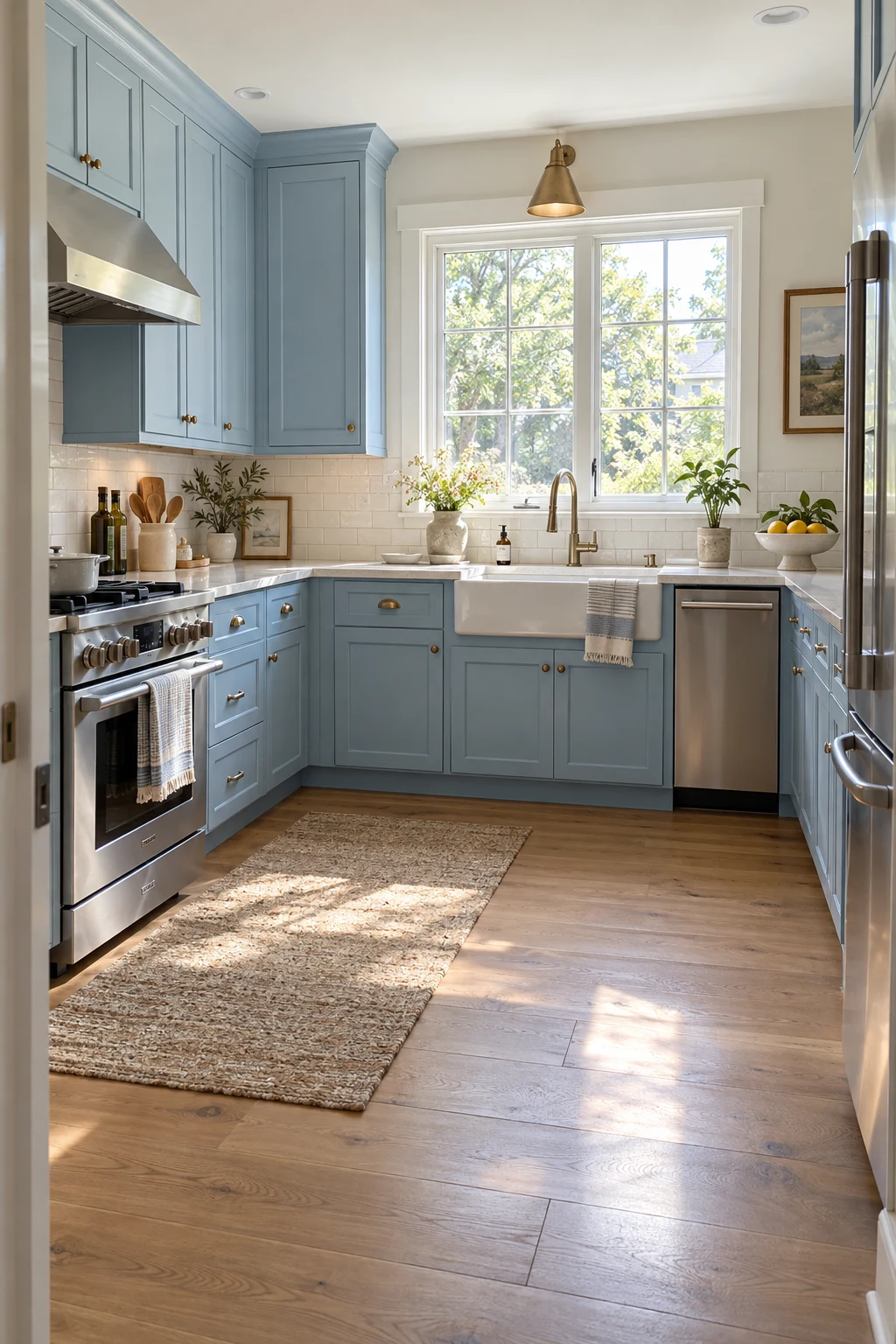
Powder blue gives a compact kitchen color without navy's visual weight. Choose a gray undertone so the doors stay calm beside white quartz instead of turning sugary in midday sun.
Keep the layout clear: one continuous blue run, a pale backsplash, and no more than two hardware finishes. Standard 36-inch counters and a 42-inch work aisle make the palette feel spacious.
Use a washable satin cabinet enamel, especially around the sink and range. Pale doors reveal cooking splatter sooner than dark ones, but they are also easier to touch up when you keep a labeled half-pint of the finish.
Paint two 12-by-18-inch boards, move them around the room, and check the blue beside the actual countertop at three times of day.
2. Ground a Bright Kitchen With a Deep Navy Island
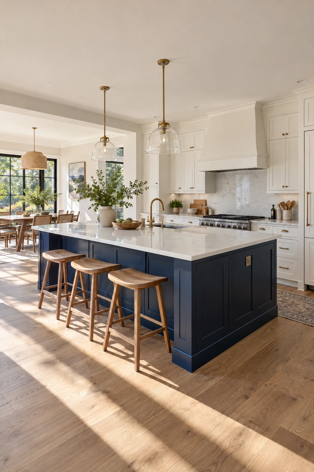
A navy island anchors an open room without darkening every wall. Warm-white perimeter cabinets keep the edges bright, while oak stools stop the center feeling cold.
Allow 42 inches between the island and a single-cook run; 48 inches is better for two cooks. Open the dishwasher, oven, and nearby drawers first to expose clearance problems.
Repeat navy only once elsewhere, perhaps in a runner stripe or framed print. If you are comparing more split-color layouts, these two-tone kitchen cabinet ideas show additional ways to place contrast deliberately.
3. Warm Up Smoky Blue-Green With White Oak
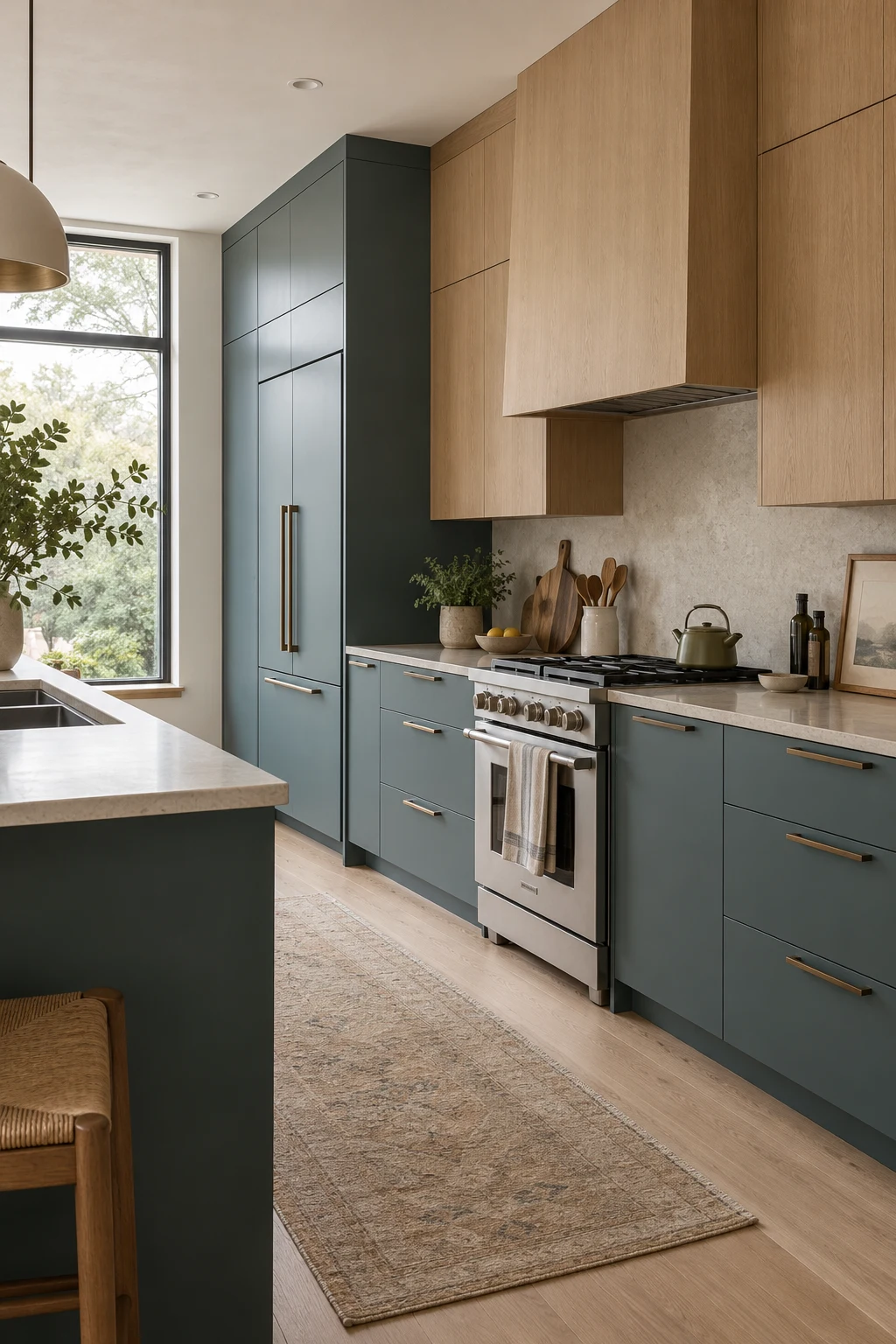
Smoky blue-green works like a complex neutral in rooms with warm wood. Choose a muted, visibly gray finish rather than clear teal; it sits comfortably beside oak and stainless appliances.
Use the blue-green on base and tall cabinets, then reserve white oak for upper doors or open shelves. This keeps visual weight low while letting the grain add movement above eye level.
Matte slab doors show fingerprints near integrated pulls, so specify a cleanable low-sheen coating and test it with a damp microfiber cloth. A discreet edge pull is easier to wipe than a deep routed channel.
- Compare the blue-green sample directly against the oak, not against a white wall.
- Keep stone veining quiet so three strong surfaces do not compete.
4. Pair Denim Blue With Honed Soapstone
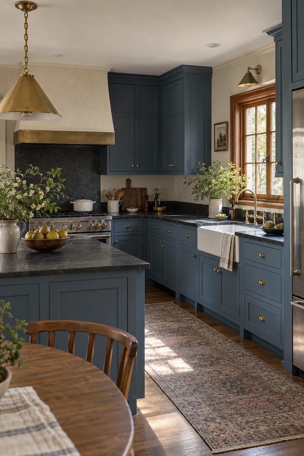
Denim blue is softer than navy yet deep enough to support black soapstone. The pairing feels collected rather than high-contrast because both colors contain a muted, dusty quality.
Inset doors suit this traditional combination, but confirm the cabinetmaker's reveal stays even; dark counter edges make crooked gaps more obvious. Use aged brass in modest doses and leave the larger appliances stainless or panel-ready.
Soapstone develops marks and a patina, so this look is best for homeowners who enjoy materials changing over time. If you prefer consistency, choose a soapstone-look quartz with restrained veining and eased edges.
5. Use Cobalt on Lowers and White Above
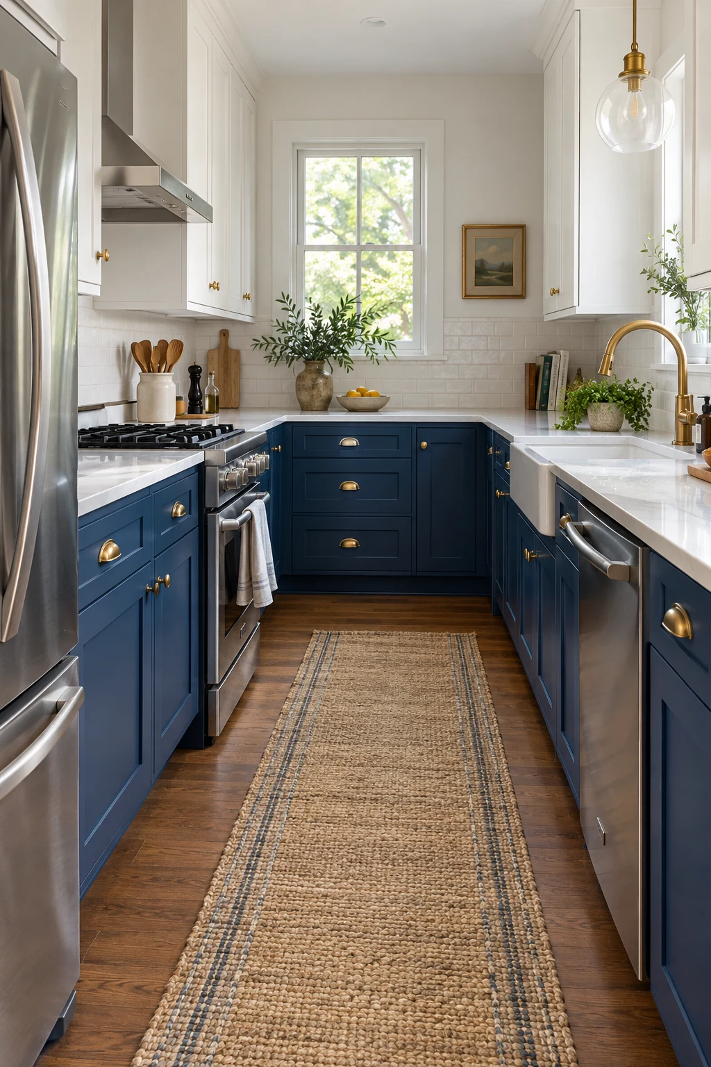
Cobalt adds cheerful energy, but placing it below the counter keeps the strongest color out of your direct sightline. White uppers reflect window light and stop a compact galley from feeling boxed in.
Choose one clear cobalt rather than mixing several vivid blues. Bridge the two cabinet colors with a simple white countertop, then use stainless hardware so the scheme stays crisp instead of becoming themed.
In a rental, achieve a similar balance with removable film on flat lower doors only. Test one hidden panel for residue and obtain written permission before covering factory-finished cabinetry.
6. Create Cottage Calm With Duck-Egg Blue
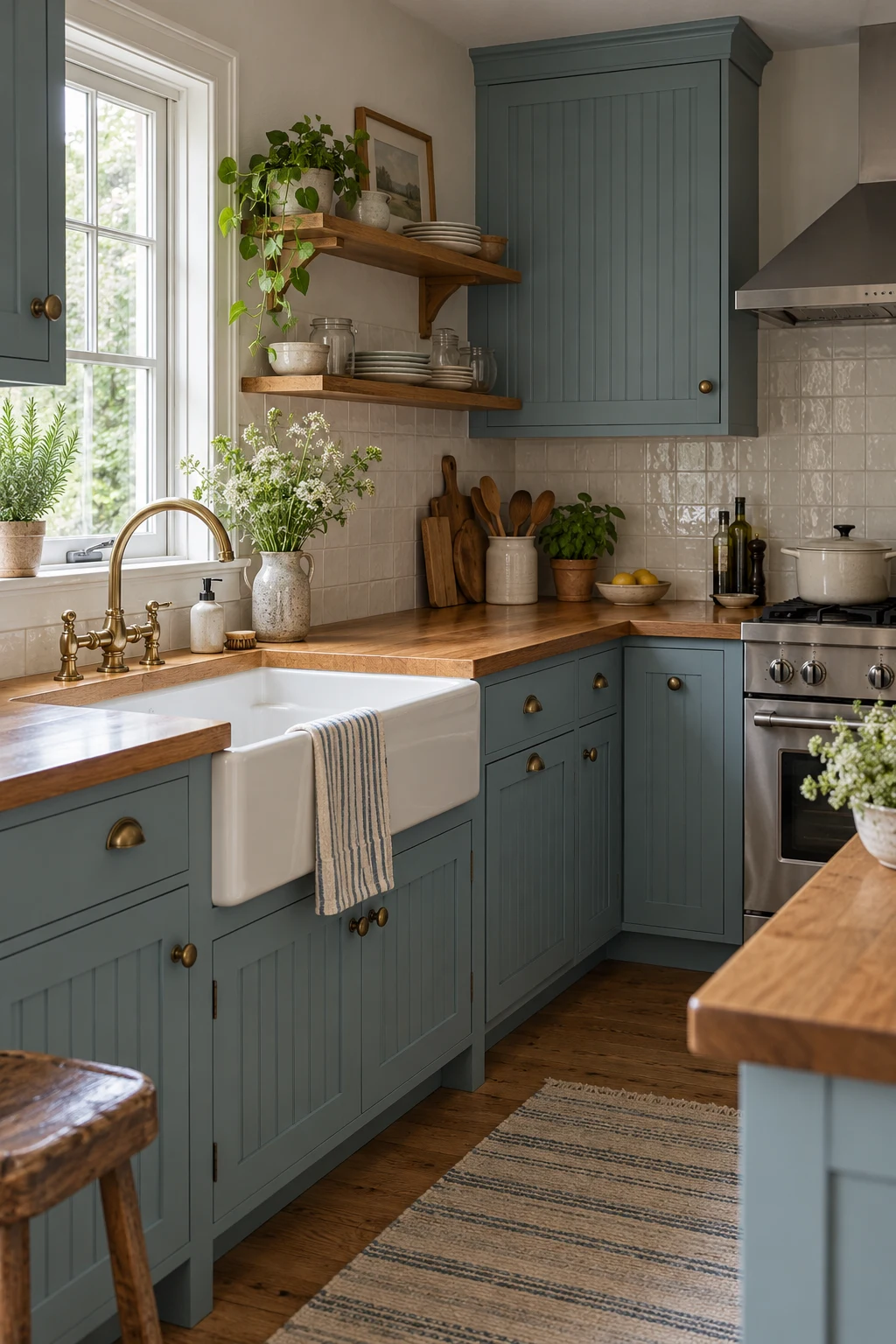
Duck-egg blue feels soft beside cream tile and warm timber. It suits cottage kitchens where perfectly white paint can make older floors and trim look unexpectedly yellow.
Beadboard doors add texture, but use them selectively; too many narrow grooves collect grease near a range. Plain Shaker drawer fronts below the cooktop are faster to clean and still suit the relaxed style.
Seal butcher block around the sink on every exposed edge, including cutouts. Keep a trivet beside the range and re-oil the worktop on the schedule recommended for the finish rather than waiting for dry patches.
7. Turn a Midnight-Blue Pantry Wall Into an Anchor
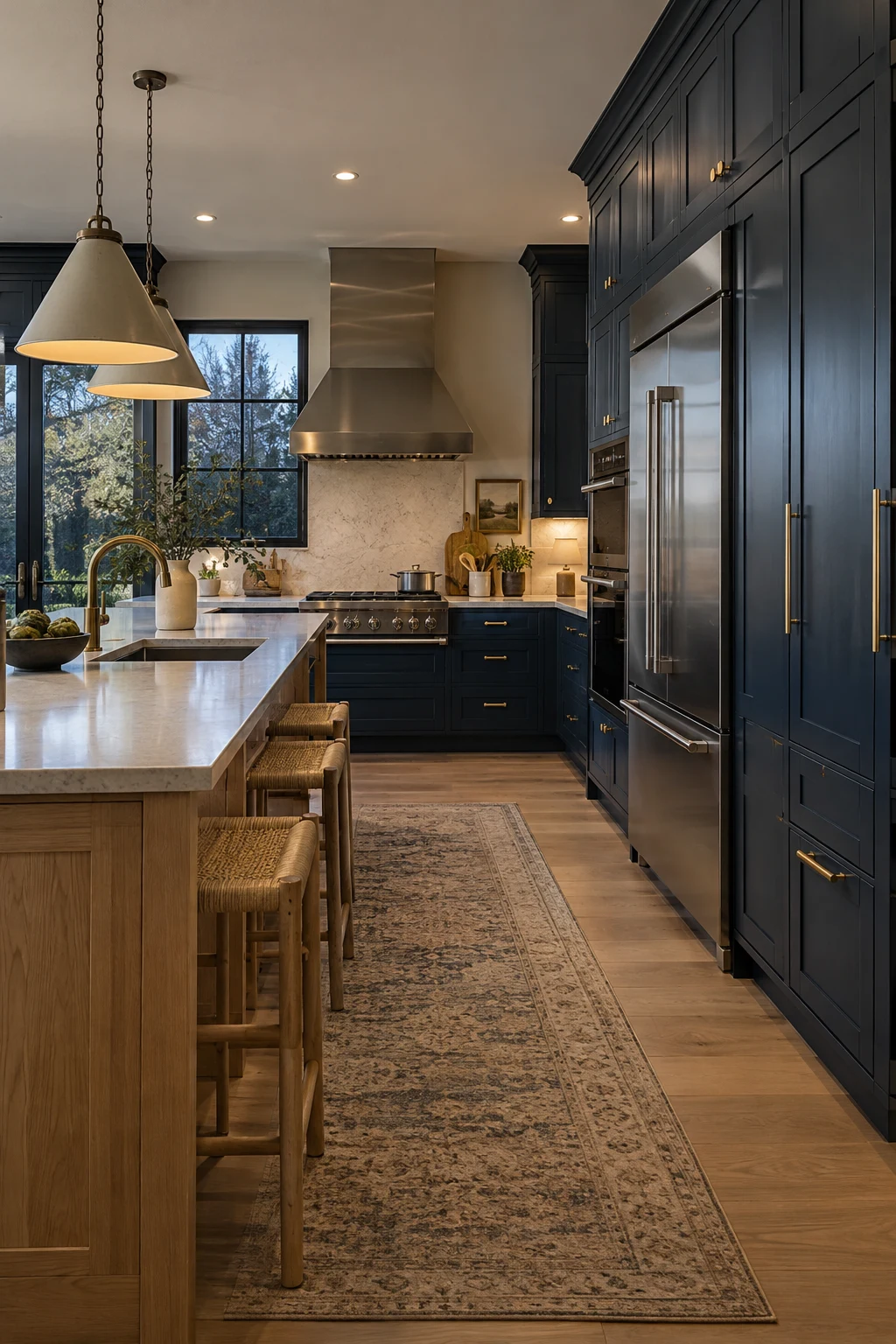
A midnight-blue pantry wall makes tall storage read as one architectural volume. It is especially effective in an open plan because the refrigerator, ovens, and pantry doors stop looking like unrelated vertical boxes.
Keep at least one neighboring surface light—an oak island, pale floor, or generous window wall. Use vertical fillers where tall doors meet the wall so handles clear trim and doors can open fully.
Dark floor-to-ceiling paint shows dust along the toe kick. Choose a durable satin finish, add a removable plinth if possible, and plan outlets inside appliance-storage cabinets before installation.
8. Wake Up a Galley With Cerulean Blue
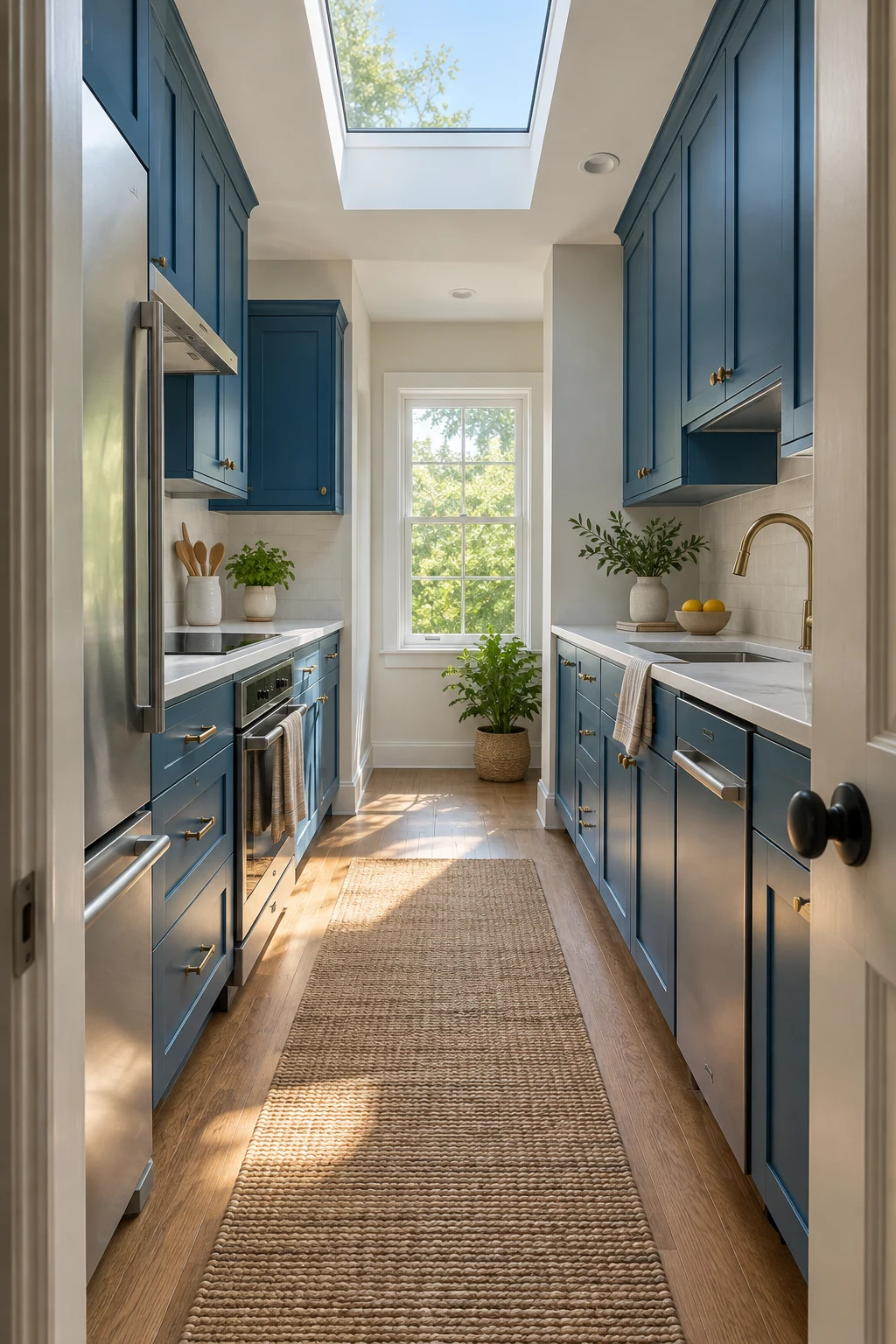
Cerulean works when a galley receives strong overhead or end-window light. Its clarity brings life to a narrow footprint, while pale counters keep the two long cabinet runs from closing in.
Protect a central aisle of at least 40 inches in a one-cook kitchen and avoid deep decorative handles that catch clothing. Put the refrigerator near the entrance so someone grabbing a drink does not cross the cooking zone.
If the room lacks a skylight, sample cerulean under your installed bulbs before committing. High color-rendering lamps help the shade stay blue instead of shifting dull green at night.
9. Soften Brass With Dusty Periwinkle
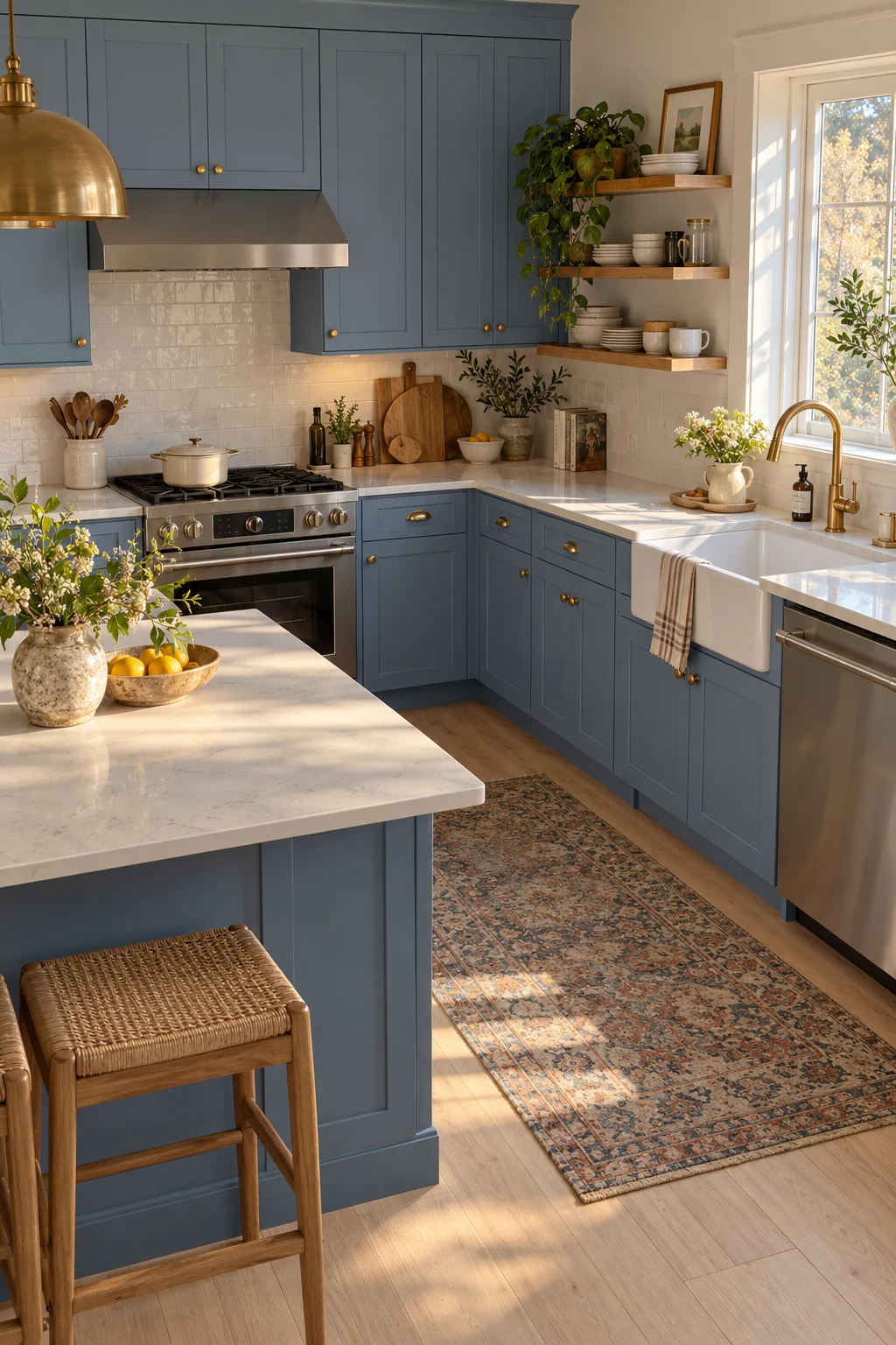
Dusty periwinkle brings a nuanced hint of violet. Choose a grayed version beside the countertop sample; cool white stone can exaggerate purple, while creamy quartz settles it.
Warm brass gives the shade definition, but keep the metal consistent on doors and drawers. A nickel faucet is still workable when it relates to stainless appliances rather than appearing as a random third finish.
This medium-light color is useful in north-facing kitchens because it remains visible without becoming heavy. Test it on both a sunny wall and the darkest base cabinet before approving the formula.
10. Build Character With French-Blue Beadboard
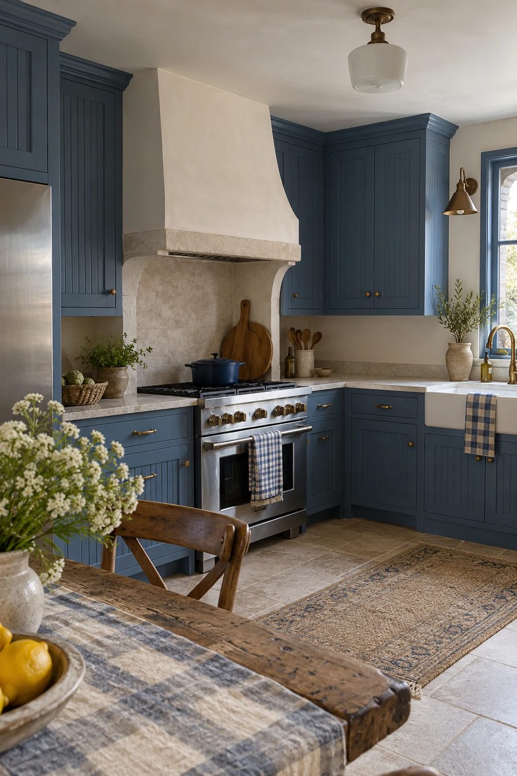
French blue sits between gray-blue and denim, giving traditional millwork depth without the formality of navy. It pairs beautifully with limestone tones, aged wood, and unlacquered brass.
Use beadboard on selected doors or an island end panel rather than every surface. A 3- to 4-inch board rhythm reads clearly at kitchen scale and is easier to clean than very narrow grooves.
Budget for a careful sprayed finish if the doors are new. On existing cabinets, clean each groove, sand lightly, and apply thin coats so paint does not pool along the bead edges.
Place Blue Where It Improves the Layout
Blue can organize a kitchen as well as decorate it. Use color to define working zones, reduce the apparent mass of storage, or make one functional feature easier to understand.
11. Balance Blue Base Cabinets With Oak Uppers
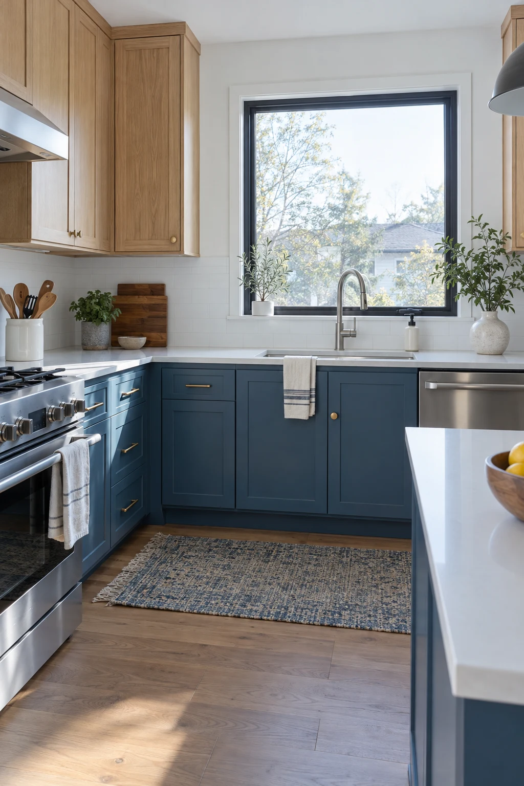
Blue base cabinets hide everyday scuffs better than pale wood, while oak uppers bring warmth near eye level. This is a practical two-material scheme for busy kitchens that still need to feel light.
Align door widths and horizontal rails across both finishes so the switch looks intentional. Repeat oak at the floor or on one shelf, then let the countertop form a simple visual break.
Specify the same interior hardware and hinge quality for both cabinet types. Different exterior finishes should not produce different door behavior or inconsistent gaps after installation.
12. Separate Tall Storage With a Navy Cabinet Bank
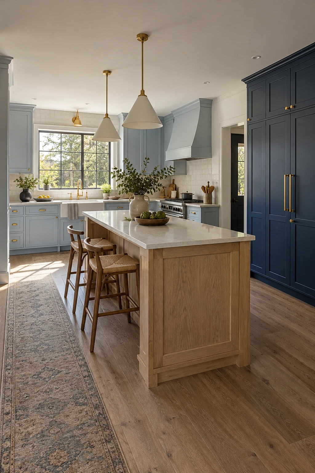
Use navy on full-height storage and a paler blue around windows or worktops. The vertical contrast defines the heavy storage zone while the lighter perimeter supports detailed tasks.
Group ovens and the refrigerator inside the dark bank when ventilation and manufacturer clearances allow. A matching end panel makes the group read as built-in furniture instead of a line of appliances.
Keep handles on the tall units long enough to grasp comfortably, particularly on integrated refrigeration. Dark doors disguise slim pulls, so confirm their position with painter's tape before drilling.
13. Make a Blue Breakfast Hutch the Daily Hub
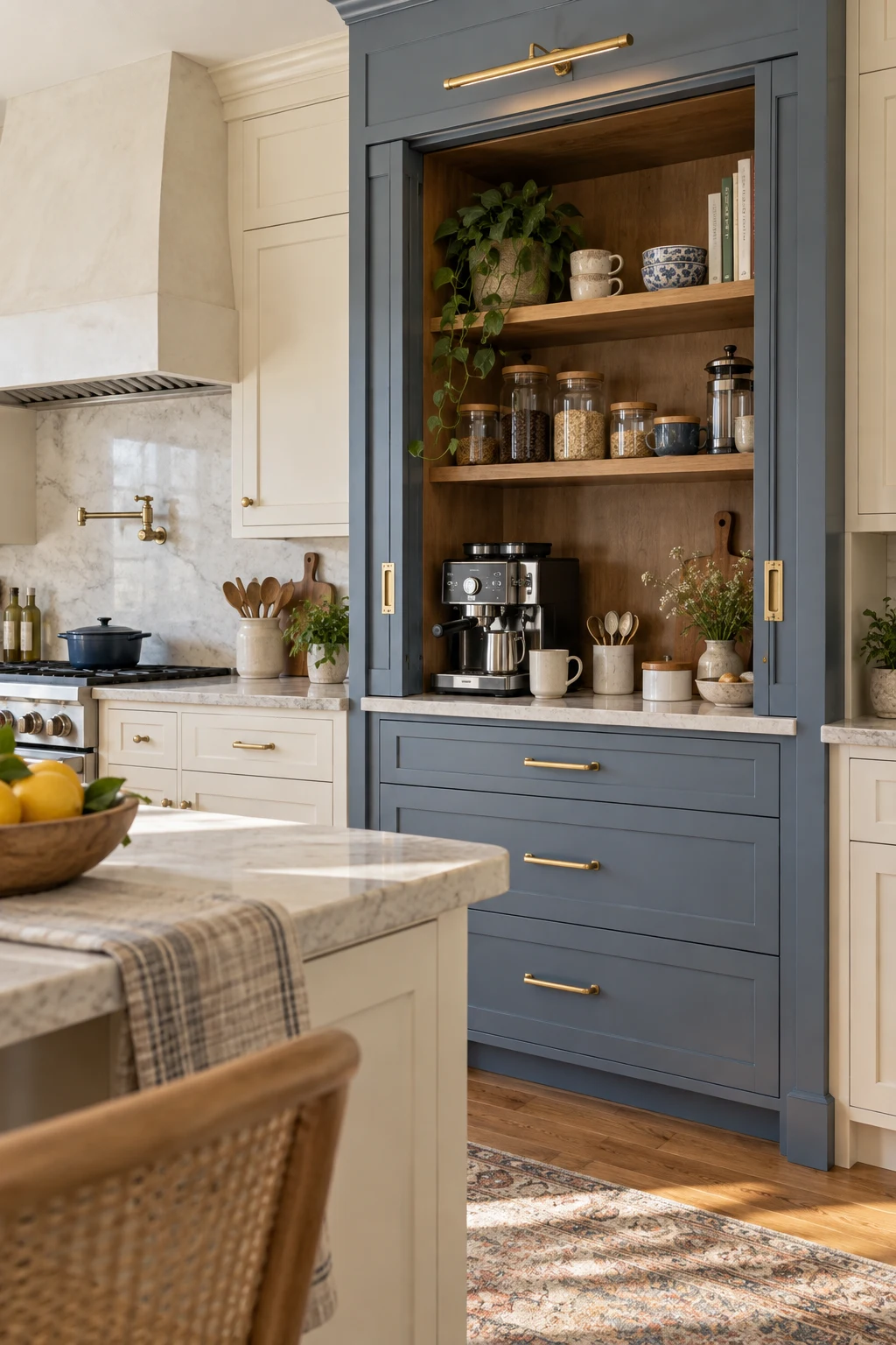
A blue breakfast hutch creates a useful destination within a neutral kitchen. Place coffee, cereal, mugs, and charging outlets together so morning traffic stays away from the main prep counter.
Plan at least 18 inches of clear counter below the appliance, then confirm pocket or bifold doors remain outside the work surface when open. Heat-producing appliances need the clearances specified by their manufacturers.
Use a wipeable backsplash inside the hutch and drawers below for heavy supplies. Blue interiors disguise minor coffee splashes better than white, but removable shelf liners make deeper cleaning faster.
14. Let a Blue Island Support a Quartz Waterfall
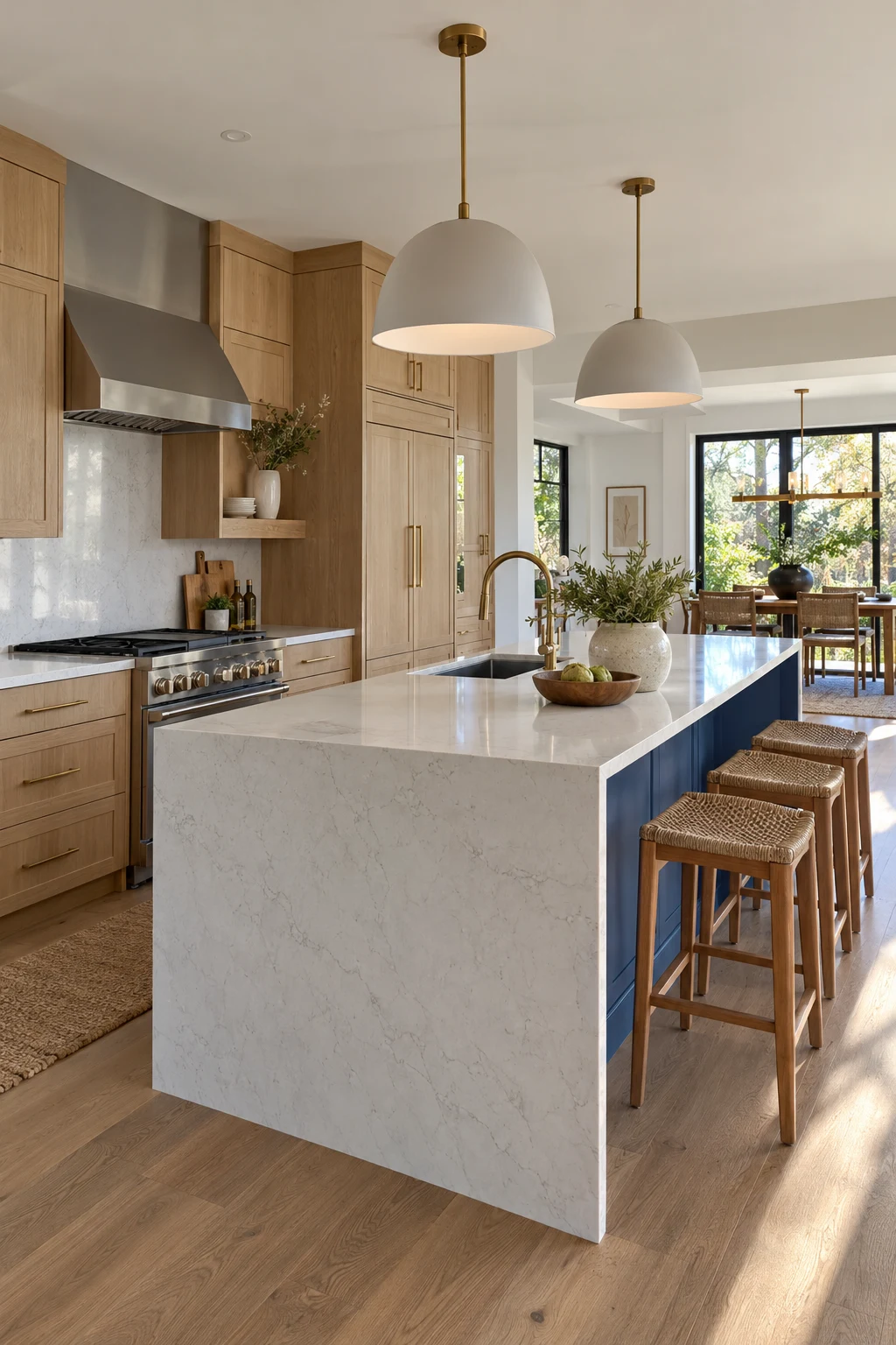
A saturated blue island keeps a pale quartz waterfall from feeling clinical. The color behind the stone also gives the island presence when viewed from a living or dining area.
Confirm slab thickness, edge build-up, and floor level before fabrication. The stone end should meet the floor cleanly without blocking toe space on the working side or crowding an end outlet.
Waterfall stone increases material and labor costs, so concentrate it on the most visible end. A standard painted panel on the hidden end can preserve the effect while reducing waste.
15. Use a Blue Peninsula in a Compact U-Shape
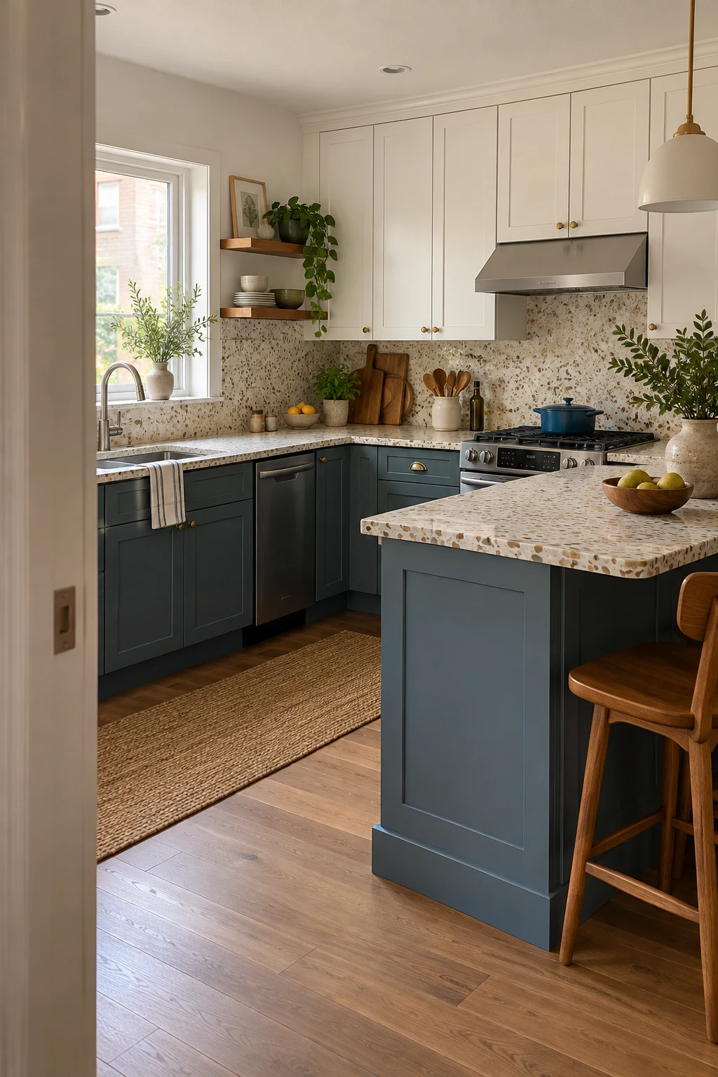
A muted-blue peninsula can define the kitchen without the clearance demands of a freestanding island. It adds two seats, extra drawers, and a visual boundary within a small open room.
Allow roughly 24 inches of width per stool and a 12- to 15-inch overhang for adult knees. Keep the dishwasher and main drawers away from the seating corner so open doors do not trap anyone.
For more footprint-first planning, these small apartment kitchen ideas offer additional ways to add function without overfilling the room.
Mark the peninsula and stool clearance on the floor, then walk every route with cabinet and appliance doors represented in their open positions.
16. Hide Small Appliances in a Blue Garage Wall
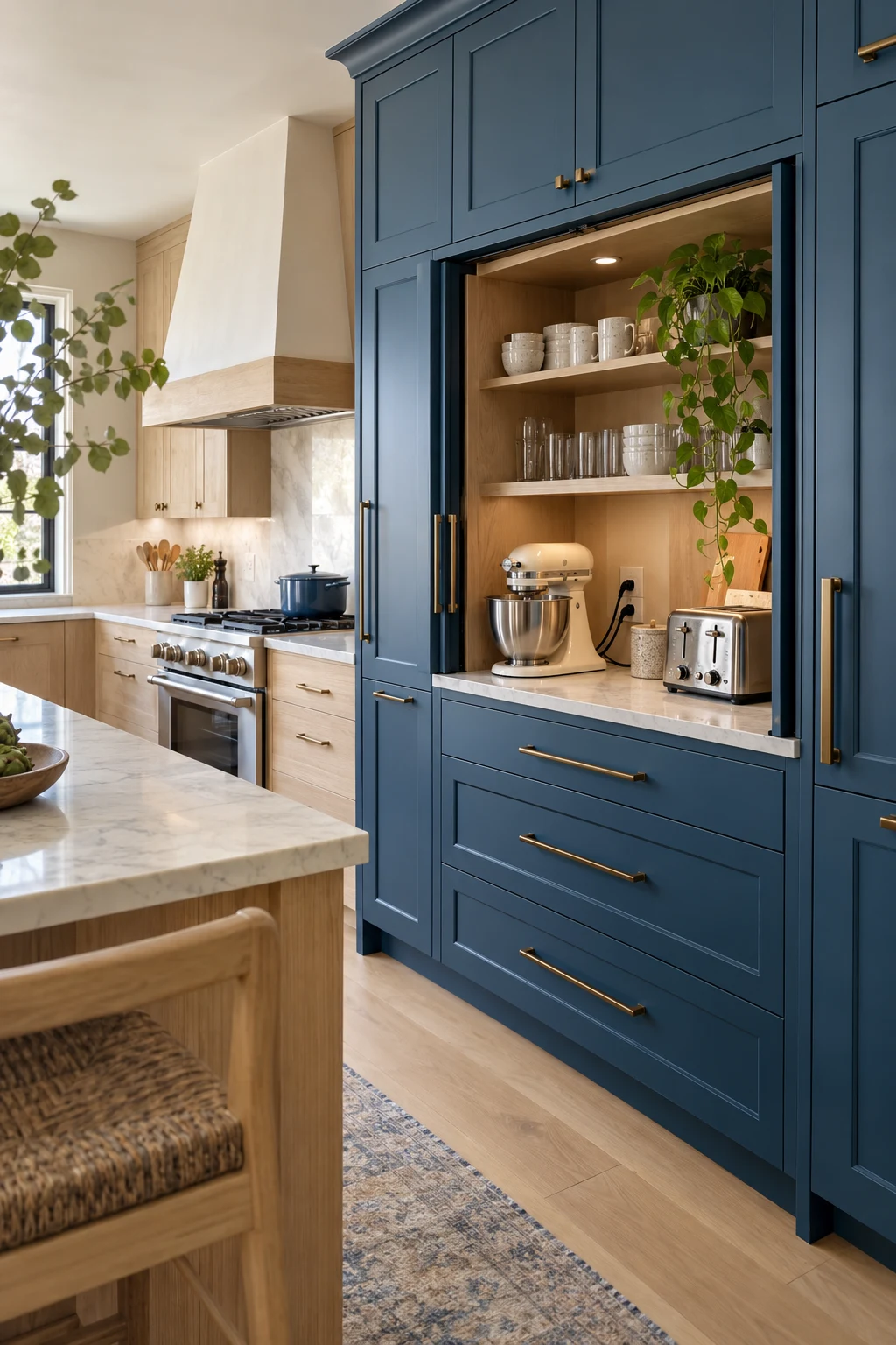
A blue appliance wall can hold visual interest while the working counter stays clear. Pocket doors are ideal because they disappear beside the cavity rather than occupying prep space.
Measure the tallest appliance with its lid fully open and the coffee maker with its reservoir removed. Add outlets at usable heights and follow ventilation guidance before operating anything inside a closed cabinet.
Store attachments in the drawer directly below each machine. That simple zoning matters more than decorative baskets and keeps a deep garage from becoming a place where small parts disappear.
17. Paint Only the Pantry Interior Blue
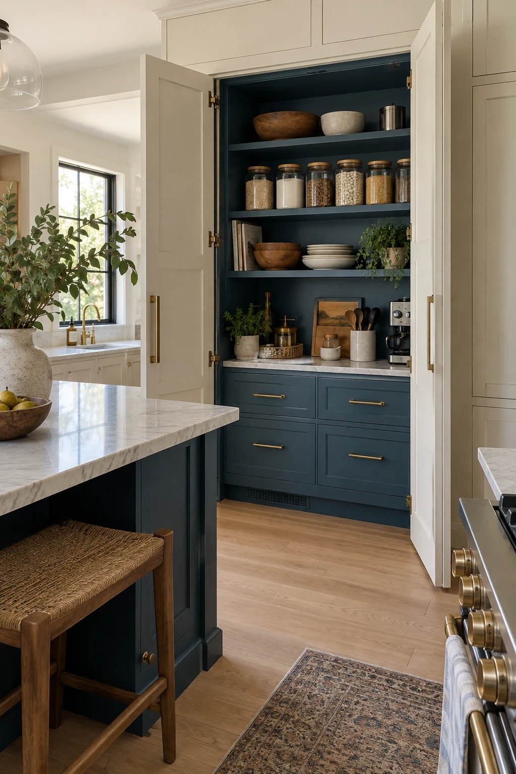
A hidden blue pantry gives you a bold moment without committing every kitchen door to color. It works particularly well behind cream or wood doors, where the reveal feels intentional and personal.
Use the same blue on shelves, back wall, and trim, but select a durable satin for horizontal surfaces. Leave at least 14 inches between pantry shelves that must hold tall cereal boxes or small appliances.
Add LED strips at the front of the shelves so their light reaches labels instead of the back wall. A door switch prevents the concealed space from being left lit.
18. Highlight the Sink Run With Navy
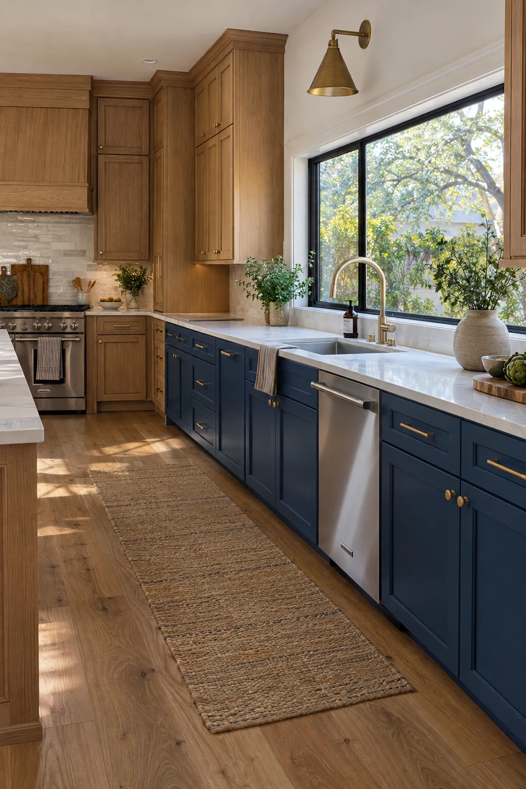
Painting only the sink run navy creates a functional color zone and gives the window wall more depth. The surrounding oak keeps the room warm and makes the blue feel architectural rather than decorative.
Center the sink on the window when plumbing permits, then place the dishwasher immediately beside it. Continuous navy toe kicks and end panels keep the isolated run from looking like replacement cabinets.
Protect the finish at the trash pullout and dishwasher edge with careful priming and full cure time. Water and steam exploit soft paint long before the rest of the doors show wear.
19. Keep a Narrow Galley Airy With Blue Lowers
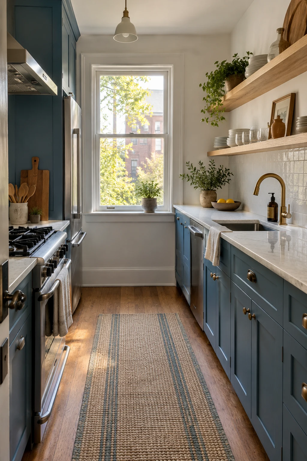
Slate-blue lowers provide color without making both walls feel tall and heavy. Replace selected uppers with shallow shelves only where you can keep everyday dishes orderly and away from cooking grease.
A 40- to 42-inch aisle works for one cook, but appliance handles and open doors reduce that number. Choose counter-depth refrigeration and verify the oven door does not block the only exit.
Use one long runner rather than several small mats. It creates a cleaner sightline and reduces trip edges in a room where traffic already follows a narrow path.
20. Layer Two Blues Instead of Blue and White
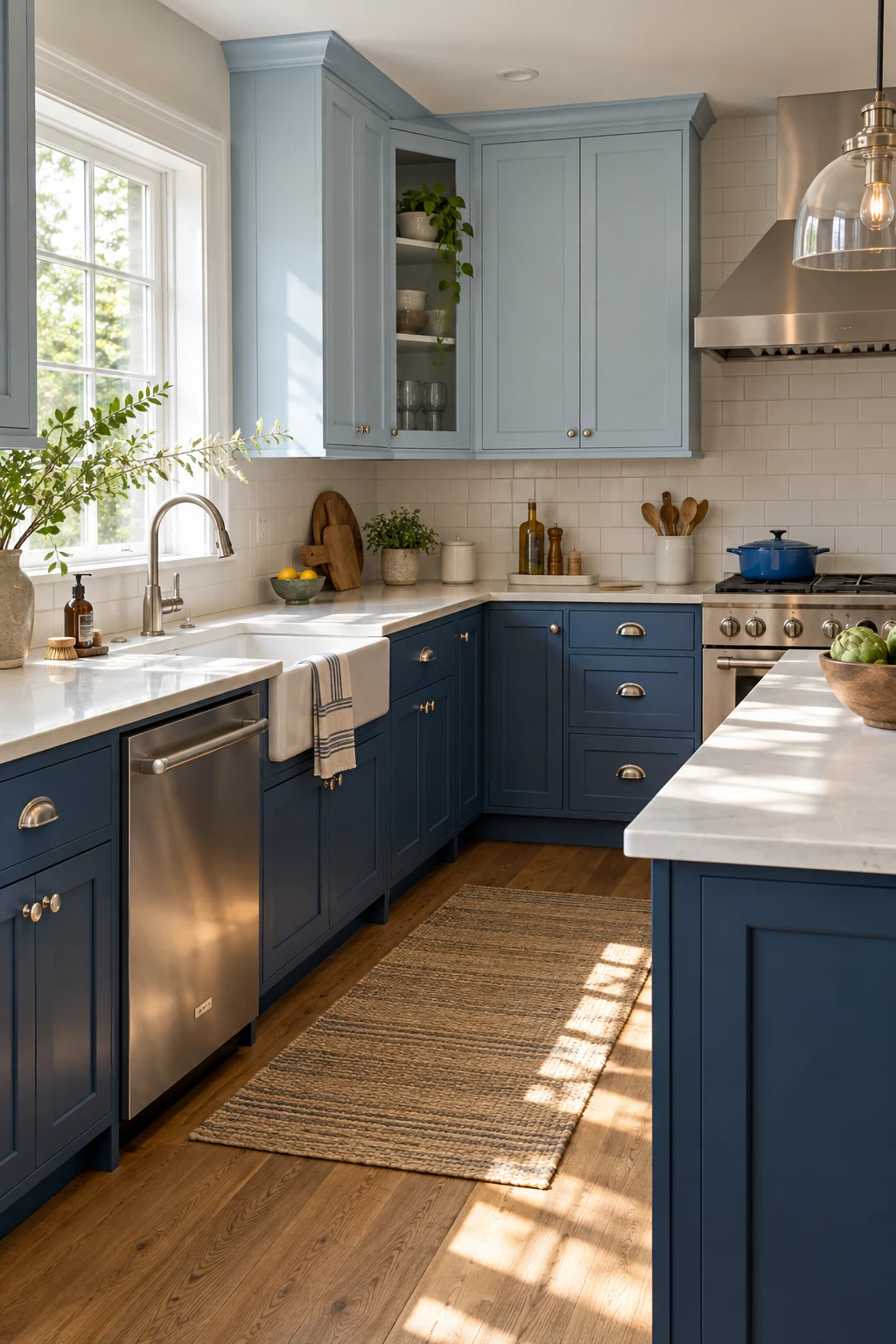
A tonal scheme feels softer than the usual blue-and-white split. Pair a pale sky blue above with a deeper ocean blue below, keeping both shades equally muted or equally clear.
Compare undertones on a single board; a green-leaning lower blue can make a violet-leaning upper look accidental. Warm-white counters and one hardware finish give the eye a consistent bridge.
Use the darker shade where hands and shoes create the most wear. Pale uppers stay farther from splashes, while their lighter value helps reflect task lighting across the counter.
Pair Blue Cabinets With the Right Surfaces
Countertops, backsplashes, and floors decide whether blue feels crisp, earthy, glamorous, or relaxed. Test the actual materials together and keep at least one surface visually quiet.
21. Brighten Navy With Calacatta-Look Quartz
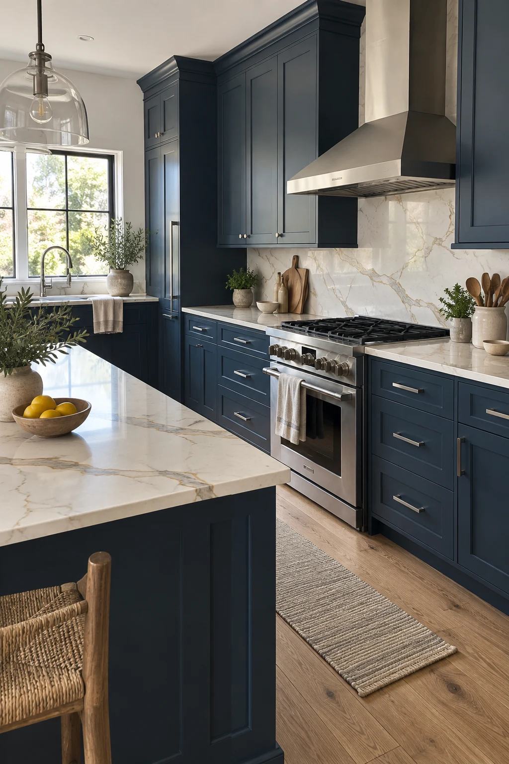
Creamy Calacatta-look quartz lifts navy without the starkness of pure white. Choose broad, restrained veining so the counter supports the cabinetry rather than creating a busy second focal point.
Run the same slab 18 inches up the backsplash for continuity, or to the hood for a stronger statement. Ask the fabricator to plan seam locations away from the sink corners and main sightline.
Quartz is low maintenance, but dark cabinet edges still collect crumbs and pale dust. A soft brush attachment around recessed panels prevents buildup without polishing the paint unevenly.
22. Set Pale Blue Against Honed Limestone
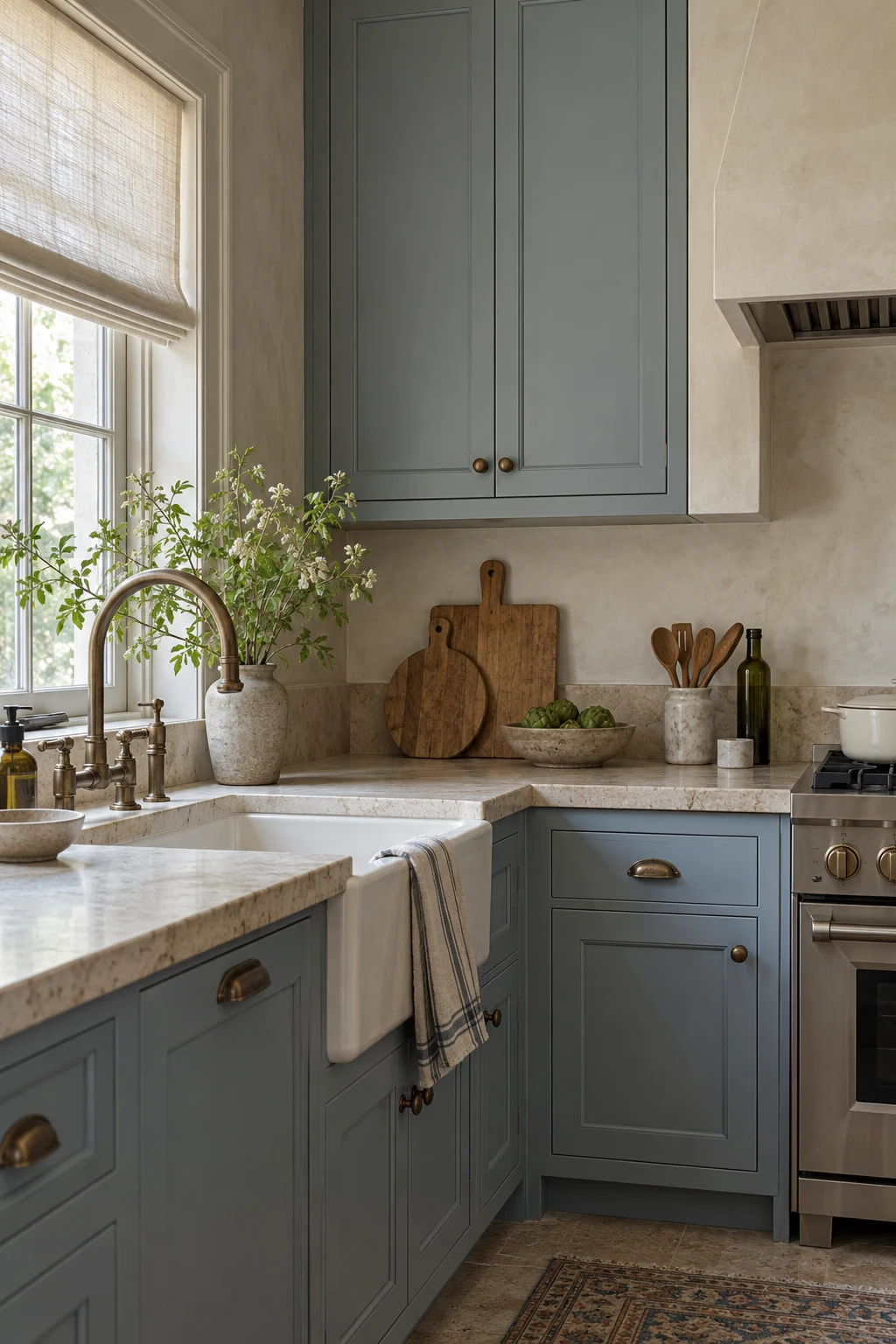
Pale blue and beige limestone create a quiet, chalky palette suited to traditional or transitional rooms. A honed finish keeps the stone soft and prevents glossy glare from overpowering the cabinetry.
Natural limestone can etch and stain, so use it if patina fits your expectations. For easier upkeep, compare porcelain or quartz alternatives beside a real stone sample; printed replicas vary widely in warmth.
Seal natural stone as recommended and wipe acidic spills promptly. Around the sink, a short matching upstand protects the wall while preserving the simple material story.
23. Give Blue-Green Cabinets Warm Concrete Counters
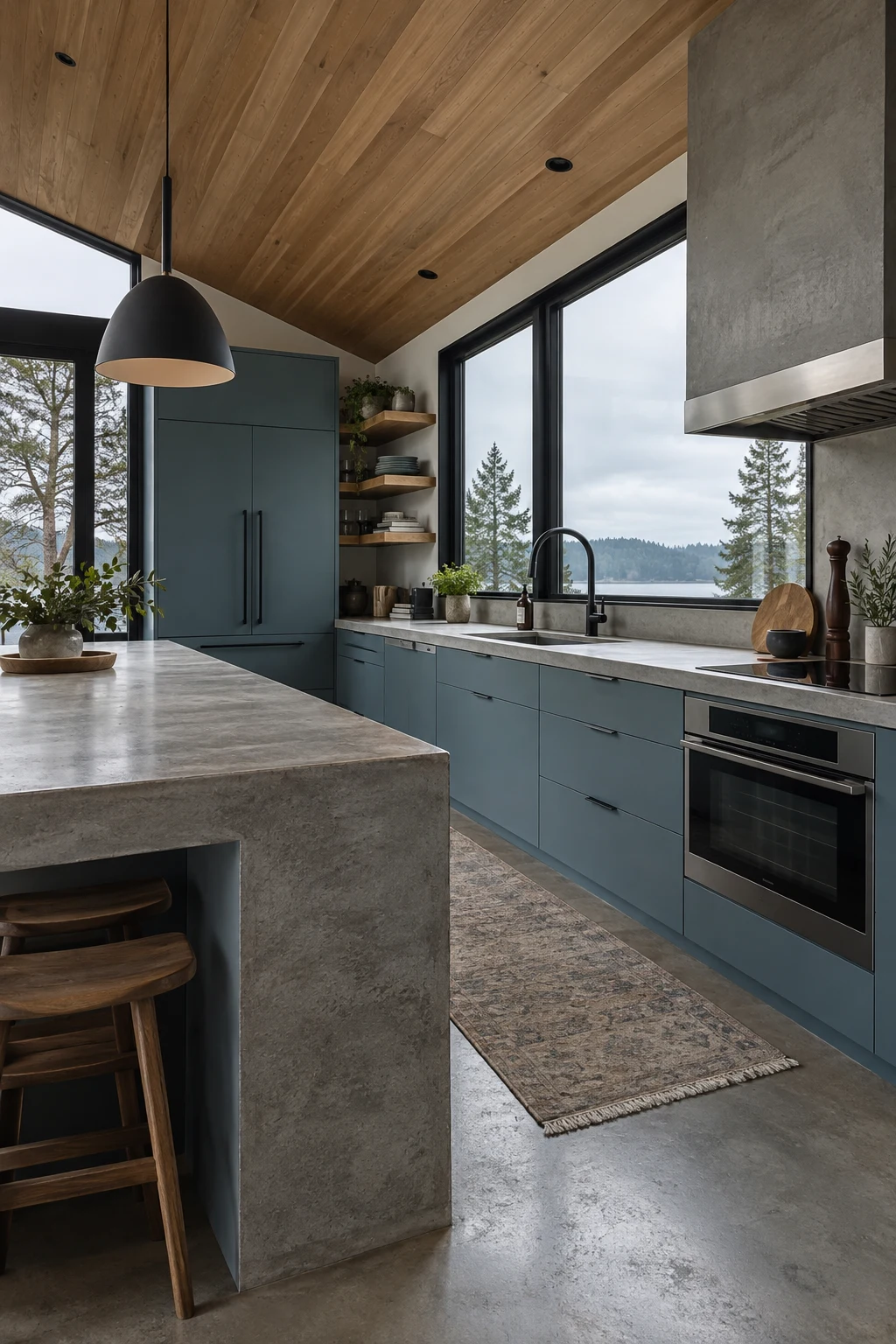
Warm-gray concrete settles blue-green cabinetry and suits modern architecture. Avoid a cold cement gray; a taupe or sand undertone makes the blue feel inviting beside wood and black-framed windows.
Concrete is heavy, so confirm cabinet support and slab thickness with the fabricator. Precast sections can improve quality control, while a concrete-look porcelain or quartz surface reduces weight and maintenance.
Use an eased edge rather than a bulky waterfall everywhere. One substantial island end is enough to express the material without making every counter feel massive.
24. Warm Royal Blue With Walnut Butcher Block
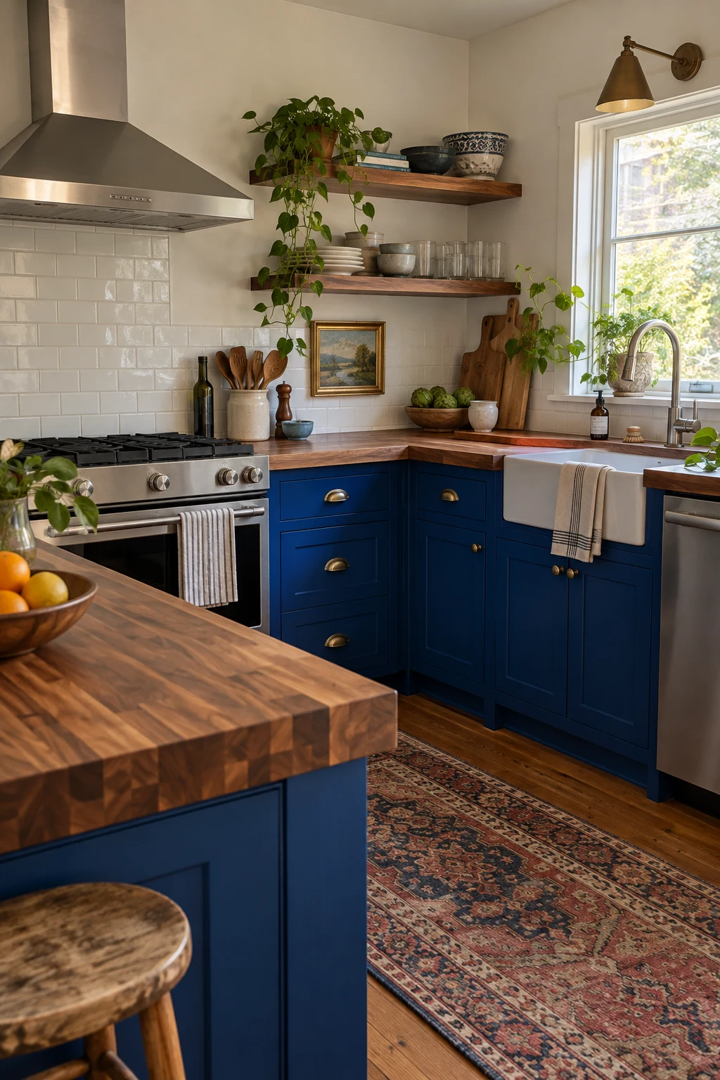
Walnut gives royal blue the depth it needs to feel grown-up. The wood's darker grain can support a vivid cabinet color better than pale maple, particularly in a small eclectic kitchen.
Keep the backsplash simple and the upper walls light. Because both blue and walnut are expressive, patterned tile or multiple metals can quickly make the room feel crowded.
Use cutting boards for food prep and keep standing water away from seams. If maintenance feels unrealistic, choose a walnut-look laminate for secondary counters and reserve real wood for an island section.
25. Add Movement With Dusty Blue and Terrazzo
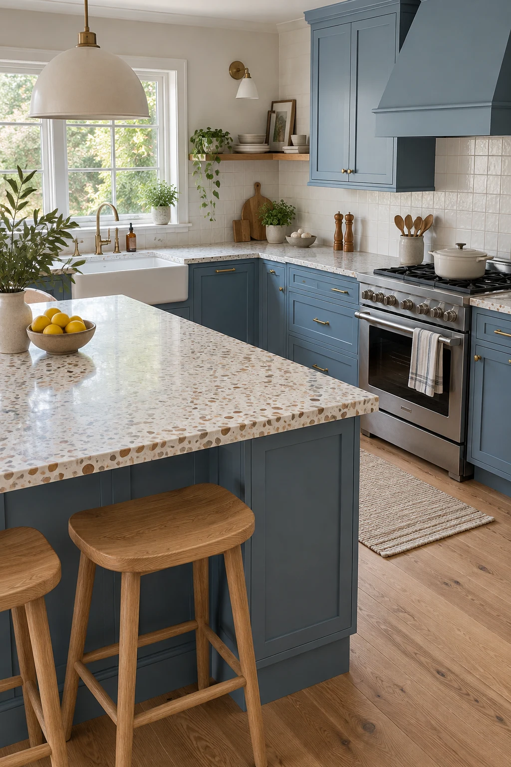
Dusty blue gives terrazzo a calm base, allowing small cream and rust chips to provide movement. Choose a fine aggregate for a compact kitchen; oversized fragments can distort scale across short counter runs.
Pull one warm chip color into oak stools or a runner, not into every accessory. White walls and straightforward cabinet fronts help the playful surface stay sophisticated.
Check whether the selected terrazzo is cement, resin, porcelain, or quartz because care requirements differ. Always review a full slab or large tile; a tiny sample cannot show the overall distribution.
26. Reflect Light With Navy and Zellige Tile
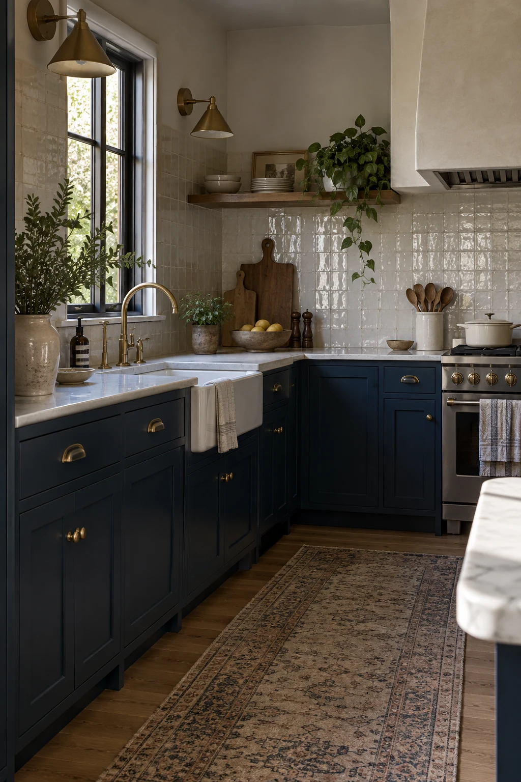
Warm-white zellige tile reflects small flashes of light across navy cabinets, keeping a dark palette lively. Select a batch with controlled color variation if you want texture without a patchwork effect.
Use narrow grout joints only when the tile maker recommends them; irregular edges still need room for a skilled installer to maintain a believable field. Carry tile behind the hood for easier grease cleanup.
Glossy tile shows splatter, but its uneven surface can be slower to wipe than flat ceramic. Keep a soft cloth nearby and avoid abrasive pads that dull the glaze.
27. Stretch the Wall With Vertical White Tile
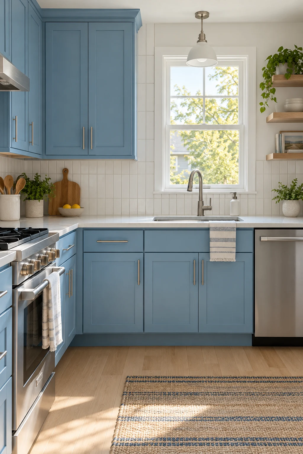
Vertical stacked tile makes the backsplash feel taller and gives sky-blue cabinets a crisp modern partner. A slim rectangular tile works best when grout lines are straight enough to support the graphic pattern.
Run the tile to the underside of the uppers and align cuts at windows before installation begins. Matching grout reduces visual noise and lets the cabinet color remain the focus.
With limited daylight, choose a softly reflective glaze rather than a mirror-bright finish. Borrow light-placement ideas from these kitchen window ideas when planning the surrounding wall.
28. Make Indigo Dramatic With Aged Brass
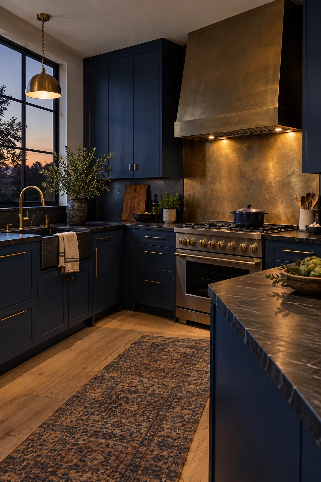
Aged brass behind the range brings warmth to indigo and creates a controlled focal point. Choose a living finish only if gradual darkening and fingerprints fit the intended character.
Limit the metal sheet to the protected cooking zone, with code-compliant clearances and a properly sized hood. Dark stone counters help the transition feel deliberate without adding another bright line.
Ask how the panel should be cleaned before installation; strong acids and abrasive powders can permanently mark brass. A sealed brass-look laminate or tile offers a steadier appearance on a tighter budget.
29. Let Blue Cabinets Calm Exposed Brick
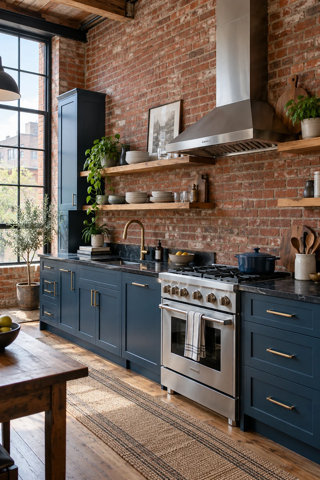
Steel blue cools the orange and red variation in exposed brick without fighting it. A gray undertone is important; a clear royal blue can make the contrast feel more commercial than residential.
Keep counters dark and simple, then use one oak shelf to connect with the brick's warmth. Confirm that old masonry is sound, clean, and suitably sealed before treating it as a backsplash.
Brick behind a range is porous and difficult to degrease. Install a clear, heat-appropriate protective panel in the cooking zone or reserve exposed brick for the sink and display walls.
30. Add Vintage Rhythm With a Checkerboard Floor
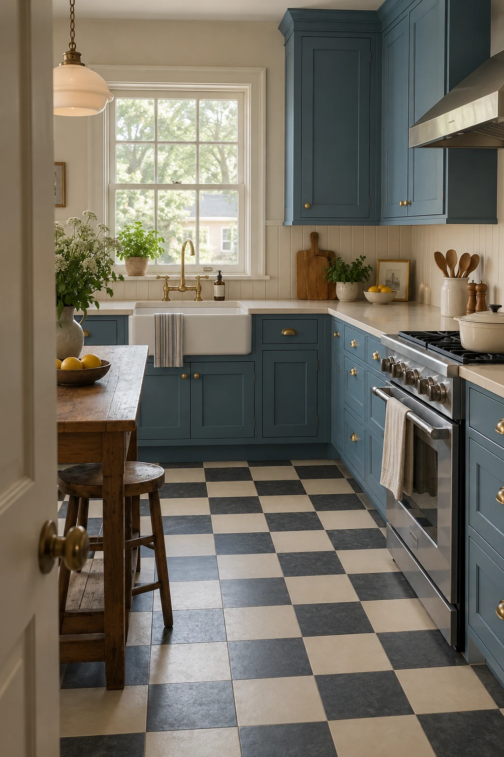
A small-scale cream-and-charcoal checkerboard floor gives medium-blue cabinets a vintage foundation. The softer colors feel easier to live with than stark black and white, especially across a large open floor.
Dry-lay several rows to center the pattern on the main aisle and avoid tiny cuts at visible edges. Square placement feels calm; a diagonal layout creates more movement and additional perimeter cuts.
Use slip-resistant tile appropriate for kitchens and choose grout close to the darker square. That combination reduces the appearance of traffic soil while keeping the pattern readable.
Match Blue Cabinets to Your Design Style
Door profile, hardware, lighting, and architectural detail can move the same color from minimalist to farmhouse. Let the cabinet construction lead the style rather than relying on themed accessories.
31. Go Minimal With Matte Navy Slab Doors
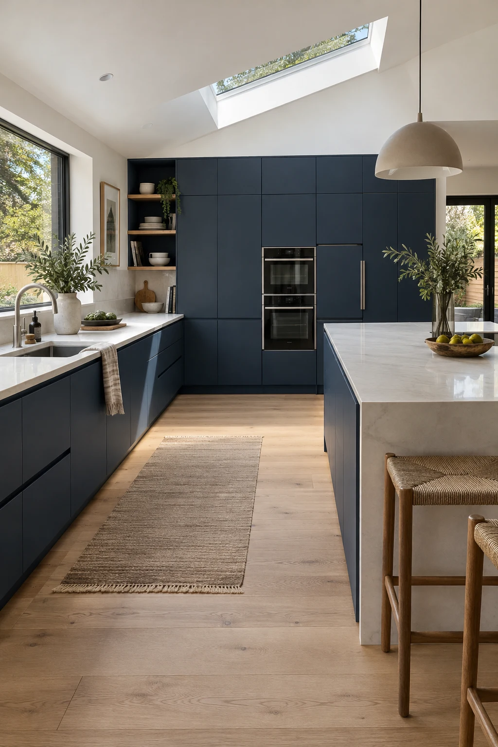
Matte navy slab doors create a clean architectural backdrop, particularly when tall storage and appliances align in one plane. Pale oak flooring prevents the large dark surfaces from feeling severe.
Concealed edge pulls preserve the flat profile, but test grip depth before ordering. People with limited hand strength may prefer a slim bar pull that is easier to grasp and just as streamlined.
Ask for a fingerprint-resistant finish and keep a manufacturer-approved cleaner nearby. Matte coatings can develop shiny patches if repeatedly scrubbed with harsh products.
32. Choose Prussian Blue for Traditional Inset Cabinets
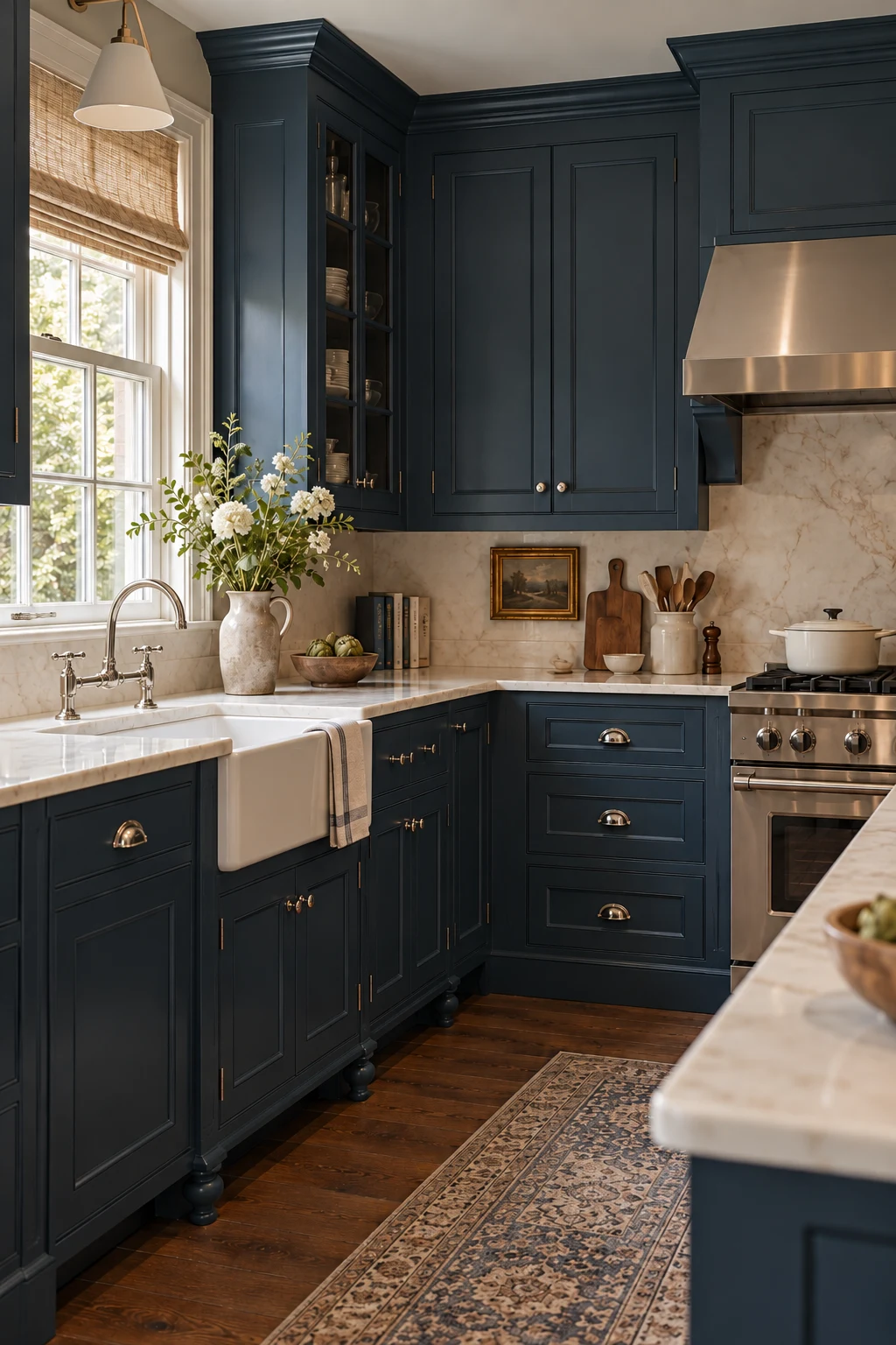
Prussian blue has the depth to support inset doors, crown molding, and furniture-style feet. Its slightly green undertone feels historic without requiring distressed paint or decorative glazing.
Keep reveals precise and repeat polished nickel on knobs, hinges, and the bridge faucet. Traditional detail looks strongest when the small alignments are controlled rather than when every surface is ornamented.
Inset doors can swell in humid rooms, so confirm appropriate clearances and a stable finish system. Wipe water from the sink base promptly and check caulk where stone meets the backsplash.
33. Keep Coastal Blue Natural, Not Themed
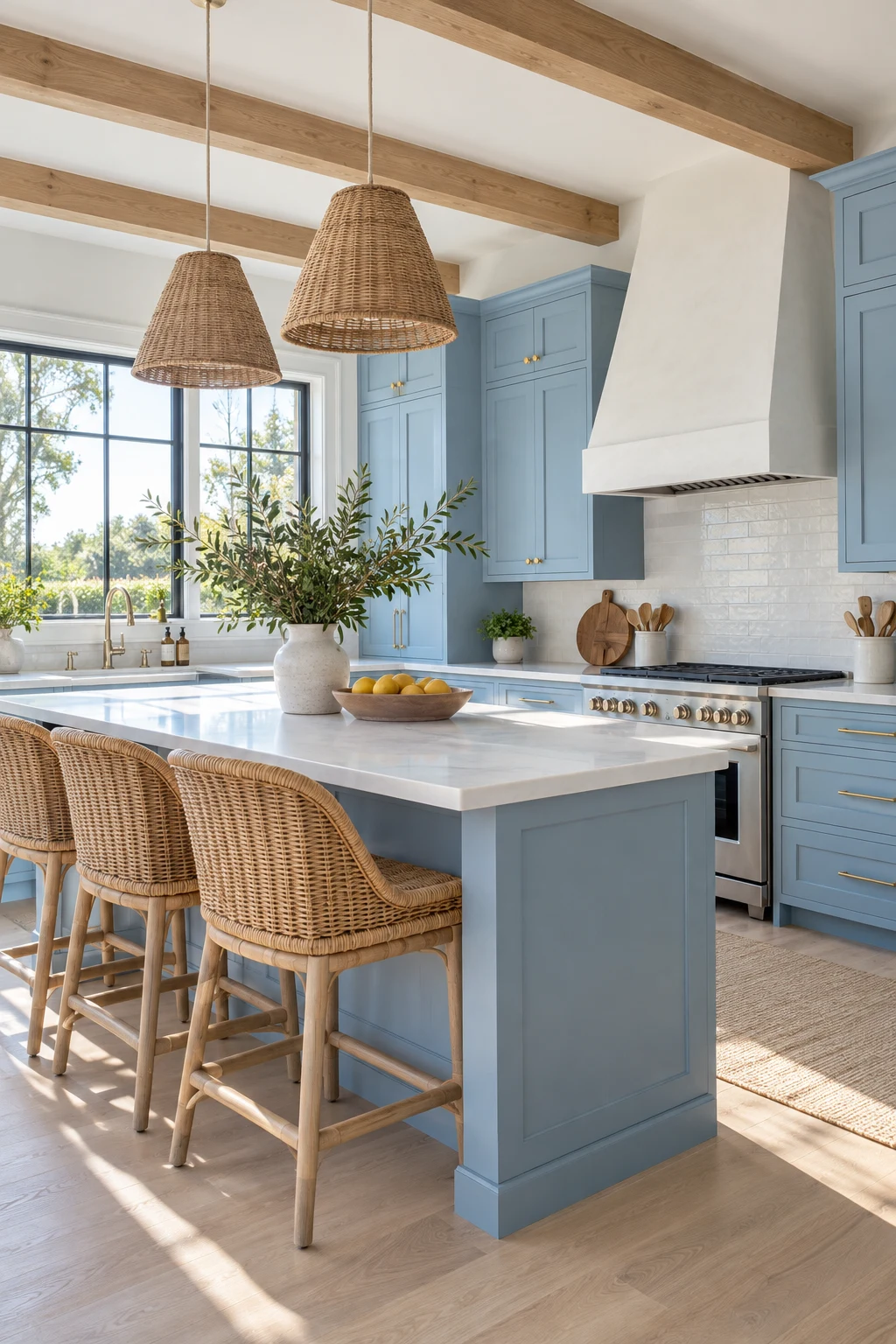
Sky-blue cabinets, rattan stools, and pale oak can suggest the coast without shells or anchor motifs. The result feels fresher and works even when the home is nowhere near the water.
Use woven texture at seating height and keep cabinet fronts simple. A warm white counter links the natural materials while stainless or nickel hardware prevents the room from becoming too beige.
Rattan needs protection from direct sink splashes and harsh sun. Choose replaceable stool seats or synthetic weave if young children and frequent meals make wipeability a priority.
34. Try Pale Blue in a Scandinavian Kitchen
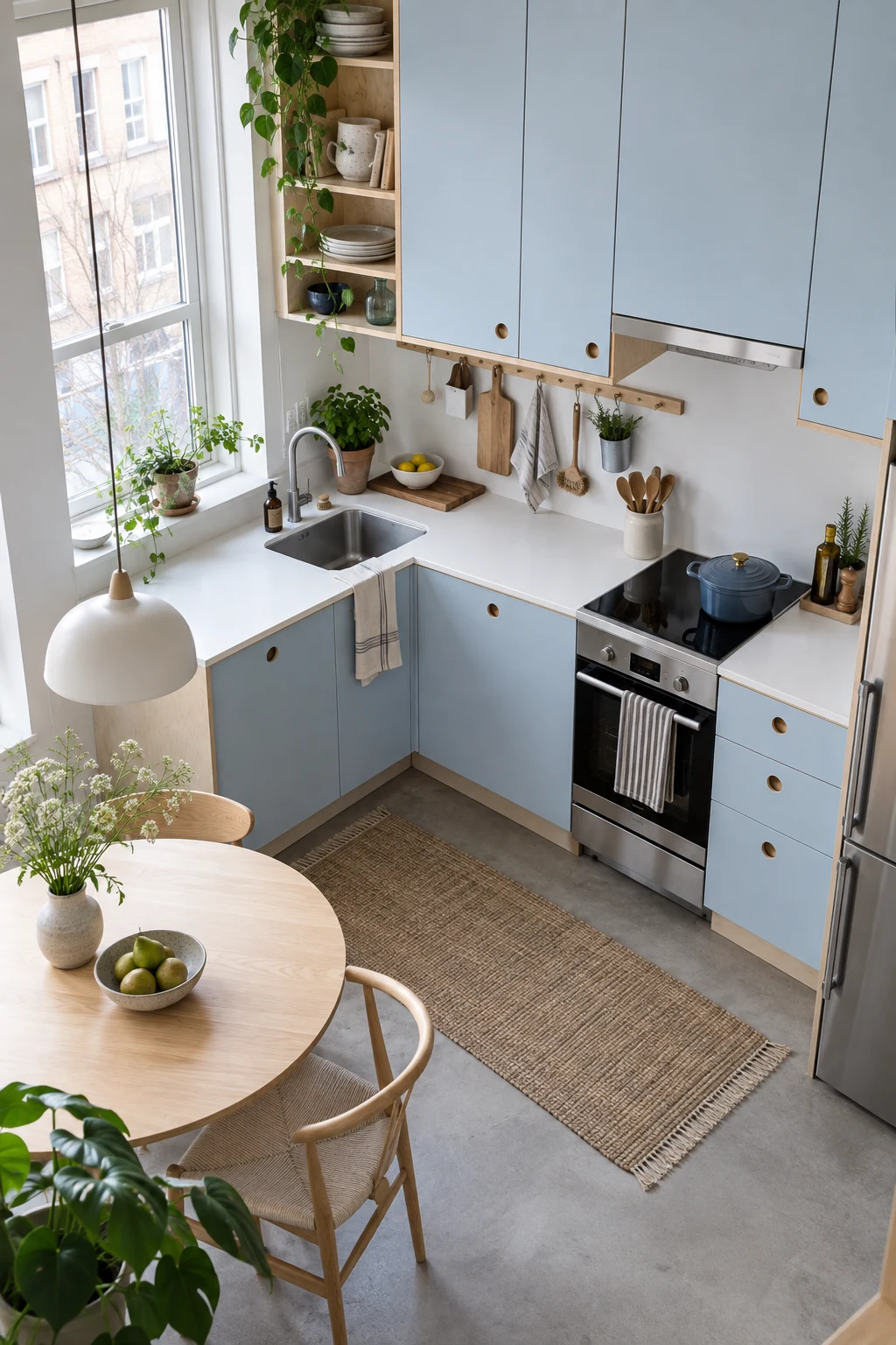
Very pale blue slab cabinets bring gentle color to a Scandinavian layout without interrupting its clean lines. Birch shelves and a white worktop keep the small room bright and functional.
Take storage to the ceiling, then reserve one open niche for daily dishes or a plant. In a compact kitchen, several small display shelves usually create more visual clutter than useful storage.
Choose flush, easy-clean pulls and a durable laminate if budget matters. Good lighting and accurate installation will make simple materials look more intentional than an expensive finish fitted poorly.
35. Modernize Farmhouse Blue With Clean Details
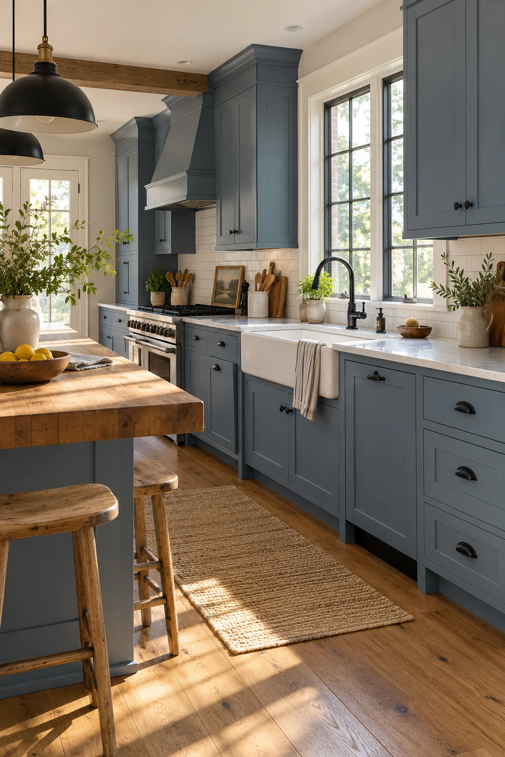
Muted barn blue gives an apron-front sink and Shaker cabinets farmhouse warmth without relying on distressed finishes. Straightforward black hardware and a plain backsplash keep the look current.
Confirm the sink base is built for the apron model's exact dimensions and weight. Retrofit installations often require door modifications and additional support, so measure before buying the sink.
Use butcher block on an island rather than directly around the sink if you want easier care. That placement preserves wood warmth while keeping the wettest counter in quartz or stone.
36. Mix Lapis Blue With Terracotta
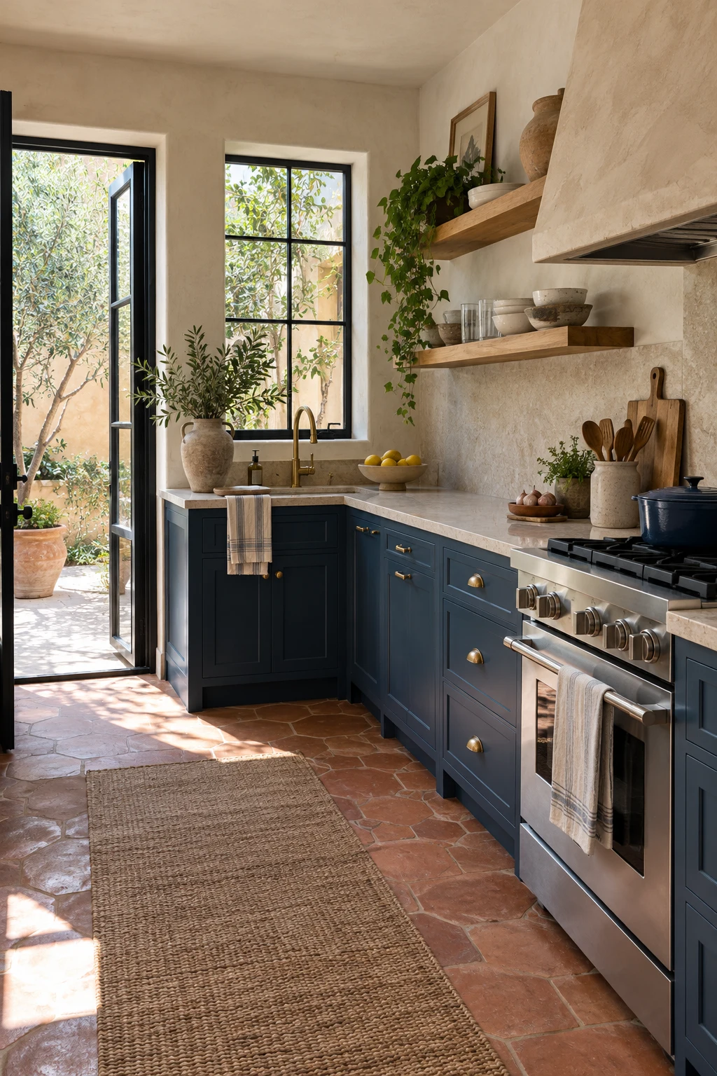
Lapis blue and terracotta create a strong warm-cool balance rooted in natural pigments. Keep upper walls plaster-toned and use oak shelves so the room has visual relief above the counter.
Terracotta varies in thickness and color, so order extra material and blend tiles from several boxes. A penetrating sealer makes kitchen cleanup easier while preserving the matte character.
Limit lapis to lower cabinetry if the room is small. Strong blue at floor level grounds the space, while light walls and tall windows carry daylight deeper into the plan.
37. Use Fluted Glass for an Art Deco Note
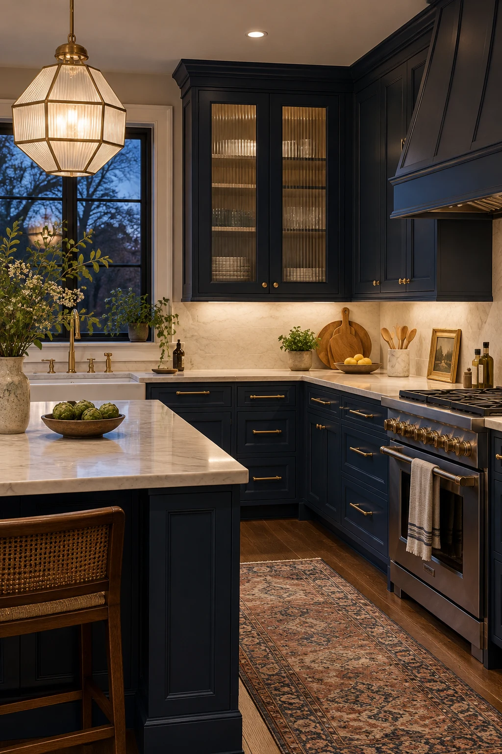
Two fluted-glass upper doors add Art Deco rhythm to navy cabinetry without turning the entire kitchen into a period set. The texture conceals imperfectly arranged glassware while still reflecting light.
Repeat brass in slender pulls and one geometric pendant, then stop. Too many gold accents compete with the vertical glass pattern and can make a hardworking room feel staged.
Specify tempered or otherwise code-appropriate glass and removable shelf pins. Clean the ribbed side with a soft brush attachment before wiping so dust does not collect in the grooves.
38. Build an English-Country Plate Rack
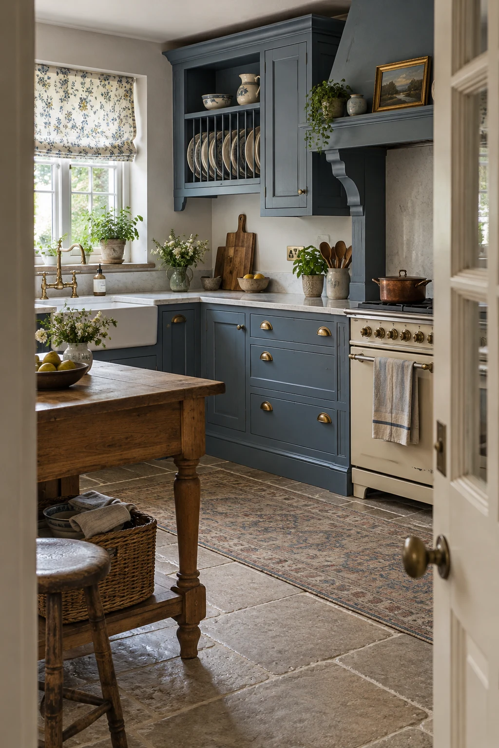
A built-in plate rack brings useful display storage to heritage-blue cabinetry. Size the slots for the plates you actually use, including their rim depth, rather than copying a decorative rack from a photo.
Place the rack near the dishwasher or dining area, not above the greasiest cooking zone. An oak worktable and cream range support the collected feeling without needing distressed cabinet paint.
Open plate storage needs regular dusting, so reserve it for frequently rotated dishes. Less-used serving pieces belong behind doors where the blue cabinetry can keep the overall wall calm.
39. Give Industrial Style a Steel-Blue Base
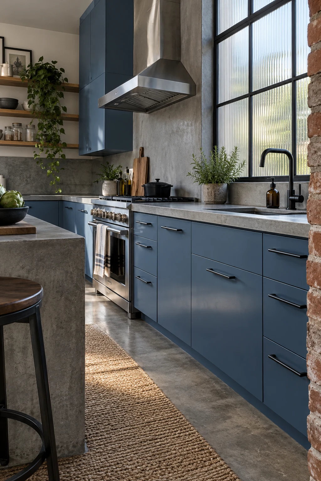
Steel blue is an easier industrial cabinet color than black because it retains depth in lower light. Pair it with black pulls, concrete-look counters, and one authentic brick or ribbed-glass element.
Keep upper storage selective so the architecture can breathe. Long uninterrupted cabinet rows plus exposed brick plus heavy metal lighting can make a modest kitchen feel visually compressed.
Choose powder-coated hardware with smooth edges and wipe concrete-look surfaces according to their actual material. Real concrete, porcelain, and laminate require different repair and cleaning methods.
40. Color-Drench Cabinets, Walls, and Trim
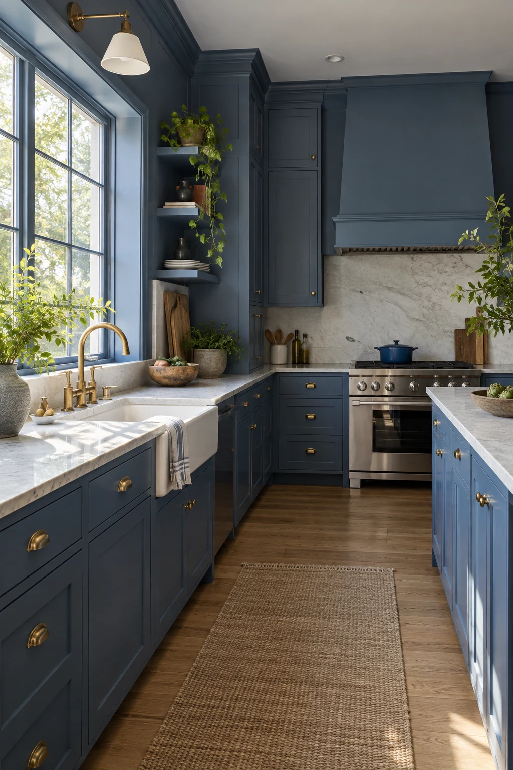
Painting cabinets, walls, and trim in one medium blue can blur awkward boundaries and make a small room feel intentional. Vary sheen rather than color: satin cabinets, eggshell walls, and semi-gloss trim.
Keep counters and floors lighter so the architecture still has definition. Sample the wall formula beside the cabinet enamel because identical color codes can look different across paint products.
This approach is harder to reverse in a rental and needs careful landlord approval. Homeowners should keep a complete finish schedule so future touch-ups match the correct sheen on each surface.
Make Blue Cabinets Practical on Any Budget
A successful blue kitchen should survive cooking, cleaning, changing light, and real household traffic. These final ideas focus on affordable updates, small rooms, rentals, and finishes that stay manageable.
41. Add a Freestanding Blue Cabinet in a Rental
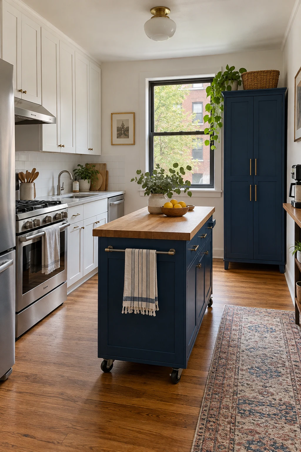
A freestanding blue pantry or movable island gives renters color and storage without altering permanent cabinets. Choose furniture that clears outlets, vents, and door swings, then anchor tall pieces with an approved anti-tip method.
Match the two movable pieces loosely rather than forcing an exact factory color. Repeating navy at different depths looks collected, while identical but mismatched blues can appear accidental.
Keep receipts, assembly instructions, and wall-repair supplies together for move-out. Never block required egress or place a rolling island where its casters can enter the cooking aisle.
42. Repaint Existing Oak Cabinets on a Budget
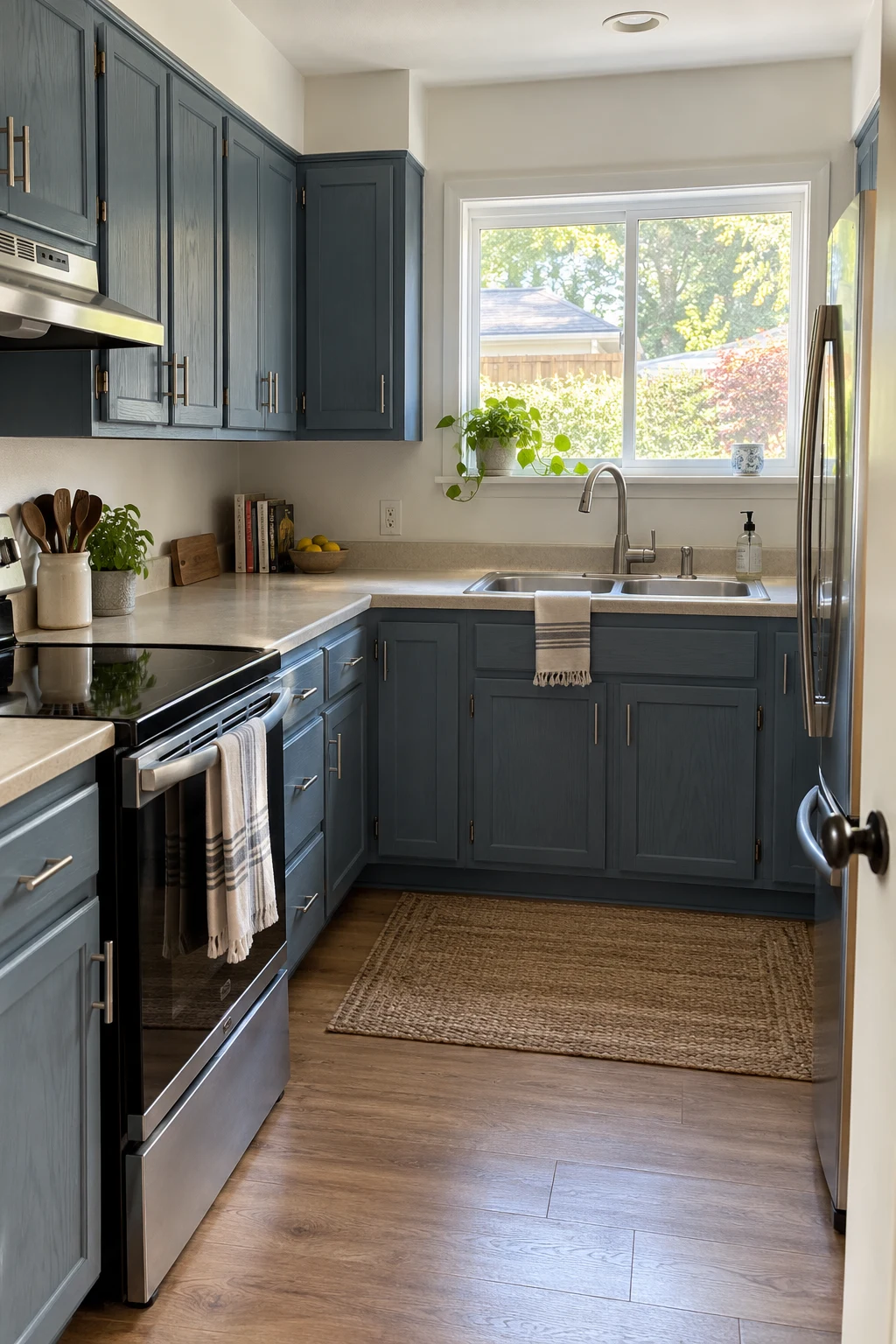
Painting sound oak cabinets can deliver a major change without replacing boxes. Clean with a degreaser, label every door, sand enough for adhesion, and use a bonding primer that suits the existing finish.
Muted blue lets some grain remain believable rather than pretending oak is perfectly smooth. Plan several curing days before rehanging doors; paint that feels dry can still dent around hinges and bumpers.
Spend first on preparation, a good brush or sprayer setup, and accurate hardware placement. The cabinet-refresh tools below are useful only when they directly support a measured, patient process.
- Number every door and bag its hinges before removing anything.
- Test primer adhesion on one cleaned side panel before committing the whole kitchen.
- Reinstall hardware only after the finish reaches its stated recoat and handling time.
Shop the cabinet refresh tools on Amazon
Shop the cabinet hardware template on Amazon
43. Refresh Only the Island in One Weekend
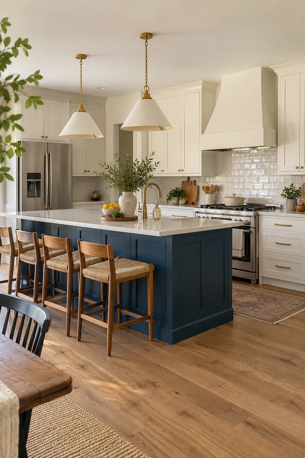
Painting only the island limits disruption and gives you a realistic test of living with blue. Choose a shade already present in a rug, art piece, or adjoining room so the update feels connected.
Remove doors and hardware even for a small project; painting around them produces ridges and weak edges. Degrease the toe kick thoroughly because shoes leave residue that primer cannot bond through.
A weekend may cover preparation and coats, but full cure usually takes longer. Use the island gently and delay attaching bumpers or child latches until the product instructions allow.
44. Upgrade Blue Cabinets With Better Hardware
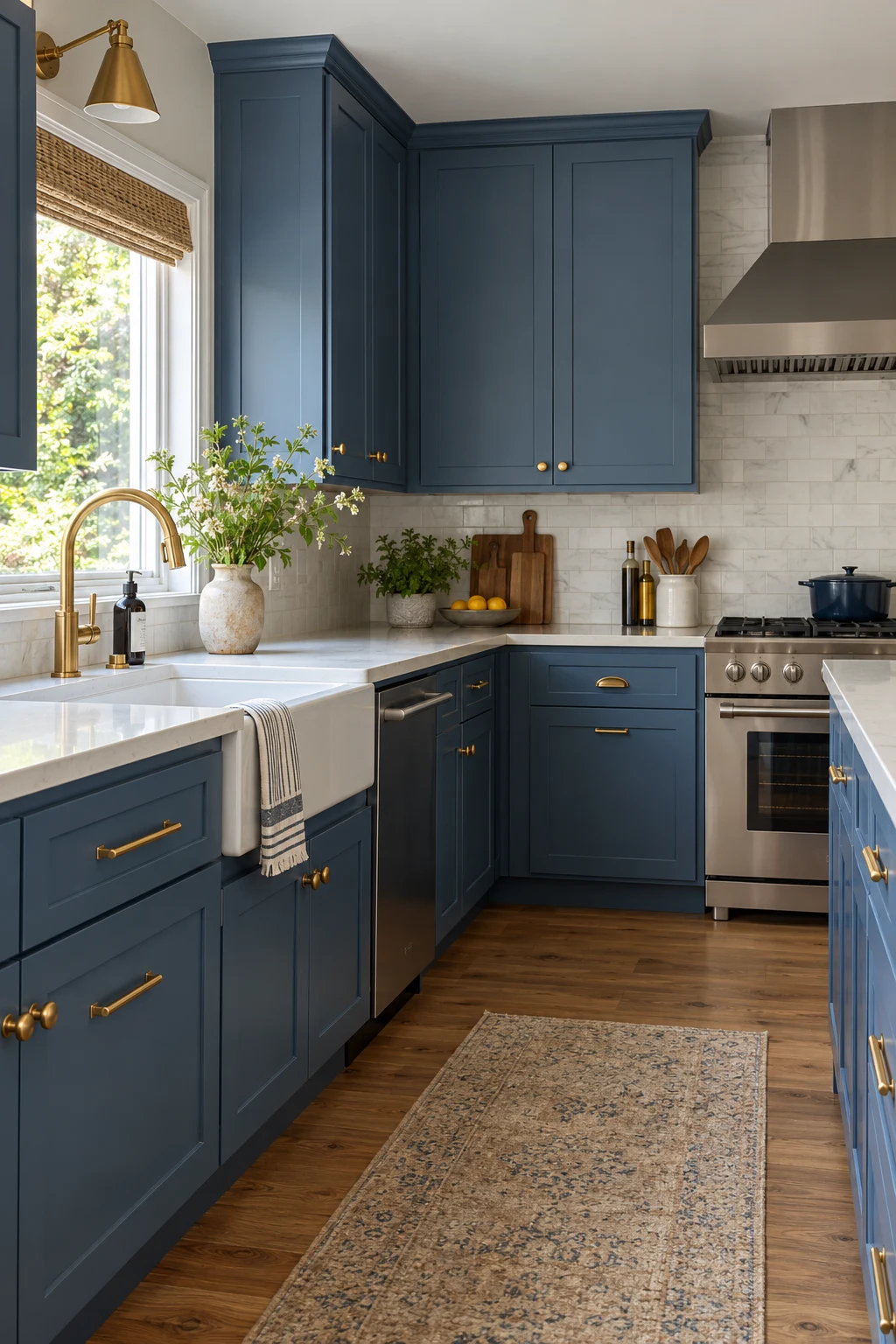
New hardware can sharpen blue cabinets without repainting them. Brushed brass warms cool blue, polished nickel feels crisp, and black creates the strongest outline on pale shades.
Measure the existing hole spacing center to center before shopping. Reusing holes avoids filler repairs; when drilling new doors, make a template and test it on scrap before touching finished cabinetry.
Long pulls should feel comfortable on heavy drawers, while small knobs suit light doors. Tighten fasteners after several weeks because wood movement and daily use can loosen newly installed pieces.
45. Paint the Interiors of Glass Cabinets Blue
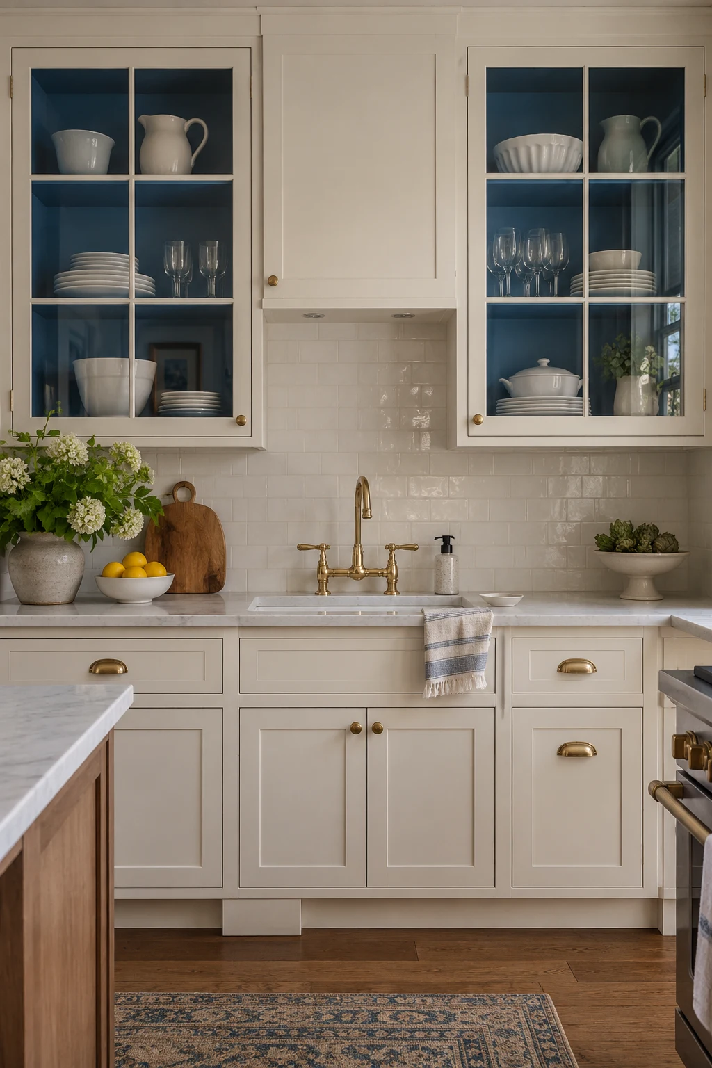
Painting only the interior of glass-front cabinets creates a controlled blue accent. White dishes stand out clearly, while closed cream doors keep the larger kitchen neutral.
Remove shelves before painting and coat the back, sides, and shelf edges consistently. Tempered glass doors should be handled carefully and stored upright on padded supports during the work.
Use the display cabinets for a limited set of everyday pieces. Too many colors behind glass will compete with the blue backing and make the cabinet look less organized.
46. Use Light-Blue Satin in a Tiny Kitchen
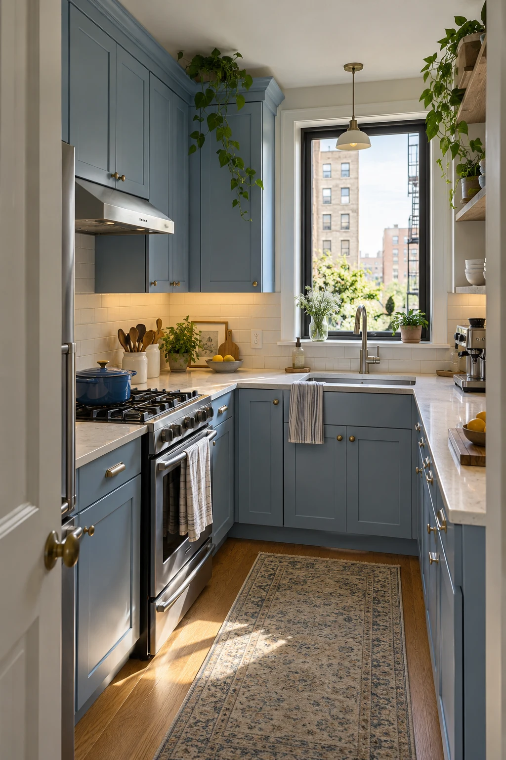
Light-blue satin cabinets reflect a modest amount of light without the glare of high gloss. Taking storage to the ceiling uses vertical space and reduces the dusty ledge above standard uppers.
Keep countertop appliances to one planned zone and choose compact models only when their capacity suits your household. A slim dishwasher or 24-inch range can release meaningful drawer space in a very small plan.
For more ways to use cabinet interiors efficiently, visit these kitchen cabinet organization ideas before ordering inserts or pullouts.
Protect one continuous prep area at least 24 inches wide before adding decorative shelves, countertop storage, or another small appliance.
47. Layer Lighting Around Teal in a Windowless Kitchen
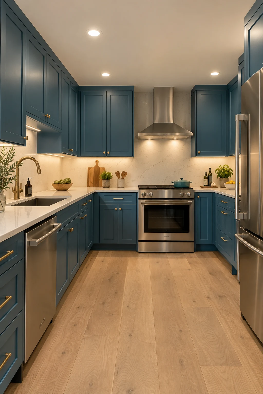
Mid-tone teal can work without windows when lighting is planned in layers. Combine diffuse ceiling light, continuous under-cabinet task light, and a small decorative fixture rather than relying on one harsh source.
Use lamps with high color rendering and the same color temperature across visible fixtures. Mixed warm and cool bulbs can make cabinet doors appear like different shades from one end to the other.
Provide proper mechanical ventilation because lighting cannot solve moisture or cooking odors. Light counters and oak flooring help the teal remain rich without turning the room into a dark box.
48. Use Cool Navy in a South-Facing Kitchen
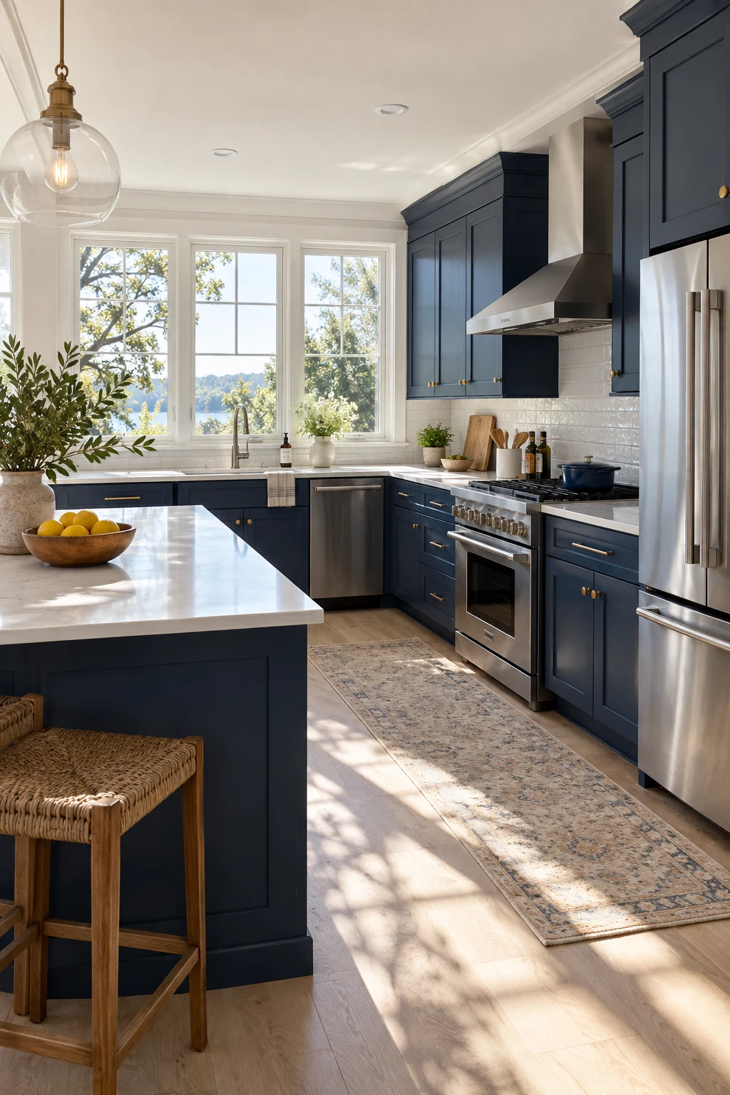
Strong southern light can support a cool, true navy that would feel flat in a darker room. White quartz and pale ash flooring keep the generous light moving across the space.
View samples during the brightest afternoon hour; direct sun may reveal undertones hidden in the morning. Also check the color after sunset under the fixtures you plan to keep.
Add a washable shade or curtain if glare becomes uncomfortable near the sink. These kitchen window curtain ideas can help you soften light without hiding the cabinet color.
49. Warm North Light With Slate Blue
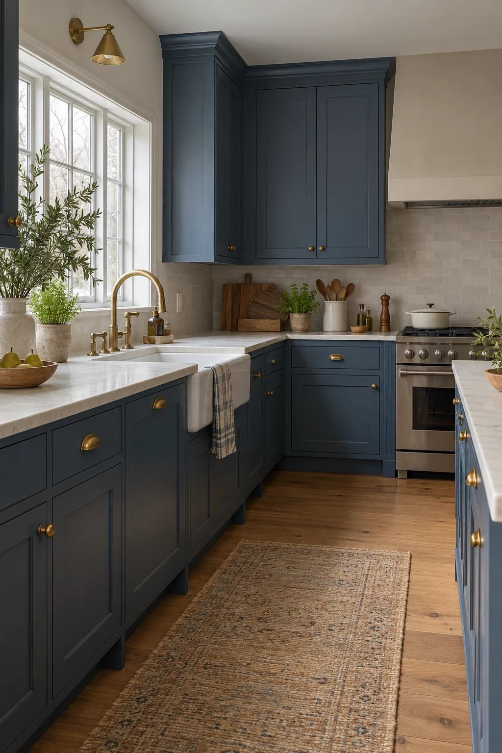
North-facing daylight is cool and indirect, so choose slate blue with a warm gray or slight green undertone. Creamy counters, aged brass, and honey-toned oak prevent the cabinet color from becoming steely.
Paint a sample on the darkest wall and judge it on an overcast day. If it still looks inviting there, the color is unlikely to disappoint during brighter conditions.
Avoid pairing warm slate blue with a stark blue-white backsplash. A soft ivory similar to these white kitchen ideas creates a more gradual, livable contrast.
50. Choose a Washable Satin Finish for Family Life
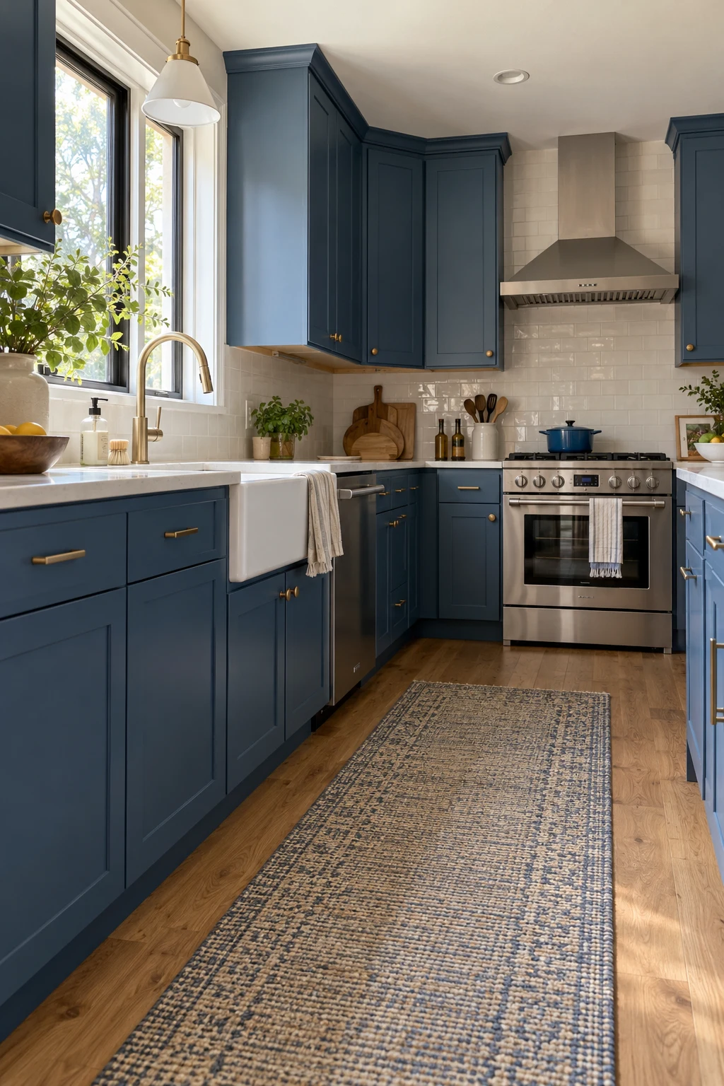
Satin blue is practical for a hardworking kitchen: more washable than flat paint and less reflective than semi-gloss. A smooth Shaker or slab profile reduces corners where grime collects.
Ask the paint or cabinet manufacturer for cure time and approved cleaners. Water, soft microfiber, and a small amount of mild soap are safer starting points than abrasive pads or solvent-heavy sprays.
Keep a labeled touch-up container and record the brand, formula, sheen, and batch date. Good maintenance information is part of the design; it makes small chips repairable instead of turning them into a future full repaint.
Choosing the Blue That Belongs in Your Kitchen
The most successful blue kitchen is not necessarily the darkest, trendiest, or most dramatic. It is the one whose undertone works with your daylight, whose placement supports the layout, and whose finish fits the way your household cooks and cleans.
Narrow your favorites to two shades and one placement plan, then test them at full scale beside the real counters, floor, and hardware. That small pause is far less expensive than repainting a complete cabinet run—and it usually makes the final decision feel obvious.