39 Modern Bedroom Wallpaper Ideas
This post may contain affiliate links: full affiliate disclosure.
Is your bedroom feeling boring? Wallpaper is the fastest way to add huge style without buying all new furniture.
We found 39 genius ideas for using paper—from peel-and-stick to bold patterns—to make your sleep space cozy and cool.
Skip the paint can and give one of these easy ideas a try!
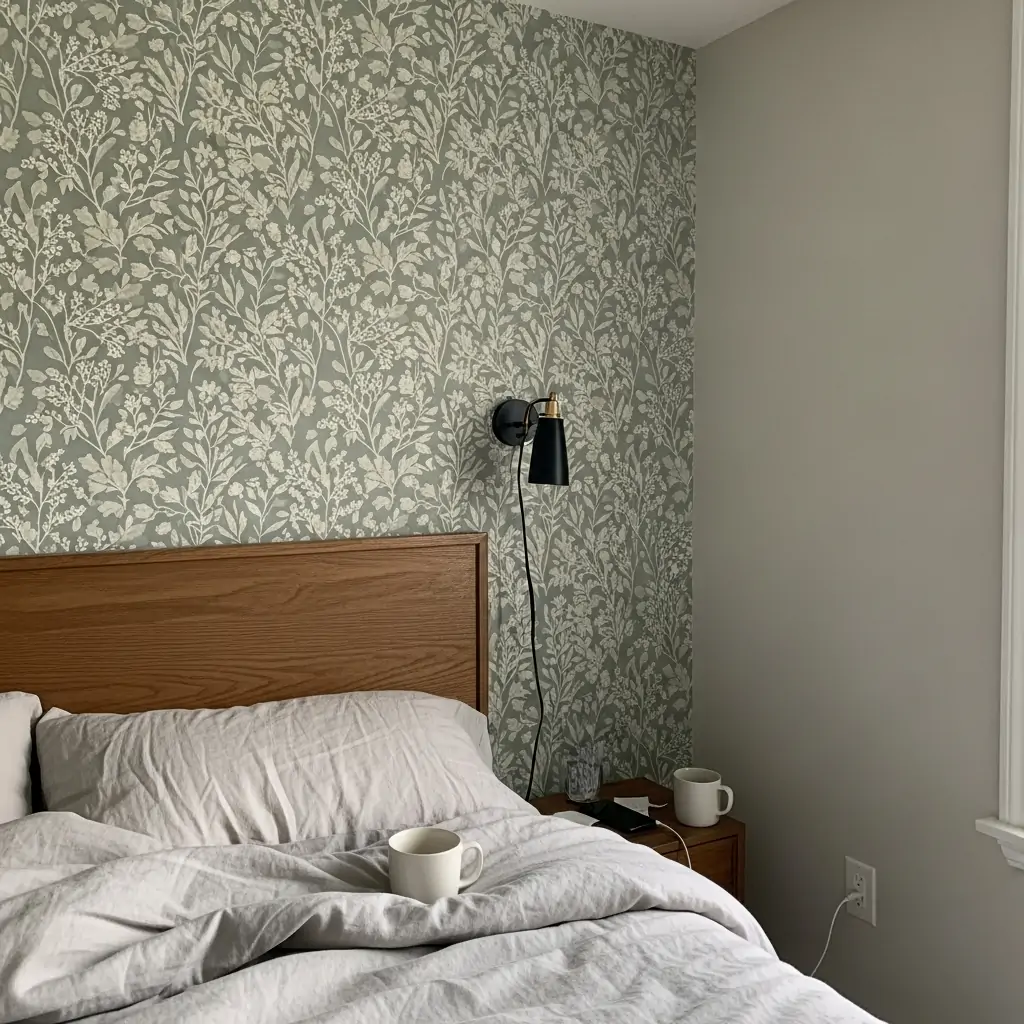
1. Behind The Headboard Only
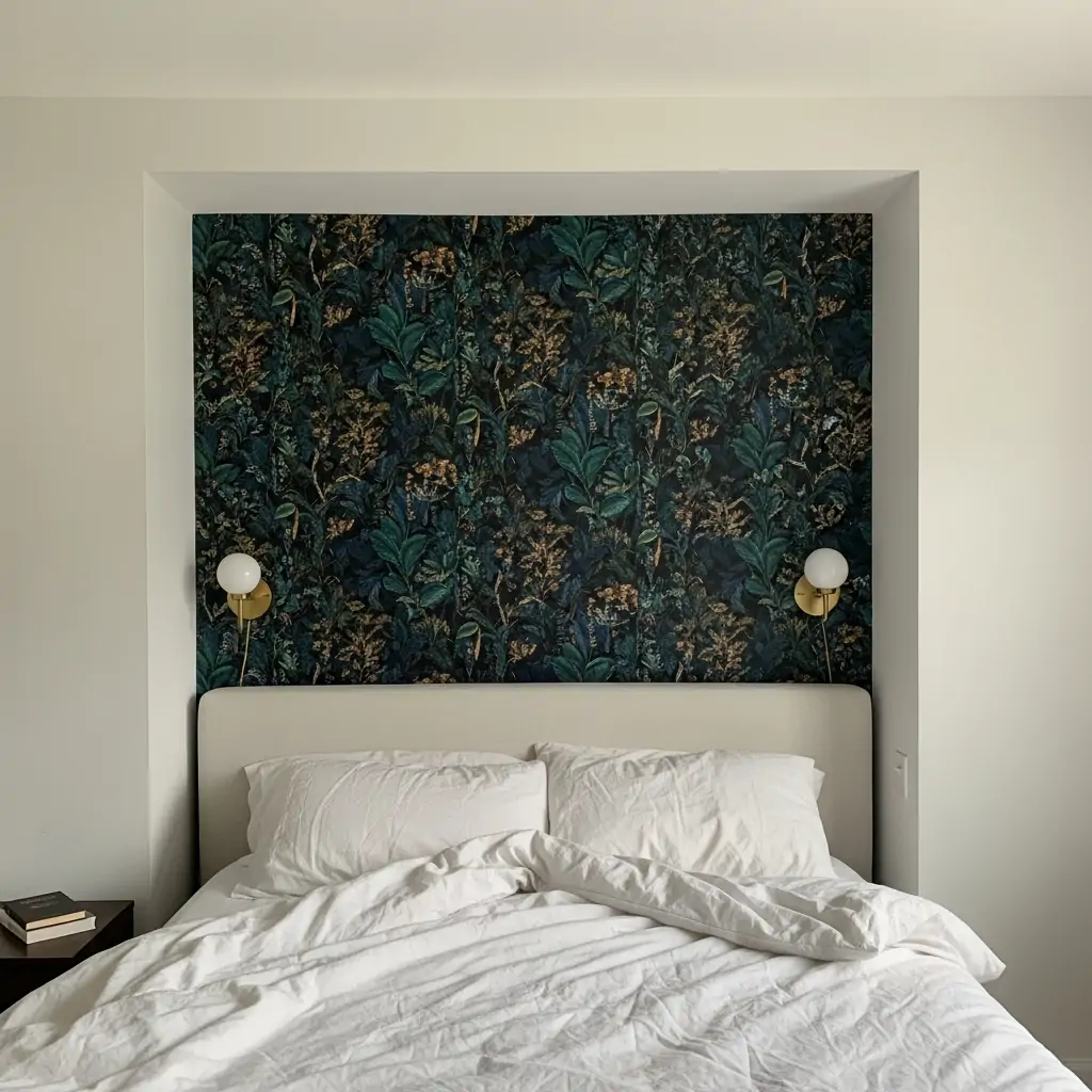
Use a dramatic or very bold pattern just on the wall directly behind your bed. This makes your bed the clear center of attention and defines the space instantly. It saves you money since you only need one roll of the fancy paper.
- Use heavy textures for impact.
- Keep the rest of the walls painted neutral.
- Choose a color that complements your bedding.
Pro Tip: If the pattern is busy, choose bedding that is solid white or a simple color to keep the room feeling calm.
2. One Full Accent Wall
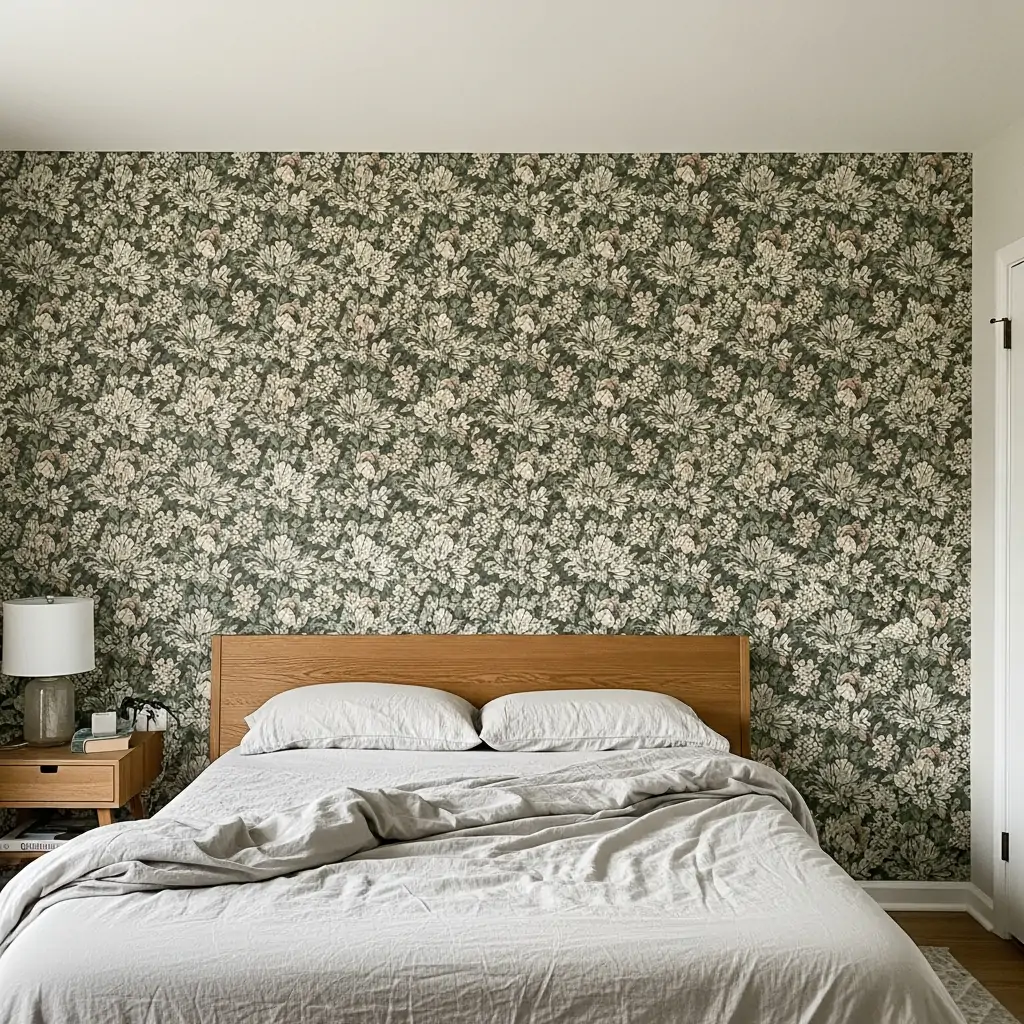
Pick the largest wall that doesn’t have a window or door interrupting it. This gives the pattern the most room to shine without being cut up. This method works best for large, repeating designs or murals.
- Measure the wall three times before ordering.
- Use a pattern that brings in colors already in the room.
- Hang the paper starting in the middle of the wall.
Pro Tip: Balance the paper by hanging a simple mirror or one large piece of art on the wall, not a cluster of small frames.
3. Wallpaper The Ceiling
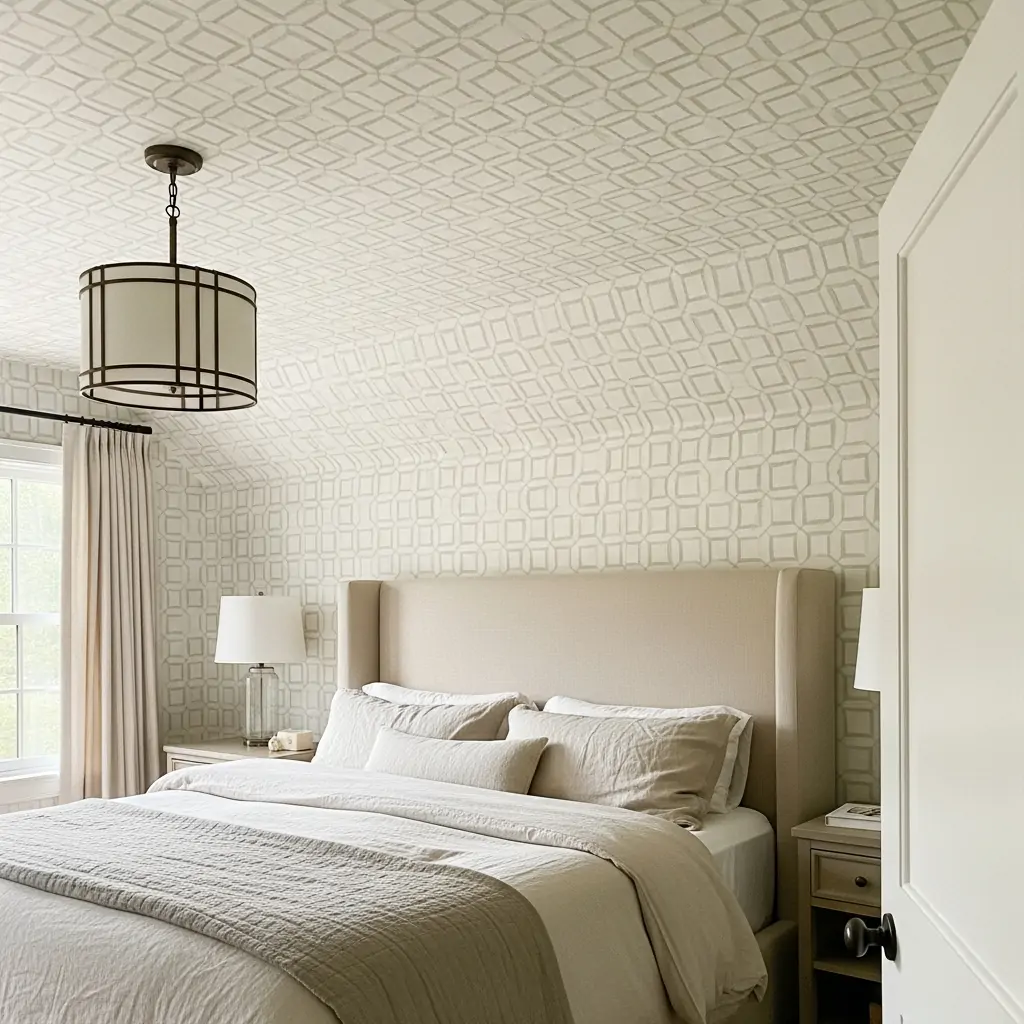
Don’t forget the fifth wall! Wallpapering the ceiling adds an unexpected layer of style that makes the room feel custom and finished. Use lighter colors or subtle textures so the room doesn’t feel heavy.
- Use peel-and-stick for easier overhead work.
- Choose soft, dreamy patterns like clouds or stars.
- A light texture adds depth without being distracting.
Pro Tip: When lying in bed, you will be looking up, so make sure the paper is something you enjoy looking at for long periods.
4. Inside Closet Doors
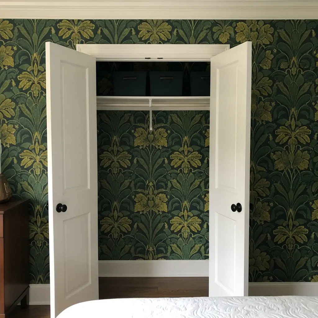
Add a fun surprise every time you open your closet or built-in cabinet doors. This is a great way to use up leftover scraps from a larger project or to try a bold pattern you wouldn’t commit to on a whole wall.
- Use small sample rolls for this project.
- Choose a bright color or quirky print.
- Ensure the paper is flat and adhered well to handle opening/closing.
Pro Tip: If your closet has shelves, paper the back wall behind the shelves for a colorful backdrop.
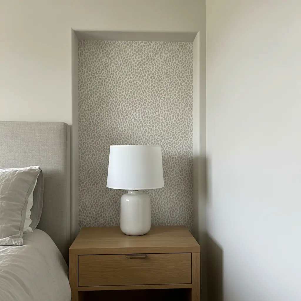
5. Define A Small Nook
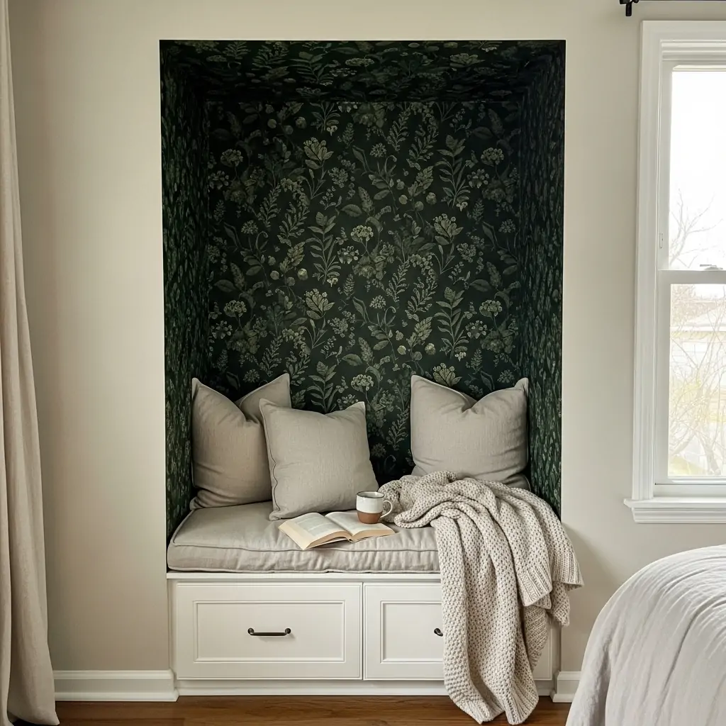
If you have a small reading corner, a built-in shelf, or a window seat, use wallpaper just in that area. This makes the space feel special and separates it from the main sleeping area. Darker colors make the nook feel extra cozy.
- Use a contrasting color to the main walls.
- Choose a nature-inspired or soothing pattern.
- This works great for kid’s play areas too.
Pro Tip: Install a simple shelf or hook in the nook area to complete the defined zone.
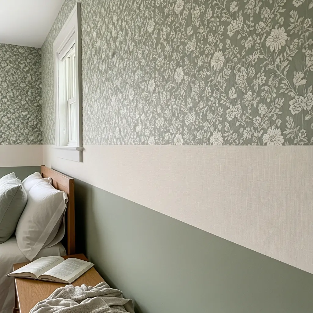
6. Wallpaper Half The Wall
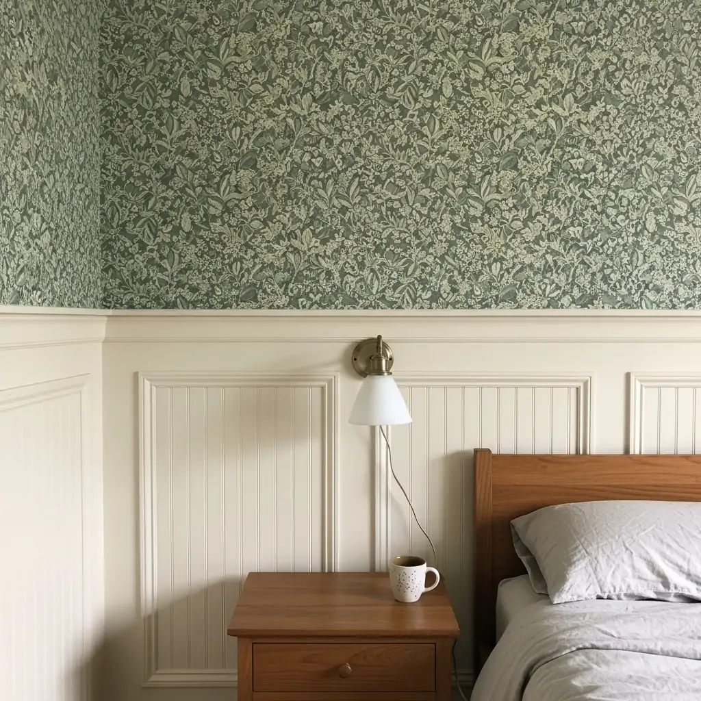
Use busy wallpaper on the top half of the wall and paint or wood paneling on the bottom half. This is a great way to use a pattern you love without it feeling overwhelming. It also protects the lower half of the wall from wear and tear.
- Use a chair rail molding for a clean break.
- Ensure the bottom color matches a color in the paper.
- Keep the paper high enough so the bed doesn’t cover too much.
Pro Tip: Measure the wall so the break falls slightly higher than halfway up (about two-thirds up) for a more modern look.
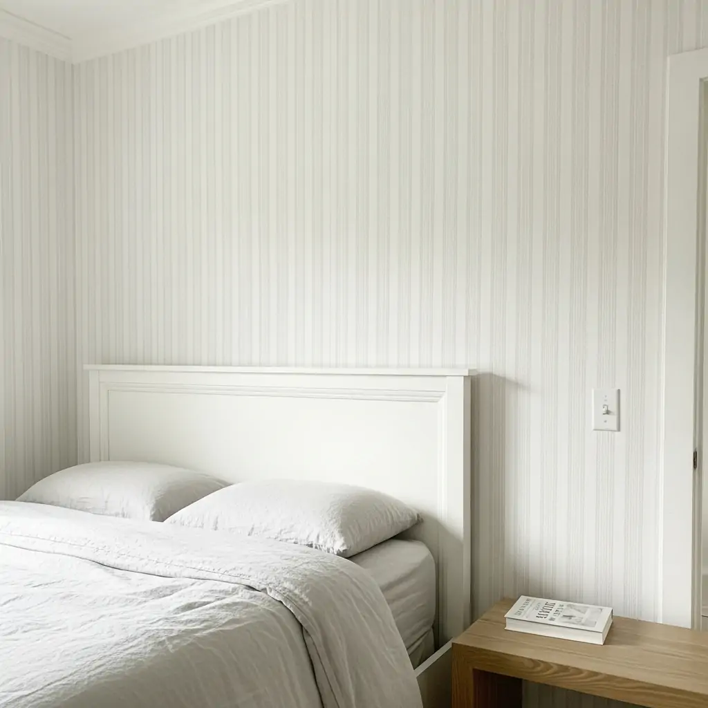
7. Classic Vertical Stripes
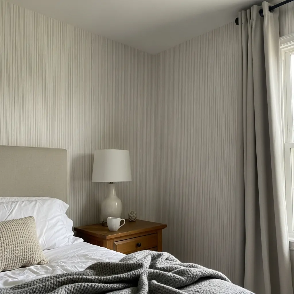
Striped paper is a classic choice that never goes out of style. Vertical stripes trick the eye into thinking the ceilings are higher than they really are. Choose thin, subtle lines for a refined, gentle look.
- Match the stripe color to your trim paint.
- Use soft grey and white stripes for a clean look.
- Ensure the first strip is perfectly plumb (straight up and down).
Pro Tip: If your walls are slightly crooked, use thicker stripes as they hide minor imperfections better than thin ones.
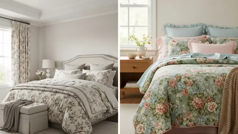
8. Oversized Flower Prints
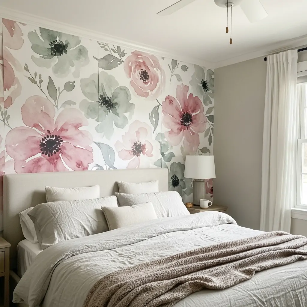
Choose huge, watercolor-style florals that feel more like art than pattern. These large-scale designs create a very romantic and soft vibe, perfect for a calming master bedroom. Look for muted or pastel colors.
- Keep bedding simple (white or solid colors).
- Use soft lighting to highlight the paper.
- Great for one accent wall only.
Pro Tip: Avoid small, busy floral prints, as they can feel old-fashioned. Go big or go home with florals.
9. Linen Weave Texture
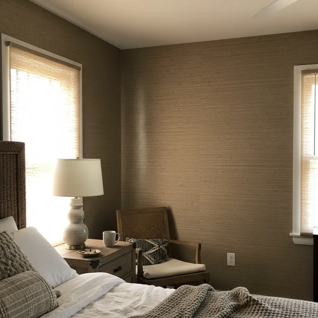
Use wallpaper that mimics the look and feel of natural fabric like linen, grasscloth, or woven texture. This adds depth and interest without introducing a distracting pattern. It works well on all four walls.
- Look for vinyl versions for easy cleaning.
- Choose soft neutral tones like cream or beige.
- Texture helps hide wall imperfections.
Pro Tip: If using faux grasscloth, hang the panels horizontally to mimic the way natural grasscloth is traditionally installed.
10. Bold Diamond Shapes
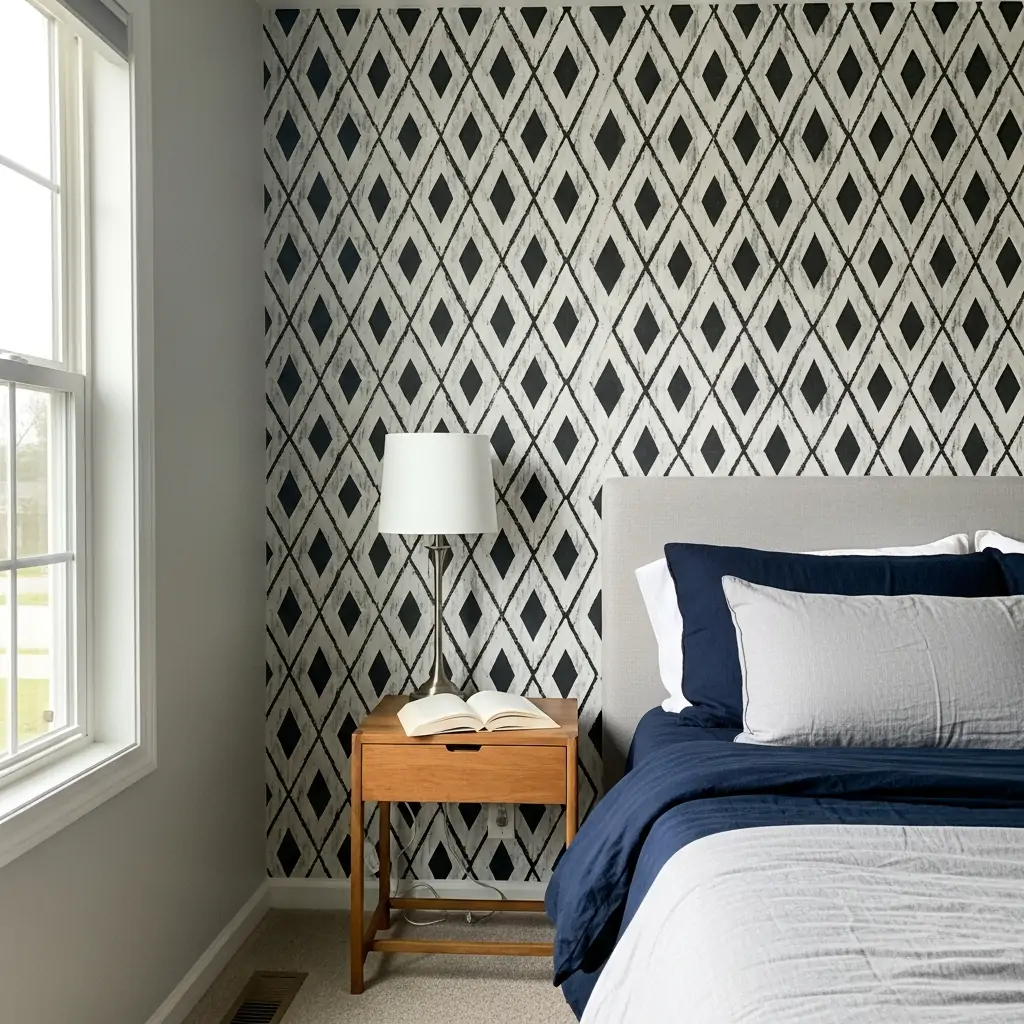
Geometric patterns, like crisp diamonds or chevrons, add energy and a modern feel to the room. Stick to high-contrast colors like black and white or navy and grey for maximum impact.
- Use only on an accent wall.
- Balance the pattern with solid furniture.
- Ensure the pattern is aligned perfectly across strips.
Pro Tip: Use a simple peel-and-stick geometric paper if you are nervous about committing to a permanent pattern.
11. Faux Shiplap Look
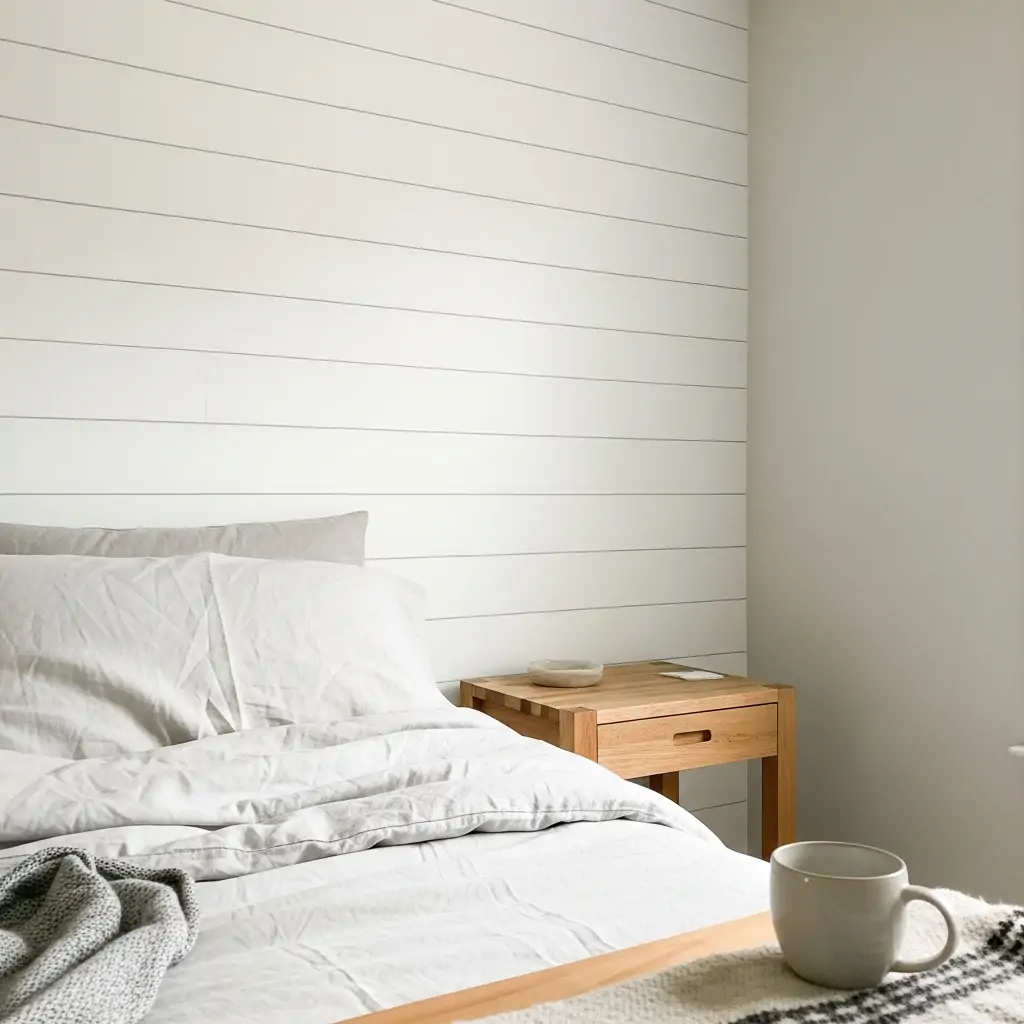
Get the trendy farmhouse shiplap look without any sawing or nailing boards. Faux shiplap wallpaper is easy to install and gives you that classic, clean horizontal line. It instantly brightens a room.
- Choose white or light grey colors.
- Ensure the lines are perfectly level when applying.
- Great for adding texture to a small room.
Pro Tip: Start hanging the paper at the ceiling line and make sure the top edge is perfectly straight before continuing down the wall.
12. Deep Forest Green
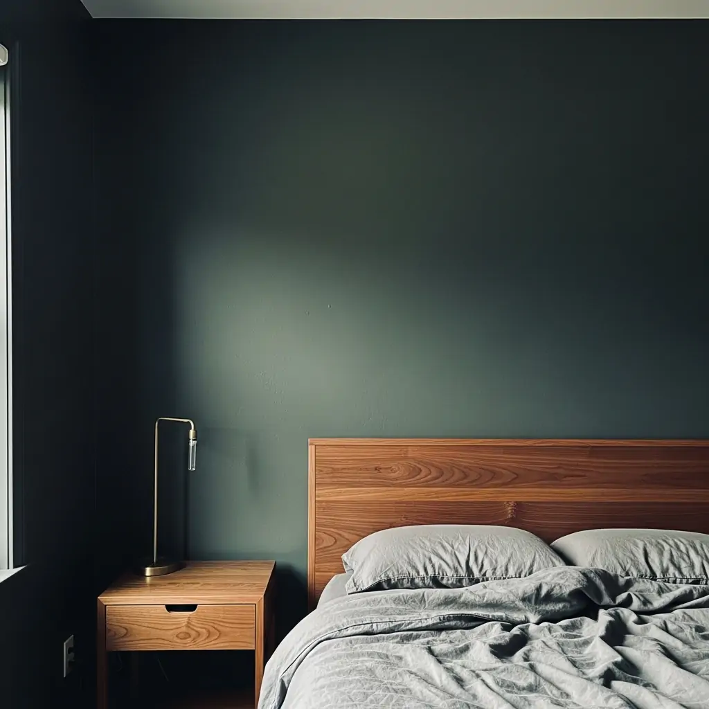
Use rich, deep colors like hunter green, navy, or charcoal for a moody, relaxing space. Dark colors make the room feel like a cozy cocoon, which is ideal for sleep. Pair these papers with warm, natural wood tones.
- Use bright white trim to frame the dark color.
- Add brass or gold accents for warmth.
- Ensure the room has good lighting fixtures.
Pro Tip: Dark paper works best in bedrooms that get a lot of daytime sun, otherwise the room can feel too cave-like.
13. Calming Powder Blue
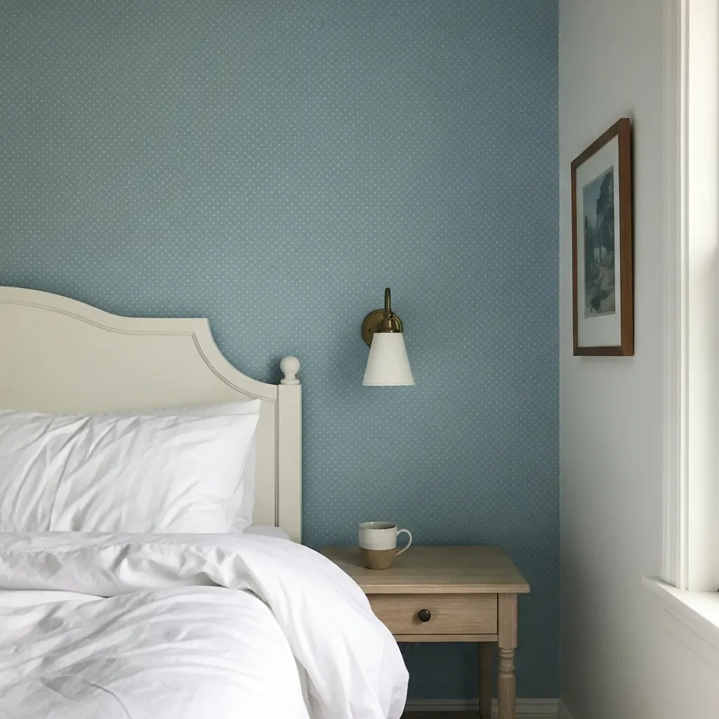
Soft blue papers with tiny dots or subtle texture promote sleepiness and peace. Light blue is a classic bedroom color that feels fresh and airy. It works well in rooms meant to be quiet retreats.
- Pair with white or cream furniture.
- Use in rooms that face the sun (south or west).
- Choose a paper with a matte finish.
Pro Tip: If you don’t want a solid blue wall, find a paper that is white with a light blue pattern or stripe.
14. Full Wall Landscape
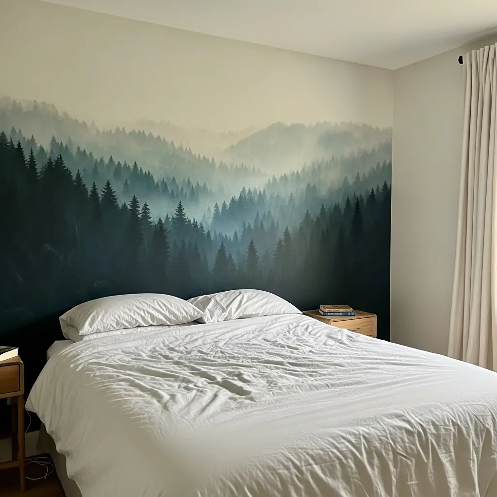
Install a scenic mural that covers the entire accent wall. These can be forests, oceans, or abstract art that looks like a painting. Murals are measured specifically for your wall size, so they look custom.
- Measure the wall carefully before ordering.
- Choose a scene that makes you feel relaxed.
- Keep the rest of the room very minimal.
Pro Tip: Place the bed slightly off-center from the mural if possible so the scene is not completely hidden by the headboard.
15. Metallic Foil Shine
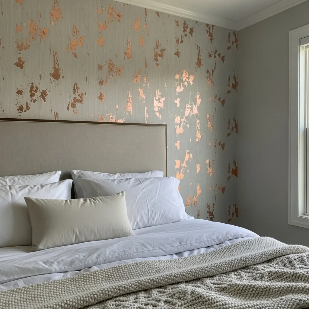
Choose paper with subtle gold, silver, or copper accents that catch the light throughout the day. This adds a hint of glamour and sophistication without being overly flashy. Metallic paper works best behind the bed.
- Use warm metals (gold/brass) for a cozy feel.
- Use cool metals (silver/chrome) for modern looks.
- Install near a window to maximize the sparkle.
Pro Tip: Metallic paper often needs special paste and careful handling, so read the instructions completely before starting.
16. Simple Polka Dots
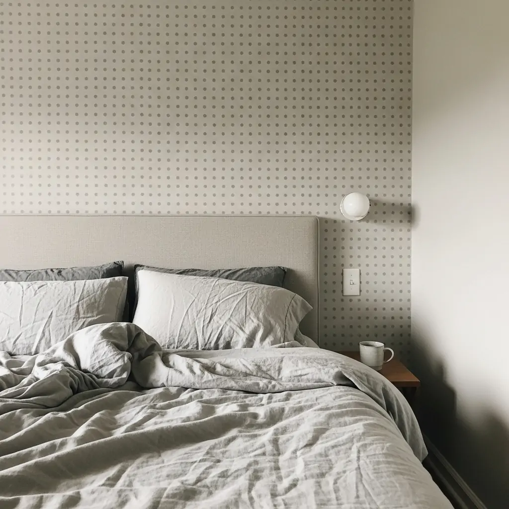
Small, evenly spaced polka dots are fun for kids’ rooms but can also be sophisticated in neutral colors like beige or grey. Dots add a playful texture without committing to a complex pattern.
- Choose matte paper for a softer look.
- Use dots in a nursery or small guest room.
- Keep the dot color light and airy.
Pro Tip: To keep dots from looking too childish, ensure the dots are small and the background color is a deep, rich tone like navy.
17. Vintage Toile Scenes
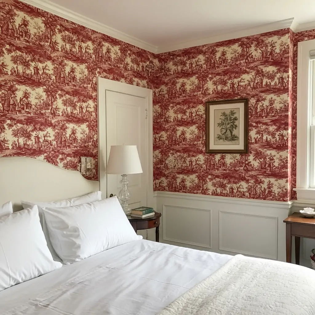
Toile patterns feature repeating pastoral scenes, usually in only two colors (like red on cream or blue on white). This classic paper is timeless, elegant, and perfect for a charming guest room or traditional master suite.
- Use Toile in a soft color like grey or lavender.
- Pair with antique or classic furniture.
- Look for patterns that tell a story.
Pro Tip: If the pattern feels too busy, use the Toile paper only on the top half of the wall, separated by wainscoting.
18. Tropical Leaf Prints
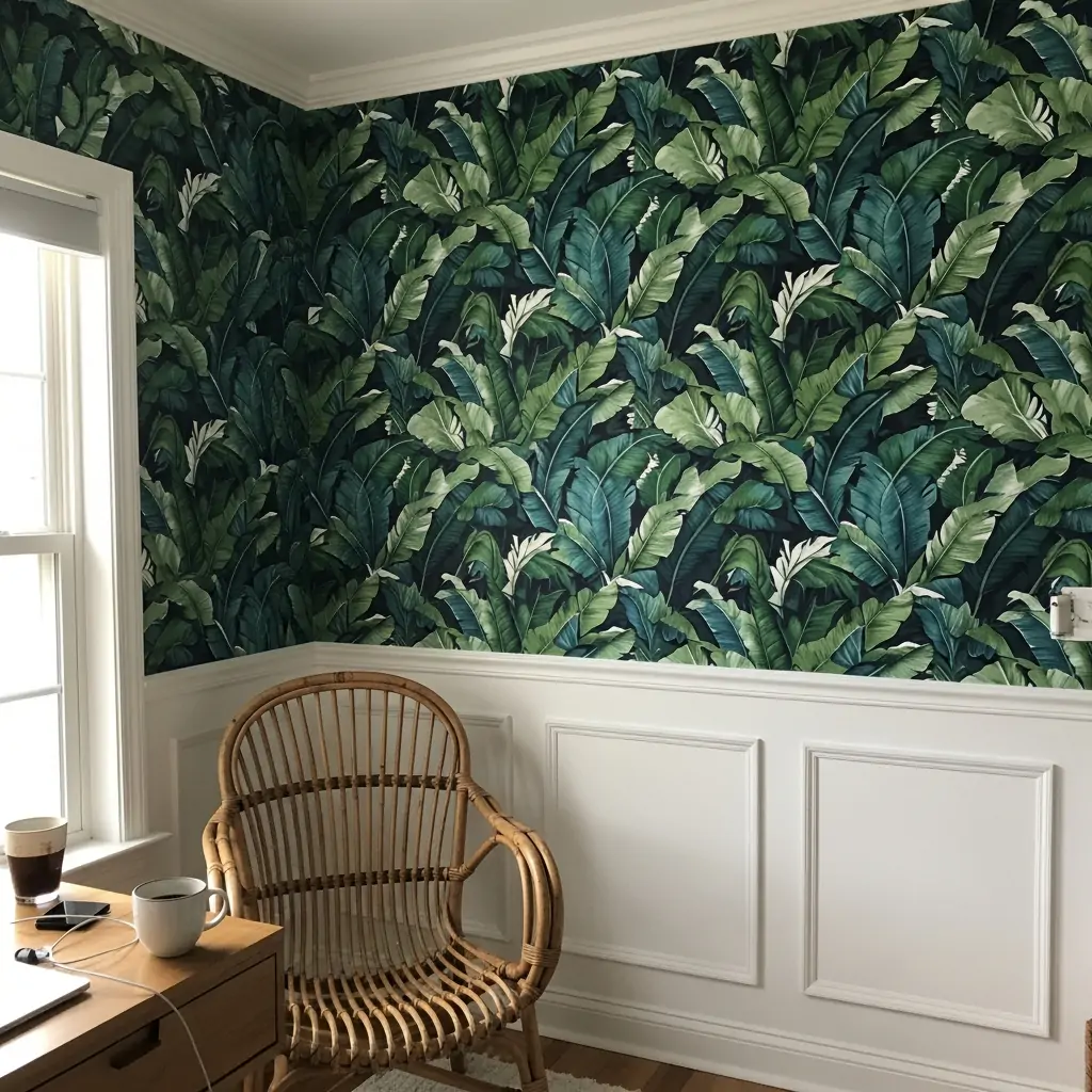
Bring vacation vibes indoors with large, lush tropical leaf patterns like banana leaves or palms. This is a bold choice that adds life and color. Use this paper in a room that needs energy and brightness.
- Use white bedding to let the leaves pop.
- Choose greens and deep blues.
- Great for sunny rooms.
Pro Tip: To make the look feel less dated, choose a paper where the leaves are oversized and slightly abstract rather than strictly realistic.
19. Modern Abstract Curves
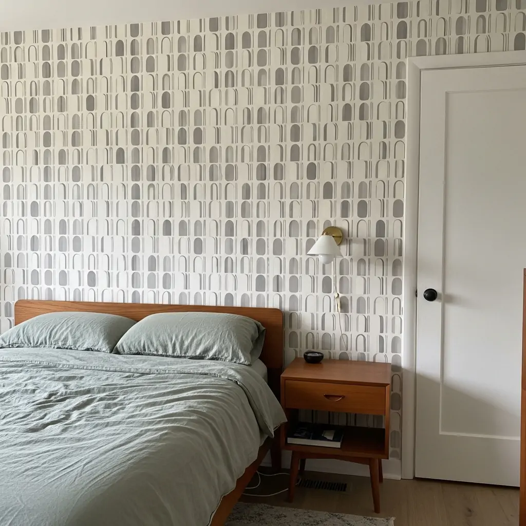
Look for papers featuring simple, modern abstract shapes like half circles, arches, or squiggles. These patterns are perfect for a mid-century modern or contemporary bedroom style. Stick to simple, clean lines.
- Use high-contrast colors (like mustard yellow and grey).
- Keep accessories clean and minimal.
- Works well on a small wall section.
Pro Tip: If you are unsure about the pattern, buy a small sample and tape it up for a few days to see how it feels in the light.
20. Faux Industrial Brick
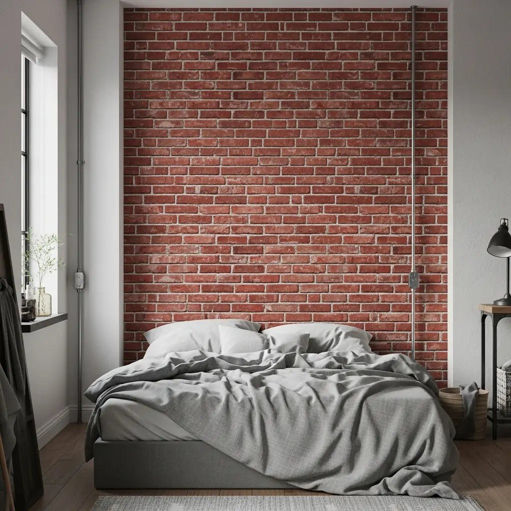
Use realistic faux brick paper to give your bedroom an urban loft or industrial feel. This adds instant texture and depth. Use this paper only on one wall to avoid the room feeling too heavy or closed in.
- Choose distressed or white-washed brick looks.
- Pair with metal furniture pieces.
- Ensure the pattern lines up perfectly between strips.
Pro Tip: This paper looks great behind open shelving where you can place books and small plants.
21. Black Or Charcoal Paper
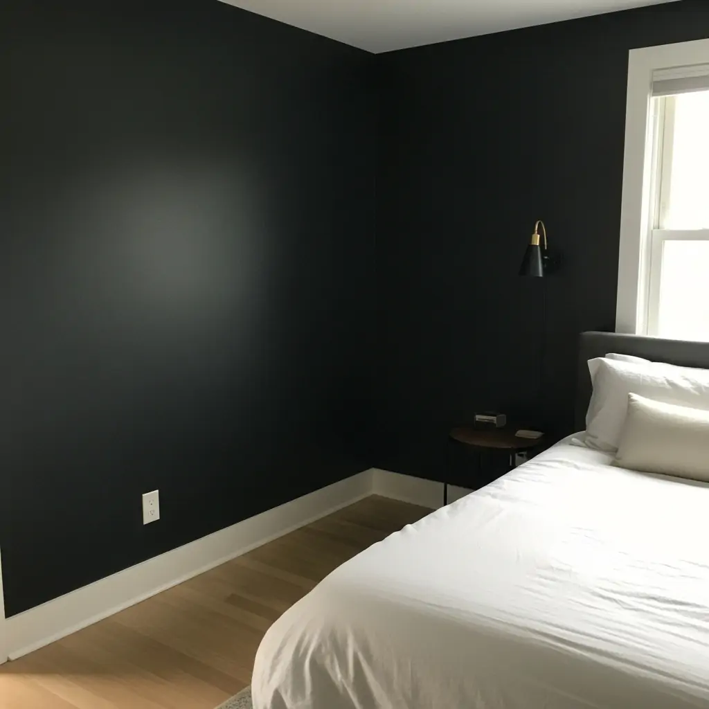
Using very dark paper creates a dramatic, cozy effect that makes the bedroom feel like a true escape. This cocooning effect is great for promoting deep sleep. Balance the dark color with light wood floors or white bedding.
- Choose a paper with slight texture or pattern.
- Use bright white trim to frame the walls.
- Add mirrors to reflect light.
Pro Tip: If full black is too much, try a deep charcoal grey or a textured navy blue instead.
22. White On White Texture
Choose white paper with embossed patterns, subtle white stripes, or raised texture. This adds depth and interest to the walls without adding any color. It’s perfect for making a small room feel bigger and brighter.
- Use soft lighting to highlight the texture.
- Great for adding interest to sloped ceilings.
- Looks expensive and custom.
Pro Tip: Look for paper that mimics molding or millwork for a custom, architectural look.
23. Peel And Stick Magic
If you rent your home or change your mind often, use temporary, removable peel-and-stick wallpaper. It looks just as good as traditional paper but comes off easily without damaging the paint underneath. It is great for DIY beginners.
- Test a small piece first to ensure it removes cleanly.
- Great for short-term trends.
- Easier to install than traditional paste paper.
Pro Tip: Peel-and-stick paper is usually thicker and more forgiving if your walls aren’t perfectly smooth.
24. Tiny Repeating Prints
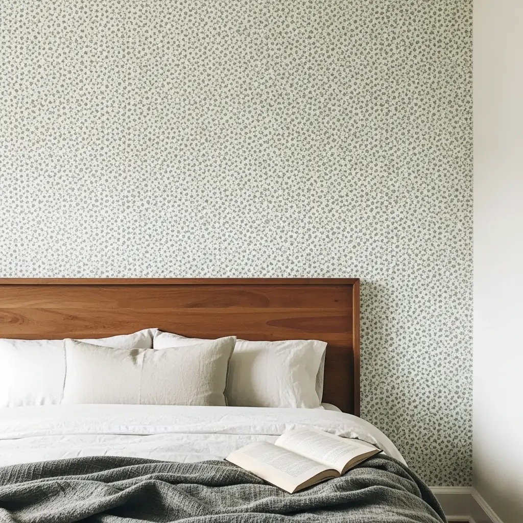
Use small, tightly packed patterns like tiny stars, mini diamonds, or small flowers. From far away, this creates a soft, overall texture, but up close, it is interesting and detailed. It’s a gentle way to add pattern.
- Choose a muted color palette.
- Use in a room with lots of windows.
- Great for all four walls.
Pro Tip:
25. Frame Wallpaper Sections
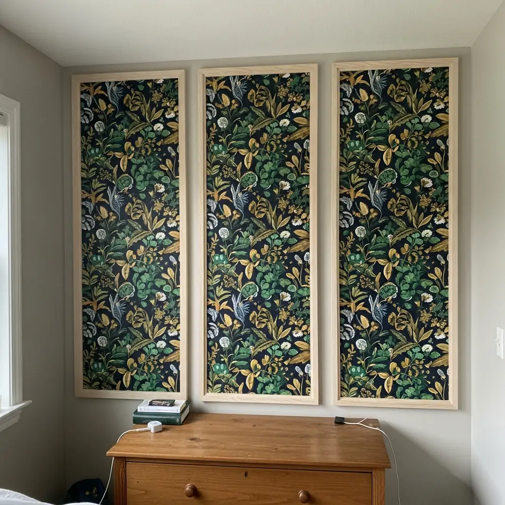
If you love a very expensive, bold paper, use it sparingly. Cut the paper into large vertical strips or squares and frame them with thin wood molding. This creates custom art panels and saves money on materials.
- Paint the wall behind the frames a neutral color.
- Use three or four evenly spaced panels.
- This gives a formal, elegant look.
Pro Tip: Measure and install the molding frames first, then cut the paper to fit precisely inside the box.
26. Horizontal Stripes
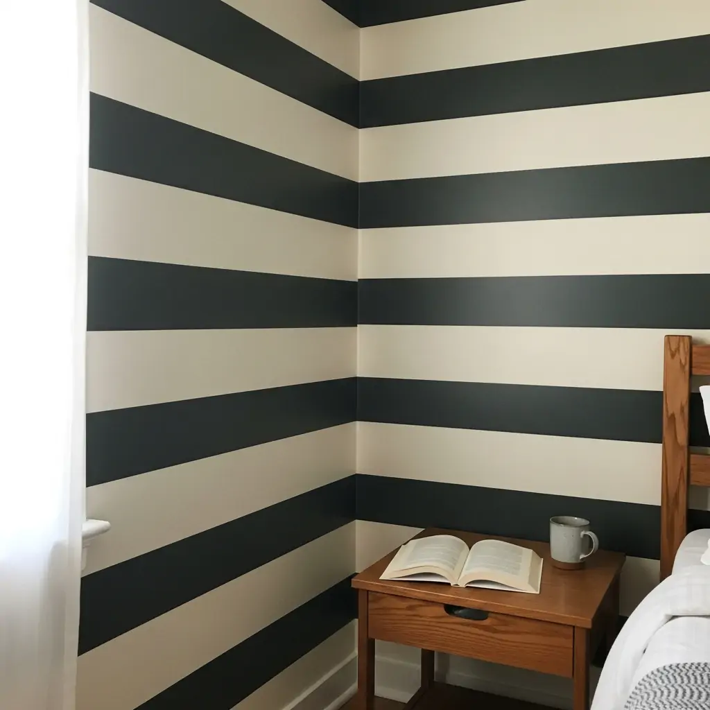
Run striped paper horizontally instead of vertically for a unique, modern look. Horizontal lines make a room feel wider and longer. This works best with thick stripes and simple color combinations.
- Use a laser level for installation.
- Best for wider, shorter rooms.
- Makes the room feel grounded.
Pro Tip: Start hanging the paper in the middle of the wall and work your way up and down to ensure the pattern looks centered.
27. Fun Kids’ Theme Paper
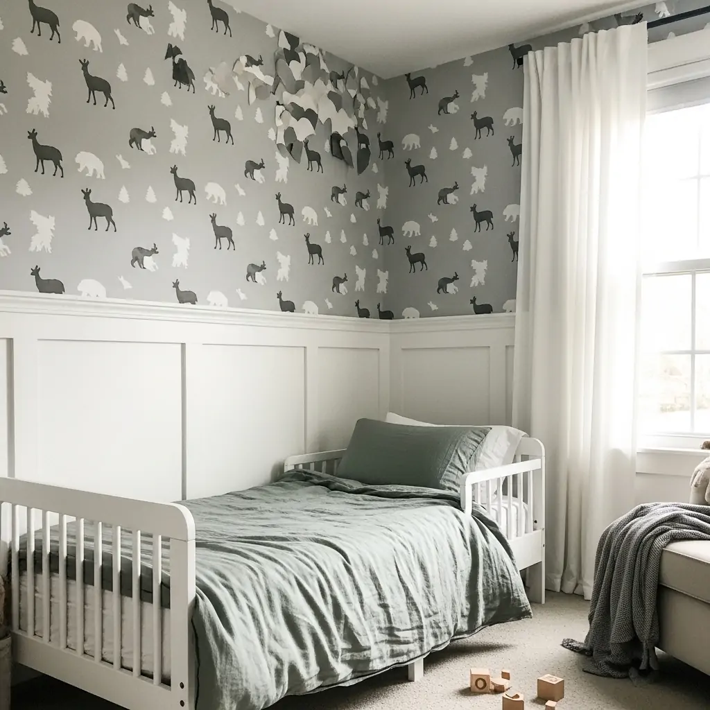
Choose age-appropriate paper for children’s rooms, such as dinosaurs, stars, or simple animal silhouettes. Look for patterns that are fun but also easy to transition as the child grows older.
- Use peel-and-stick for easy changes later.
- Choose a paper that can grow with the child.
- Use only on one wall for visual stimulation.
Pro Tip: Avoid characters or specific movie themes, as kids quickly outgrow them. Stick to general themes like space or nature.
28. Ombre Fade Effect
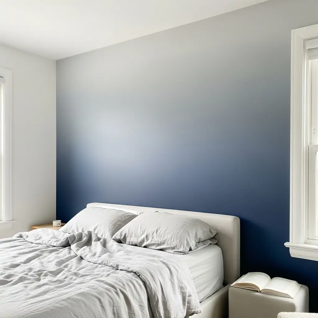
Use wallpaper that slowly transitions or fades from a dark color at the bottom to a light color at the top. This creates a soft, dreamy look that draws the eye upward and makes the ceiling seem taller.
- Hang in a room with high ceilings.
- Choose soft blues or pinks for the fade.
- Looks like a custom paint job.
Pro Tip: If you have a chair rail, ensure the transition starts below the rail for the best visual effect.
29. Line Your Bookcases
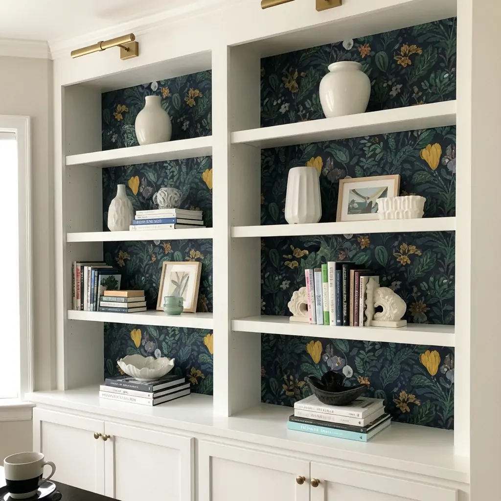
Use brightly patterned paper to line the back of open bookshelves, cabinets, or built-ins. This adds a pop of color and texture behind your displayed items. It is a small project that makes a big impact.
- Use leftover paper scraps.
- Choose a bold, fun pattern.
- Secure the paper well, as it gets touched often.
Pro Tip: If the shelves are removable, take them out before applying the paper for an easier, cleaner job.
30. Custom Headboard Cutout
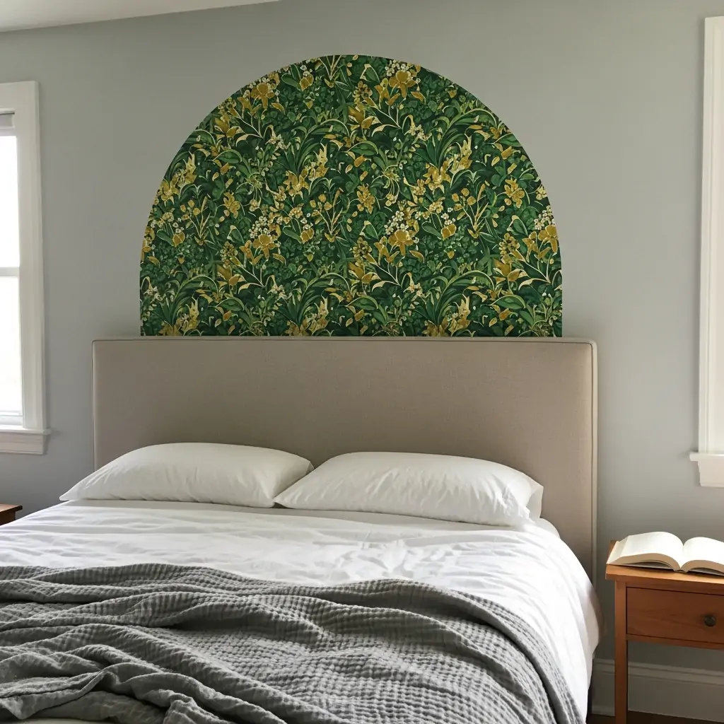
If you have a plain, rectangular headboard, cut a piece of wallpaper slightly larger than the headboard shape and stick it directly behind it. This creates a custom, colorful frame for your sleeping area.
- Use a contrasting color to the main wall paint.
- Choose a paper with a large, central motif.
- Measure twice, cut once.
Pro Tip: Use a pencil to lightly trace the shape onto the wall before applying the paper to ensure it is centered.
31. Use A Wide Border
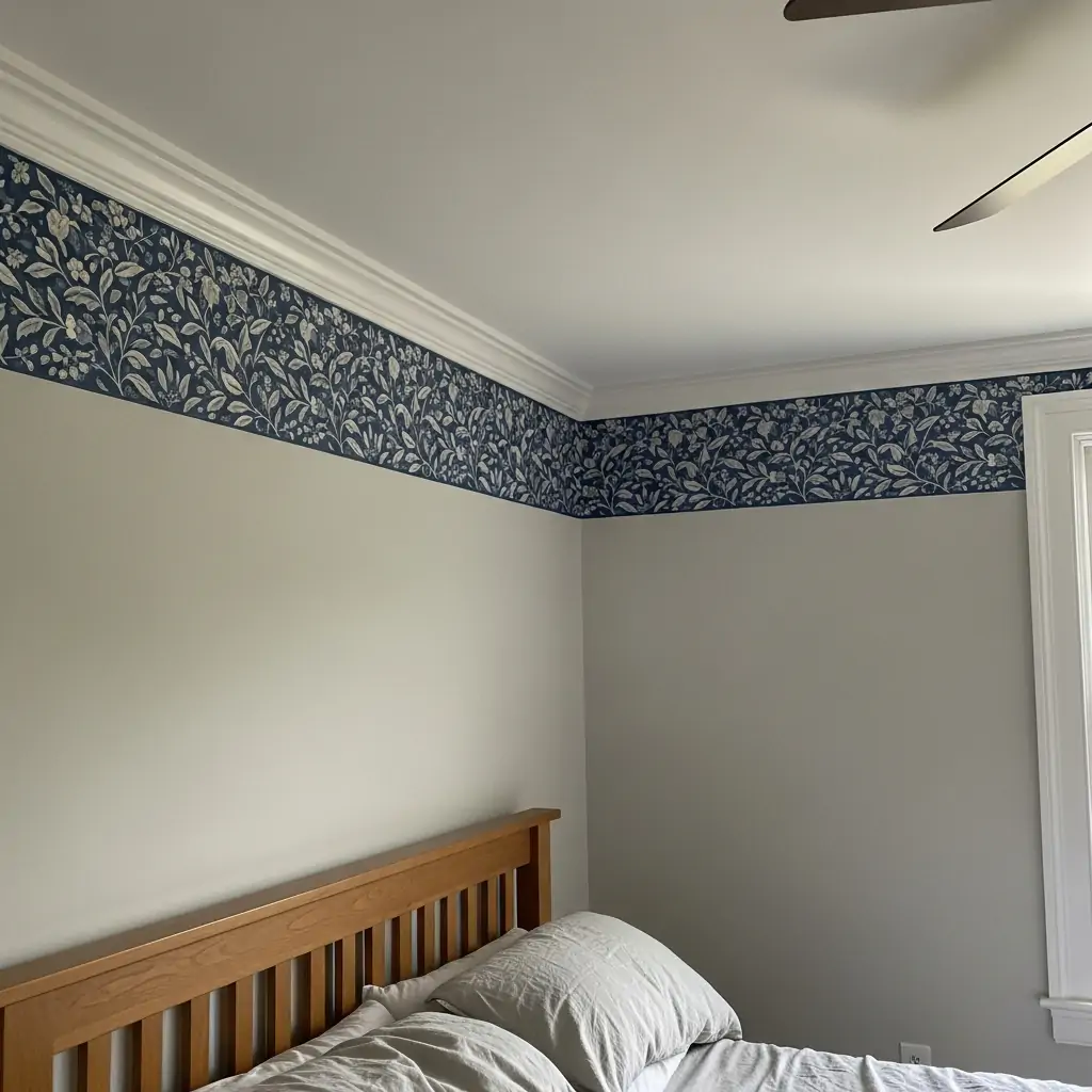
Instead of covering the whole wall, use an extra-wide decorative border near the ceiling line, similar to crown molding. This adds architectural detail and color without the work of a full wall installation.
- Look for borders that mimic molding or trim.
- Use a geometric pattern for a modern border.
- Ensure the wall paint below is crisp and clean.
Pro Tip: Borders work best when placed right up against the ceiling line, not halfway down the wall.
32. Easy-Clean Vinyl Paper
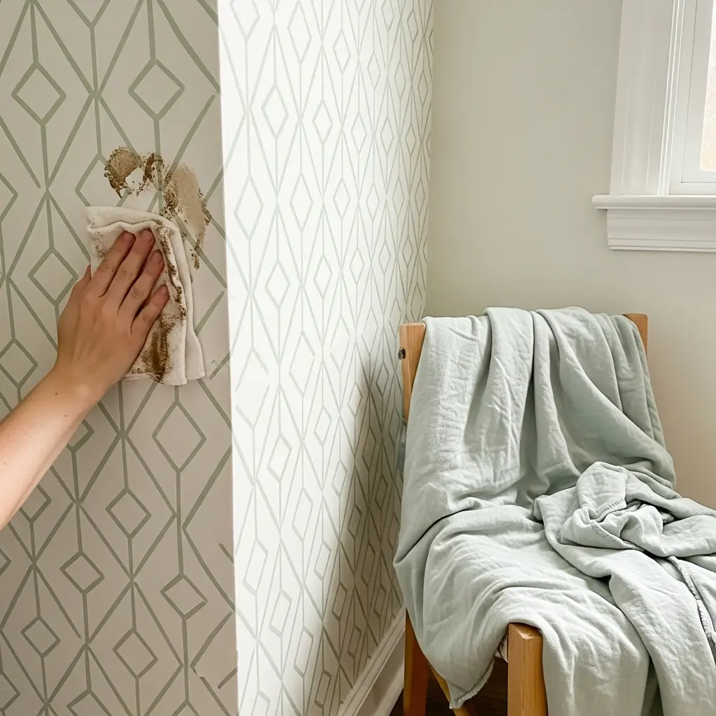
Choose durable, scrubbable vinyl wallpaper, especially if you have kids or pets. Vinyl paper resists moisture and is much easier to wipe down than traditional paper. It’s practical without sacrificing style.
- Great for high-traffic areas.
- Wipe down with a damp cloth easily.
- Vinyl is often easier to hang.
Pro Tip: Vinyl paper is usually thicker, which means it hides minor dents and imperfections in the wall surface better.
33. Budget Faux Grasscloth
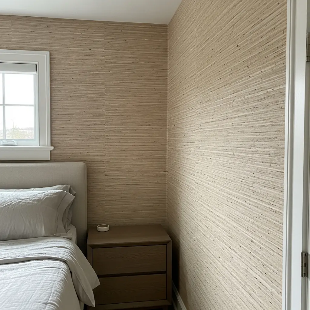
Real grasscloth is beautiful but often very expensive. Use vinyl or textured paper that mimics the natural woven look for a fraction of the cost. It gives you the high-end texture without the high maintenance.
- Choose a neutral beige or grey.
- Use on all four walls for an enveloping feel.
- Pair with rattan or wicker furniture.
Pro Tip: Unlike real grasscloth, faux versions don’t have color variation, so ensure the color is exactly what you want before buying.
34. Matching Fabric Look
Choose a paper that comes with matching or coordinating fabric options. You can use the fabric for pillows, simple curtains, or a throw blanket. This creates a cohesive, designer look in the room.
- Don’t overdo the match; use fabric sparingly.
- Great for creating custom pillows.
- Creates a very traditional feel.
Pro Tip: If you use a busy paper, choose a simpler coordinating fabric (like a solid color from the paper pattern) to avoid visual clutter.
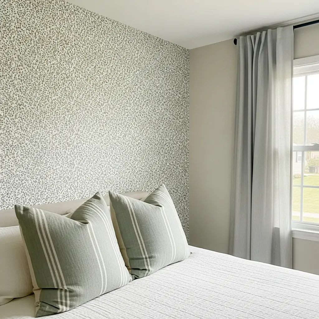
35. Subtle Animal Print
Use soft, tone-on-tone animal prints like cheetah spots or snake patterns in neutral colors (grey, beige, cream). This adds a touch of subtle sophistication and texture without being loud or tacky. Use on a small wall only.
- Pair with luxurious velvet bedding.
- Look for metallic animal prints.
- Use the print behind a dresser or mirror.
Pro Tip: The key is subtlety. Ensure the pattern colors are very close to each other (e.g., light grey spots on a slightly darker grey background).
36. Mix Two Different Papers
Use a horizontal stripe of one paper (like a solid color or texture) between two sections of a different, more patterned paper. This requires very precise measuring but creates a unique, layered look.
- Use thin molding to separate the papers.
- Choose papers in the same color family.
- Great way to use a small amount of fancy paper.
Pro Tip: Use a simple solid paper for the middle horizontal stripe to give the eye a break between the two patterned sections.
37. Paper Around Light Fixture
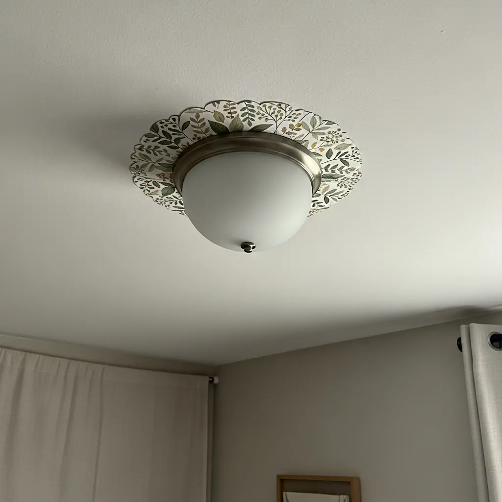
Use a small piece of decorative paper cut into a circle or simple shape around your main light fixture on the ceiling. This draws the eye upward and adds a decorative element to an otherwise plain ceiling spot.
- Choose a bold color for this small spot.
- Use a simple geometric pattern.
- Measure the fixture size exactly.
Pro Tip: This idea works best if your light fixture is a simple flush mount or semi-flush mount style.
38. Small Bathroom Drama
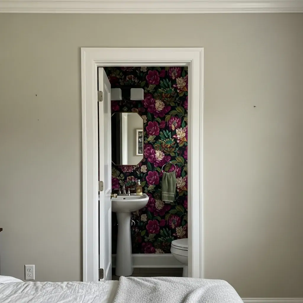
If your bedroom has a small attached powder room or half bath, use a super bold or shocking paper in that small space. Small rooms can handle intense patterns that would overwhelm a larger bedroom. It’s a fun surprise for guests.
- Choose a bright color or crazy pattern.
- Use paper with high durability.
- It’s a low-risk way to try a trend.
Pro Tip: Ensure the paper choice complements the style of the main bedroom, even if the pattern is much bolder.
39. Digital Art Print
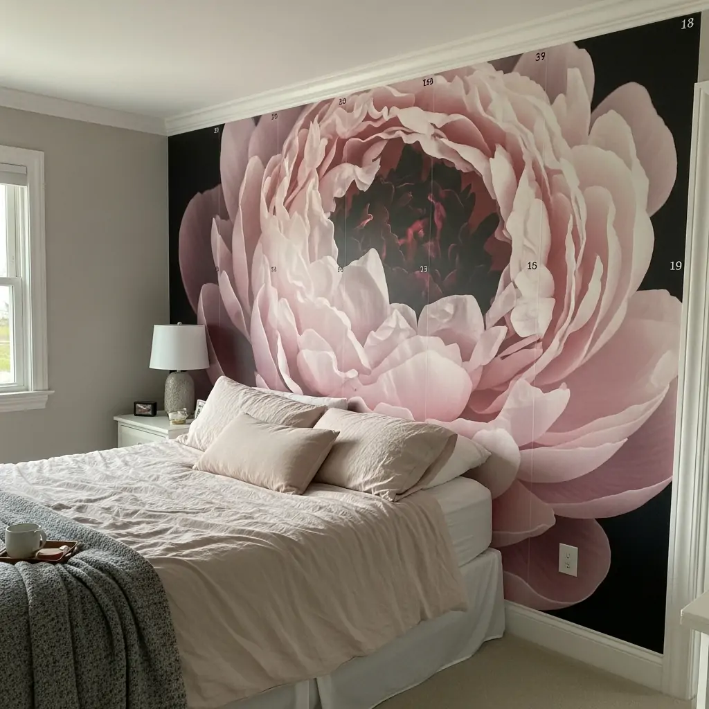
Use modern digital wallpaper featuring high-resolution art, like a close-up flower photo or a realistic abstract painting. These papers often come in large, numbered panels that create one massive piece of art on the wall.
- Ensure the wall surface is perfectly smooth first.
- Choose a scene with soft lighting.
- It feels like having a gallery wall.
Pro Tip: When installing a photo mural, start from the center panel and work outward to ensure the image is perfectly centered on the wall.
Ready to give your bedroom the upgrade it deserves? Wallpaper is the secret weapon for making a room feel totally custom and cozy.
Pick your favorite idea, grab some paste (or peel-and-stick!), and get started this weekend.
Don’t forget to comment below and tell us which pattern you chose! Pin this list so you can find these ideas later.