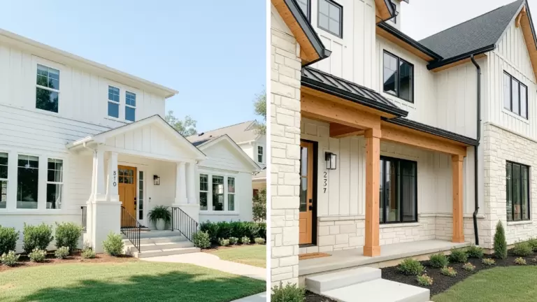
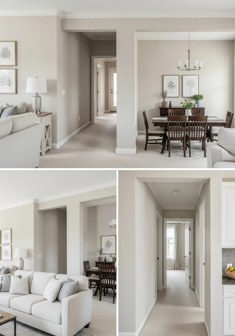
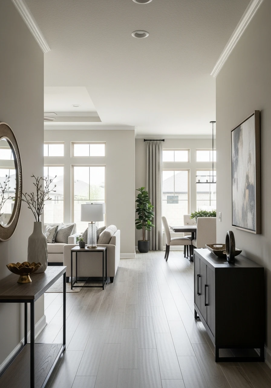
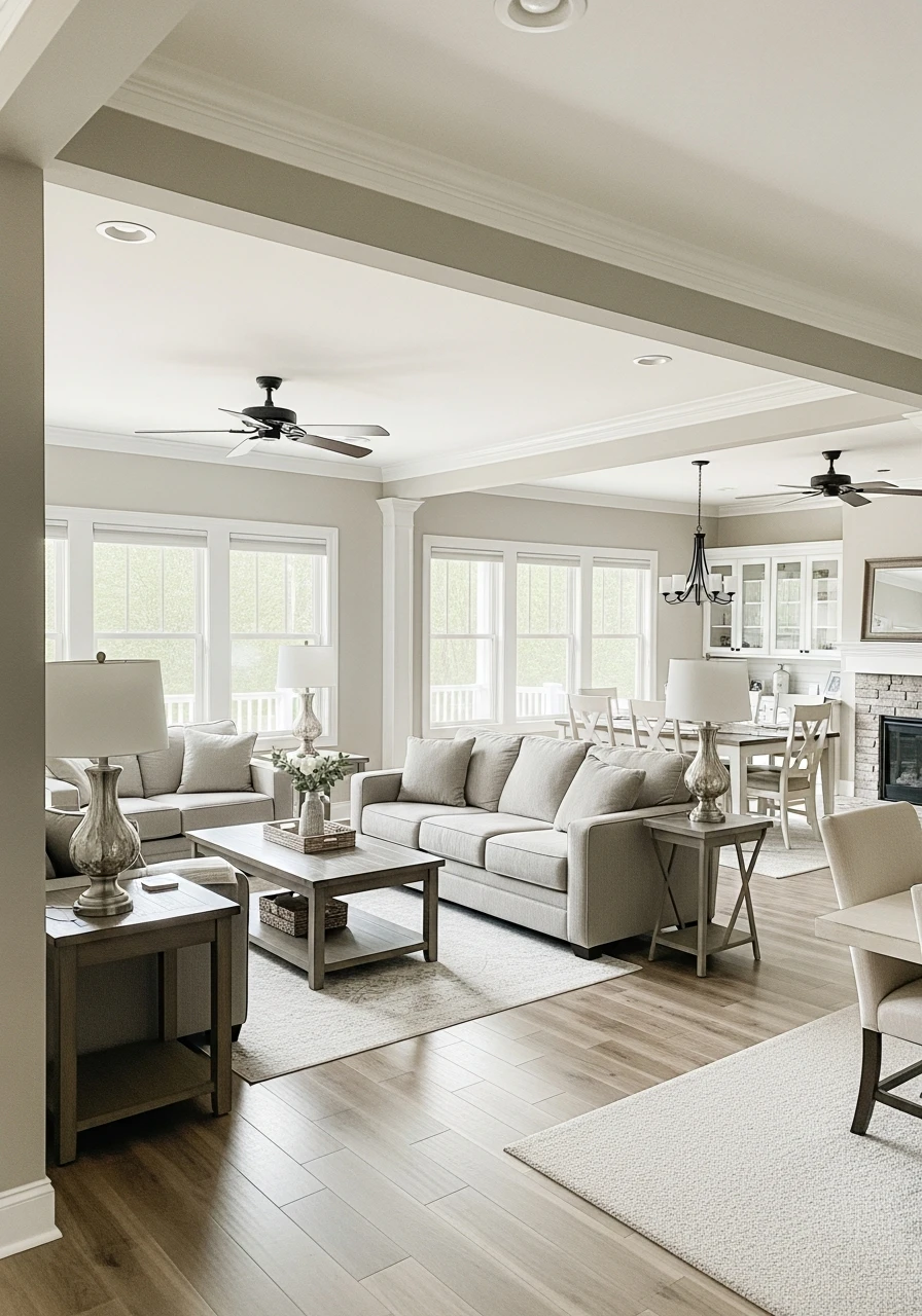
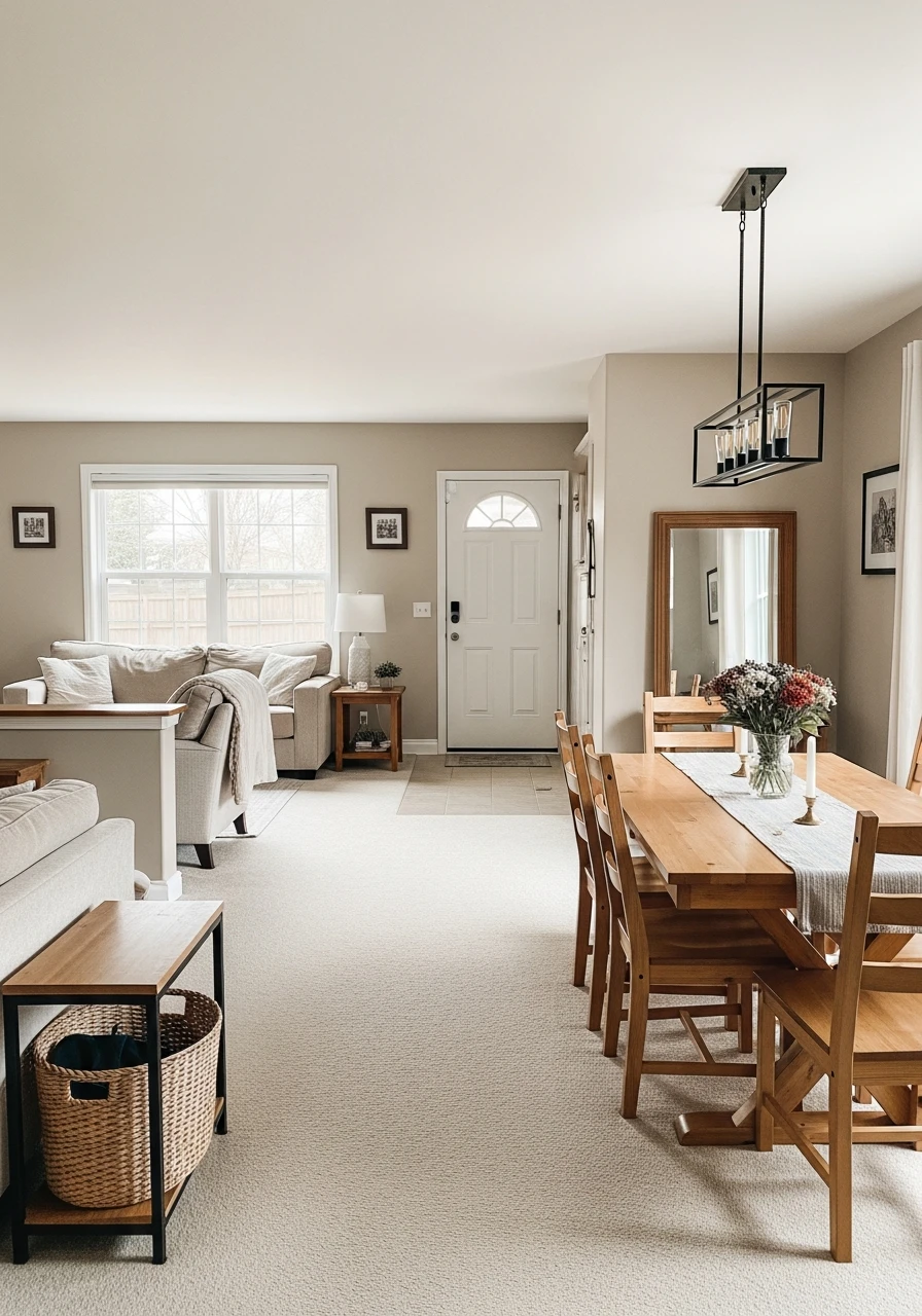
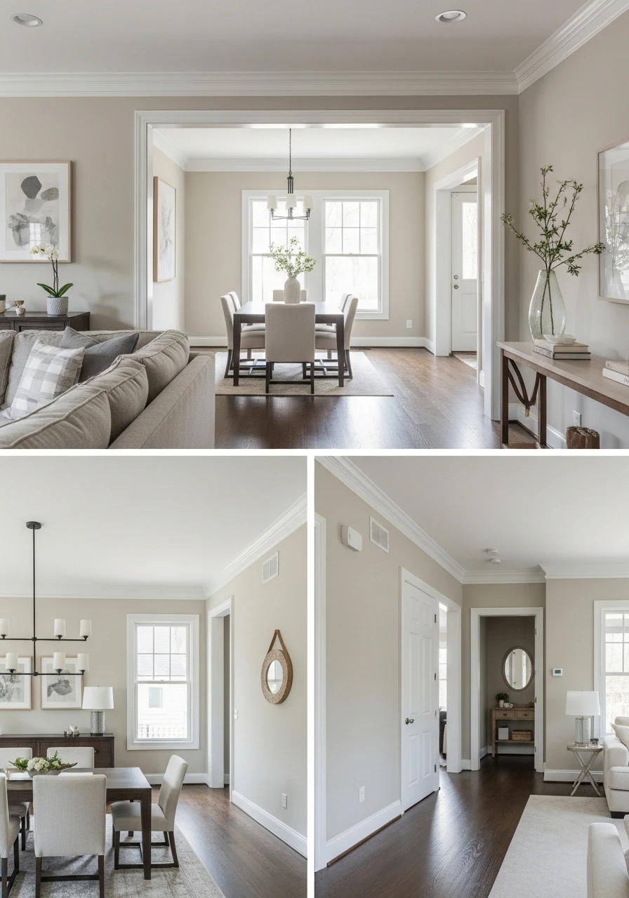
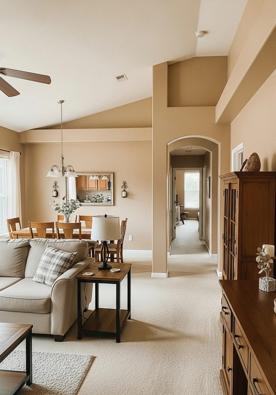
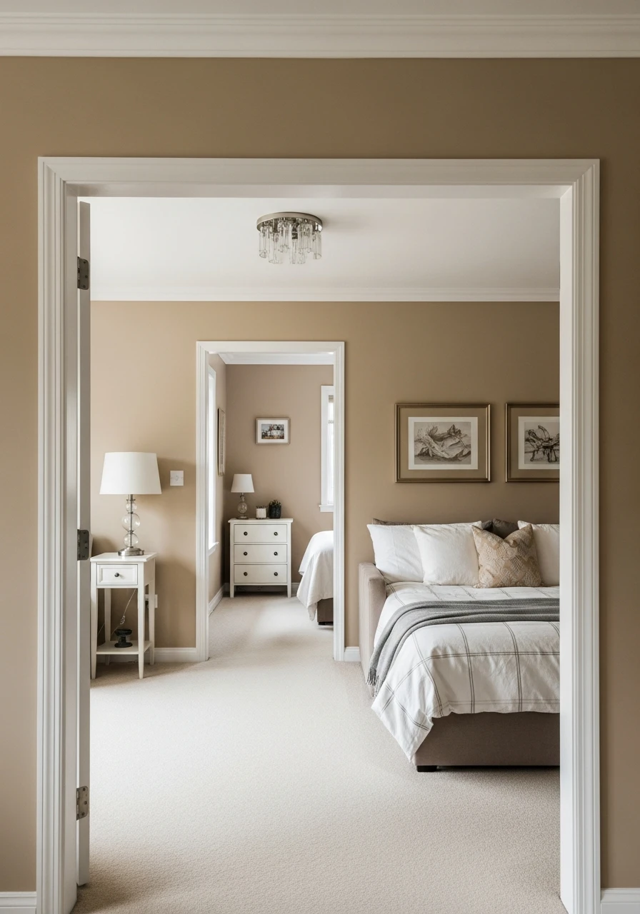
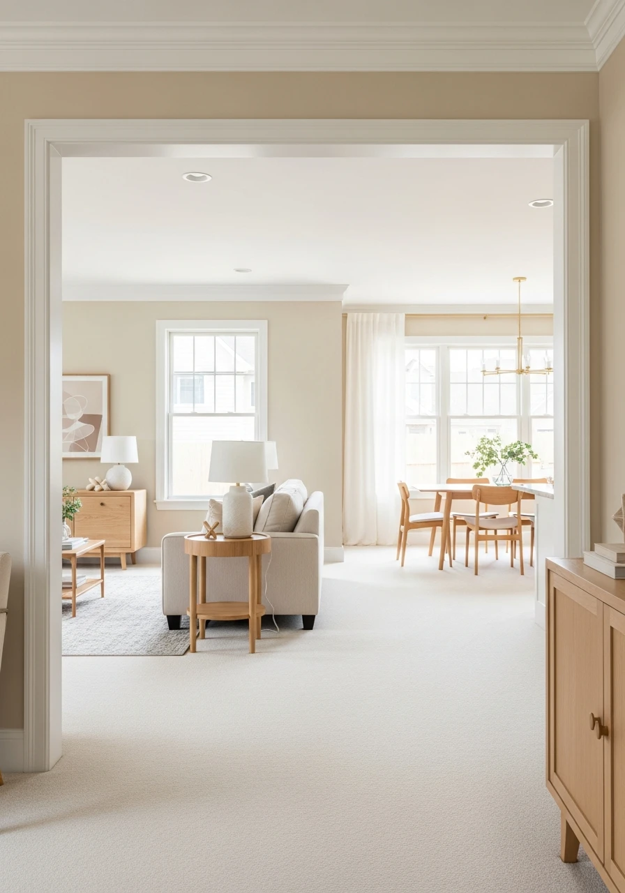
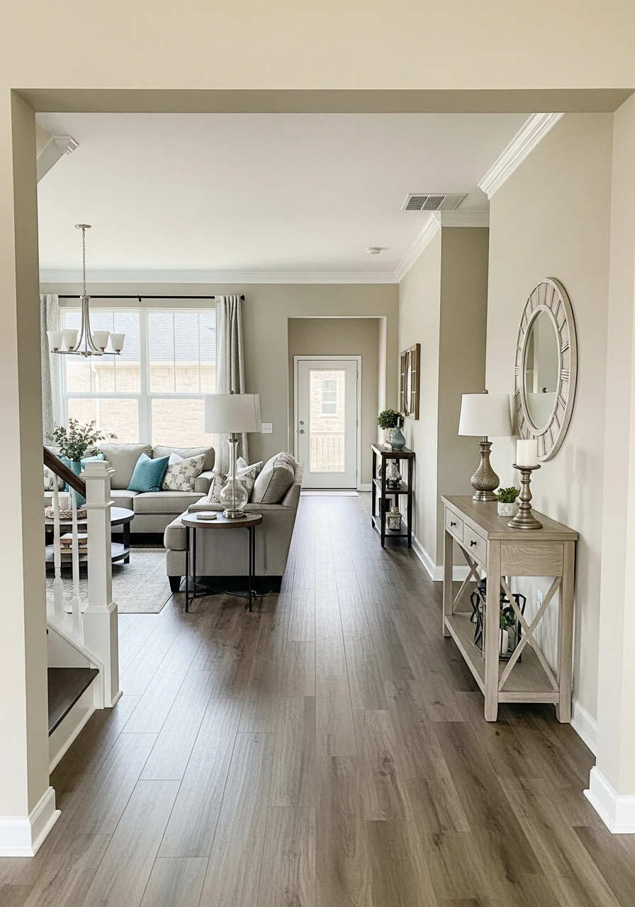
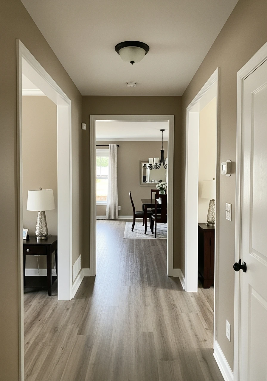
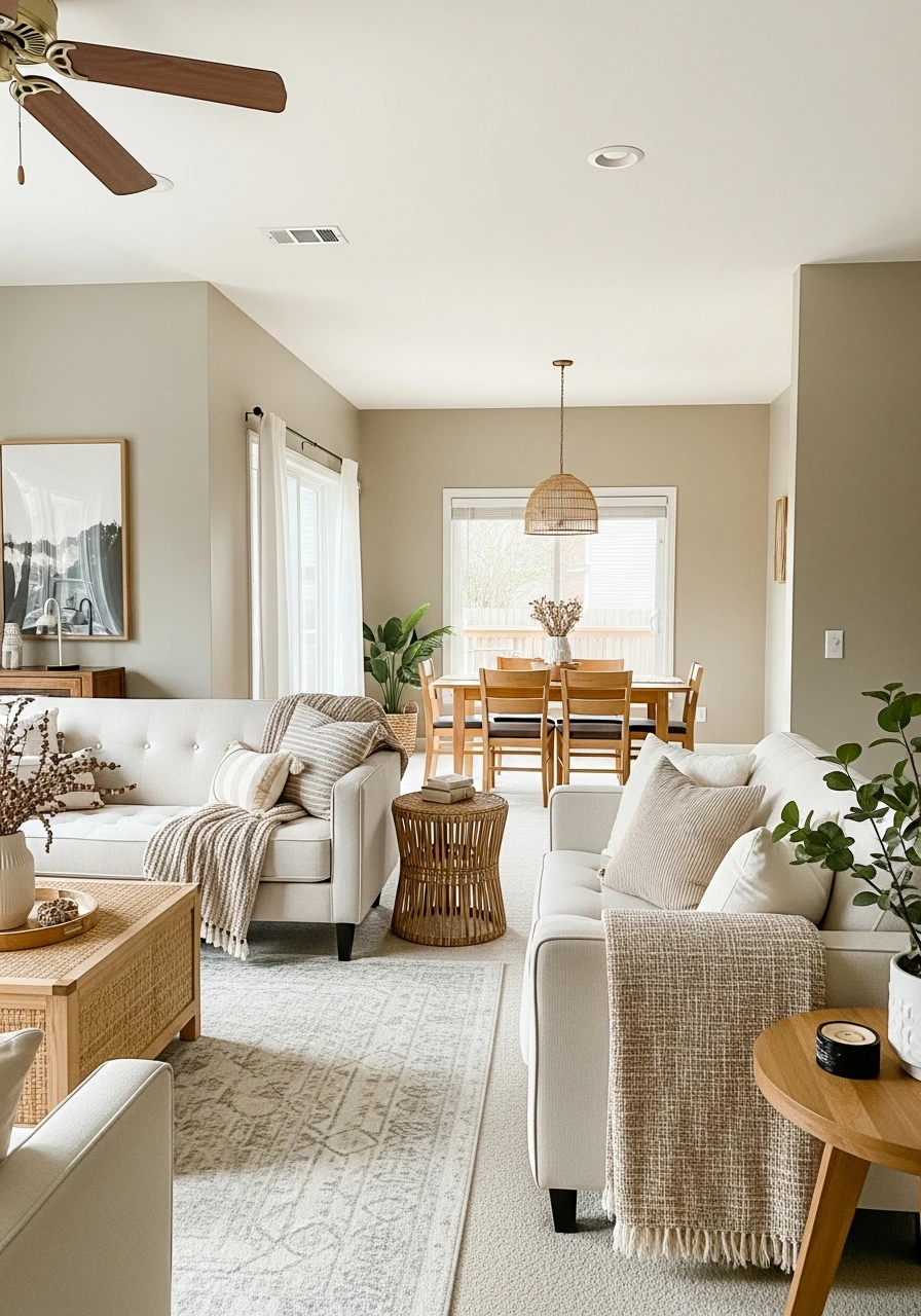
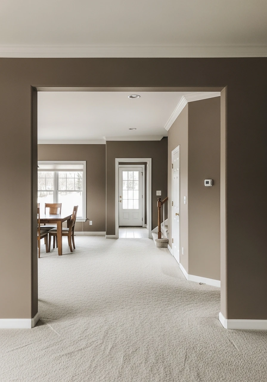
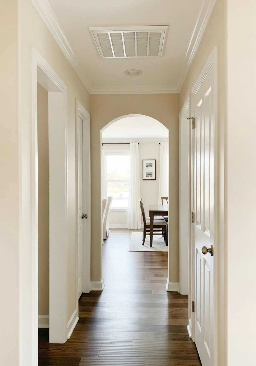
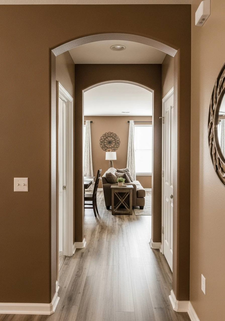
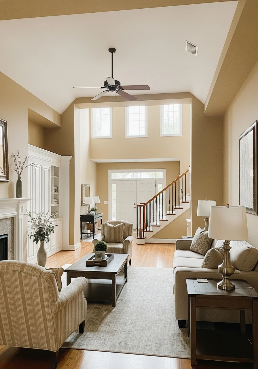
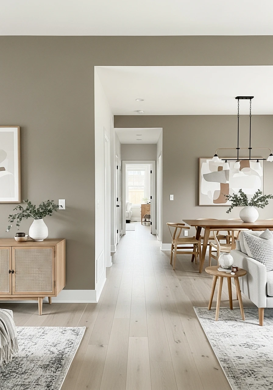
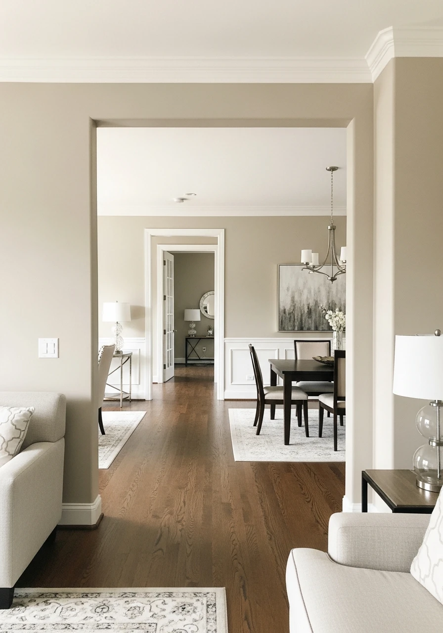
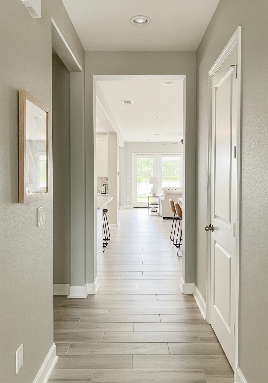
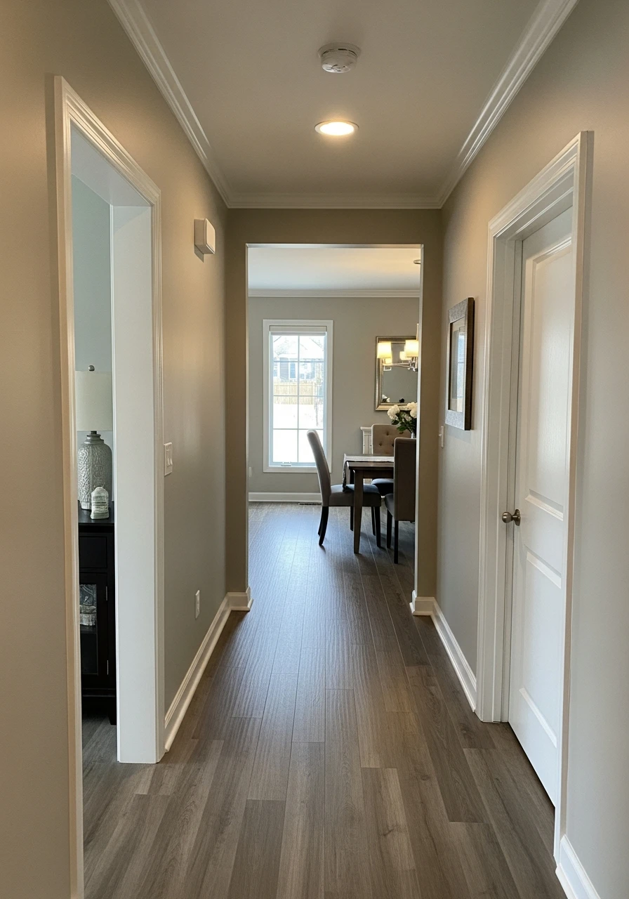
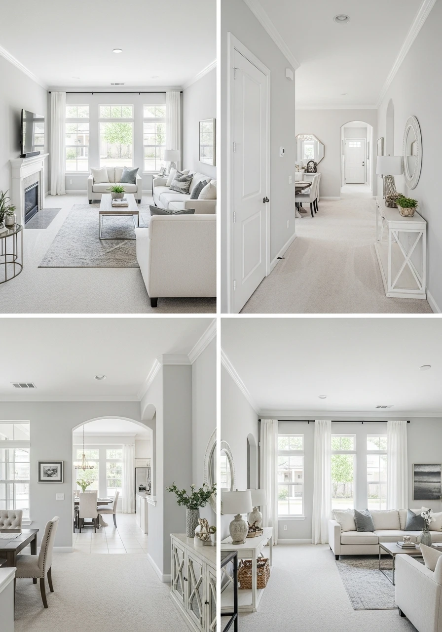
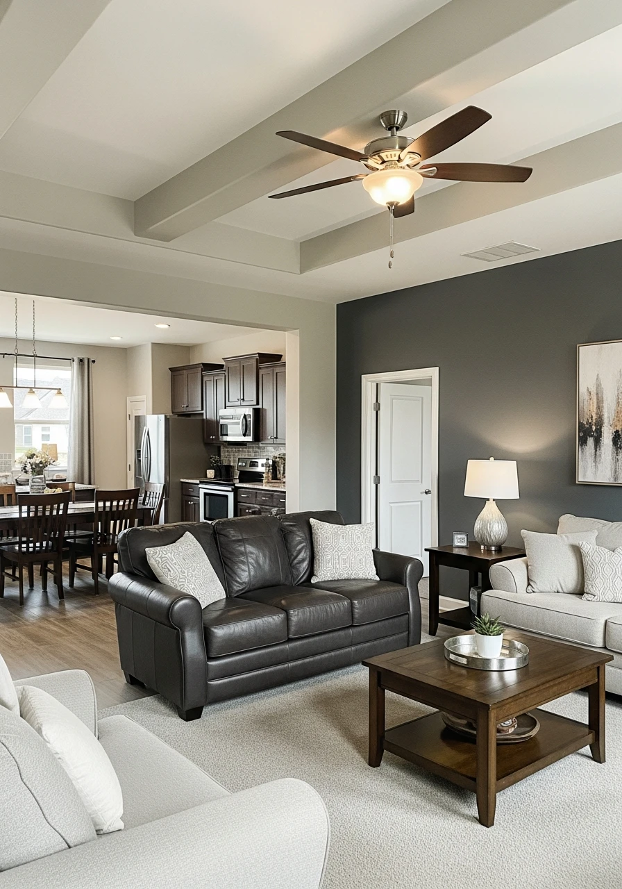
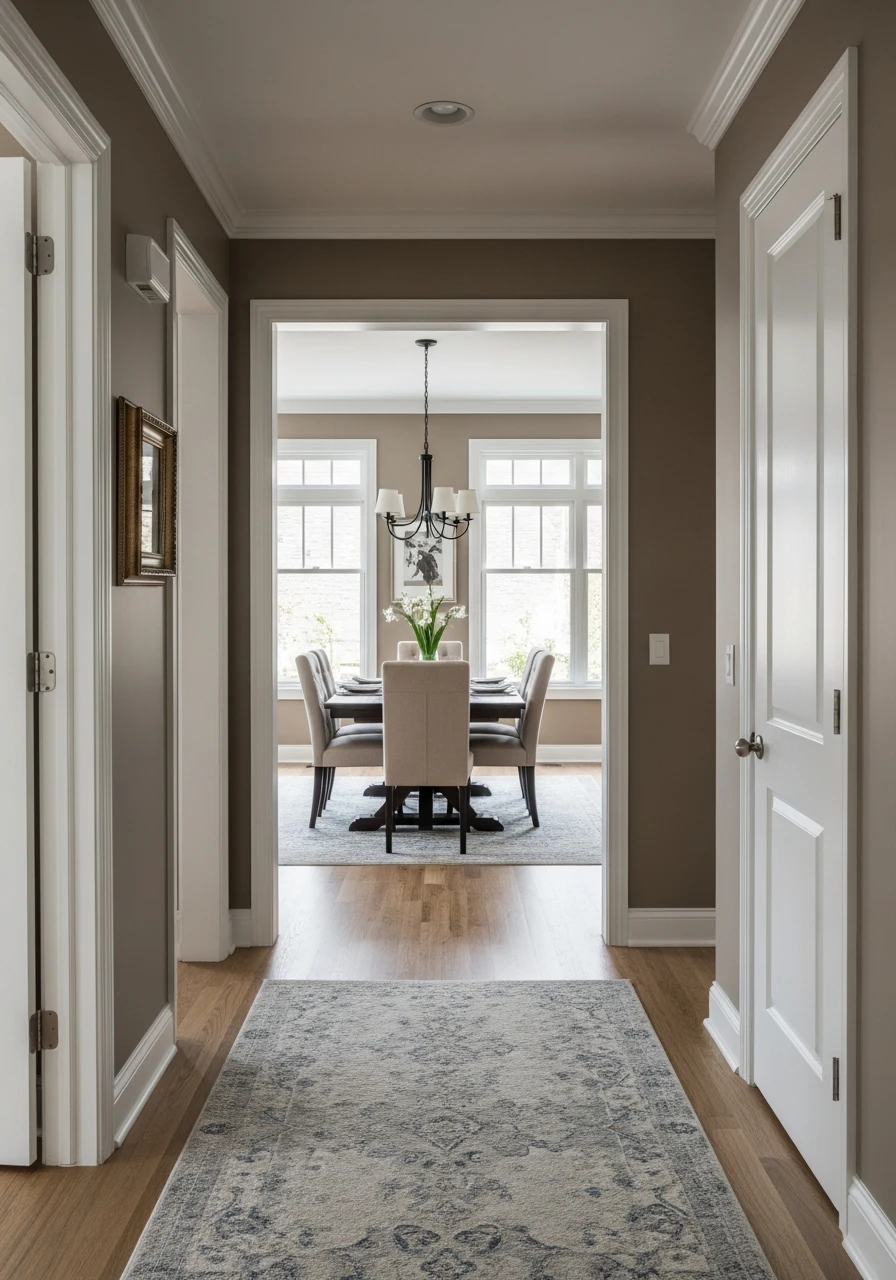
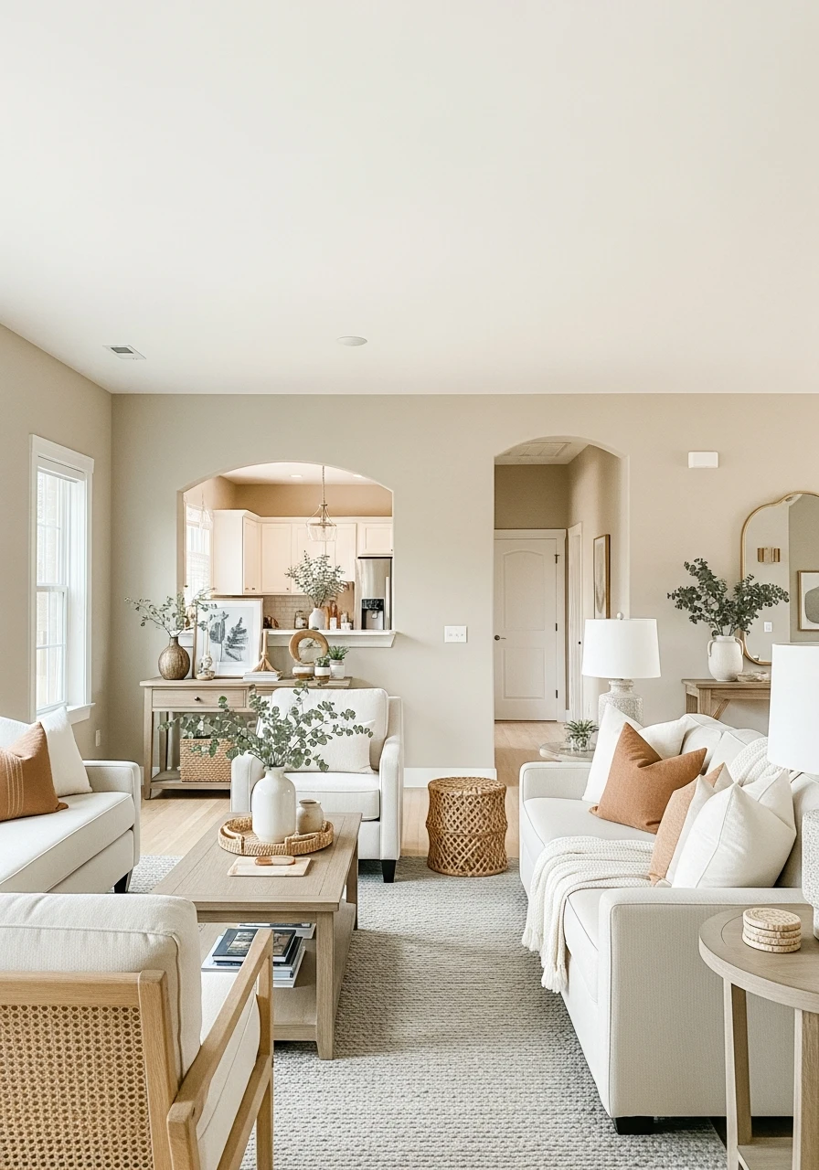
50 Whole House Neutral Paint Colors
This post may contain affiliate links: full affiliate disclosure.
Dreaming of a home that feels put-together and stylish, but without breaking your budget?
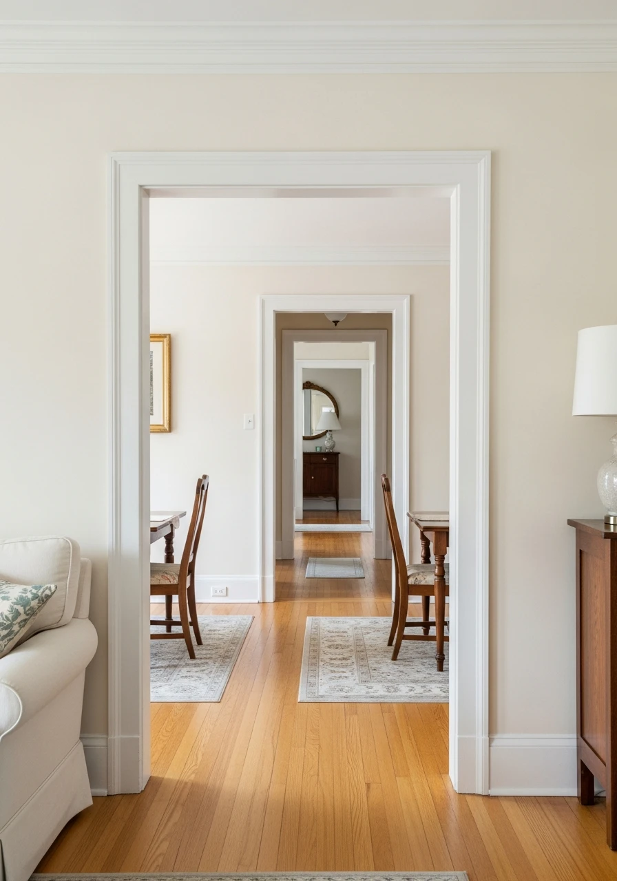
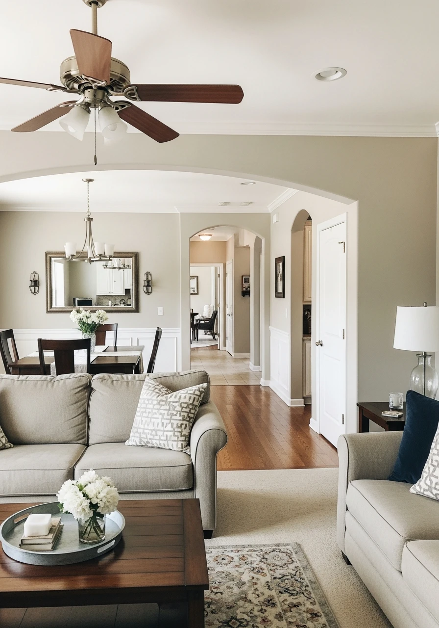
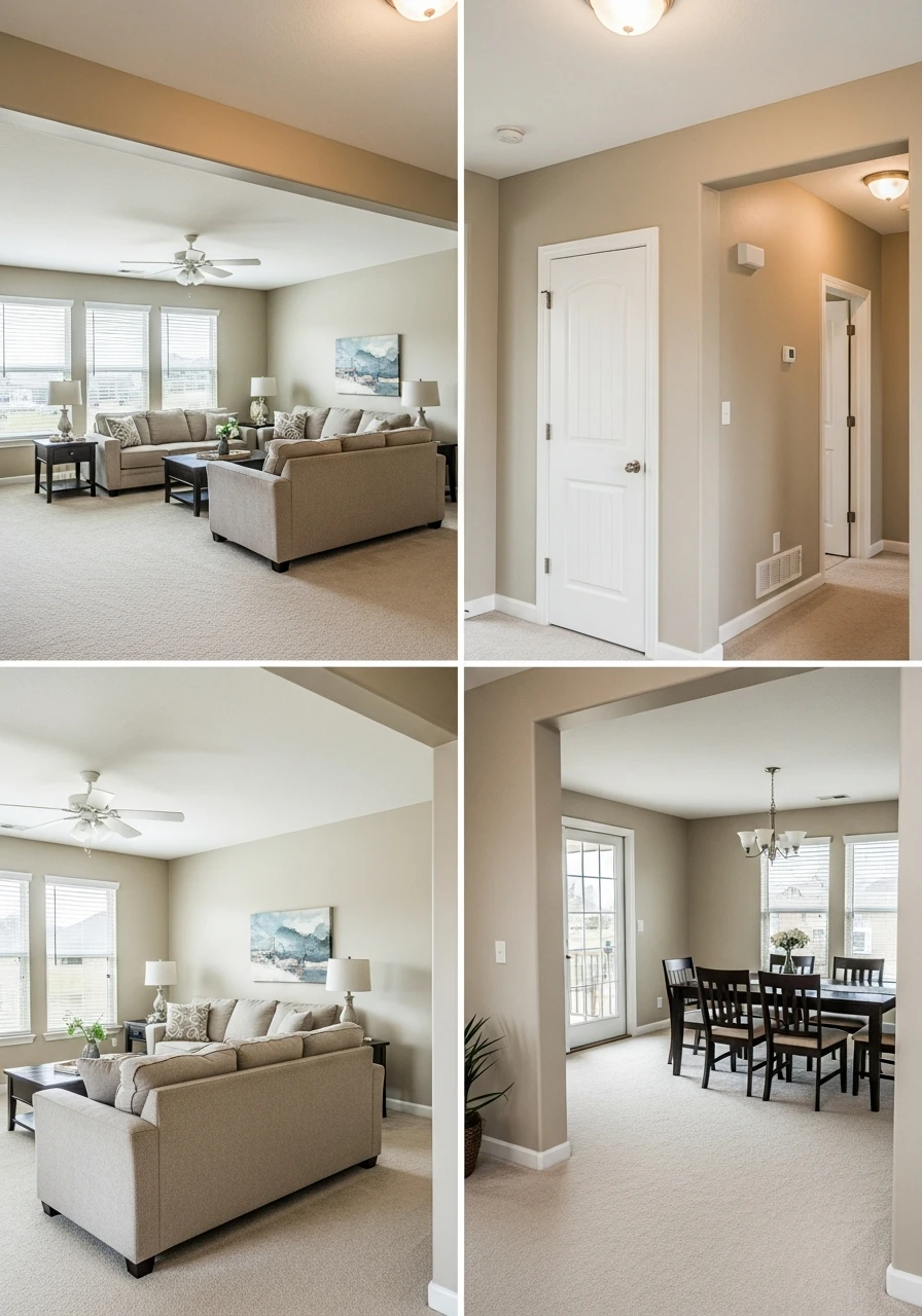
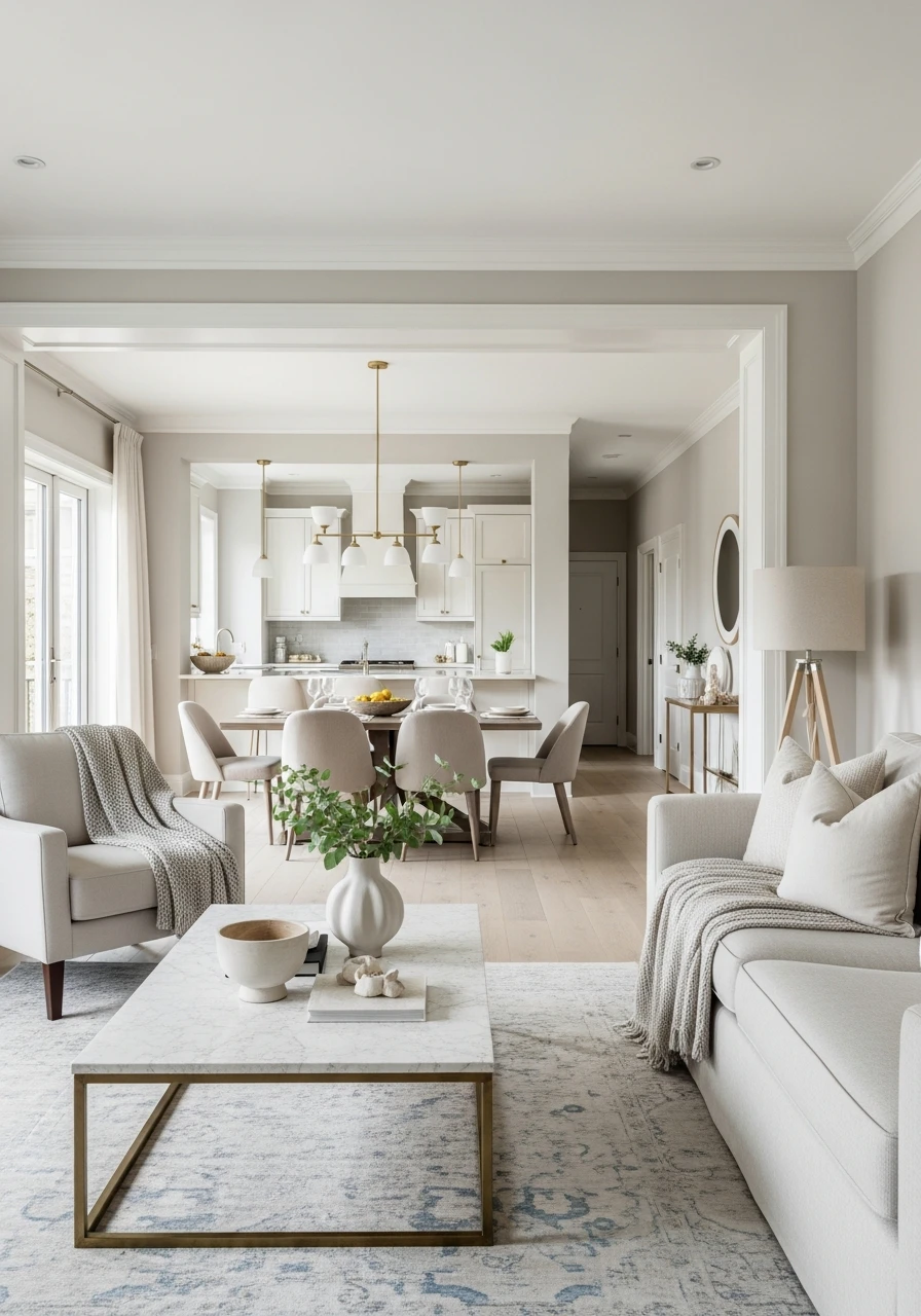
Choosing the right neutral paint color for your whole house is a smart way to get that ‘designer’ look.
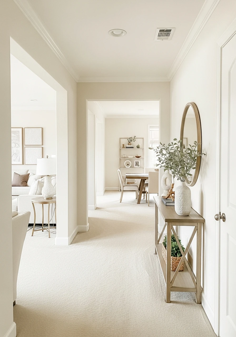
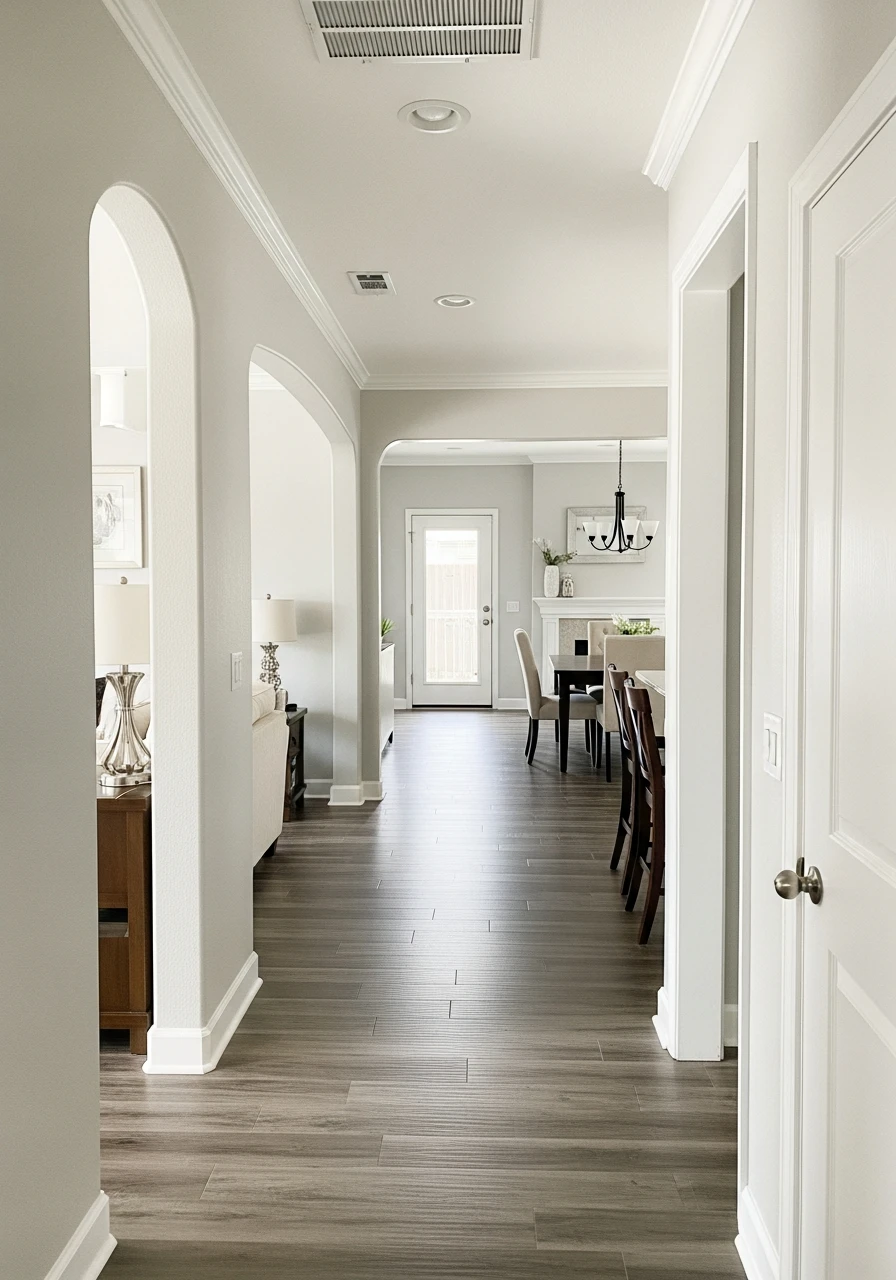
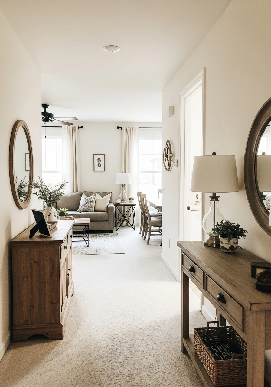
Neutrals create a calm, flowing feeling from room to room, making your space feel bigger and more inviting.
They also act as a perfect backdrop for your furniture and decor, letting your personal style shine.
We’ve gathered 50 amazing neutral paint ideas that will help you create a high-end feel in every corner of your home, easily and affordably. Get ready to find your perfect shade!
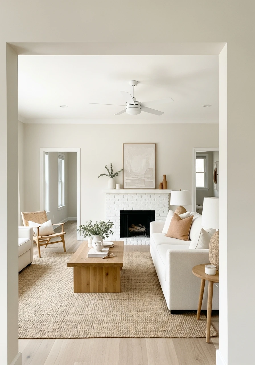
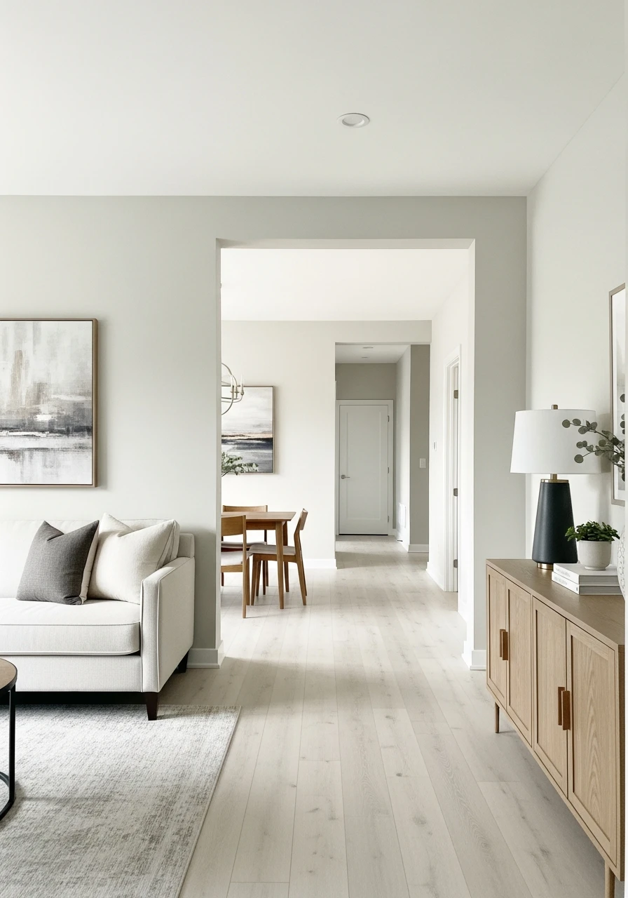
1. Alabaster: A Warm White for Your Whole Home
This gentle, warm white paint color is a favorite for making homes feel inviting and open. It creates a soft backdrop that works well with almost any decor style, giving your house a polished look without being stark.
- Makes rooms feel larger and brighter.
- Pairs well with both modern and traditional styles.
- A great choice for a consistent look throughout your home.
Pro Tip: Test this color in different rooms. Natural light can change how white paint looks during the day.
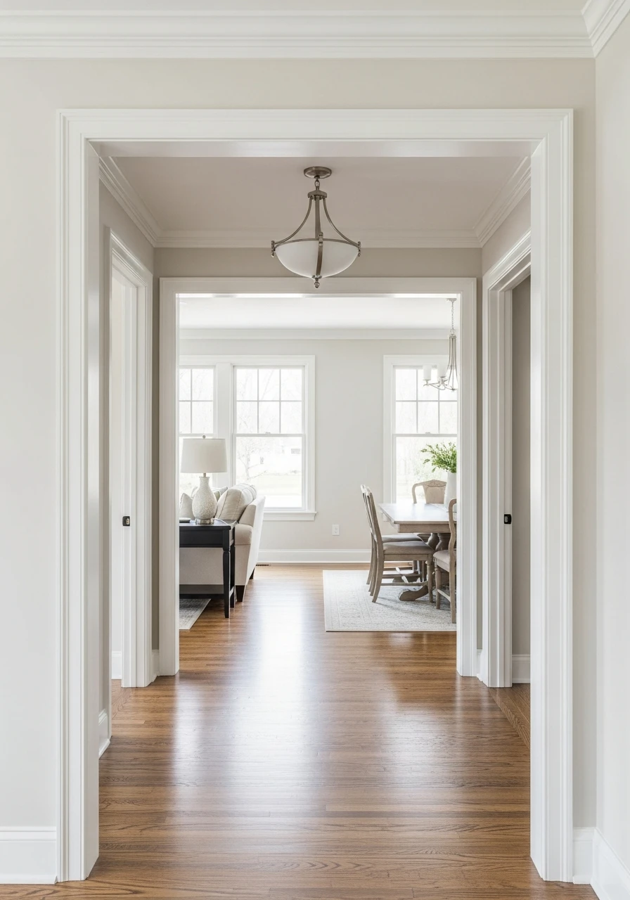
2. White Dove: Soft White for Seamless Flow
White Dove is a beautiful, soft white with a hint of gray, making it incredibly versatile. It’s not too bright, not too creamy, just a perfect balanced white that helps rooms flow into one another, creating a calm and airy atmosphere.
- Offers a clean, crisp feel without being cold.
- Works with a wide range of accent colors.
- Ideal for creating a continuous, open feel in your home.
Pro Tip: Consider your trim color. A slightly brighter white trim can make White Dove walls stand out beautifully.
3. Swiss Coffee: Creamy Neutral for Bright Walls
If you love a warm, creamy white, Swiss Coffee is an excellent choice. It brings a cozy brightness to any room, making your whole house feel welcoming and softly lit. It’s perfect for adding warmth without going full beige.
- Adds a gentle warmth to any space.
- Great for homes that need a touch more brightness.
- A classic choice for a cozy, yet refined feel.
Pro Tip: This color can look different in homes with north-facing versus south-facing windows. Always sample first!
4. Shoji White: Warm Off-White for Natural Interiors
Shoji White is a lovely warm off-white that has a subtle hint of beige or gray, giving it a natural, organic feel. It’s perfect for creating a relaxed and inviting atmosphere, especially if you love natural textures and wood tones.
- Connects well with natural materials like wood and linen.
- Softens a room without making it feel small.
- A sophisticated choice for a modern farmhouse or natural style.
Pro Tip: Pair this with woven baskets or wood furniture to really bring out its natural warmth.
5. Whisper White: Soft Warm Neutral for Light Spaces
Whisper White is a subtle and soft warm white that feels light and airy. It’s a fantastic choice for homes where you want brightness without any harshness. It gives a gentle glow, making rooms feel larger and more open.
- Creates an ethereal and calm environment.
- Perfect for maximizing natural light.
- A simple yet elegant backdrop for any decor.
Pro Tip: Use satin or eggshell finishes for a soft sheen that reflects light without being too shiny.
6. Simply White: Fresh Neutral for Modern Design
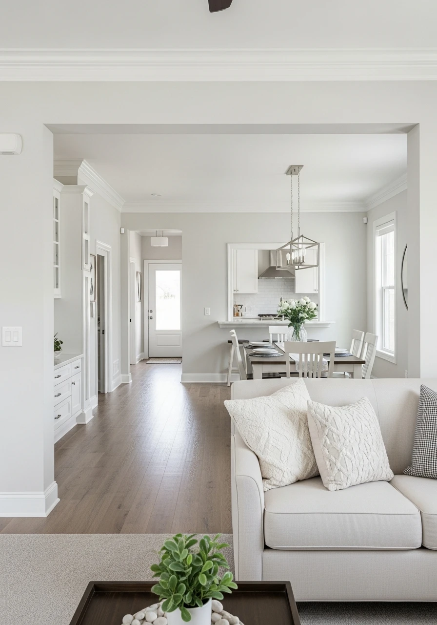
Simply White is a clean, crisp white with just a touch of warmth. It’s incredibly popular for its ability to make a space feel fresh and modern. It’s bright enough to feel contemporary, but soft enough to be welcoming, making it versatile for any home.
- A go-to for modern and minimalist looks.
- Provides a clean canvas for colorful art and furniture.
- Helps define architectural details beautifully.
Pro Tip: This color really pops when paired with dark wood floors or black accents.
7. Cream and Sugar: Warm Cream for Cozy Style
This inviting warm cream color lives up to its name, offering a sweet and cozy feel to your entire home. It’s richer than a pure white but still very light, perfect for creating a snug and comforting atmosphere without feeling heavy.
- Adds significant warmth to cooler rooms.
- Pairs beautifully with traditional and rustic decor.
- Creates a comforting and classic home environment.
Pro Tip: Use this color in living rooms and bedrooms for an extra layer of comfort and relaxation.
8. Melodious Ivory: Soft Ivory for Elegant Palettes
Melodious Ivory is a soft, gentle ivory that brings a touch of classic elegance to your home. It’s a step up from white, offering a bit more color depth while remaining firmly in the neutral family. It’s perfect for a sophisticated, timeless look.
- Offers a subtle richness that feels luxurious.
- Works well with gold accents and rich fabrics.
- A great base for a timeless and elegant design.
Pro Tip: This color looks amazing with dark wood furniture, adding contrast and depth.
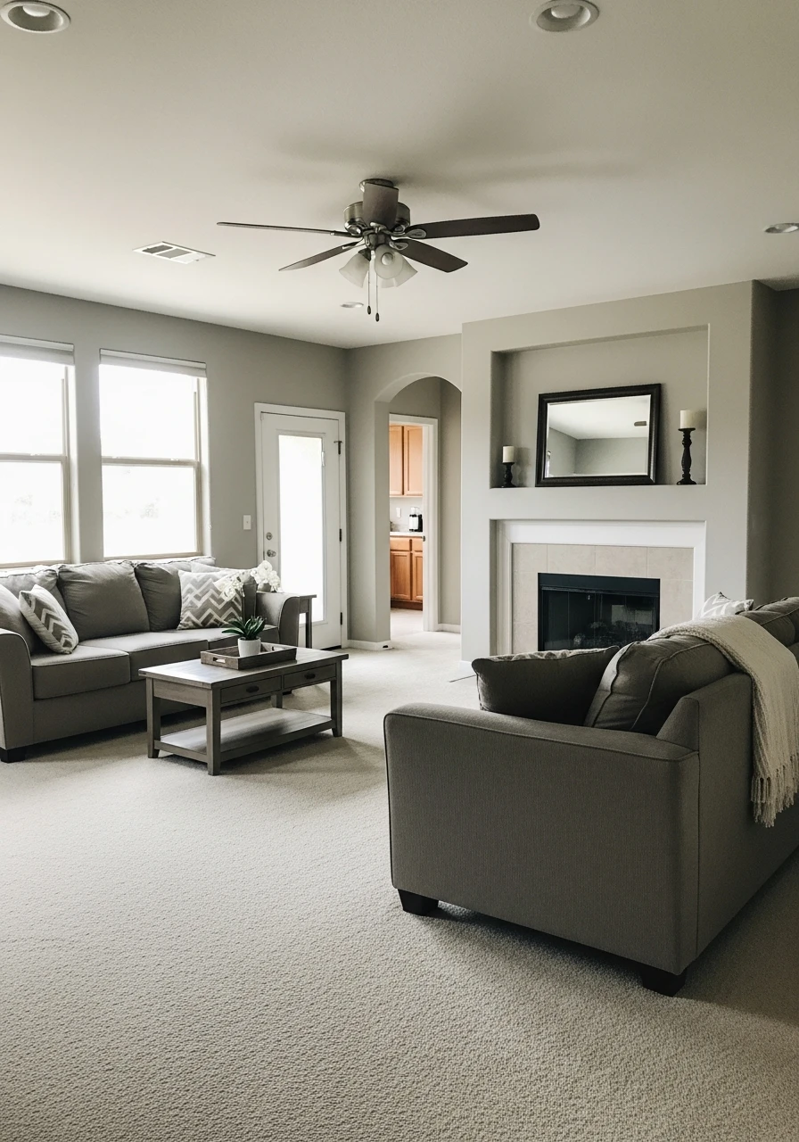
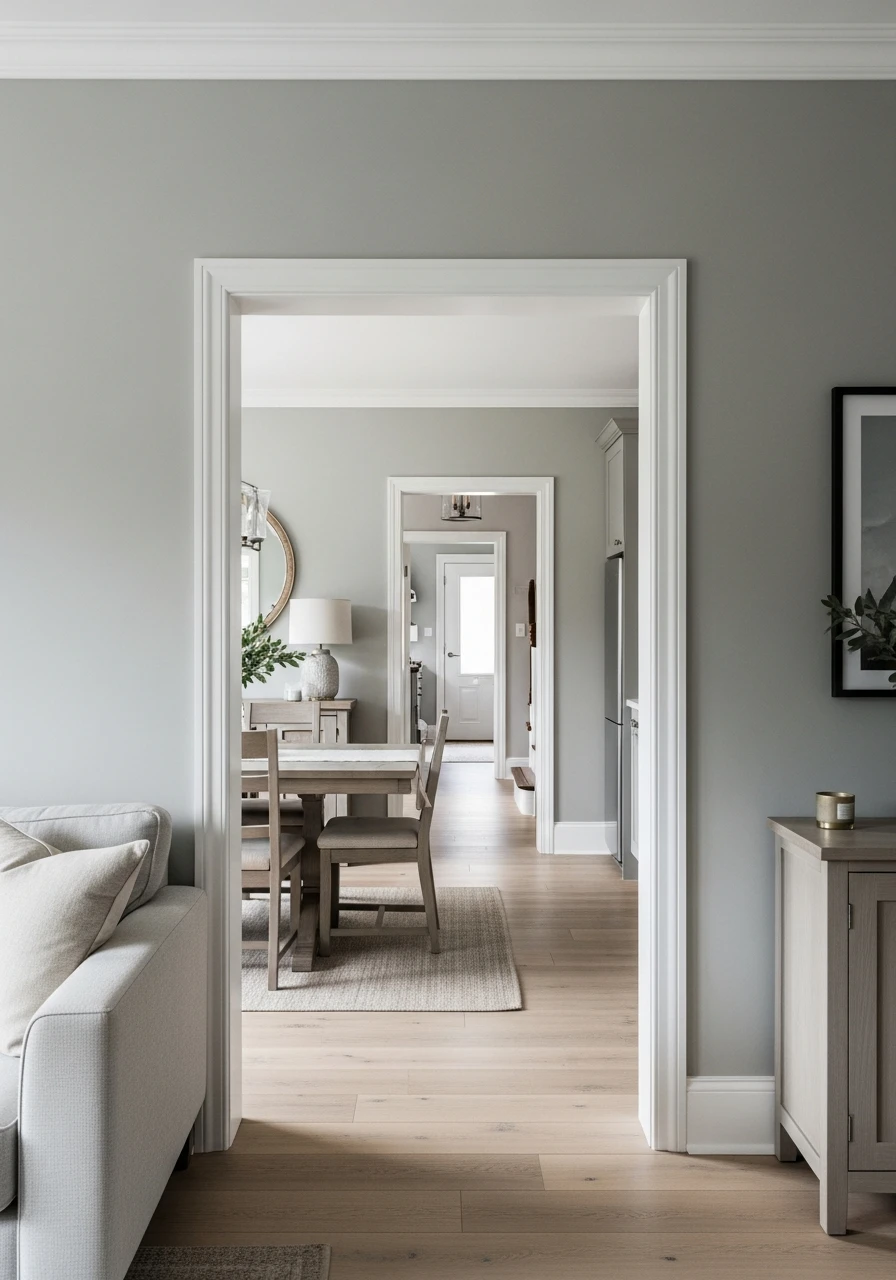
9. Revere Pewter: Classic Greige for Open Homes
Revere Pewter is a beloved greige (gray + beige) that strikes a perfect balance between warm and cool. It’s incredibly versatile and looks stunning in open-concept homes, providing a consistent, sophisticated backdrop that changes beautifully with the light.
- Adapts well to different lighting conditions.
- A popular choice for its ability to suit many styles.
- Creates a sense of calm and refinement.
Pro Tip: Use this color in main living areas to connect different rooms seamlessly.
10. Accessible Beige: Balanced Greige for Entire Home Walls
Accessible Beige is a true chameleon greige, leaning a bit more towards beige but still with noticeable gray undertones. It’s warm, inviting, and incredibly balanced, making it an excellent choice for a whole-house color that feels comfortable and current.
- A warm and inviting neutral.
- Works well with both warm and cool decor elements.
- Offers a comforting, earthy feel to your home.
Pro Tip: This color is fantastic for showcasing colorful artwork or patterned fabrics.
11. Crushed Ice: Light Greige for Airy Interiors
Crushed Ice is a delicate, light greige that brings an airy and fresh feeling to any space. It’s lighter than many greiges, making it perfect for brightening rooms while still offering more depth than a pure white. It’s a modern and clean choice.
- Perfect for creating a spacious and light feel.
- A contemporary neutral that feels fresh.
- Pairs well with silver or chrome fixtures.
Pro Tip: Use this color in rooms with less natural light to help them feel more open.
12. Pale Oak: Putty-Beige Neutral for Calm Flow
Pale Oak is a beautiful putty-beige with soft gray undertones. It’s known for its calming effect and its ability to create a seamless flow throughout a home. It’s warm without being too yellow, offering a sophisticated and serene backdrop.
- Creates a very calm and peaceful environment.
- Flexible enough to work with many decor styles.
- A fantastic choice for bedrooms and living rooms where relaxation is key.
Pro Tip: This color really shines when paired with natural wood finishes and soft textiles.
13. Repose Gray: Versatile Light Greige for Modern Style
Repose Gray is a popular light greige that leans more toward the gray side but still has enough warmth to prevent it from feeling cold. It’s a very versatile color that’s perfect for a modern whole-house style, offering a clean and crisp look.
- A modern and clean neutral.
- Works well with both dark and light furniture.
- Great for open layouts to ensure consistency.
Pro Tip: Consider pairing it with white trim for a sharp, contemporary contrast.
14. Coastal Fog: Soft Greige for Relaxed Design
Coastal Fog is a soft greige that has a gentle, muted quality, evoking a sense of calm and relaxation. It’s perfect for creating a serene and laid-back home design, ideal for those who love a tranquil atmosphere.
- Creates a soothing and quiet environment.
- Pairs wonderfully with blues and greens for a coastal feel.
- A great choice for a relaxed, easy-going home.
Pro Tip: Add natural textures like jute rugs or linen curtains to enhance the relaxed vibe.
15. Natural Linen: Warm Greige for Cozy Backdrops
Natural Linen is a warm greige that truly feels like its namesake fabric—cozy, inviting, and organic. It’s a beautiful neutral that provides a comforting backdrop for any room, making your home feel grounded and welcoming.
- Adds a cozy, textured feel to walls.
- Works well with rustic or farmhouse decor.
- A comforting color that feels like a warm hug.
Pro Tip: This color looks amazing with actual linen textiles and other natural fibers.
16. Edgecomb Gray: Timeless Greige for Seamless Interiors
Edgecomb Gray is a timeless greige that is incredibly popular for its ability to look good in almost any light. It’s a chameleon color that can appear more beige or more gray depending on the time of day, making it perfect for seamless transitions between rooms.
- A truly versatile and adaptable neutral.
- Known for its subtle warmth and elegance.
- Perfect for creating a cohesive look throughout your house.
Pro Tip: This color is often recommended by designers for its universal appeal. It’s a safe and stylish bet!
17. Balanced Beige: Earthy Neutral for Warm Palettes
Balanced Beige is a beautiful, warm, earthy beige that lives up to its name by offering a perfect blend of comfort and style. It’s a great choice for creating a warm and inviting palette throughout your home, especially if you prefer warmer tones.
- Provides a comforting and grounded feel.
- Works well with natural wood furniture.
- A solid choice for a consistently warm home.
Pro Tip: Pair with creamy whites or soft greens for a harmonious and natural look.
18. Kilim Beige: Rich Warm Neutral for Cozy Walls
Kilim Beige is a richer, more saturated warm beige that brings a deep coziness to any room. It’s perfect for creating a snug and inviting atmosphere, especially in homes where you want a bit more color depth than a light greige or white.
- Adds a deep, comforting warmth.
- Great for creating a cozy and intimate space.
- Works well with Mediterranean or Southwestern decor touches.
Pro Tip: This color can be a great choice for a dining room or a cozy den.
19. Manchester Tan: Sandy Beige for Bright Spaces
Manchester Tan is a classic sandy beige that brings a bright yet warm feel to your home. It’s lighter than some other beiges, preventing rooms from feeling too dark, while still offering a beautiful, sunny glow.
- A bright and cheerful beige.
- Pairs well with white trim for a fresh look.
- Ideal for making a space feel open and inviting.
Pro Tip: This color looks particularly good in rooms with plenty of natural light, enhancing its sunny quality.
20. Universal Khaki: Nature-Inspired Beige for Full Home Flow
Universal Khaki is a nature-inspired beige with a touch of green-gray undertones, giving it an earthy and sophisticated feel. It’s a wonderful choice for a whole-house color, providing a grounding and organic flow throughout your space.
- Offers a sophisticated, earthy feel.
- Works beautifully with plants and natural decor.
- A unique neutral that stands out subtly.
Pro Tip: Use this color to connect indoor spaces with outdoor views, creating harmony.
21. Stone Hearth: Warm Beige for Comfortable Design

Stone Hearth is a warm, inviting beige that feels deeply comfortable and grounding. It has subtle gray undertones that keep it from being too yellow, making it a versatile choice for a comfortable and stylish whole-house design.
- Creates a very warm and grounded feeling.
- Perfect for a home that values comfort and coziness.
- A classic choice that won’t go out of style.
Pro Tip: This color is fantastic in spaces where you want to feel relaxed, like a family room or bedroom.
22. Wheat Bread: Soft Natural Beige for Family-Friendly Homes
Wheat Bread is a soft, natural beige that evokes the warmth of freshly baked goods. It’s a gentle and inviting color, perfect for creating a family-friendly home that feels both cozy and clean.
- A comforting and approachable beige.
- Hides everyday scuffs well, making it practical for families.
- Creates a welcoming and homey atmosphere.
Pro Tip: Consider an eggshell finish for easy cleaning in high-traffic areas.
23. Studio Taupe: Sophisticated Beige Neutral for Stylish Interiors
Studio Taupe is a sophisticated beige neutral that has a lovely blend of beige and gray, leaning towards a slightly deeper tone. It’s perfect for creating stylish, refined interiors that feel both modern and timeless.
- Adds a touch of elegance and depth.
- Works well with both light and dark furniture.
- A great choice for a high-end look on a budget.
Pro Tip: Pair this color with crisp white trim for a sharp, clean look.
24. Accessible Tan: Balanced Sandy Neutral for Transitional Looks
Accessible Tan is a balanced sandy neutral that bridges the gap between traditional and modern styles. It’s warm and inviting, but its subtle undertones keep it fresh, making it ideal for homes that blend different design elements.
- A versatile color that suits many furniture styles.
- Creates a smooth transition between rooms.
- Offers a comforting, yet updated feel.
Pro Tip: This color is a great base if you like to change your decor accents often.
25. Pashmina: Mushroom Taupe Neutral for Sophisticated Style
Pashmina is a beautiful mushroom taupe neutral, offering a unique blend of brown and gray with a hint of purple. It’s a sophisticated choice that adds depth and warmth, perfect for creating a refined and cozy whole-house style.
- Adds a rich, luxurious feel.
- Changes beautifully with different lighting.
- A distinctive neutral that still feels calming.
Pro Tip: This color can look stunning with antique wood pieces or velvet textures.
26. Shiitake: Earthy Taupe Neutral for Organic Design
Shiitake is an earthy taupe neutral that has a grounded, natural feel, much like its namesake. It’s perfect for homes that embrace organic design and natural materials, bringing a sense of calm and connection to nature indoors.
- Connects well with outdoor elements.
- A calming and stable neutral.
- Great for a natural, minimalist look.
Pro Tip: Introduce lots of greenery and natural wood to enhance its organic vibe.
27. Jitney: Muted Sandy Brown Neutral for Warm Atmosphere
Jitney is a muted sandy brown neutral that brings a deep, comforting warmth to any space. It’s richer than a typical beige but still acts as a beautiful neutral backdrop, creating a cozy and inviting atmosphere throughout your home.
- Adds a rustic, grounded warmth.
- Perfect for creating a snug and intimate feeling.
- A great choice for homes that love deeper, earthy tones.
Pro Tip: This color looks especially good with creamy white accents and warm lighting.
28. Natural Choice: Creamy Earth Neutral for Soft Backdrops
Natural Choice is a creamy, earthy neutral that offers a soft and gentle backdrop for your home. It’s a light color with a subtle warmth, making rooms feel airy and inviting without being stark white. It’s a versatile and comforting option.
- A soft and inviting neutral.
- Works well with many different decor styles.
- Creates a serene and light-filled atmosphere.
Pro Tip: This color is a great base for layering different textures and patterns in your decor.
29. Smoked Tan: Brown-Infused Neutral for Cozy Walls
Smoked Tan is a brown-infused neutral that offers a deep, cozy warmth. It’s perfect for creating a snug and comforting feel, making your walls feel like a warm embrace. It’s a richer alternative to lighter beiges.
- Adds significant warmth and depth.
- Great for creating a cozy, den-like atmosphere.
- Pairs well with traditional decor and leather furniture.
Pro Tip: Use this color in a room where you want to feel truly relaxed and at ease.
30. Sherwood Tan: Earthy Neutral for Traditional Spaces
Sherwood Tan is an earthy neutral that brings a classic, traditional feel to your home. It’s a solid, dependable tan that feels grounded and established, perfect for homes that appreciate timeless design.
- A reliable and classic tan.
- Works well with traditional furniture and decor.
- Provides a warm and inviting foundation.
Pro Tip: This color is excellent for showcasing classic artwork or antique pieces.
31. Utaupeia: Sandy Taupe Neutral for Modern Nature-Inspired Homes
Utaupeia is a sandy taupe neutral that blends the best of warm browns with cool grays, creating a sophisticated and modern feel. It’s a great choice for homes that draw inspiration from nature but want a contemporary edge.
- Offers a modern take on earthy tones.
- Versatile enough for different lighting conditions.
- Creates a refined and calm atmosphere.
Pro Tip: Pair with minimalist furniture and natural wood accents for a chic look.
32. Epernay: Champagne Neutral for Elegant Color Flow
Epernay is a beautiful champagne neutral that has a subtle shimmer and warmth, bringing a touch of understated elegance to your home. It’s a sophisticated choice that creates a smooth, luxurious color flow throughout your space.
- Adds a delicate, luxurious feel.
- Pairs beautifully with gold or brass accents.
- A refined alternative to traditional beige.
Pro Tip: This color looks stunning in dining rooms or entryways where you want to make a refined statement.
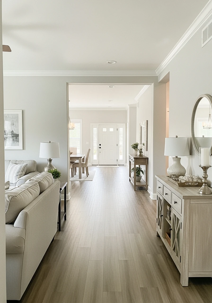
33. Gray Owl: Soft Warm Gray Neutral for Flexible Palettes
Gray Owl is a soft, warm gray neutral that is incredibly flexible and adaptable. It has a subtle green undertone that keeps it feeling fresh and light, making it a wonderful choice for a whole-house palette that needs to work with many different styles.
- A light and airy gray.
- Adapts well to various decor styles.
- Creates a calm and fresh environment.
Pro Tip: This gray works well with both warm wood tones and cooler metals like silver.
34. Worldly Gray: Modern Warm Gray Neutral for Seamless Design
Worldly Gray is a modern warm gray neutral that has just enough beige to keep it from feeling cold. It’s a fantastic choice for seamless interior design, offering a sophisticated and inviting backdrop that connects rooms effortlessly.
- A true ‘greige’ that leans gray.
- Provides a soft and welcoming feel.
- Perfect for open concept living spaces.
Pro Tip: This color is a great foundation if you want to introduce pops of color with your accessories.
35. Classic Gray: Light Neutral Gray for Bright Walls
Classic Gray is a very light, almost off-white gray that still offers more depth than a pure white. It’s perfect for brightening walls while providing a sophisticated neutral base. It feels clean, crisp, and timeless.
- Creates a bright and airy feel.
- A very soft and delicate gray.
- Works well with almost any accent color.
Pro Tip: Use this color if you want a subtle hint of gray without it feeling too dark or heavy.
36. Cracked Pepper: Deep Warm Gray Neutral for Modern Contrast
Cracked Pepper is a deep, warm gray neutral that offers a striking contrast to lighter elements in your home. It’s perfect for creating a modern, dramatic look, especially as an accent wall or in smaller, cozy spaces to add depth.
- Adds a bold and modern touch.
- Great for creating a focal point.
- Pairs beautifully with natural wood and white accents.
Pro Tip: Consider using this color in a powder room or a home office for a sophisticated feel.
37. Drift of Mist: Soft Modern Neutral for Airy Style
Drift of Mist is a soft, modern neutral with hints of both gray and beige, creating a very light and airy feel. It’s perfect for homes that want a subtle touch of color without committing to a strong hue, promoting a serene style.
- Creates a very gentle and ethereal atmosphere.
- A versatile color that feels fresh and current.
- Ideal for maximizing light in any room.
Pro Tip: This color is a great choice for a minimal or Scandinavian-inspired design.
38. Balboa Mist: Subtle Gray-Beige Neutral for Calm Design
Balboa Mist is a subtle gray-beige neutral that offers a beautiful blend of warmth and coolness. It’s known for its calming effect and its ability to create a serene and peaceful design throughout your home.
- A soft and soothing greige.
- Works well with both warm and cool decor.
- Perfect for creating a tranquil home environment.
Pro Tip: This color is excellent for bedrooms or any space where you want to feel relaxed.
39. Warm Eucalyptus: Green-Based Neutral for Nature-Inspired Homes
Warm Eucalyptus is a gentle, green-based neutral that brings the calming essence of nature indoors. It’s perfect for creating a peaceful and refreshing atmosphere in nature-inspired homes, adding a subtle touch of color without being overwhelming.
- Adds a calming, organic touch.
- Pairs well with plants and natural textures.
- A unique neutral that feels fresh and airy.
Pro Tip: Consider this color in a bathroom or sunroom to enhance its natural feel.
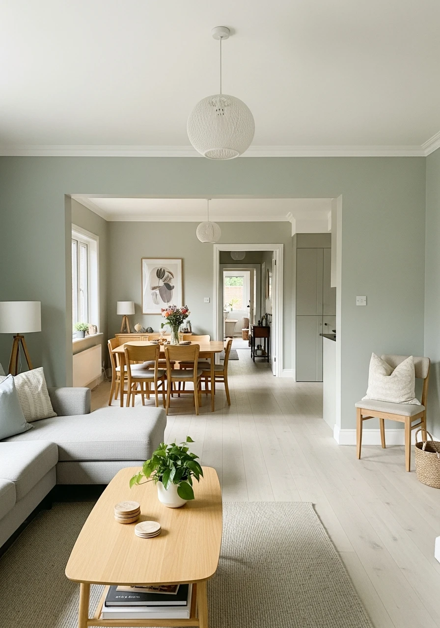
40. Evergreen Fog: Soft Sage Neutral for Trendy Interiors
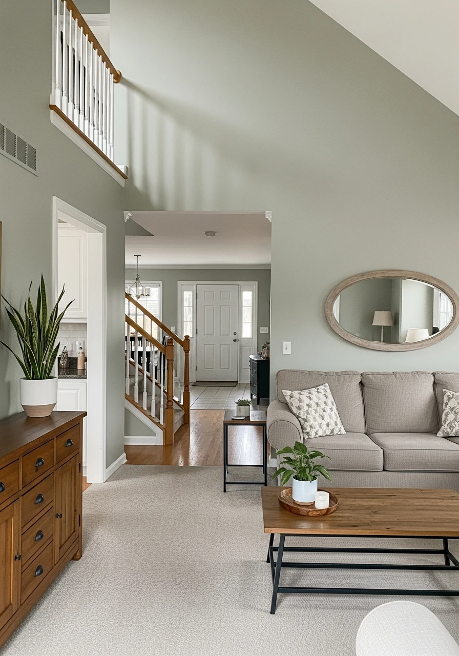
Evergreen Fog is a soft sage green neutral that is both trendy and timeless. It offers a muted, earthy green that feels sophisticated and calming, perfect for creating stylish, nature-inspired interiors with a modern edge.
- A stylish and calming green neutral.
- Works beautifully with natural wood and brass accents.
- Adds a touch of modern organic charm.
Pro Tip: This color is fantastic for creating a feature wall or painting a whole room for a sophisticated feel.
41. Rain Check: Gray-Green Neutral for Relaxed Palettes
Rain Check is a beautiful gray-green neutral that evokes the calm after a gentle rain. It’s a muted, serene color that creates a relaxed and refreshing palette throughout your home, perfect for a tranquil escape.
- Offers a soothing and calm atmosphere.
- Pairs well with blues and creams.
- A gentle color that feels refreshing.
Pro Tip: Use soft, sheer curtains to let natural light play with this color throughout the day.
42. Cavern Clay: Earthy Terracotta Neutral for Warm Accents
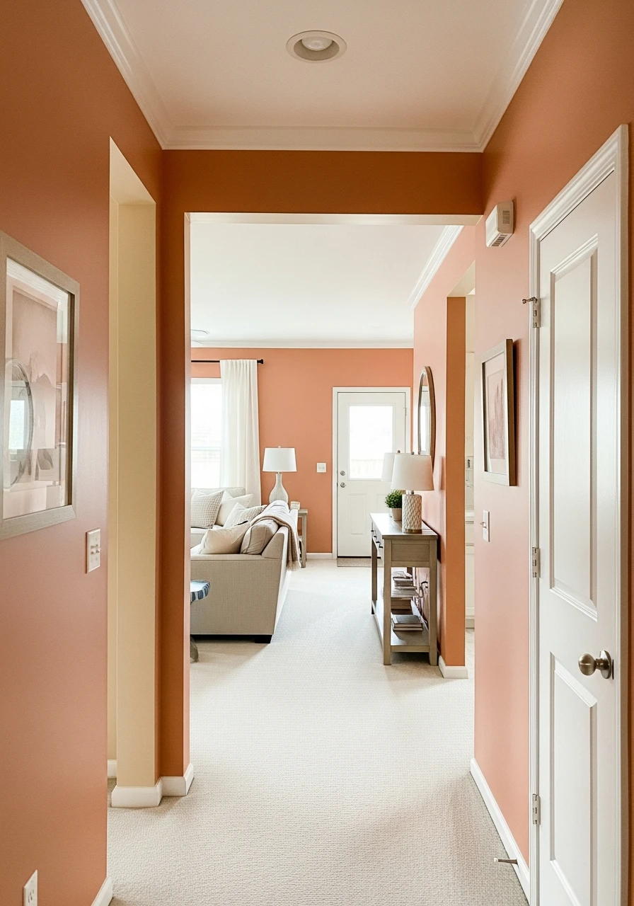
Cavern Clay is an earthy terracotta neutral that brings a warm, desert-inspired feel to your home. While it’s a stronger neutral, it works beautifully as an accent or in smaller spaces to add a unique, inviting warmth.
- Adds a touch of warm, rustic charm.
- Great for creating a cozy, inviting nook.
- Pairs well with natural fibers and leather.
Pro Tip: Consider using this on an accent wall to bring a pop of earthy warmth without overwhelming the space.
43. Silhouette: Charcoal Brown Neutral for Moody Spaces
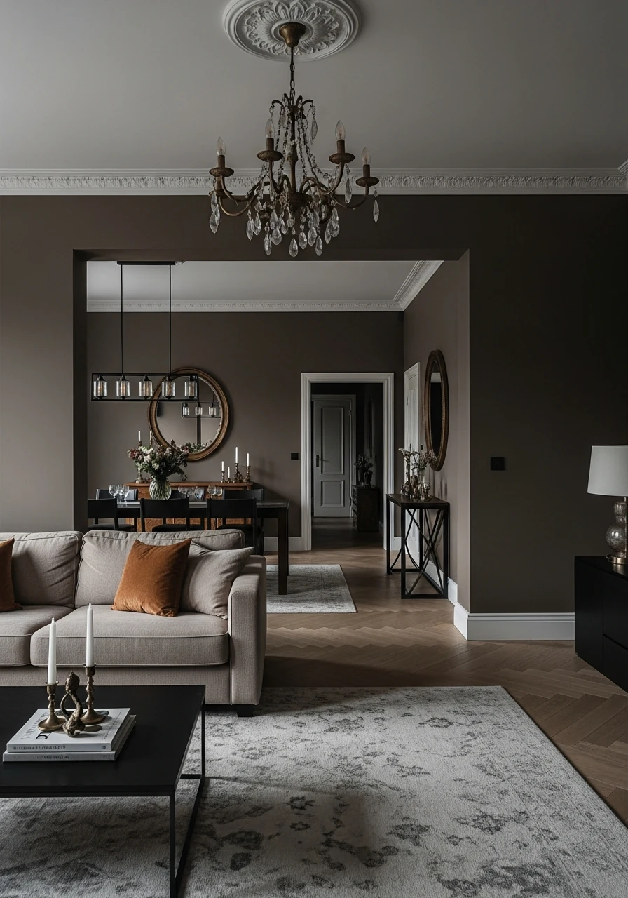
Silhouette is a deep charcoal brown neutral that is perfect for creating moody and sophisticated spaces. It adds depth and drama, making a room feel intimate and luxurious. It’s a bold neutral for those who love darker tones.
- Creates a dramatic and refined atmosphere.
- Pairs beautifully with gold accents for a luxurious touch.
- Ideal for a cozy den or a dramatic bedroom.
Pro Tip: Balance this deep color with lighter furniture and plenty of lighting to keep the room from feeling too dark.
44. Moscow Midnight: Deep Neutral for Dramatic Style
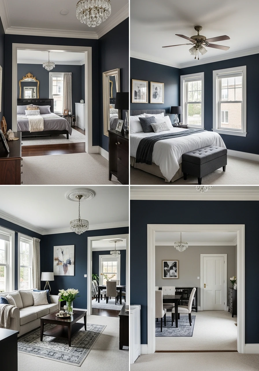
Moscow Midnight is a rich, deep neutral that has hints of both dark gray and blue, creating a truly dramatic and elegant style. It’s perfect for adding a sophisticated edge to your home, especially in rooms where you want a striking statement.
- A very sophisticated and bold neutral.
- Offers a luxurious and refined feel.
- Works well with metallic accents and rich fabrics.
Pro Tip: Use this color in a room with tall ceilings or large windows to maximize its dramatic effect.
45. Setting Plaster: Soft Blush Neutral for Warm Elegance
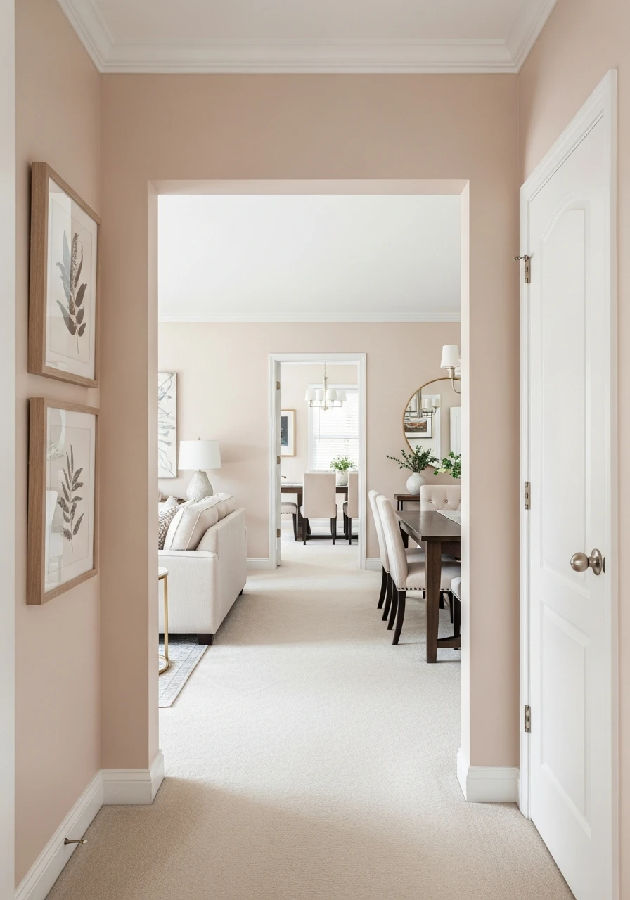
Setting Plaster is a soft blush neutral with warm, earthy undertones, bringing a unique elegance to your home. It’s a subtle pinkish beige that feels incredibly warm and inviting, perfect for adding a gentle touch of color.
- Adds a soft, romantic elegance.
- Pairs beautifully with creamy whites and natural wood.
- A unique neutral that feels cozy and chic.
Pro Tip: This color is stunning in bedrooms or nurseries for a gentle, serene feel.
46. Lattice: Light Warm Neutral for Subtle Brightness
Lattice is a light warm neutral that has just enough depth to feel substantial without being overwhelming. It’s perfect for adding subtle brightness to your home, creating a soft and inviting backdrop that feels fresh and clean.
- A gentle and airy neutral.
- Works well in almost any room.
- Creates a sense of spaciousness and light.
Pro Tip: This color is a great option if you want something lighter than a greige but with more warmth than a cool white.
47. Full Moon: Creamy Yellow Neutral for Cheerful Walls
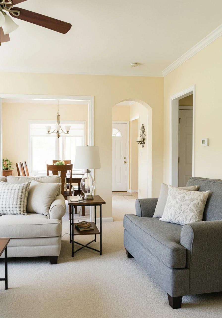
Full Moon is a creamy yellow neutral that brings a cheerful and sunny disposition to your walls. It’s a soft, gentle yellow that feels warm and inviting without being too bright, perfect for adding a touch of happiness to your home.
- Adds a cheerful and uplifting feel.
- Great for spaces that need a bit of sunshine.
- Pairs well with white and light wood tones.
Pro Tip: Use this color in rooms that face north to brighten them up and counteract cooler light.
48. Creamy: Soft Warm Neutral for Timeless Interiors
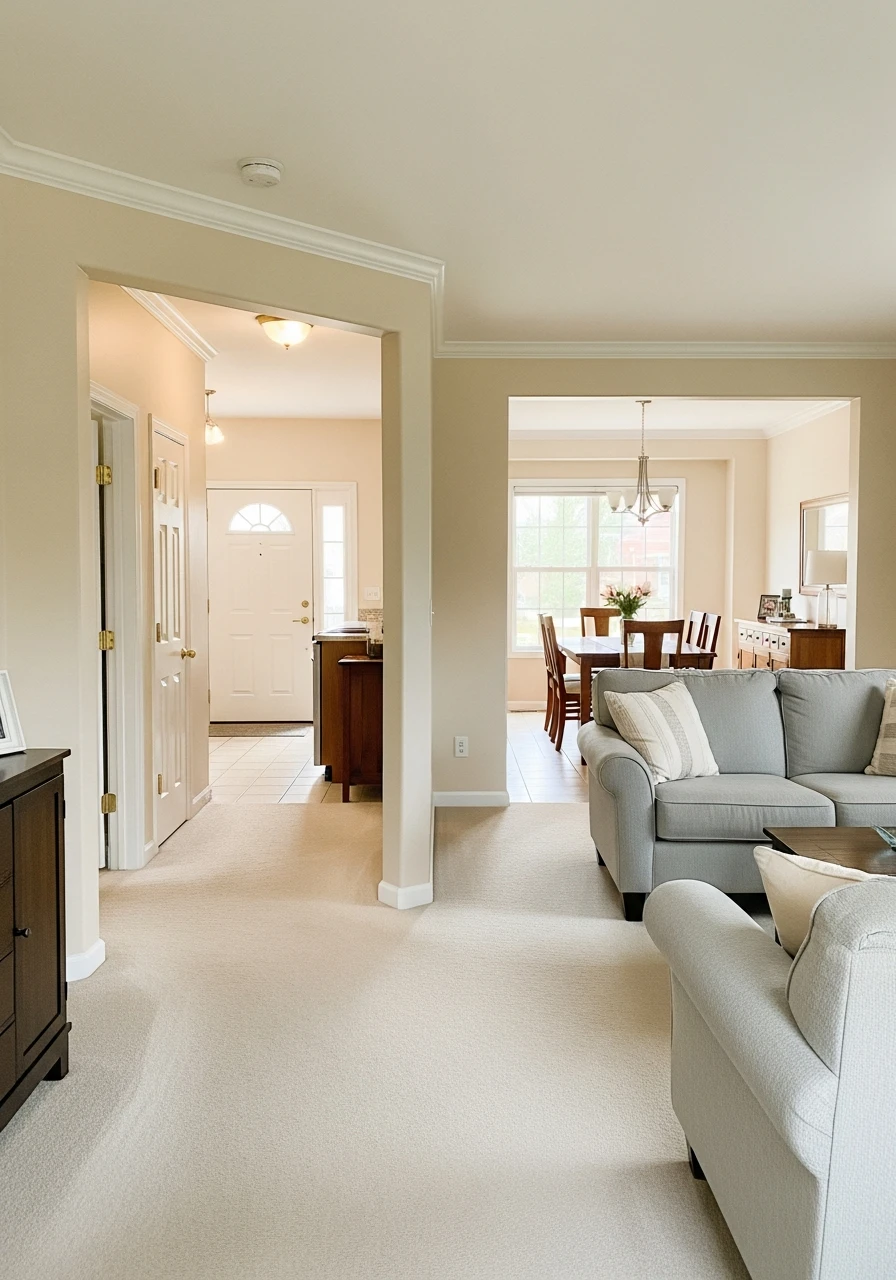
Creamy is a simple yet effective soft warm neutral that embodies timeless elegance. It’s a classic cream that provides a cozy and inviting feel, perfect for creating interiors that will look good for years to come.
- A classic and dependable cream.
- Creates a warm and welcoming atmosphere.
- Works well with traditional and transitional decor.
Pro Tip: This color is a safe bet if you’re looking for a warm neutral that won’t go out of style.
49. Deep Stone Hearth: Brown Neutral for Rich Depth
Deep Stone Hearth is a rich brown neutral that offers significant depth and character. It’s perfect for creating a grounded and luxurious feel, adding a touch of refined warmth to your home, especially in larger spaces.
- Adds a rich, sophisticated depth.
- Pairs well with natural stone and dark wood.
- Creates a comforting and established atmosphere.
Pro Tip: Use this color to bring a sense of grandeur to a living room or study.
50. Oatmeal Tone: Warm Beige Neutral Trend for Cozy Design
Oatmeal Tone is a warm beige neutral that is currently a popular choice for creating cozy and inviting home designs. It’s a comforting, soft beige that works beautifully with natural textures and a relaxed aesthetic.
- A trendy yet timeless warm beige.
- Perfect for creating a hygge-inspired home.
- Pairs well with creams, whites, and natural wood.
Pro Tip: Layer with chunky knit blankets and textured pillows to enhance the cozy oatmeal vibe.
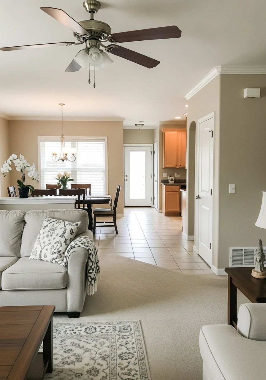
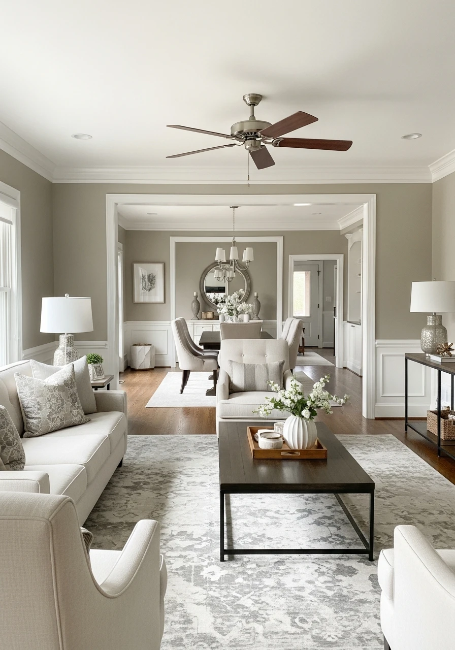
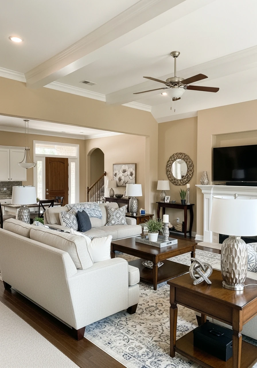
Choosing a whole-house neutral doesn’t have to be overwhelming!
These 50 ideas offer a range of beautiful shades, from crisp whites to cozy beiges and sophisticated greiges, all designed to give your home that high-end look you love, without a high-end price tag.
Remember to grab some samples, paint large swatches on your walls, and see how the colors look throughout the day. Happy painting, friends!